CSS & JS Effect – Section Design Waves
介绍
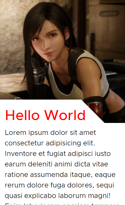
Section Waves 长这样


左边是没有 waves, 右边是加了 waves. 它的作用就是点缀. 让画面有一点 "Design" 的感觉.
参考
YouTube – CSS Wavy Background Tutorial | Section Dividers | FREE
原理
它并不是靠 CSS 做出来的. 它是 SVG. CSS 只负责一些简单的定位, 控制 width 之类的而已.
有许多线上网站可以直接做出这类的 SVG.
softr – Create Beautiful SVG Shapes (可以做一些菱形变种)
Step by Step
进入 shapedivider.app 网站
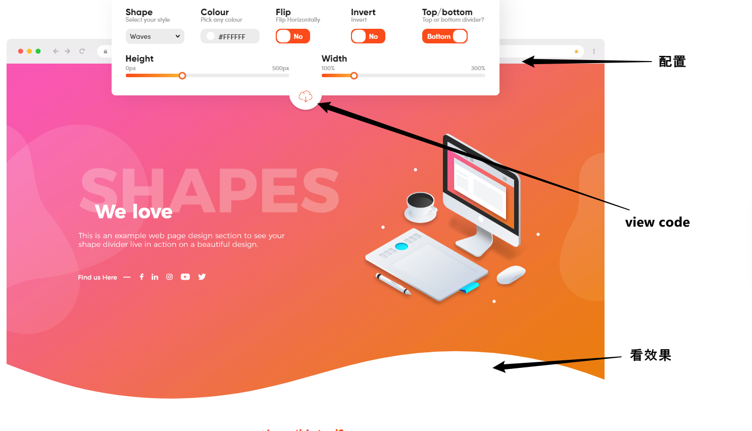
点击 view code, 把 HTML 和 CSS 拷贝下来
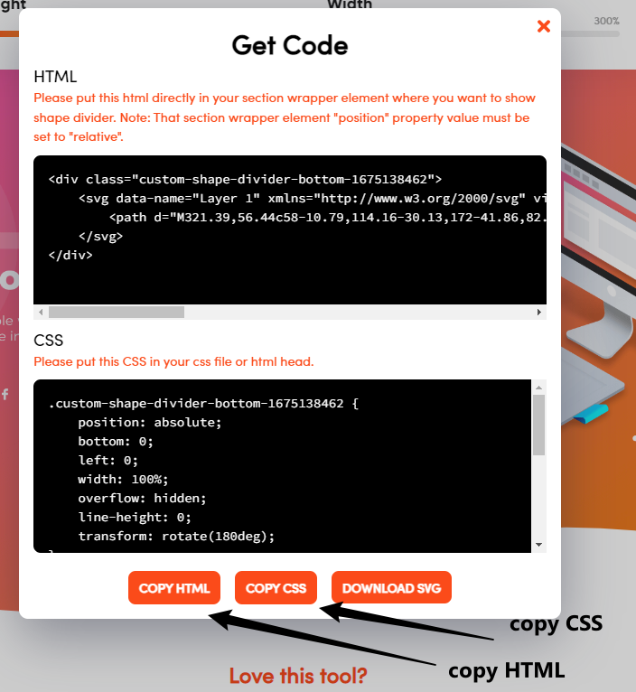
放进 HTML 和 CSS 中就可以了.
HTML
放到 section 的结尾处
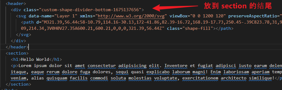


  <body>

    <header>

      <div class="custom-shape-divider-bottom-1675137656">

        <svg data-name="Layer 1" xmlns="http://www.w3.org/2000/svg" viewBox="0 0 1200 120" preserveAspectRatio="none">

          <path d="M321.39,56.44c58-10.79,114.16-30.13,172-41.86,82.39-16.72,168.19-17.73,250.45-.39C823.78,31,906.67,72,985.66,92.83c70.05,18.48,146.53,26.09,214.34,3V0H0V27.35A600.21,600.21,0,0,0,321.39,56.44Z" class="shape-fill"></path>

        </svg>

      </div>

    </header>

    <section>

      <h1>Hello World</h1>

      <p>Lorem ipsum dolor sit amet consectetur adipisicing elit. Inventore et fugiat adipisci iusto earum deleniti animi dicta vitae ratione assumenda itaque, eaque rerum dolore fuga dolores, sequi quasi explicabo laborum magni! Enim laboriosam aperiam tempore consectetur officiis corporis est, veniam, alias quisquam facilis commodi soluta molestias voluptate, exercitationem architecto similique!</p>

    </section>

  </body>
CSS
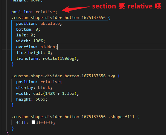
body {

  header {

    background-image: url('../images/tifa1.jpg');

    background-size: cover;

    background-position: center;

    height: 60vh;

    position: relative;

    .custom-shape-divider-bottom-1675137656 {

      position: absolute;

      bottom: 0;

      left: 0;

      width: 100%;

      overflow: hidden;

      line-height: 0;

      transform: rotate(180deg);

    }

    .custom-shape-divider-bottom-1675137656 svg {

      position: relative;

      display: block;

      width: calc(142% + 1.3px);

      height: 50px;

    }

    .custom-shape-divider-bottom-1675137656 .shape-fill {

      fill: #ffffff;

    }

  }

  section {

    padding-block: 3rem 5rem;

    padding-inline: 1rem;

    min-height: 50vh;

    h1 {

      font-size: 3rem;

      color: red;

      font-weight: 500;

    }

    p {

      margin-top: 1rem;

      font-size: 1.5rem;

      line-height: 1.5;

    }

    position: relative;

    z-index: 0;

  }

}
搞定.
简单的 Section Design (without SVG)
如果不想搞 waves 也可以用一些简单的 design. CSS 就可以做出来了
比如
好不好看是其次, 我们来看看它如何实现. (学点 CSS 呗)
HTML
<body>

  <header></header>

  <section>

    <h1>Hello World</h1>

    <p>Lorem ipsum dolor sit amet consectetur adipisicing elit. Inventore et fugiat adipisci iusto earum deleniti animi dicta vitae ratione assumenda itaque, eaque rerum dolore fuga dolores, sequi quasi explicabo laborum magni! Enim laboriosam aperiam tempore consectetur officiis corporis est, veniam, alias quisquam facilis commodi soluta molestias voluptate, exercitationem architecto similique!</p>

  </section>

</body>
一个 header 图, 一个 section 字. 简单明了.
CSS
body {

  header {

    background-image: url('../images/tifa1.jpg');

    background-size: cover;

    background-position: center;

    height: 60vh;

  }

  section {

    padding-block: 2rem 5rem;

    padding-inline: 1rem;

    min-height: 50vh;

    h1 {

      font-size: 3rem;

      color: red;

      font-weight: 500;

    }

    p {

      margin-top: 1rem;

      font-size: 1.5rem;

      line-height: 1.5;

    }

  }

}
给它一些美化
效果
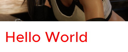
技巧一: 重叠
首先是让 Hello World 上去, 盖到背景, 如下

这种重叠通常是靠 margin negative 实现的.
section {

  margin-top: -80px;

}
效果

由于 section 没有背景色, 所以依然看得见 header 的图片. 只是 Hello World 重叠上去了.
我们不可以直接给 section 背景白色. 因为一旦给了白色, 那么它就全白了
section {

  margin-top: -80px;

  background-color: white;

}
效果
那怎么办呢?
技巧二 : overlay background
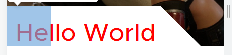
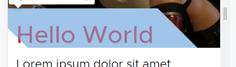
两个蓝色区块是 overlay, 背景色是 white. 是它们覆盖了 header 的背景图.
第二个区块利用了 transform skew 做出了斜线. 第一个区块则负责弥补第二个区块 skew 后左下角的缺口.
CSS
section {

  position: relative;

  z-index: 0;

  &::before {

    content: '';

    position: absolute;

    width: 20%;

    height: 80px;

    background-color: white;

    top: 0;

    left: 0;

    z-index: -1;

  }

  &::after {

    content: '';

    position: absolute;

    width: 80%;

    height: 80px;

    background-color: white;

    top: 0;

    left: 0;

    z-index: -1;

    transform: skew(45deg);

  }

}
这样就搞定了.
极端做法 clip any thing
还有一种做法只用 clip 就可以搞出任何形状了.
参考: Creative Section Breaks Using CSS Clip-Path
首先利用 Figma Pen 勾画出要 clip 的形状 (什么形状都画的出来了...)
然后 conver to relative clip path, 让它可以 responsive
最后用 svg + css 来完成
<svg class="svg">

  <clipPath id="my-clip-path" clipPathUnits="objectBoundingBox"><path d="data..."></path></clipPath>

</svg>

<div class="clipped"></div>
css
.svg {

  position: absolute;

  width: 0;

  height: 0;

}

.clipped {

  -webkit-clip-path: url(#my-clip-path);

  clip-path: url(#my-clip-path);

}
我觉得工程有点大。
CSS & JS Effect – Section Design Waves的更多相关文章
- css+js+html基础知识总结
css+js+html基础知识总结 一.CSS相关 1.css的盒子模型:IE盒子模型.标准W3C盒子模型: 2.CSS优先级机制: 选择器的优先权:!important>style(内联样式) ...
- 用html+css+js做打地鼠小游戏
html 代码 first.html <!DOCTYPE html> <html lang="en"> <head> <meta char ...
- HTML/CSS/JS编码规范
最近整理了一份HTML/CSS/JS编码规范,供大家参考.目录:一.HTML编码规范二.CSS编码规范三.JS编码规范 一.HTML编码规范 1. img标签要写alt属性 根据W3C标准,img标签 ...
- 前端工程师面试问题归纳(一、问答类html/css/js基础)
一.参考资源 1.前端面试题及答案整理(一) 2.2017年前端面试题整理汇总100题 3.2018最新Web前端经典面试试题及答案 4.[javascript常见面试题]常见前端面试题及答案 5.W ...
- CSS & JS 制作滚动幻灯片
==================纯CSS方式==================== <!DOCTYPE html> <html> <head> <met ...
- 【转】Maven Jetty 插件的问题(css/js等目录死锁)的解决
Maven Jetty 插件的问题(css/js等目录死锁,不能自动刷新)的解决: 1. 打开下面的目录:C:\Users\用户名\.m2\repository\org\eclipse\jetty ...
- Css Js Loader For Zencart
Css Js Loader 描述:这个插件很早就出来了,可能知道人非常少 这个插件的功能是整合所有的网站的CSS和JS内容到一个文件里边. 因为CSS和JS文件到了一个文件,加快了程序的运行 在配合其 ...
- 购物车数字加减按钮HTML+CSS+JS(有需要嫌麻烦的小伙伴拿走不谢)
之前在写详情页的时候,如下图 因为自己嫌麻烦,就去看其他网站是怎么写的,想直接拿来用,后来看来看去觉得写得很麻烦,于是最后还是决定自己写,附上HTML+CSS+JS代码,一条龙一站式贴心服务2333 ...
- vs合并压缩css,js插件——Bundler & Minifier
之前做了一个大转盘的抽奖活动,因为比较火,部分用户反馈看不到页面的情况,我怀疑js加载请求过慢导致,所以今天针对之前的一个页面进行调试优化. 首先想到的是对页面的js和css进行压缩优化,百度了下vs ...
- nginx资源定向 css js路径问题
今天玩玩项目,学学nginx发现还不错,速度还可以,但是CSS JS确无法使用,原来Iginx配置时需要对不同类型的文件配置规则,真是很郁闷,不过想想也还是很有道理.闲暇之际,把配置贴上来.#user ...
随机推荐
- ABC358
A link -- 点击查看代码 #include<bits/stdc++.h> using namespace std; string s,t; signed main(){ cin & ...
- BTC 地址
比特币地址(Bitcoin Address)是用于接收和发送比特币的唯一标识符,类似于传统金融系统中的银行账号.一个比特币地址由一串字母和数字组成,通常以1.3或bc1开头,具体长度为26至35个字符 ...
- Python | 解决方案 | 多个文件共用logger,重复打印问题
项目中封装了logging库为log.py,实现既把日志输出到控制台, 又写入日志文件文件. 环境:python3.7.3 项目中,多个文件共用logger,出现重复打印问题,解决流程记录如下: 文件 ...
- 安卓开发 StateListDrawable 应用
基础部份 StateListDrawable 安卓开发中,如果要做一个按扭按下改变背景,或获取焦点改变背景,最简单的方法是利用将背景指向一个资源,然后果在资源中配置事件,总共分为三步, 1) ...
- holiday week 1
本周进度总结: JAVA javafx以安装完毕并完成了环境配置 因处于小学期中java暂时搁置学习 自学了部分链表.多线程以及一些C/C++的知识,对部分C++库有了更进一步了解 因多线程的问题将平 ...
- 微服务:openFeign
openFeign是一个声明式http客户端.作用:基于springMVC常见注解,帮我们更优雅的实现http请求 引入依赖 <!--openFeign--> <dependency ...
- python解决urllib发送请求报错:urllib.error.URLError: <urlopen error [SSL: CERTIFICATE_VERIFY_FAILED] certificate verify failed: unable to get local issuer certificate (_ssl.c:xxxx)>
在使用urllib.request.Request(url)前,添加代码放到最前面 import ssl ssl._create_default_https_context = ssl._create ...
- Linux 安装LibreOffice及常见问题解决
Linux 安装LibreOffice及常见问题解决 一 .在官网下载对应的压缩包 官网地址:https://www.libreoffice.org/download/download/ 选择Linu ...
- Fiddler使用界面介绍-左侧会话面板
左侧会话面板,是Fiddler抓取的请求数据展示
- Could not retrieve mirrorlist http://mirrorlist.centos.org/?release=7&arch=x86_64&repo=os&infra=stock error was 14: curl#6 - "Could not resolve host: mirrorlist.centos.org; 未知的错误"解决yum下载报错
报错信息 │ (SSH client, X server and network tools) │ │ │ │ ⮞ SSH session to root@192.168.117.166 │ │ • ...