python绘制图的度分布柱状图, draw graph degree histogram with Python
图的度数分布
import collections

import matplotlib.pyplot as plt

import networkx as nx

G = nx.gnp_random_graph(100, 0.02)

degree_sequence = sorted([d for n, d in G.degree()], reverse=True)  # degree sequence

# print "Degree sequence", degree_sequence

degreeCount = collections.Counter(degree_sequence)

deg, cnt = zip(*degreeCount.items())

# #as an alternation, you can pick out the top N items for the plot:

#d = sorted(degreeCount.items(), key=lambda item:item[1], reverse=True)[:30]   # pick out the up 30 items from counter

#deg = [i[0] for i in d]

#cnt = [i[1] for i in d]

fig, ax = plt.subplots()

plt.bar(deg, cnt, width=0.80, color='b')

plt.title("Degree Histogram")

plt.ylabel("Count")

plt.xlabel("Degree")

ax.set_xticks([d + 0.4 for d in deg])

ax.set_xticklabels(deg)

# draw graph in inset

plt.axes([0.4, 0.4, 0.5, 0.5])

Gcc = sorted(nx.connected_component_subgraphs(G), key=len, reverse=True)[0]

pos = nx.spring_layout(G)

plt.axis('off')

nx.draw_networkx_nodes(G, pos, node_size=20)

nx.draw_networkx_edges(G, pos, alpha=0.4)

plt.draw()
Source for reference:
degree-histogram, networkx

Draw the histogram for values of dict
import collections
import matplotlib.pyplot as plt
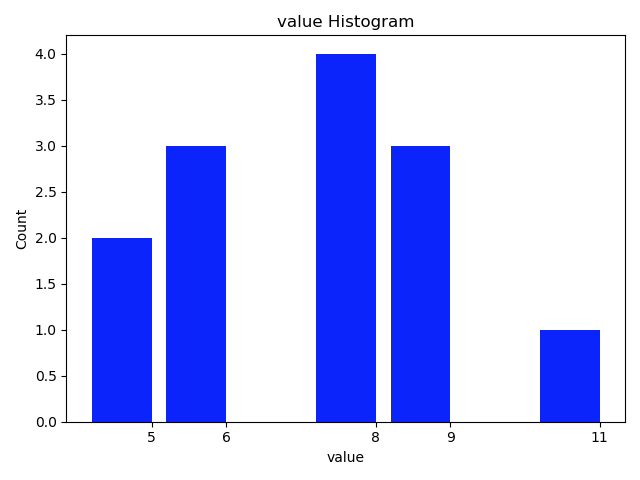
dict_granuLevel = {'1283': 9, '291': 5, '451': 6, '964': 8, '1093': 5, '525': 8, '878': 11, '1553': 9, '1107': 6, '1588': 8,
'1435': 6, '861': 8, '1054': 9}
value_sequence = sorted([d for d in dict_granuLevel.values()], reverse=True) # value sequence
print("value sequence:", value_sequence)
valueCount = collections.Counter(value_sequence)
val, cnt = zip(*valueCount.items())
# # as an alternation, you can pick out the top N items for the plot:
# d = sorted(degreeCount.items(), key=lambda item:item[1], reverse=True)[:10] # pick out the up 10 items from counter
# val = [i[0] for i in d]
# cnt = [i[1] for i in d]
fig, ax = plt.subplots()
plt.bar(val, cnt, width=0.80, color='b')
plt.title("value Histogram")
plt.ylabel("Count")
plt.xlabel("value")
ax.set_xticks([d + 0.4 for d in val])
ax.set_xticklabels(val)
plt.show()
The function style:
import collections

import matplotlib.pyplot as plt

def plot_histogram(list_input, k=0):

    '''

    draw the histogram for items in list_input

    :param list: list of count_numbers. all items are required to be int.

    :param k: the top k-th count of items to be considered for drawing the plot. default: k=0, plot all

    :return:

    '''

    valueCount = collections.Counter(list_input)

    val, cnt = zip(*valueCount.items())

    print('  len of val, cnt:', len(val), end='')

    if k != 0:

        print(' pick the largest', k, 'cnt for histogram.')

        d = sorted(valueCount.items(), key=lambda item: item[1], reverse=True)[:k]    # pick out the up k items from counter

    else:

        d = sorted(valueCount.items(), key=lambda item: item[1], reverse=True)

        print(' k = 0. Pick all the cnt for histogram.')

    val = [i[0] for i in d]

    cnt = [i[1] for i in d]

    fig, ax = plt.subplots()

    plt.bar(val, cnt, width=0.80, color='b')

    plt.title("value Histogram")

    plt.ylabel("Count")

    plt.xlabel("value")

    ax.set_xticks([d + 0.4 for d in val])

    ax.set_xticklabels(val)

    plt.show()

    return

dict_granuLevel = {'tom': 9, 'cat': 5, 'dot': 6, 'dog': 8, 'hors': 5, 'fao': 8, 'pao': 11, 'koo': 9, 'jan': 6, 'dec': 8,

             'foo': 6, 'doo': 8, 'coo': 9}

value_sequence = sorted([d for d in dict_granuLevel.values()], reverse=True)  # value sequence

print("value sequence:", value_sequence)

plot_histogram(value_sequence, 3)
read more: 用python + networkx探索和分析网络数据
python绘制图的度分布柱状图, draw graph degree histogram with Python的更多相关文章
- 用Python 绘制分布(折线)图
用Python 绘制分布(折线)图,使用的是 plot()函数. 一个简单的例子: # encoding=utf-8 import matplotlib.pyplot as plt from pyla ...
- Python绘制六种可视化图表详解,三维图最炫酷!你觉得呢?
Python绘制六种可视化图表详解,三维图最炫酷!你觉得呢? 可视化图表,有相当多种,但常见的也就下面几种,其他比较复杂一点,大都也是基于如下几种进行组合,变换出来的.对于初学者来说,很容易被这官网上 ...
- python 绘制柱状图
python 绘制柱状图 import matplotlib.pyplot as plt import numpy as np # 创建一个点数为 8 x 6 的窗口, 并设置分辨率为 80像素/每英 ...
- 使用python绘制根轨迹图
最近在学自动控制原理,发现根轨迹这一张全是绘图的,然而书上教的全是使用matlab进行计算机辅助绘图.但国内对于使用python进行这种绘图的资料基本没有,后来发现python-control包已经将 ...
- Python的可视化包 – Matplotlib 2D图表(点图和线图,.柱状或饼状类型的图),3D图表(曲面图,散点图和柱状图)
Python的可视化包 – Matplotlib Matplotlib是Python中最常用的可视化工具之一,可以非常方便地创建海量类型地2D图表和一些基本的3D图表.Matplotlib最早是为了可 ...
- Python绘制语谱图+时域波形
"""Python绘制语谱图""" """Python绘制时域波形""" # 导 ...
- Python 绘制 柱状图
用Python 绘制 柱状图,使用的是bar()函数. 一个简单的例子: # 创建一个点数为 8 x 6 的窗口, 并设置分辨率为 80像素/每英寸 plt.figure(figsize=(10, 1 ...
- Python绘制面积图
一.Python绘制面积图对应代码如下图所示 import matplotlib.pyplot as plt from pylab import mpl mpl.rcParams['font.sans ...
- Python绘制折线图
一.Python绘制折线图 1.1.Python绘制折线图对应代码如下图所示 import matplotlib.pyplot as pltimport numpy as np from pylab ...
随机推荐
- C# 内存建表备忘
#region=====建表===== DataSet dataSet; // 创建表 DataTable table = new DataTable("testTable"); ...
- 阶段1 语言基础+高级_1-3-Java语言高级_04-集合_06 Set集合_4_Set集合存储元素不重复的原理
set集合元素为什么不能重复 集合重写了toString的方法所以打印是里面的内容 往里面存了三次abc 哈希表,初始容量是16个 set集合存储字符串的时候比较特殊 横着是数组,竖着就是链表结构.跟 ...
- docker进阶——数据管理与网络
一.数据卷管理 用户在使用 Docker 的过程中,势必需要查看容器内应用产生的数据,或者 需要将容器内数据进行备份,甚至多个容器之间进行数据共享,这必然会涉及 到容器的数据管理 (1)Data Vo ...
- HAWQ技术总结
HAWQ技术总结: 1. 官网: http://hawq.incubator.apache.org/ 2. 特性 2.1 sql支持完善 ANSI SQL标准,OLAP扩展,标准JDBC/ODBC支持 ...
- Android在WindowManagerService和ActivityManagerService中的Token
https://upload-images.jianshu.io/upload_images/5688445-6cf0575bb52ccb45.png 1. ActivityRecord中的token ...
- idea多行注释缩进
选中多行代码 - 按下tab键——向后整体移动 选中多行代码 - 按下shift + tab键——向前整体缩进(整体去掉代码前面的空格)
- C++ 中赋值运算符重载以及深拷贝浅拷贝解析
转载自:http://blog.csdn.net/business122/article/details/21242857 关键词:构造函数,浅拷贝,深拷贝,堆栈(stack),堆heap,赋值运算符 ...
- Vue+axios+Node+express实现文件上传(用户头像上传)
Vue 页面的代码 <label for='my_file' class="theme-color"> <mu-icon left value="bac ...
- python学习第四十八天json模块与pickle模块差异
在开发过程中,字符串和python数据类型进行转换,下面比较python学习第四十八天json模块与pickle模块差异. json 的优点和缺点 优点 跨语言,体积小 缺点 只能支持 int st ...
- python 学习第四十七天shelve模块
shelve模块是一个简单的k,v将内存数据通过文件持久化的模块,可以持久化任何pickle可支持的python数据格式. 1,序列化 import shelve f=shelve.open('she ...