python绘制图的度分布柱状图, draw graph degree histogram with Python
图的度数分布
import collections

import matplotlib.pyplot as plt

import networkx as nx

G = nx.gnp_random_graph(100, 0.02)

degree_sequence = sorted([d for n, d in G.degree()], reverse=True)  # degree sequence

# print "Degree sequence", degree_sequence

degreeCount = collections.Counter(degree_sequence)

deg, cnt = zip(*degreeCount.items())

# #as an alternation, you can pick out the top N items for the plot:

#d = sorted(degreeCount.items(), key=lambda item:item[1], reverse=True)[:30]   # pick out the up 30 items from counter

#deg = [i[0] for i in d]

#cnt = [i[1] for i in d]

fig, ax = plt.subplots()

plt.bar(deg, cnt, width=0.80, color='b')

plt.title("Degree Histogram")

plt.ylabel("Count")

plt.xlabel("Degree")

ax.set_xticks([d + 0.4 for d in deg])

ax.set_xticklabels(deg)

# draw graph in inset

plt.axes([0.4, 0.4, 0.5, 0.5])

Gcc = sorted(nx.connected_component_subgraphs(G), key=len, reverse=True)[0]

pos = nx.spring_layout(G)

plt.axis('off')

nx.draw_networkx_nodes(G, pos, node_size=20)

nx.draw_networkx_edges(G, pos, alpha=0.4)

plt.draw()
Source for reference:
degree-histogram, networkx

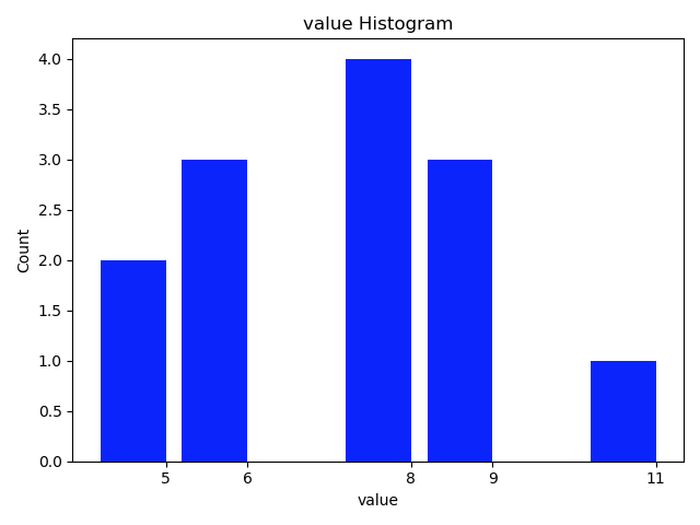
Draw the histogram for values of dict
import collections

import matplotlib.pyplot as plt

dict_granuLevel = {'1283': 9, '291': 5, '451': 6, '964': 8, '1093': 5, '525': 8, '878': 11, '1553': 9, '1107': 6, '1588': 8,

             '1435': 6, '861': 8, '1054': 9}

value_sequence = sorted([d for d in dict_granuLevel.values()], reverse=True)  # value sequence

print("value sequence:", value_sequence)

valueCount = collections.Counter(value_sequence)

val, cnt = zip(*valueCount.items())

# # as an alternation, you can pick out the top N items for the plot:

# d = sorted(degreeCount.items(), key=lambda item:item[1], reverse=True)[:10]   # pick out the up 10 items from counter

# val = [i[0] for i in d]

# cnt = [i[1] for i in d]

fig, ax = plt.subplots()

plt.bar(val, cnt, width=0.80, color='b')

plt.title("value Histogram")

plt.ylabel("Count")

plt.xlabel("value")

ax.set_xticks([d + 0.4 for d in val])

ax.set_xticklabels(val)

plt.show()
The function style:
import collections

import matplotlib.pyplot as plt

def plot_histogram(list_input, k=0):

    '''

    draw the histogram for items in list_input

    :param list: list of count_numbers. all items are required to be int.

    :param k: the top k-th count of items to be considered for drawing the plot. default: k=0, plot all

    :return:

    '''

    valueCount = collections.Counter(list_input)

    val, cnt = zip(*valueCount.items())

    print('  len of val, cnt:', len(val), end='')

    if k != 0:

        print(' pick the largest', k, 'cnt for histogram.')

        d = sorted(valueCount.items(), key=lambda item: item[1], reverse=True)[:k]    # pick out the up k items from counter

    else:

        d = sorted(valueCount.items(), key=lambda item: item[1], reverse=True)

        print(' k = 0. Pick all the cnt for histogram.')

    val = [i[0] for i in d]

    cnt = [i[1] for i in d]

    fig, ax = plt.subplots()

    plt.bar(val, cnt, width=0.80, color='b')

    plt.title("value Histogram")

    plt.ylabel("Count")

    plt.xlabel("value")

    ax.set_xticks([d + 0.4 for d in val])

    ax.set_xticklabels(val)

    plt.show()

    return

dict_granuLevel = {'tom': 9, 'cat': 5, 'dot': 6, 'dog': 8, 'hors': 5, 'fao': 8, 'pao': 11, 'koo': 9, 'jan': 6, 'dec': 8,

             'foo': 6, 'doo': 8, 'coo': 9}

value_sequence = sorted([d for d in dict_granuLevel.values()], reverse=True)  # value sequence

print("value sequence:", value_sequence)

plot_histogram(value_sequence, 3)
read more: 用python + networkx探索和分析网络数据
python绘制图的度分布柱状图, draw graph degree histogram with Python的更多相关文章
- 用Python 绘制分布(折线)图
用Python 绘制分布(折线)图,使用的是 plot()函数. 一个简单的例子: # encoding=utf-8 import matplotlib.pyplot as plt from pyla ...
- Python绘制六种可视化图表详解,三维图最炫酷!你觉得呢?
Python绘制六种可视化图表详解,三维图最炫酷!你觉得呢? 可视化图表,有相当多种,但常见的也就下面几种,其他比较复杂一点,大都也是基于如下几种进行组合,变换出来的.对于初学者来说,很容易被这官网上 ...
- python 绘制柱状图
python 绘制柱状图 import matplotlib.pyplot as plt import numpy as np # 创建一个点数为 8 x 6 的窗口, 并设置分辨率为 80像素/每英 ...
- 使用python绘制根轨迹图
最近在学自动控制原理,发现根轨迹这一张全是绘图的,然而书上教的全是使用matlab进行计算机辅助绘图.但国内对于使用python进行这种绘图的资料基本没有,后来发现python-control包已经将 ...
- Python的可视化包 – Matplotlib 2D图表(点图和线图,.柱状或饼状类型的图),3D图表(曲面图,散点图和柱状图)
Python的可视化包 – Matplotlib Matplotlib是Python中最常用的可视化工具之一,可以非常方便地创建海量类型地2D图表和一些基本的3D图表.Matplotlib最早是为了可 ...
- Python绘制语谱图+时域波形
"""Python绘制语谱图""" """Python绘制时域波形""" # 导 ...
- Python 绘制 柱状图
用Python 绘制 柱状图,使用的是bar()函数. 一个简单的例子: # 创建一个点数为 8 x 6 的窗口, 并设置分辨率为 80像素/每英寸 plt.figure(figsize=(10, 1 ...
- Python绘制面积图
一.Python绘制面积图对应代码如下图所示 import matplotlib.pyplot as plt from pylab import mpl mpl.rcParams['font.sans ...
- Python绘制折线图
一.Python绘制折线图 1.1.Python绘制折线图对应代码如下图所示 import matplotlib.pyplot as pltimport numpy as np from pylab ...
随机推荐
- Phaser 源码分析
Phaser 一个可重用的同步屏障,功能上与 CyclicBarrier 和 CountDownLatch 类似,但是支持更灵活的使用. 把多个线程协作执行的任务划分为多个阶段,编程时需要明确各个阶段 ...
- Delphi XE2 之 FireMonkey 入门(27) - 数据绑定: TBindingsList: TBindScope
Delphi XE2 之 FireMonkey 入门(27) - 数据绑定: TBindingsList: TBindScope 如果在编写表达式时, 如果能够随意指认需要的控件就好了(通过 Owne ...
- Delphi XE2 之 FireMonkey 入门(19) - TFmxObject 的子类们(表)
参考: 和 FMX 相关的类(表) TFmxObject IFreeNotification TAnimation TBitmapAnimation TBi ...
- #Week 11 - 343.Integer Break
Week 11 - 343.Integer Break Given a positive integer n, break it into the sum of at least two positi ...
- API网关spring cloud gateway和负载均衡框架ribbon实战
通常我们如果有一个服务,会部署到多台服务器上,这些微服务如果都暴露给客户,是非常难以管理的,我们系统需要有一个唯一的出口,API网关是一个服务,是系统的唯一出口.API网关封装了系统内部的微服务,为客 ...
- jvm学习(2)JVM内存说明
前言 一.类方法 类方法是静态方法,前面需要有static修饰符修饰.类方法内不能涉及有关变量的内容1.不能调用类的对象方法2.不能引用对象变量3.类方法不能被重写(覆盖)4.类方法不能使用super ...
- 初学css list-style属性
网上很多css布局中会看到这样的一句:list-style:none: 那么list-style到底什么意思?中文即:列表样式:无: 其实它是一个简写属性,包含了所有列表属性,具体包含list-sty ...
- Java使用POI读取和写入Excel指南(转)
做项目时经常有通过程序读取Excel数据,或是创建新的Excel并写入数据的需求: 网上很多经验教程里使用的POI版本都比较老了,一些API在新版里已经废弃,这里基于最新的Apache POI 4.0 ...
- 比Redux更容易上手的状态管理库
前言 当项目越发复杂时,我们发现仅仅是提升状态已经无法适应如此复杂的状态管理了,程序状态变得比较难同步,操作,到处是回调,发布,订阅,这意味着我们需要更好的状态管理方式,于是就引入了状态管理库,如Re ...
- python学习笔记(13):python并发编程以及系统常用模块
一.进程与线程 1.进程:程序的一次执行(程序装载入内存,系统分配资源运行).n 每个进程有自己的内存空间.数据栈等,只能使用进程间通讯,而不能直接共享信息 2.线程:所有线程运行在同一个进程中,共享 ...