WPF ItemsControl ListBox ListView比较
在进行列表信息展示时,WPF中提供多种列表可供选择。这篇博客将对WPF ItemsControl, ListBox, ListView进行比较。
相同点:
1. 这三个控件都是列表型控件,可以进行列表绑定(ItemsSource);
2. 这三个控件均使用ItemsPresenter来展示列表信息;
不同点:
控件层次关系:
System.Object
System.Windows.Threading.DispatcherObject
System.Windows.DependencyObject
System.Windows.Media.Visual
System.Windows.UIElement
System.Windows.FrameworkElement
System.Windows.Controls.Control
System.Windows.Controls.ItemsControl
System.Object
System.Windows.Threading.DispatcherObject
System.Windows.DependencyObject
System.Windows.Media.Visual
System.Windows.UIElement
System.Windows.FrameworkElement
System.Windows.Controls.Control
System.Windows.Controls.ItemsControl
System.Windows.Controls.Primitives.Selector
System.Windows.Controls.ListBox
ListBox 继承于ItemsControl,增加了一个Selector对象,ItemsControl中的Item是不支持选择的。而ListBox中Item是支持选择,并且可以单选,多选。
System.Object
System.Windows.Threading.DispatcherObject
System.Windows.DependencyObject
System.Windows.Media.Visual
System.Windows.UIElement
System.Windows.FrameworkElement
System.Windows.Controls.Control
System.Windows.Controls.ItemsControl
System.Windows.Controls.Primitives.Selector
System.Windows.Controls.ListBox
System.Windows.Controls.ListView
ListView继承与ListBox,增加了一个View依赖属性。
ItemsControl是不包含水平和垂直方向的滚动条的。ListBox和ListView有水平和垂直方向滚动条。
ItemControl的样式:
<ResourceDictionary

    xmlns="http://schemas.microsoft.com/winfx/2006/xaml/presentation"

    xmlns:x="http://schemas.microsoft.com/winfx/2006/xaml">

    <Style x:Key="ItemsControlDefaultStyle" TargetType="{x:Type ItemsControl}">

        <Setter Property="Template">

            <Setter.Value>

                <ControlTemplate TargetType="{x:Type ItemsControl}">

                    <Border BorderBrush="{TemplateBinding BorderBrush}" BorderThickness="{TemplateBinding BorderThickness}" Background="{TemplateBinding Background}"

Padding="{TemplateBinding Padding}" SnapsToDevicePixels="true">

                        <ItemsPresenter SnapsToDevicePixels="{TemplateBinding SnapsToDevicePixels}"/>

                    </Border>

                </ControlTemplate>

            </Setter.Value>

        </Setter>

    </Style>

    <!-- Resource dictionary entries should be defined here. -->

</ResourceDictionary>
ListBox和ListView的样式基本一样,除了TargetType外,
<ResourceDictionary

    xmlns="http://schemas.microsoft.com/winfx/2006/xaml/presentation"

    xmlns:x="http://schemas.microsoft.com/winfx/2006/xaml">

    <SolidColorBrush x:Key="ListBorder" Color="#828790"/>

    <Style x:Key="ListBoxDefaultStyle" TargetType="{x:Type ListBox}">

        <Setter Property="Background" Value="{DynamicResource {x:Static SystemColors.WindowBrushKey}}"/>

        <Setter Property="BorderBrush" Value="{StaticResource ListBorder}"/>

        <Setter Property="BorderThickness" Value="1"/>

        <Setter Property="Foreground" Value="{DynamicResource {x:Static SystemColors.ControlTextBrushKey}}"/>

        <Setter Property="ScrollViewer.HorizontalScrollBarVisibility" Value="Auto"/>

        <Setter Property="ScrollViewer.VerticalScrollBarVisibility" Value="Auto"/>

        <Setter Property="ScrollViewer.CanContentScroll" Value="true"/>

        <Setter Property="ScrollViewer.PanningMode" Value="Both"/>

        <Setter Property="Stylus.IsFlicksEnabled" Value="False"/>

        <Setter Property="VerticalContentAlignment" Value="Center"/>

        <Setter Property="Template">

            <Setter.Value>

                <ControlTemplate TargetType="{x:Type ListBox}">

                    <Border x:Name="Bd" BorderBrush="{TemplateBinding BorderBrush}" BorderThickness="{TemplateBinding BorderThickness}" Background="{TemplateBinding Background}" Padding="1"

SnapsToDevicePixels="true">

                        <ScrollViewer Focusable="false" Padding="{TemplateBinding Padding}">

                            <ItemsPresenter SnapsToDevicePixels="{TemplateBinding SnapsToDevicePixels}"/>

                        </ScrollViewer>

                    </Border>

                    <ControlTemplate.Triggers>

                        <Trigger Property="IsEnabled" Value="false">

                            <Setter Property="Background" TargetName="Bd" Value="{DynamicResource {x:Static SystemColors.ControlBrushKey}}"/>

                        </Trigger>

                        <Trigger Property="IsGrouping" Value="true">

                            <Setter Property="ScrollViewer.CanContentScroll" Value="false"/>

                        </Trigger>

                    </ControlTemplate.Triggers>

                </ControlTemplate>

            </Setter.Value>

        </Setter>

    </Style>

    <!-- Resource dictionary entries should be defined here. -->

</ResourceDictionary>
在项目中如何选择使用这三个控件;
1. 如果列表信息只做展示,但不提供选择功能,可以使用ItemsControl;
2. ListView比ListBox增加了一个View属性。
示例代码:
ItemsControl vs ListBox (Selector)
    <Grid>

        <Grid.RowDefinitions>

            <RowDefinition Height="Auto"/>

            <RowDefinition Height="Auto"/>

        </Grid.RowDefinitions>

        <!--ItemsControl-->

        <StackPanel>

            <TextBlock Text="ItemsControl" FontSize="18"/>

            <ItemsControl ItemsSource="{Binding .}">

                <ItemsControl.ItemTemplate>

                    <DataTemplate>

                        <Grid>

                            <Ellipse Width="110" Height="55" Fill="#ebebee"/>

                            <StackPanel>

                                <TextBlock Text="{Binding Priority}" FontSize="16" HorizontalAlignment="Center"/>

                                <TextBlock Text="{Binding Name}" FontSize="16" HorizontalAlignment="Center"/>

                            </StackPanel>

                        </Grid>

                    </DataTemplate>

                </ItemsControl.ItemTemplate>

                <ItemsControl.ItemsPanel>

                    <ItemsPanelTemplate>

                        <WrapPanel />

                    </ItemsPanelTemplate>

                </ItemsControl.ItemsPanel>

                <ItemsControl.ItemContainerStyle>

                    <Style>

                        <Setter Property="Control.Margin" Value="5"/>

                    </Style>

                </ItemsControl.ItemContainerStyle>

            </ItemsControl>

        </StackPanel>

        <!--ListBox-->

        <StackPanel Grid.Row="1">

            <TextBlock Text="ListBox" FontSize="18"/>

            <ListBox ItemsSource="{Binding .}">

                <ListBox.ItemTemplate>

                    <DataTemplate>

                        <Grid>

                            <Ellipse Width="110" Height="55" Fill="#ebebee"/>

                            <StackPanel>

                                <TextBlock Text="{Binding Priority}" FontSize="16" HorizontalAlignment="Center"/>

                                <TextBlock Text="{Binding Name}" FontSize="16" HorizontalAlignment="Center"/>

                            </StackPanel>

                        </Grid>

                    </DataTemplate>

                </ListBox.ItemTemplate>

                <ListBox.ItemsPanel>

                    <ItemsPanelTemplate>

                        <StackPanel/>

                    </ItemsPanelTemplate>

                </ListBox.ItemsPanel>

                <ListBox.ItemContainerStyle>

                    <Style>

                        <Setter Property="Control.Width" Value="120"/>

                        <Setter Property="Control.Margin" Value="5"/>

                    </Style>

                </ListBox.ItemContainerStyle>

                <ListBox.Template>

                    <ControlTemplate>

                        <ScrollViewer HorizontalScrollBarVisibility="Auto" VerticalScrollBarVisibility="Auto">

                            <ItemsPresenter/>

                        </ScrollViewer>

                    </ControlTemplate>

                </ListBox.Template>

            </ListBox>

        </StackPanel>

    </Grid>
C#
    public class Task

    {

        public string Name { get; set; }

        public int Priority { get; set; }

    }

    ObservableCollection<Task> _tasks = null;

    public MainWindow()

    {

        InitializeComponent();

        _tasks = new ObservableCollection<Task>()

        {

            new Task() { Name = "Shopping",Priority = 2 },

            new Task() { Name = "Laundry",Priority = 2 },

            new Task() { Name = "Email",Priority = 1 },

            new Task() { Name = "Writting",Priority = 2 },

            new Task() { Name = "Learning",Priority = 2 },

            new Task() { Name = "Working",Priority = 2 },

        };

        DataContext = _tasks;

    }
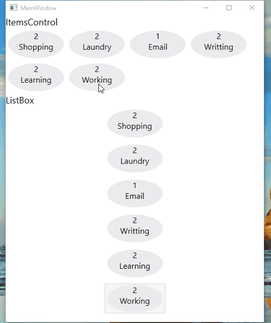
运行效果:
ListView View属性的使用
<ListView ItemsSource="{Binding .}">

    <ListView.View>

        <GridView>

            <GridView.Columns>

                <GridViewColumn Header="Task Name" DisplayMemberBinding="{Binding Name}" Width="100"/>

                <GridViewColumn Header="Task Priority" DisplayMemberBinding="{Binding Priority}" Width="100"/>

            </GridView.Columns>

        </GridView>

    </ListView.View>

</ListView>
运行效果:

感谢您的阅读,代码点击这里下载。
WPF ItemsControl ListBox ListView比较的更多相关文章
- WPF中ListBox /ListView如何改变选中条背景颜色
适用ListBox /ListView WPF中LISTVIEW如何改变选中条背景颜色 https://www.cnblogs.com/sjqq/p/7828119.html
- WPF 自定义ItemsControl/ListBox/ListView控件样式
一.前言 ItemsControl.ListBox.ListView这三种控件在WPF中都可作为列表信息展示控件.我们可以通过修改这三个控件的样式来展示我们的列表信息. 既然都是展示列表信息的控件,那 ...
- WPF中ListBox ListView数据翻页浏览笔记(强调:是数据翻页,非翻页动画)
ListBox和ListView在应用中,常常有需求关于每页显示固定数量的数据,然后通过Timer自动或者手动翻页操作,本文介绍到的就是该动作的实现. 一.重点 对于ListBox和ListView来 ...
- WPF ListBox/ListView/DataGrid 虚拟化时的滚动方式
ListBox的滚动方式 分为像素滚动和列表项滚动 通过ListBox的附加属性ScrollViewer.CanContentScroll来设置.因此ListBox的默认模板中,含有ScrollVie ...
- WPF ItemsControl 手动刷新
原文:WPF ItemsControl 手动刷新 遇到这样一个问题, 我的ItemsSource是绑定到一个ObservableCollection<T>类型的实力上去的. 但是T类型没有 ...
- C# WinForm开发系列 - ListBox/ListView/Panel
转自会飞的小猪文章 C# WinForm开发系列 - ListBox/ListView/Panel 在博客园看到了一篇博文,觉得很不错,就转载过来了. 包含自定义绘制的ListBox, 带拖动, ...
- WPF中ListBox的项ListBoxItem被选中的时候Background变化
使用WPF 中ListBox,点击ListBoxItem的时候,自定义它的背景色,曾经在网上找了一些方法, 不是很理想,后来在StackOverflow上找到了,贴出代码和效果图: 效果图:
- 继续聊WPF——如何获取ListView中选中的项
在WPF中获Listview中选中的项,与WinForm里面有着很大的区别,要亲身去研究一下在WPF中如果处理,其实也不难,来,下面我们一起来通过一个简单的示例来感悟一下吧. 第一步就是建立一个WPF ...
- 用WPF实现在ListView中的鼠标悬停Tooltip显示
原文:用WPF实现在ListView中的鼠标悬停Tooltip显示 一.具体需求描述 在WPF下实现,当鼠标悬停在ListView中的某一元素的时候能弹出一个ToolTip以显示需要的信息. 二.代码 ...
随机推荐
- ubuntu查看端口占用
查看端口号 sudo netstat -ltnp | 结束进程 sudo kill pid
- C#中委托演变的的三个阶段
命名函数 匿名方法 lambda表达式 委托是一种可以把引用存储为函数的类型,定义了委托后,就可以声明该委托类型的变量,接着把这个变量初始化为与委托有相同返回类型和参数列表的函数引用,之后就可以使用委 ...
- meteor 为基础,联合 Apollo + React + React-Router
Graphql with Apollo, Meteor and React: https://janikvonrotz.ch/2016/10/09/graphql-with-apollo-meteor ...
- unity3d项目文件目录发布后,对应的ios/android应用目录[转]
Unity3d的Resource.AssetBundle与手游动态更新的报告,在这里分享一下,希望能够对各位用Unity的朋友有些许帮助.目录:1.Unity的资源数据加载2.Resource.Str ...
- DELPHI XE5开发WEB服务器及安卓手机客户端
Xe5开发web服务端和手机客户端 ------------------------------------- Delphi xe5作为最新开发利器,就类似如当年的DELPHI,功能强大,快发速度快, ...
- java 基础第一季
1. i安装jdk ii 配置环境变量:JAVA_HOME 配置jdk的安装路径 path 配置命令文件的位置 bin目录的安装路径 PATH_HOME 配置库文件的位置 l ...
- 2101 Problem A Snake Filled
题目描述 “What a boring world!”Julyed felt so bored that she began to write numbers on the coordinate pa ...
- 2078 Problem H Secret Message 中石油-未提交-->已提交
题目描述 Jack and Jill developed a special encryption method, so they can enjoy conversations without wo ...
- webclient 和httpclient 应用
//webclient应用 MyImageServerEntities db = new MyImageServerEntities(); public ActionResult Index() { ...
- centos 6.5 配置LDAP服务器+客户端!
各种度娘!各种歌哥!网上教程参差不齐,历时1天,终于完成,不敢独享,遂,总结分享之,有问题可以留言,知无不言...开始吧 Note: 本次配置的服务器环境是<redhat enterprise ...