Angular 2 to Angular 4 with Angular Material UI Components
Content
Part 2: Filter/Search using Angular2 pipe, Global Error handling, Debugging Client side
Part 3: Angular 2 to Angular 4 with Angular Material UI Components
Introduction
In this article, we will continue enhancing the User Management application by upgrading the Angular version from Angular 2 to Angular 4 and using Angular Material 2 components instead of traditional HTML and third-party components (e.g. ng2-bs3-modal modal pop up we used for Add/Update/Delete User).
Angular 4 has couple of new cool features, I don’t want to go over them since you can easily find them online. Check here for quick review. We will use Email Validator and If-else Template conditions in User Management application.
Angular Material is Angular compatible components that we mostly use to design the web application’s UI e.g. Input, Autocomplete, dropdown, checkbox etc. Click here to review the Angular Material components. We will replace all current HTML and third-party components with the Angular Material components.
Background
This article is the third part of Angular2 in ASP.NET MVC & Web API - Part 2. In previous articles, we used ng3-bs3-modal third-party modal pop up components and traditional HTML controls. In this article, we will be replacing all controls with Angular Material components. It is highly recommended that you go through Part 1 & Part 2 before reading this article.
Let’s Start
Before starting the actual development, let me show what would be the final output of this article. You can compare it with Angular2 in ASP.NET MVC & Web API - Part 2 to get an idea what we are going to build.


You can see, we added few more form controls on Add User modal pop up and look & feel of each control is very different from Part 1 & Part 2. Let’s start the development:
As this article is continuation of Angular2 in ASP.NET MVC & Web API - Part 2 article, let’s download the attached project from here.
Restore the Angular 4 Packages
- Open the
Angular2MVC_p2.slnin Visual Studio 2017 Community Edition (Preferably), it is also recommended to rename the solution.
- Edit the
package.jsonfile and replace the file content with the following packages:
 Copy Code
{
"name": "angular-quickstart",
"version": "1.0.0",
"description": "QuickStart package.json from the documentation for visual studio 2017 & WebApi",
"scripts": {
"start": "tsc && concurrently \"tsc -w\" \"lite-server\" ",
"lint": "tslint ./app/**/*.ts -t verbose",
"lite": "lite-server",
"pree2e": "webdriver-manager update",
"test": "tsc && concurrently \"tsc -w\" \"karma start karma.conf.js\"",
"test-once": "tsc && karma start karma.conf.js --single-run",
"tsc": "tsc",
"tsc:w": "tsc -w"
},
"keywords": [],
"author": "",
"license": "MIT",
"dependencies": {
"@angular/common": "4.0.2",
"@angular/compiler": "4.0.2",
"@angular/core": "4.0.2",
"@angular/forms": "4.0.2",
"@angular/http": "4.0.2",
"@angular/platform-browser": "4.0.2",
"@angular/platform-browser-dynamic": "4.0.2",
"@angular/router": "4.0.2",
"angular-in-memory-web-api": "0.2.4",
"systemjs": "0.19.40",
"core-js": "2.4.1",
"rxjs": "5.0.1",
"zone.js": "0.7.4"
},
"devDependencies": {
"concurrently": "3.2.0",
"lite-server": "2.2.2",
"typescript": "2.0.10",
"canonical-path": "0.0.2",
"tslint": "3.15.1",
"lodash": "4.16.4",
"jasmine-core": "2.4.1",
"karma": "1.3.0",
"karma-chrome-launcher": "2.0.0",
"karma-cli": "1.0.1",
"karma-jasmine": "1.0.2",
"karma-jasmine-html-reporter": "0.2.2",
"protractor": "4.0.14",
"rimraf": "2.5.4",
"@types/node": "6.0.46",
"@types/jasmine": "2.5.36",
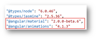
"@angular/material": "2.0.0-beta.6",
"@angular/animations": "4.1.3"
},
"repository": {}
}
- You can see in the
dependenciessection, we are upgrading the Angular & other helping packages version to4.0.2.

- In the
devDependenciessection, you can see we are importing the Angular Material package:
- Right click on
package.jsonfile and select optionRestore Packages, it will take few minutes to download all the package. Wait until you get package restore complete message. - Save the file and click on the menu
Build -> Rebuild Solutionoption. It will take few seconds or minute to download all packages (.Net & Angular). That’s it with Angular 4 packages restore.
Upgrade the user Table in Database
- In previous articles, we had only three fields in
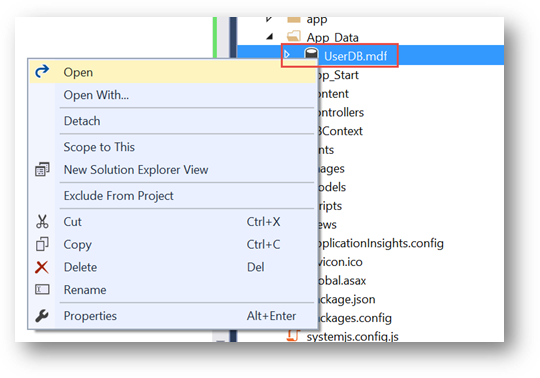
Usertable, let’s add some more to better understand the Angular Material components. - Go to
App_Datafolder, right click and selectOpenor double click onUserDB.mdffile to edit it:
- Expand the
TablesfromData Connections -> UserDBEntitieshierarchy, right click onTblUserand select optionOpen Table Defination:

- You would see only four fields (
Id,FirstName,LastName,Gender), let's manually update the table according to the following screen shot:

- Once you are done, click on top
Updatebutton. It will take few moments and you will end up with the following screen, click onUpdate Databasebutton:

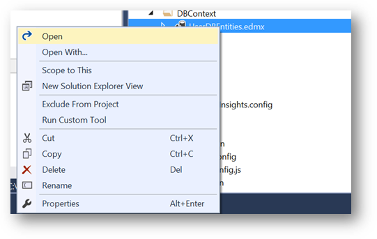
- Next let’s update the
Userentity, go toDBContextfolder, right click onUserDBEntities.edmxand select optionOpenor double click to edit it:
- Right click anywhere on the screen and select option
Update Model from Database…

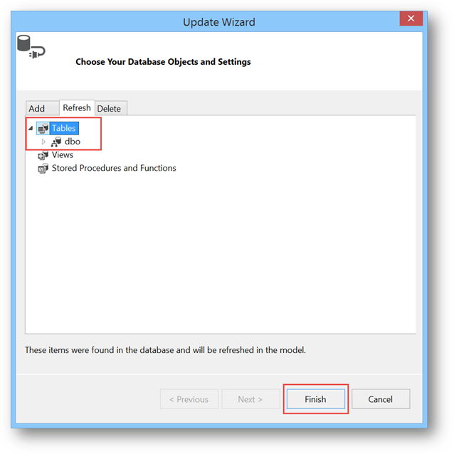
- On
Update Wizardscreen, go toRefreshtab, selectTablesand click onFinishbutton:
- After few moment, you would see
TblUserwould be updated as follow:

We are all set with Database update, let move to next steps.
Angular 4 & Angular Material Components Update
Let’s update our User Management application to use Angular Material components and few features of Angular 4.
- Edit the
app -> app.module.tsand add following import statements for Angular Material. Also add theBrowserAnimationsModule,MaterialModule,MdNativeDateModulemodules in import section:
<span id="ArticleContent">import { BrowserAnimationsModule } from '@angular/platform-browser/animations';

import { MaterialModule, MdNativeDateModule } from '@angular/material';</span>
- Next add the Material and Animation reference in
systemjs.config.jsfile.
<span id="ArticleContent">'@angular/animations': 'npm:@angular/animations/bundles/animations.umd.js',

'@angular/animations/browser': 'npm:@angular/animations/bundles/animations-browser.umd.js',

'@angular/platform-browser/animations': 'npm:@angular/platform-browser/bundles/platform-browser-animations.umd.js',

'@angular/material': 'npm:@angular/material/bundles/material.umd.js',

</span>
- Now that we added the Angular Material module in our
AppModule, our application is ready to use Angular Material components. First let’s modify thehomepage. Edit theapp -> Components -> home.component.tsfile. - Instead of plain image, let’s use the
Cardfrom Angular Material, go to Angular Material Card page to understand what is Card, where and how to use it? - On the Angular Material
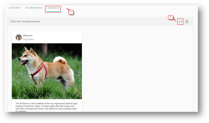
Cardpage and for any other component, you can see there are three tabsOVERVIEW,API REFERENCEandEXAMPLEthat give us following information:OVERVIEW: Component description, architecture and it’s use. HTML, TS and CSS code and link to working Plunker.API REFERENCE: How to import component, Module and Directive information.EXAMPLE: Running example with almost all feature of specific component and Plunker link with HTML, TS and CSS code.
- Since we are on card page, click on
ExampleTab then click on View Source< >link.
- You would land to following view with three tabs
HTML,TSandCSS.

- We will just copy the
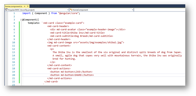
HTML,Typescript(if required any) andCSSfrom here to our application for all components where we would need them. Of course, we will modify it according to our requirements but DO NOT shy to copy, this really help us to take full advantage of Angular Material components without any effort. So, copy the entiremd-cardHTML and replace it withhome.component.tstemplate’s HTML:
- For Angular Material components, we may need
CSSfor many components, so let’s create stylesheet. Right click onContentfolder and selectAdd -> Style Sheet:

- Enter the name
style.cssand click onOKbutton:

- Replace the
style.csscontent with followingCSS:
<span id="ArticleContent">.example-card {

  width: 400px;

}

.example-header-image {

  background-image: url('../images/users.png');

  background-size: cover;

}</span>
- Next, edit the
App_Start -> BundleConfig.csand update theContent/cssbundle as follow to add and use the newly addedstyle.cssin our application:
<span id="ArticleContent">bundles.Add(new StyleBundle("~/Content/css").Include(

                      "~/Content/style.css",

                      "~/Content/bootstrap.css"));</span>
- Now, our style sheet is ready to use, we will keep adding the CSS classes for other components as we move forward in our development.
- Let’s go back to our
home.component.tsand modify it. Change themd-card-titlee.g. "Users",md-card-subtitleas "Sample Image" etc. Update the image URL inmd-card-imagetosrc="../../images/users.png". The finalhome.component.tstemplate should look like following:

- Compile and Run the project, your home page should be as following:
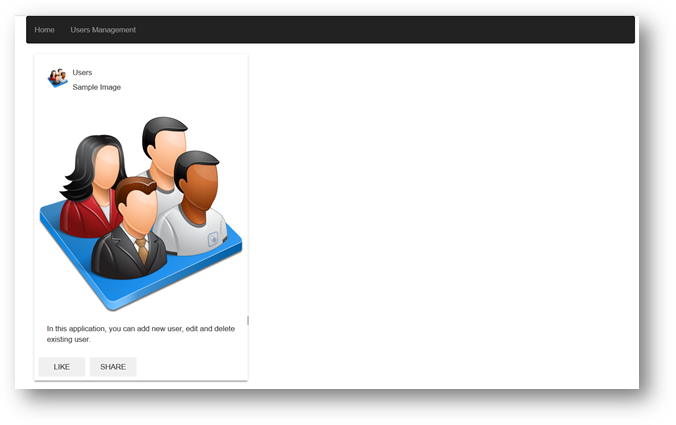
- Great, so we successfully used our first Angular Material component.
- Next, let’s move to
user.component.tsand update it with the Angular Material components. To make it simple and use Dialog component, we need to break it in two components. TheUserComponentwill only have User list whereasAdd,UpdateandDeletefunctionality will be moved toManageUsercomponent that we going to create in next steps. - In previous articles, we were using
ng2-bs3-modalmodal pop up control for add, update and delete screen that is not needed any more, so remove all of its references fromapp.module.ts,systemjs.config.jsanduser.component.tsfiles. - Next, let’s create the
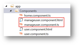
ManageUsercomponent and then we will come back toUserComponentto clean it. Right click onapp -> Componentsand selectAdd -> TypeScriptfile:

- Enter the name
manageuser.component.tsand click onOKbutton. Also create themanageuser.component.htmlfile:
- In the previous steps, we updated the
Usertable with few additional columns, let’s update ouruser.tsaccordingly. Edit theapp-> Model -> user.tsand update it as following:
<span id="ArticleContent">export interface IUser {

    Id: number,

    FirstName: string,

    LastName: string,

    Email:string,

    Gender: string,

    DOB: string,

    City: string,

    State: string,

    Zip: string,

    Country:string

}</span>
- In
manageuser.component.html, we will add Angular Material Dialog. We will simply go to Dialog Plunker and copy thedialog-result-example-dialog.htmlfile content tomanageuser.component.html. From this file, you can see there are three main section of Dialog,title,contentandaction buttonsthat is quite self-explanatory. The other Angular Material components correspond touser.tsmodel fields that will go insidemd-dialog-contentdiv are as follow:- mdInput: For FirstName, LastName, Email, City and Zip
- md-radio-button: For Gendder (Male/Female)
- md-datepicker: Date picker control for Date of Birth (DOB)
- md-autocomplete: Auto complete dropdown for states, it filters state as soon we start typing. (Same as our Search User functionality we developed through pipe)
- md-select: Dropdown for Country.
- md-raised-button: Cancel and Add/Update/Delete buttons.
- You can go to
Plunkerlink for each component to see running example, I personally prefer Plunker to get the code for each component. - Copy the following HTML in
manageuser.component.htmlfile:
Copy Code<span id="ArticleContent"><form novalidate (ngSubmit)="onSubmit(userFrm)" [formGroup]="userFrm">
<div>
<h1 md-dialog-title><span><md-icon>create</md-icon>{{modalTitle}}</span></h1>
</div>
<div style="padding-bottom:1px; padding: 0px; border: 0px; color: rgb(0, 0, 255);">></div>
<div md-dialog-content class="md-dialog-container">
<div class="frm-ctrl">
<md-input-container>
<input mdInput placeholder="First Name" formControlName="FirstName">
</md-input-container>
<div *ngIf="formErrors.FirstName" class="text-danger">
{{ formErrors.FirstName }}
</div>
</div>
<div class="frm-ctrl">
<md-input-container>
<input mdInput placeholder="Last Name" formControlName="LastName">
</md-input-container>
<div *ngIf="formErrors.LastName" class="text-danger">
{{ formErrors.LastName }}
</div>
</div>
<div class="frm-ctrl">
<md-input-container>
<input type="email" mdInput placeholder="Email" formControlName="Email">
</md-input-container>
<div *ngIf="formErrors.Email" class="text-danger">
{{ formErrors.Email }}
</div>
</div>
<div class="frm-ctrl">
<md-radio-group formControlName="Gender">
<md-radio-button *ngFor="let gndr of gender" [value]="gndr">
{{gndr}}
</md-radio-button>
</md-radio-group>
<div *ngIf="formErrors.Gender" class="text-danger">
{{ formErrors.Gender }}
</div>
</div>
<div class="frm-ctrl">
<md-input-container style="width:50%">
<input mdInput [mdDatepicker]="picker" placeholder="Date of Birth" formControlName="DOB">
<button mdSuffix [mdDatepickerToggle]="picker"></button>
</md-input-container>
<md-datepicker #picker></md-datepicker>
<div *ngIf="formErrors.DOB" class="text-danger">
{{ formErrors.DOB }}
</div>
</div>
<div class="frm-ctrl">
<div class="line_ctrl">
<md-input-container class="example-full-width">
<input mdInput placeholder="City" formControlName="City">
</md-input-container>
<div *ngIf="formErrors.City" class="text-danger">
{{ formErrors.City }}
</div>
</div>
<div class="line_ctrl">
<md-input-container>
<input mdInput placeholder="State" [mdAutocomplete]="auto" formControlName="State">
</md-input-container>
<md-autocomplete #auto="mdAutocomplete">
<md-option *ngFor="let state of filteredStates | async" [value]="state">
{{ state }}
</md-option>
</md-autocomplete>
<div *ngIf="formErrors.State" class="text-danger">
{{ formErrors.State }}
</div>
</div>
<div class="line_ctrl">
<md-input-container class="example-full-width">
<input mdInput #postalCode maxlength="5" placeholder="Zip" formControlName="Zip">
<md-hint align="end">{{postalCode.value.length}} / 5</md-hint>
</md-input-container>
<div *ngIf="formErrors.Zip" class="text-danger">
{{ formErrors.Zip }}
</div>
</div>
</div>
<div class="frm-ctrl">
<md-selectplaceholder="Country"style="width:50%"formControlName="Country">
<md-option*ngFor="let ctry of country"[value]="ctry.value">
{{ ctry.viewValue }}
</md-option>
</md-select>
<div*ngIf="formErrors.Country"class="text-danger">
{{ formErrors.Country }}
</div>
</div>
</div>
<md-dialog-actionsclass="md-dialog-footer"align="end">
<buttoncolor="warn"type="button"md-raised-button(click)="dialogRef.close()">Cancel</button>
<buttontype="submit"color="primary"[disabled]="userFrm.invalid"md-raised-button>{{modalBtnTitle}}</button>
</md-dialog-actions>
</form></span>
- This is the same Reactive (Model Driven) form we were using in the previous article but with additional fields and also with Angular Material components that I briefly explained in previous step. This form will be loaded in
Dialogbox as you can see this is in the Dialogcontenttags. We will see inUserComponenthow to display the Dialog box. Add the following CSS instyle.cssfile. You are welcome to change the CSS according to your choice:
<span id="ArticleContent">.md-dialog-container {

    width: 550px;

    height: 480px;

    padding-bottom: 20px;

    padding-top: 20px;

}

.md-dialog-footer {

    padding: 20px;

    width: 100%;

}

md-input-container {

    width: 100%;

}

.frm-ctrl {

    padding-top: 20px;

    width: 100%;

}

.line_ctrl {

    float: left;

    width: 145px;

    text-align: right;

    margin: 2px;

    display: inline;

}</span>
- Next, copy the following code in
manageuser.component.tsand let’s understand it:
Copy Code<span id="ArticleContent">import { Component, OnInit, ViewChild } from '@angular/core';
import { UserService } from '../Service/user.service';
import { FormBuilder, FormGroup, Validators } from '@angular/forms';
import { ModalComponent } from 'ng2-bs3-modal/ng2-bs3-modal';
import { IUser } from '../Model/user';
import { DBOperation } from '../Shared/enum';
import { Observable } from 'rxjs/Rx';
import { Global } from '../Shared/global';
import { MdDialog, MdDialogRef } from '@angular/material';
import { FormControl } from '@angular/forms';
@Component({
templateUrl: 'app/Components/manageuser.component.html',
})
export class ManageUser implements OnInit {
msg: string;
indLoading: boolean = false;
userFrm: FormGroup;
dbops: DBOperation;
modalTitle: string;
modalBtnTitle: string;
listFilter: string;
selectedOption: string;
user: IUser;
country = [
{ value: 'USA', viewValue: 'USA' },
{ value: 'Canada', viewValue: 'Canada' }
];
gender = [
'Male',
'Female'
];
states = ['Alabama','Alaska','Arizona','Arkansas','California','Colorado','Connecticut','Delaware','Florida','Georgia','Hawaii',
'Idaho','Illinois','Indiana','Iowa','Kansas','Kentucky','Louisiana','Maine','Maryland','Massachusetts','Michigan','Minnesota',
'Mississippi','Missouri','Montana','Nebraska','Nevada','New Hampshire','New Jersey','New Mexico','New York','North Carolina',
'North Dakota','Ohio','Oklahoma','Oregon','Pennsylvania','Rhode Island','South Carolina','South Dakota','Tennessee','Texas',
'Utah','Vermont','Virginia','Washington','West Virginia','Wisconsin','Wyoming'
];
stateCtrl: FormControl;
filteredStates: any;
constructor(private fb: FormBuilder, private _userService: UserService, public dialogRef: MdDialogRef<ManageUser>) { }
filterStates(val: string) {
return val ? this.states.filter(s => new RegExp(`^${val}`, 'gi').test(s))
: this.states;
}
ngOnInit(): void {
this.userFrm = this.fb.group({
Id: [''],
FirstName: ['', [Validators.required, Validators.maxLength(50)]],
LastName: ['', [Validators.required, Validators.maxLength(50)]],
Email: ['', [Validators.required, Validators.email]],
Gender: ['', Validators.required],
DOB: ['', Validators.required],
City: ['', Validators.required],
State: ['', Validators.required],
Zip: ['', Validators.required],
Country: ['', Validators.required]
});
this.filteredStates = this.userFrm.controls["State"].valueChanges.startWith(null).map(name => this.filterStates(name));
this.userFrm.valueChanges.subscribe(data => this.onValueChanged(data));
this.onValueChanged();
if (this.dbops == DBOperation.create)
this.userFrm.reset();
else
this.userFrm.setValue(this.user);
this.SetControlsState(this.dbops == DBOperation.delete ? false : true);
}
onValueChanged(data?: any) {
if (!this.userFrm) { return; }
const form = this.userFrm;
for (const field in this.formErrors) {
// clear previous error message (if any)
this.formErrors[field] = '';
const control = form.get(field);
if (control && control.dirty && !control.valid) {
const messages = this.validationMessages[field];
for (const key in control.errors) {
this.formErrors[field] += messages[key] + ' ';
}
}
}
}
formErrors = {
'FirstName': '',
'LastName': '',
'Email': '',
'Gender': '',
'DOB': '',
'City': '',
'State': '',
'Zip': '',
'Country': ''
};
validationMessages = {
'FirstName': {
'maxlength': 'First Name cannot be more than 50 characters long.',
'required': 'First Name is required.'
},
'LastName': {
'maxlength': 'Last Name cannot be more than 50 characters long.',
'required': 'Last Name is required.'
},
'Email': {
'email': 'Invalid email format.',
'required': 'Email is required.'
},
'Gender': {
'required': 'Gender is required.'
}
,
'DOB': {
'required': 'DOB is required.'
}
,
'City': {
'required': 'City is required.'
}
,
'State': {
'required': 'State is required.'
}
,
'Zip': {
'required': 'Zip is required.'
}
,
'Country': {
'required': 'Country is required.'
}
};
onSubmit(formData: any) {
switch (this.dbops) {
case DBOperation.create:
this._userService.post(Global.BASE_USER_ENDPOINT, formData.value).subscribe(
data => {
if (data == 1) //Success
{
this.dialogRef.close("success");
}
else {
this.dialogRef.close("error");
}
},
error => {
this.dialogRef.close("error");
}
);
break;
case DBOperation.update:
this._userService.put(Global.BASE_USER_ENDPOINT, formData._value.Id, formData._value).subscribe(
data => {
if (data == 1) //Success
{
this.dialogRef.close("success");
}
else {
this.dialogRef.close("error");
}
},
error => {
this.dialogRef.close("error");
}
);
break;
case DBOperation.delete:
this._userService.delete(Global.BASE_USER_ENDPOINT, formData._value.Id).subscribe(
data => {
if (data == 1) //Success
{
this.dialogRef.close("success");
}
else {
this.dialogRef.close("error");
}
},
error => {
this.dialogRef.close("error");
}
);
break;
}
}
SetControlsState(isEnable: boolean) {
isEnable ? this.userFrm.enable() : this.userFrm.disable();
}
}</span>
- Just for readability purpose, you can shrink above code to have scroll bar.
- Most of the code I copied from
user.component.tsfrom previous article e.g. User Form creation, initialization and error message. Only difference is few more fields and validation rules includingEmail Validatorthat isAngular 4feature. There are local variables forCountry,GenderandStatesthat populatemd-select,md-radio-buttonandmd-autocompletecontrols respectively. One interesting thing aboutStatesmd-autocompletecontrol is how it works? If you see inngOnInit()event, after creating and initializing theuserFrmreactive form, we are adding the following line:
<span id="ArticleContent">this.filteredStates = this.userFrm.controls["State"].valueChanges.startWith(null).map(name => this.filterStates(name));

</span>
- In above line, every time when user starts typing any character in
States md-autocompletecomponent,valueChangesevent occurs that callsfilterStatesmethod that compares the user entered string with array of states and returns the matching result on runtime. The body offilterStatesmethod is as follow:
<span id="ArticleContent">filterStates(val: string) {

           return val ? this.states.filter(s => new RegExp(`^${val}`, 'gi').test(s)): this.states;

   }

</span>
- The rest of the code is already explained in previous articles.
- Now let's go to
user.component.tsfile and replace the existing code with the following:
Copy Code<span id="ArticleContent">import { Component, OnInit, ViewChild } from '@angular/core';
import { UserService } from '../Service/user.service';
import { IUser } from '../Model/user';
import { DBOperation } from '../Shared/enum';
import { Observable } from 'rxjs/Rx';
import { Global } from '../Shared/global';
import { ManageUser} from './manageuser.component';
import { MdDialog, MdDialogRef } from '@angular/material';
@Component({
templateUrl: 'app/Components/user.component.html'
})
export class UserComponent implements OnInit {
users: IUser[];
user: IUser;
msg: string;
dbops: DBOperation;
modalTitle: string;
modalBtnTitle: string;
listFilter: string;
searchTitle: string = "Search: ";
selectedOption: string;
constructor(private _userService: UserService, private dialog: MdDialog) { }
openDialog() {
let dialogRef = this.dialog.open(ManageUser);
dialogRef.componentInstance.dbops = this.dbops;
dialogRef.componentInstance.modalTitle = this.modalTitle;
dialogRef.componentInstance.modalBtnTitle = this.modalBtnTitle;
dialogRef.componentInstance.user = this.user;
dialogRef.afterClosed().subscribe(result => {
if (result == "success") {
this.LoadUsers();
switch (this.dbops) {
case DBOperation.create:
this.msg = "Data successfully added.";
break;
case DBOperation.update:
this.msg = "Data successfully updated.";
break;
case DBOperation.delete:
this.msg = "Data successfully deleted.";
break;
}
}
else if (result == "error")
this.msg = "There is some issue in saving records, please contact to system administrator!"
else
this.msg = result;
});
}
ngOnInit(): void {
this.LoadUsers();
}
LoadUsers(): void {
this._userService.get(Global.BASE_USER_ENDPOINT)
.subscribe(users => { this.users = users; }
//,error => this.msg = <any>error
);
}
addUser() {
this.dbops = DBOperation.create;
this.modalTitle = "Add New User";
this.modalBtnTitle = "Add";
this.openDialog();
}
editUser(id: number) {
this.dbops = DBOperation.update;
this.modalTitle = "Edit User";
this.modalBtnTitle = "Update";
this.user = this.users.filter(x => x.Id == id)[0];
this.openDialog();
}
deleteUser(id: number) {
this.dbops = DBOperation.delete;
this.modalTitle = "Confirm to Delete?";
this.modalBtnTitle = "Delete";
this.user = this.users.filter(x => x.Id == id)[0];
this.openDialog();
}
criteriaChange(value: string): void {
if (value != '[object Event]')
this.listFilter = value;
}
}</span>
- The
UserComponentis now quite slim because lot of code is being moved toManageUsercomponent. One new method isopenDialogthat opens the Dialog box and sends the parameters. Let’s understand it step by step:let dialogRef = this.dialog.open(ManageUser):dialog.opentakes theManageUsercomponent as a parameter that we just created in previous steps.dialogRef.componentInstance.dbops = this.dbops;is used to send the parameter to Dialog component (ManageUsercomponent). We are sendingdpops(what kind of operation we want to do, Add/Update/Delete to change the view accordingly). ThemodalTitleandmodalBtnTitleare labels for each DB operation view.userparameter is the single user record that we are sending for Edit and Delete view. After parameters statement, we are subscribing the Dialog’safterClosedevent to check the result sent fromManageUsercomponent. Check theManageUsercomponent’sonSubmitfunction, we are explicitly sending the “success” and “error” string. Based on success and failure of corresponding DB operation, we are showing message under the User list.
- In
addUser,editUseranddeleteUsermethods, we are only setting thedbops,modalTitleandmodalBtnTitlevariables values and calling theopenDialogfunction where these variables are sent toManageUsercomponent as I explained in previous steps. Rest of the code is self-explanatory. - Next, edit the
user.component.htmland replace the code with following:
Copy Code<span id="ArticleContent"><div class='panel panel-primary'>
<div class='panel-heading'>
User Management
</div>
<div class='panel-body'>
<div>
<search-list [title]='searchTitle' (change)="criteriaChange($event)"></search-list>
</div>
<div class='table-responsive'>
<div style="padding-bottom:10px"><button class="btn btn-primary" (click)="addUser()">Add</button></div>
<div *ngIf='users && users.length==0' class="alert alert-info" role="alert">No record found!</div>
<table class='table table-striped' *ngIf='users; else loadingScreen;'>
<thead>
<tr>
<th>First Name</th>
<th>Last Name</th>
<th>Gender</th>
<th></th>
</tr>
</thead>
<tbody>
<tr *ngFor="let user of users | userFilter:listFilter">
<td>{{user.FirstName}}</td>
<td>{{user.LastName}}</td>
<td>{{user.Gender}}</td>
<td>
<button title="Edit" class="btn btn-primary" (click)="editUser(user.Id)">Edit</button>
<button title="Delete" class="btn btn-danger" (click)="deleteUser(user.Id)">Delete</button>
</td>
</tr>
</tbody>
</table>
<ng-template #loadingScreen><div class="alert alert-info" role="alert"><md-progress-spinner mode="indeterminate" style="width:50px; height:50px"></md-progress-spinner>loading...</div></ng-template>
</div>
<div *ngIf="msg" role="alert" class="alert alert-info alert-dismissible">
<button type="button" class="close" data-dismiss="alert" aria-label="Close"><span aria-hidden="true">×</span></button>
<span class="glyphicon glyphicon-exclamation-sign" aria-hidden="true"></span>
<span class="sr-only">Error:</span>
{{msg}}
</div>
</div>
</div></span>
- We removed the
ng2-bs3-modalfrom HTML source since it's functionality is being moved toManageUsercomponent where we are using Angular Material's Dialog component. Here we are using one more Angular 4 feature, ngIf – else. Find the<table class='table table-striped' *ngIf='users; else loadingScreen;'> statement. *ngIf='users; else loadingScreen;'that says until users list is loaded, show theloadingScreentemplate. WhereloadingScreentemplate is as following in subsequent statements:
<span id="ArticleContent"><ng-template #loadingScreen><div class="alert alert-info" role="alert"><md-progress-spinner mode="indeterminate" style="width:50px; height:50px"></md-progress-spinner>loading...</div></ng-template></span>
- md-progress-spinner is Angular Material spinner that I replaced with loading image.
ngIf-elseis a great feature that helps in code optimization, due to this, I removed theisLoadingvariable that is not required any more. - Now that our
ManageUsercomponent is completed, let’s addd it inAppModule.ts, edit theapp-> app.module.ts,ManageUsercomponent and also add it indeclarationssection:
<span id="ArticleContent">import { ManageUser } from './components/manageuser.component';

//Declaration Statement

declarations: [AppComponent, UserComponent, HomeComponent, UserFilterPipe, SearchComponent, ManageUser],</span>
- One more step is to add the
ManageUserinentryComponentssection as follow:
<span id="ArticleContent">entryComponents: [ManageUser]</span>
- Angular Material also comes with
pre-built themes, browse thethemesfolder fromnode_modules\@angular\material\prebuilt-themes. You can use any theme, I would useindigo-pink.css. Add the theme reference inViews -> Shared -> _Layout.cshtmlpage:
<span id="ArticleContent"><link href="/node_modules/%40angular/material/prebuilt-themes/indigo-pink.css" rel="stylesheet" />

<link href="https://fonts.googleapis.com/icon?family=Material+Icons" rel="stylesheet"></span>
- In second statement, I am importing Material icons from google CDN, that we will use in
AppComponentwhile redesigning the menu. Spinner, buttons and other components color scheme, visibility and layout depends on the theme you select. Remove the theme and run the application, you would see, the application UI would be messed up. - Rebuild, clear your browser cache (browser history) and run the application. Test the application by Adding, Updating and Deleting the user.
- In final step, I want to use the Angular Material Menu component. Edit the
app -> app.component.tsand replace it's content with the following:
Copy Code<span id="ArticleContent">import { Component } from "@angular/core"
import {
Router,
// import as RouterEvent to avoid confusion with the DOM Event
Event as RouterEvent,
NavigationStart,
NavigationEnd,
NavigationCancel,
NavigationError
} from '@angular/router';
@Component({
selector: "user-app",
template: `
<div>
<nav class='navbar navbar-default'>
<div class='container-fluid'>
<button md-icon-button [mdMenuTriggerFor]="menu">
<md-icon>more_vert</md-icon> Menu
</button>
<md-menu #menu="mdMenu">
<button md-menu-item [routerLink]="['home']">
<md-icon>home</md-icon>
<span>Home</span>
</button>
<button md-menu-item [routerLink]="['user']">
<md-icon>group</md-icon>
<span>Users Management</span>
</button>
</md-menu>
</div>
</nav>
<div class='container'>
<router-outlet><div class="loading-overlay" *ngIf="loading">
<!-- show something fancy here, here with Angular 2 Material's loading bar or circle -->
<md-progress-bar mode="indeterminate"></md-progress-bar>
</div></router-outlet>
</div>
</div>
`
})
export class AppComponent {
loading: boolean = true;
constructor(private router: Router) {
router.events.subscribe((event: RouterEvent) => {
this.navigationInterceptor(event);
});
}
// Shows and hides the loading spinner during RouterEvent changes
navigationInterceptor(event: RouterEvent): void {
if (event instanceof NavigationStart) {
this.loading = true;
}
if (event instanceof NavigationEnd) {
setTimeout(() => { this.loading = false; }, 1000)
// this.loading = false;
}
// Set loading state to false in both of the below events to hide the spinner in case a request fails
if (event instanceof NavigationCancel) {
this.loading = false;
}
if (event instanceof NavigationError) {
this.loading = false;
}
}
}</span>
- In template’ HTML, we are using
md-menuwhich hasmd-menu-itembuttons withrouterLinkto corresponding views (home&user). Another thing ismd-iconthat would display before the menu item, we already have added the icons reference in_Layout.cshtmlpage. For complete list of icons, click here. - Another thing that we updated in
AppComponentis the loading progress bar between the views. This is possible by intercepting the router change and showing themd-progress-barbased on loading variable's boolean value. I purposely addedsetTimeout(() => { this.loading = false; }, 1000)delay to show you the spinner when switching between the views. - Rebuild, clear the browser cache and Run the application, you should end up with following screen:

- You can click on User Management button from top menu and see blue progress bar under the top menu.
Points of Interest
I like the Angular Material components because it saves my time and effort from using several third-party components, all components are both template and model driven (Reactive form) compatible.
Angular 4 has few more useful features, two of them ngIf-else and Email Validator are used in this article. Rest you can use wherever they are applicable.
Things, You can Improve
There are few features you can implement to improve this application. For example, the Date of Birth cannot be in future, try adding the validation rule for DOB, Show more fields in User list other than First Name, Last Name and Gender, do not show Search filter until User list is fully loaded and add the snack-bar component for successfull Add/Update/Delete message instead of current Bootstrap message. Try it!
Angular 2 to Angular 4 with Angular Material UI Components的更多相关文章
- [Angular 2 Router] Configure Your First Angular 2 Route
Using the Angular 2 router requires defining routes, passing them in to the RouterModule.forRoot and ...
- 【Angular专题】——(1)Angular,孤傲的变革者
目录 一. 漫谈Angular 二. 如果你还在使用Angularjs 三. 我计划这样学习Angular技术栈 一. 漫谈Angular Angular,来自Google的前端SPA框架,与Reac ...
- atitit.React 优缺点 相比angular react是最靠谱的web ui组件化方案了
atitit.React 优缺点 相比angular react是最靠谱的web ui组件化方案了 1. React的组件化才是web ui部件的正确方向1 1.1. 组件化集成html ,css ...
- 在angular项目中使用web-component ----How to use Web Components with Angular
原文: https://medium.com/@jorgecasar/how-to-use-web-components-with-angular-41412f0bced8 ------------- ...
- Angular 从入坑到挖坑 - Angular 使用入门
一.Overview angular 入坑记录的笔记第一篇,完成开发环境的搭建,以及如何通过 angular cli 来创建第一个 angular 应用.入坑一个多星期,通过学习官方文档以及手摸手的按 ...
- [从 0 开始的 Angular 生活]No.38 实现一个 Angular Router 切换组件页面(一)
前言 今天是进入公司的第三天,为了能尽快投入项目与成为团队可用的战力,我正在努力啃官方文档学习 Angular 的知识,所以这一篇文章主要是记录我如何阅读官方文档后,实现这个非常基本的.带导航的网页应 ...
- Angular项目构建指南 - 不再为angular构建而犹豫不决(转)
如果你不知道什么是Angular或者根本没听说过,那么我接下来所说的对你来说毫无益处,不过如果你打算以后会接触Angular或者干脆要涨涨姿势~读下去还是有点用的. Angular和它之前所出现的其余 ...
- Material UI – Material Design CSS 框架
Material Design 是谷歌推出的全新的设计理念,采用大胆的色彩.流畅的动画播放,以及卡片式的简洁设计.Material Design 风格的设计拥有干净的排版和简单的布局,容易理解,内容才 ...
- 仿Material UI框架的动画特效
Material UI是一款功能非常强大,界面却十分清新简洁的CSS框架,Material UI利用了Google的Material Design 全新设计语言,并且让每一个UI组件都变得非常独立,因 ...
随机推荐
- Java多线程(十)——线程优先级和守护线程
一.线程优先级的介绍 java 中的线程优先级的范围是1-10,默认的优先级是5.“高优先级线程”会优先于“低优先级线程”执行. java 中有两种线程:用户线程和守护线程.可以通过isDaemon( ...
- Linux IO性能分析blktrace/blk跟踪器
关键词:blktrace.blk tracer.blkparse.block traceevents.BIO. 本章只做一个记录,关于优化Block层IO性能方法工具. 对Block层没有详细分析,对 ...
- CentOS下安装Apache
CentOS下安装Apache,首先在用户状态下使用su root命令切换到超级管理员界面,让后开启终端,进行apache的安装过程. [root@localhost centos]# yum ins ...
- odoo8 和odoo10区别
V8 函数:'sale_order_count': fields.function(_sale_order_count, string='# of Sales Order', type='integ ...
- Gym101138D Strange Queries/BZOJ5016 SNOI2017 一个简单的询问 莫队、前缀和、容斥
传送门--Gym 传送门--BZOJ THUWC2019D1T1撞题可还行 以前有些人做过还问过我,但是我没有珍惜,直到进入考场才追悔莫及-- 设\(que_{i,j}\)表示询问\((1,i,1,j ...
- UIToolBar - 官方文档
继承关系:UIToolBar -> UIView -> UIResponder -> NSObject. toolBar是一个工具栏,用于显示一个或多个按钮.其按钮叫做toolBar ...
- Java多线程核心技术(六)线程组与线程异常
本文应注重掌握如下知识点: 线程组的使用 如何切换线程状态 SimpleDataFormat 类与多线程的解决办法 如何处理线程的异常 1.线程的状态 线程对象在不同运行时期有不同的状态,状态信息就处 ...
- NetCore实践篇:分布式监控客户端ZipkinTracer从入门到放弃之路
前言 本文紧接上篇.Net架构篇:思考如何设计一款实用的分布式监控系统?,上篇仅仅是个思考篇,跟本文没有太大的关系.但有思考,结合现有的开源组件,实践起来更易理解起来,所以看本文之前,应该先看下上篇博 ...
- 面试 15:顺时针从外往里打印数字(剑指 Offer 第 20 题)
面试 15:顺时针从外往里打印数字 题目:输入一个矩阵,按照从外向里以顺时针的顺序依次打印每一个数字.例如输入: {{1,2,3}, {4,5,6}, {7,8,9}} 则依次打印数字为 1.2.3. ...
- centos7 关闭selinux
关闭SeLinux 临时关闭:setenforce 0 永久关闭:vi /etc/selinux/config