
纯css3实现的动画加载特效
之前给大家带了很多款进度加载条,今天再给大家分享一款纯css3实现的动画加载特效。效果图如下:
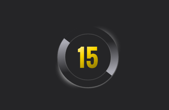
实现的代码。
html代码:
  <div class="wrap">

        <div class="curve3">

        </div>

        <div class="curve2">

            <div class="text">

                15

            </div>

        </div>

        <div class="curve">

            <div class="topleft">

            </div>

            <div class="bottomright">

            </div>

        </div>

        <div class="bottomleft glow">

        </div>

        <div class="topright">

        </div>

    </div>
css3代码:
body {

   background: #252527;

}

.wrap {

  width:200px;

  margin-left:auto;

  margin-right:auto;

  position:relative;

}

.curve {

  left:200px;

  width:200px;

  height:200px;

  border-radius:100px;

  background: #252527;

  -webkit-animation: spin 1.5s;

   -webkit-animation-iteration-count: infinite;

  -webkit-animation-timing-function: linear;

   -moz-animation: spin 1.5s;

   -moz-animation-iteration-count: infinite;

  -moz-animation-timing-function: linear;

  animation: spin 1.5s;

  animation-iteration-count: infinite;

  animation-timing-function: linear;

}

@-webkit-keyframes spin {

  0% {

    -webkit-transform: rotate(0deg);}

  100% {-webkit-transform: rotate(360deg);}

}

@-moz-keyframes spin {

  0% {

    -moz-transform: rotate(0deg);}

  100% {-moz-transform: rotate(360deg);}

}

@keyframes spin {

  0% {

    -moz-transform: rotate(0deg);}

  100% {-moz-transform: rotate(360deg);}

}

.curve3 {

  position:absolute;

  margin-top:149px;

  width:200px;

  height:200px;

  border-radius:100px;

  box-shadow: 0px 3px 5px 0.02em #888888;

}

.glow {

  box-shadow: 0px 3px 15px 0.02em #888888

}

.topleft {

  width:100px;

  height:100px;

  border-top-left-radius:100px;

  background:-webkit-linear-gradient(top right, #AAAAB3 10%, #252527 80%);

  background:-moz-linear-gradient(top right, #AAAAB3 10%, #252527 80%);

  background:linear-gradient(to bottom left, #AAAAB3 10%, #252527 80%);

}

.bottomright {

  width:100px;

  height:100px;

  border-bottom-right-radius:100px;

 background:-webkit-linear-gradient( top right, #252527 20%, #AAAAB3 90%);

  background:-moz-linear-gradient( top right, #252527 20%, #AAAAB3 90%);

  background:linear-gradient( to bottom left, #252527 20%, #AAAAB3 90%);

  position:relative;

  left:100px;

}

.curve2 {

  top:175px;

  left:25px;

  position:relative;

  width:150px;

  height:150px;

  border-radius:100px;

background-color:#252527;

  z-index:;

  box-shadow: 0px 0px 5px 0.02em #888888;

}

.text {

  display:inline-block;

  font-family: 'Oswald';

  font-size:80px;

  margin-left: 40px;

  margin-top: 16px;

  background:-webkit-linear-gradient( top left, white, #ffd700, #998100 80%);

  -webkit-background-clip:text;

  -webkit-text-fill-color: transparent;

  color:#ffd700;

}

.bottomleft {

  width:50px;

  height:50px;

  margin-right:;

  border-bottom-left-radius:50px;

  background:#252527;

  position:relative;

  z-index:-4;

  top:-100px;

}

.glow {

  box-shadow: 16px 30px 30px 5px #ffffff;

}

.topright {

  width:50px;

  height:50px;

  border-top-right-radius:50px;

  background:#252527;

  position:relative;

  left:125px;

  bottom:220px;

  box-shadow: 5px -5px 35px 5px #ffffff;   z-index:-4;

}
via:http://www.w2bc.com/Article/19040
纯css3实现的动画加载特效的更多相关文章
- 纯css3实现的动画加载条
之前大大家分享了很多款加载条.今天给大家带来一款纯css3实现的动画加载条. 这款加载条适用浏览器:360.FireFox.Chrome.Safari.Opera.傲游.搜狗.世界之窗. 不支持IE8 ...
- 一款纯css3实现的动画加载导航
之前为大家介绍了好几款导航菜单,今天为给大家再带来一款纯css3实现的动画加载导航.该导航出现的时候以动画的形式出现.效果图如下: 在线预览 源码下载 实现的代码. html代码: <ul ...
- 16款纯CSS3实现的loading加载动画
分享16款纯CSS3实现的loading加载动画.这是一款实用的可替代GIF格式图片的CSS3加载动画代码.效果图如下: 在线预览 源码下载 实现的代码. html代码: <div clas ...
- 纯css3实现的win8加载动画
今天给大家分享一款纯css3实现的win8加载动画.在这款实例中动画效果完全由css3实现.一起看下效果图: 在线预览 源码下载 实现的代码. html代码: <div class=&quo ...
- 一款纯css3实现的条纹加载条
之前为大家带来了很多加载动画. 基于prefixfree.js的进度加载条 ,基于jquery带百分比的响应式进度加载条.今天给大家分享一款纯css3实现的条纹加载条.带有响应式的效果.效果图如下 : ...
- 纯CSS3实现loading正在加载。。。
场景分析:随着我司专职前端切图人员离职,切图的活重新落到我们小组团队成员的日常任务list里面,加上我们小组 7个前端 基本都是后台转的前端 (赶鸭子上架 前端现在需求量大 没办法) 加上自己也将就一 ...
- 纯CSS3文字Loading动画特效
纯CSS3文字Loading动画特效是一款个性的loading文字加载动画. 在线演示本地下载
- CSS3实现的图片加载动画效果
来源:GBin1.com 使用CSS3实现的不同图片加载动画效果,支持响应式,非常适合针对瀑布流布局图片动态加载特效进行增强! HTML <ul class="grid effect- ...
- 分享JQuery动画插件Velocity.js的六种列表加载特效
分享JQuery动画插件Velocity.js的六种列表加载特效.在这款实例中给中六种不同的列表加载效果.分别为从上飞入.从右侧飞入.从左侧飞入.和渐显.一起看下效果图: 在线预览 源码下载 实现 ...
随机推荐
- Yii 1.1 URL两个笔记 同时支持PATH于GET路由和隐藏index.php
同时支持PATH于GET格式路由(修改框架文件 简直坑) framework/web/CUrlManager.php parseUrl方法 第一行判断修改成 if($this->getUrlFo ...
- 【数据结构与算法分析——C语言描述】第二章总结 算法分析
算法 算法(algorithm)是为求解一个问题需要遵循的.被清楚地指定的简单指令的集合. 数学基础 四个定义: 1.大O表示法: 如果存在正常数 c 和 n0 使得当 N ≥ n0时,T(N) ≤ ...
- C++11常量表达式
[C++11之常量表达式] 关键字:constexpr: 中文学名:常量表达式. constexpr用于把运行期计算放置在编译期. 使用constexpr有3个限制: 1.函数中只能有一个return ...
- hdu 5655 CA Loves Stick
CA Loves Stick Time Limit: 2000/1000 MS (Java/Others) Memory Limit: 262144/262144 K (Java/Others) ...
- CodeForces 711A Bus to Udayland (水题)
题意:给定一个n*4的矩阵,然后O表示空座位,X表示已经有人了,问你是不能找到一对相邻的座位,都是空的,并且前两个是一对,后两个是一对. 析:直接暴力找就行. 代码如下: #pragma commen ...
- POJ 3169 Layout (差分约束)
题意:给定一些母牛,要求一个排列,有的母牛距离不能超过w,有的距离不能小于w,问你第一个和第n个最远距离是多少. 析:以前只是听说过个算法,从来没用过,差分约束. 对于第 i 个母牛和第 i+1 个, ...
- 1) data-options
<select class="easyui-combobox" data-options="editable:false"> <select ...
- jdbc调用存储过程的方法
----------------------------jdbc调用存储过程的方法---------------------------------------------------private ...
- Giraph之SSSP(shortest path)单机伪分布运行成功
所遇问题:Exception 1: Exception in thread "main" java.lang.IllegalArgumentException: "che ...
- JedisPool使用原理和源代码
1,JedisPool的使用 <!-- 连接池的配置信息 --><beanid="jedisConfig"class="redis.clients.je ...