CSS实现四种loading动画效果
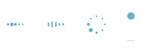
四种loading加载效果:
<!DOCTYPE html>

<html lang="en">

<head>

    <meta charset="utf-8">

    <title>四种加载效果</title>

<style>

/*第一种*/

.demo1 {

    width: 4px;

    height: 4px;

    border-radius: 2px;

    background: #68b2ce;

    float: left;

    margin:  3px;

    animation: demo1 linear 1s infinite;

    -webkit-animation: demo1 linear 1s infinite;

}

.demo1:nth-child(){

    animation-delay:0s;

}

.demo1:nth-child(){

    animation-delay:.15s;

}

.demo1:nth-child(){

    animation-delay:.3s;

}

.demo1:nth-child(){

    animation-delay:.45s;

}

.demo1:nth-child(){

    animation-delay:.6s;

}

@keyframes demo1{

    %,%,% {transform: scale();}

    % {transform: scale(2.5);}

}

@-webkit-keyframes demo1{

    %,%,% {transform: scale();}

    % {transform: scale(2.5);}

}

/*第二种*/

.demo2 {

    width: 4px;

    height: 6px;

    background: #68b2ce;

    float: left;

    margin:  3px;

    animation: demo2 linear 1s infinite;

    -webkit-animation: demo2 linear 1s infinite;

}

.demo2:nth-child(){

    animation-delay:0s;

}

.demo2:nth-child(){

    animation-delay:.15s;

}

.demo2:nth-child(){

    animation-delay:.3s;

}

.demo2:nth-child(){

    animation-delay:.45s;

}

.demo2:nth-child(){

    animation-delay:.6s;

}

@keyframes demo2{

    %,%,% {transform: scale();}

    % {transform: scaleY();}

}

@-webkit-keyframes demo2{

    %,%,% {transform: scale();}

    % {transform: scaleY();}

}

/*第三种*/

#loading3 {

    position: relative;

    width: 50px;

    height: 50px;

}

.demo3 {

    width: 4px;

    height: 4px;

    border-radius: 2px;

    background: #68b2ce;

    position: absolute;

    animation: demo3 linear .8s infinite;

    -webkit-animation: demo3 linear .8s infinite;

}

.demo3:nth-child(){

    left: 24px;

    top: 2px;

    animation-delay:0s;

}

.demo3:nth-child(){

    left: 40px;

    top: 8px;

    animation-delay:.1s;

}

.demo3:nth-child(){

    left: 47px;

    top: 24px;

    animation-delay:.1s;

}

.demo3:nth-child(){

    left: 40px;

    top: 40px;

    animation-delay:.2s;

}

.demo3:nth-child(){

    left: 24px;

    top: 47px;

    animation-delay:.4s;

}

.demo3:nth-child(){

    left: 8px;

    top: 40px;

    animation-delay:.5s;

}

.demo3:nth-child(){

    left: 2px;

    top: 24px;

    animation-delay:.6s;

}

.demo3:nth-child(){

    left: 8px;

    top: 8px;

    animation-delay:.7s;

}

@keyframes demo3{

    %,%,% {transform: scale();}

    % {transform: scale();}

}

@-webkit-keyframes demo3{

    %,%,% {transform: scale();}

    % {transform: scale();}

}

/*第四种*/

#loading5 {

    width: 20px;

    height: 100px;

    border-bottom: 1px solid #68b2ce;

}

.demo5 {

    width: 20px;

    height: 20px;

    border-radius: 10px;

    background: #68b2ce;

    animation: demo5 cubic-bezier(0.5,0.01,0.9,) .6s infinite alternate;

    -webkit-animation: demo5 cubic-bezier(0.5,0.01,0.9,) .6s infinite alternate;

}

@keyframes demo5{

    %{

        transform:translateY(0px);

        -webkit-transform:translateY(0px);

    }

    %{

        transform:translateY(80px);

        -webkit-transform:translateY(80px);

    }

}

@-webkit-keyframes demo5{

    %{

        transform:translateY(0px);

        -webkit-transform:translateY(0px);

    }

    % {

        transform:translateY(80px);

        -webkit-transform:translateY(80px);

    }

}

</style>

<body>

    <div id="loading1">

        <div class="demo1"></div>

        <div class="demo1"></div>

        <div class="demo1"></div>

        <div class="demo1"></div>

        <div class="demo1"></div>

    </div>

    <div id="loading2">

        <div class="demo2"></div>

        <div class="demo2"></div>

        <div class="demo2"></div>

        <div class="demo2"></div>

        <div class="demo2"></div>

    </div>

    <div id="loading3">

        <div class="demo3"></div>

        <div class="demo3"></div>

        <div class="demo3"></div>

        <div class="demo3"></div>

        <div class="demo3"></div>

        <div class="demo3"></div>

        <div class="demo3"></div>

        <div class="demo3"></div>

    </div>

    <div id="loading5">

        <div class="demo5"></div>

    </div>

</body>

</html>
CSS实现四种loading动画效果的更多相关文章
- 实现loading动画效果
下面我就来罗列三种实现loading动画效果的方法. 方法一:使用UIImageView自带的方法来实现,这也是我推荐的实现方法. NSMutableArray *array = [[NSMutabl ...
- ios开发之简单实现loading动画效果
最近有朋友问我类似微信语音播放的喇叭动画和界面图片加载loading界面是怎样实现的,是不是就是一个gif图片呢!我的回答当然是否定了,当然不排除也有人用gif图片啊!下面我就来罗列三种实现loadi ...
- 《网页设计基础——CSS的四种引入方式详解》
网页设计基础--CSS的四种引入方式详解 一.行内式: 规则: 1. 行内式是所有样式方法中最为直接的一种,它直接对HTML的标记使用style属性,然后将CSS代码直接写在其中. 格 ...
- jQuery10种不同动画效果的响应式全屏遮罩层
遮罩层有很多今天介绍这个jQuery10种不同动画效果的响应式全屏遮罩层 效果预览 下载地址 实例代码 <div class="container"> <head ...
- 简单css实现input提示交互动画效果
通过基础CSS实现输入提示交互动画效果,并兼容各浏览器! 1.效果展示 2.css代码 h4 { margin: 30px 0; } input { margin:; font-size: 16px; ...
- Atitit Loading 动画效果
Atitit Loading 动画效果 使用才场景,加载数据,以及显示警告灯.. 要有手动关闭按钮 <div class="spinner loading_part" sty ...
- 页面中CSS的四种引入方式的介绍与比较
转自:https://blog.csdn.net/qq_38689666/article/details/79039392 一:行内式 <p style="color:red" ...
- [Swift通天遁地]五、高级扩展-(11)图像加载Loading动画效果的自定义和缓存
★★★★★★★★★★★★★★★★★★★★★★★★★★★★★★★★★★★★★★★★➤微信公众号:山青咏芝(shanqingyongzhi)➤博客园地址:山青咏芝(https://www.cnblogs. ...
- Westciv Tools主要为CSS3提供了渐变gradients、盒子阴影box-shadow、变形transform和文字描边四种在线生成效果的工具
Westciv Tools主要为CSS3提供了渐变gradients.盒子阴影box-shadow.变形transform和文字描边四种在线生成效果的工具 1.Westciv Tools 彩蛋爆料直击 ...
随机推荐
- 手把手教你配置苹果APNS推送服务|钿畑的博客 | 钿畑的博客
http://www.360doc.com/content/15/0118/17/1073512_441822850.shtml# 钿畑的文章索引 1. 什么是推送通知 2. 什么是APNS? 3. ...
- HashMap/Hashtable/ConcurrentHashMap区别
HashMap:每个隔间都没锁门,有人想上厕所,管理员指给他一个隔间,里面没人的话正常用,里面有人的话把这个人赶出来然后用. 优点,每个人进来不耽误都能用:缺点,每一个上厕所的人都有被中途赶出来的危险 ...
- mkdir 创建目录
短选项 长选项 含义 -m <目录属性> --mode <目录属性> 建立目录时同时设置目录的权限. -p --parents 此选项后,可以是一个路径名称.若路径中的某些目录 ...
- (十一)mysql备份之物理备份xtrabackup
(1)备份介绍 (2)下载安装xtrabackup 官网:https://www.percona.com/downloads/XtraBackup/LATEST/ 我选择yum安装,centos版本7 ...
- 【转】requests、BeautifulSoup使用总结
转自,https://www.cnblogs.com/wupeiqi/articles/6283017.html ---- Python标准库中提供了:urllib.urllib2.httplib等 ...
- NGUI_Sprites
一.UI Sprites 控件: Sprites控件是NGUI的基础控件,几乎可以这么说所有的控件都可以基于Sprites控件添加 Box Collider然后进行附加相关的脚本组件来达到想要的插件效 ...
- [BZOJ4530]大融合
LCT维护子树信息 维护两个子树信息,$vinf_x$表示节点$x$的所有轻儿子子树信息,$inf_x$表示以$x$为根的LCT子树(包含虚边)的信息 对$vinf$: access时,断开$x$的原 ...
- 【字符串哈希】【莫队算法】bzoj3207 花神的嘲讽计划Ⅰ
既然询问的长度是确定的,那么我们可以将所有长度为K的字串弄个哈希值出来,这样字串存在性=>哈希值存在性. 自然上溢哈希,base=107比较不错. 序列长度n=>n-K+1 询问区间[x, ...
- python3 开发面试题(字典和拷贝)5.30
""" 问:执行完下面的代码后, l,m的内容分别是什么? """ def func(m): for k,v in m.items(): m ...
- python基础-文件处理与函数
1. 文件处理 1.1 文件处理流程 1.打开文件,得到文件句柄并赋值给一个变量 2.通过句柄对文件进行操作 3.关闭文件 1.2 文件读取模式r r文本模式的读,在文件不存在,不会创建新文件 f = ...