
CSS3效果:animate实现点点点loading动画效果(一)
实现如图所示的点点点loading效果:

一:CSS3 animation实现代码
html代码:
提交订单中<span class="ani_dot">...</span>
css代码:
.ani_dot {

    font-family: simsun;

}

:root .ani_dot { /* 这里使用Hack是因为IE6~IE8浏览器下, vertical-align解析不规范,值为bottom或其他会改变按钮的实际高度*/

    display: inline-block;

    width: 1.5em;

    vertical-align: bottom;

    overflow: hidden;

}

@-webkit-keyframes dot {

    0% { width:; margin-right: 1.5em; }

    33% { width: .5em; margin-right: 1em; }

    66% { width: 1em; margin-right: .5em; }

    100% { width: 1.5em; margin-right:;}

}

.ani_dot {

    -webkit-animation: dot 3s infinite step-start;

}

@keyframes dot {

    0% { width:; margin-right: 1.5em; }

    33% { width: .5em; margin-right: 1em; }

    66% { width: 1em; margin-right: .5em; }

    100% { width: 1.5em; margin-right:;}

}

.ani_dot {

    animation: dot 3s infinite step-start;

}
出现的就是如图所示的结果。
注意点:
- 1.IE10+以及其他浏览器,点点点动画消失,IE6-IE9是普通的点点点文字。
- 2.animate动画是连续的,但是我们这儿是一帧一帧的,一卡一卡的,不是那么连续的效果,用到
step-start。 - 3.上面代码还用到了css3的选择器
:root。:root为IE9+以及其他现代浏览器Hack,IE6-7甚至IE8下,inline-block水平元素的vertical-align:bottom解析与inline水平是有差异的,会导致高度撑开,因此,display:
inline-block要hack处理。
二:动画(animation)的参数详解
由于上面用到了animation动画,这里详细介绍下这个animation的参数。
简介
CSS动画(Animations)简单说就是在一段固定的动画时间内暗中在某一频率内改变其CSS某个或某些值,从而达到视觉上的转换动画效果。Animations的很多方面都是可以控制的,包括动画运行时间,开始值和结束值,还有动画的暂停和延迟其开始时间等。
语法
<single-animation> = <single-animation-name> || <time> || <single-animation-timing-function> || <time> || <single-animation-iteration-count> || <single-animation-direction> || <single-animation-fill-mode> || <single-animation-play-state>
<' animation-name '>:检索或设置对象所应用的动画名称<' animation-duration '>:检索或设置对象动画的持续时间<' animation-timing-function '>:检索或设置对象动画的过渡类型<' animation-delay '>:检索或设置对象动画延迟的时间<' animation-iteration-count '>:检索或设置对象动画的循环次数<' animation-direction '>:检索或设置对象动画在循环中是否反向运动<' animation-fill-mode '>:检索或设置对象动画时间之外的状态<' animation-play-state '>:检索或设置对象动画的状态。w3c正考虑是否将该属性移除,因为动画的状态可以通过其它的方式实现,比如重设样式
animation
所有动画属性的简写属性,除了 animation-play-state 属性。
animation-name
规定 @keyframes 动画的名称。就是@keyframes后面跟着的动画名称,本demo本文中名为dot,意思为“点”。
animation-duration
规定动画完成一个周期所花费的秒或毫秒。默认是 0。
animation-timing-function
规定动画的速度曲线。默认是 "ease"。
常见的动画速度参数:
linear:线性过渡。等同于贝塞尔曲线(0.0, 0.0, 1.0, 1.0)
ease:平滑过渡。等同于贝塞尔曲线(0.25, 0.1, 0.25, 1.0)
ease-in:由慢到快。等同于贝塞尔曲线(0.42, 0, 1.0, 1.0)
ease-out:由快到慢。等同于贝塞尔曲线(0, 0, 0.58, 1.0)
ease-in-out:由慢到快再到慢。等同于贝塞尔曲线(0.42, 0, 0.58, 1.0)
step-start:等同于 steps(1, start)
step-end:等同于 steps(1, end)
steps(<integer>[, [ start | end ] ]?):接受两个参数的步进函数。第一个参数必须为正整数,指定函数的步数。第二个参数取值可以是start或end,指定每一步的值发生变化的时间点。第二个参数是可选的,默认值为end。
cubic-bezier(<number>, <number>, <number>, <number>):特定的贝塞尔曲线类型,4个数值需在[0, 1]区间内
animation-delay
规定动画何时开始。默认是 0。也即是指动画延时执行时间。
animation-iteration-count
规定动画被播放的次数。默认是 1。当然,我们可以设置2次,3次,依次递推。还有个无线循环关键字infinite,也即是反复循环播放动画。
animation-direction
规定动画是否在下一周期逆向地播放。默认是 "normal"。当然还有下列值:
reverse:反方向运行alternate:动画先正常运行再反方向运行,并持续交替运行alternate-reverse:动画先反运行再正方向运行,并持续交替运行
animation-fill-mode
规定对象动画时间之外的状态。
none:默认值。不设置对象动画之外的状态forwards:设置对象状态为动画结束时的状态backwards:设置对象状态为动画开始时的状态both:设置对象状态为动画结束或开始的状态,动画开始之前是"from"或"0%"关键帧;动画完成之后是"to"或"100%"关键帧状态。
animation-play-state
规定动画是否正在运行或暂停。默认是 "running"。还有个值paused:暂停。
三:animation动画实例
实例一使用from to:
div{

    width:100px;

    height:100px;

    background:red;

    position:relative;

    animation:mymove 5s infinite;

    -moz-animation:mymove 5s infinite; /*Firefox*/

    -webkit-animation:mymove 5s infinite; /*Safari and Chrome*/

}

@keyframes mymove{

    from {left:0px;}

    to {left:200px;}

}

@-moz-keyframes mymove { /*Firefox*/

    from {left:0px;}

    to {left:200px;}

}

@-webkit-keyframes mymove{ /*Safari and Chrome*/

    from {left:0px;}

    to {left:200px;}

}
实例二使用百分比:
@keyframes myfirst{

    0%   {background: red; left:0px; top:0px;}

    25%  {background: yellow; left:200px; top:0px;}

    50%  {background: blue; left:200px; top:200px;}

    75%  {background: green; left:0px; top:200px;}

    100% {background: red; left:0px; top:0px;}

}

@-moz-keyframes myfirst{ /* Firefox */

    0%   {background: red; left:0px; top:0px;}

    25%  {background: yellow; left:200px; top:0px;}

    50%  {background: blue; left:200px; top:200px;}

    75%  {background: green; left:0px; top:200px;}

    100% {background: red; left:0px; top:0px;}

}

@-webkit-keyframes myfirst{ /* Safari 和 Chrome */

    0%   {background: red; left:0px; top:0px;}

    25%  {background: yellow; left:200px; top:0px;}

    50%  {background: blue; left:200px; top:200px;}

    75%  {background: green; left:0px; top:200px;}

    100% {background: red; left:0px; top:0px;}

}

@-o-keyframes myfirst {/* Opera */

    0%   {background: red; left:0px; top:0px;}

    25%  {background: yellow; left:200px; top:0px;}

    50%  {background: blue; left:200px; top:200px;}

    75%  {background: green; left:0px; top:200px;}

    100% {background: red; left:0px; top:0px;}

}
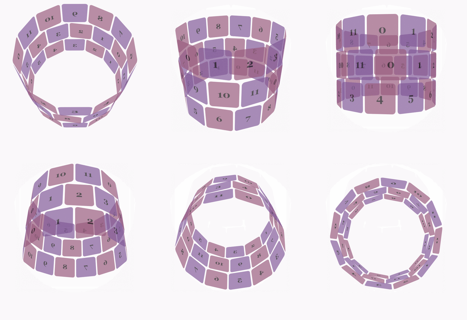
实例三,利用js+Transform和Animation实现3D动画
示例地址:https://webkit.org/blog-files/3d-transforms/poster-circle.html
只有webkit内核的浏览器才能看到相关3D动画效果。
实现效果如图所示:
css代码:
body {

        font-family: 'Lucida Grande', Verdana, Arial;

        font-size: 12px;

      }

      #stage {

        margin: 150px auto;

        width: 600px;

        height: 400px;

        -webkit-perspective:;

      }

      #rotate {

        margin: 0 auto;

        width: 600px;

        height: 400px;

        -webkit-transform-style: preserve-3d;

        -webkit-animation-name: x-spin;

        -webkit-animation-duration: 7s;

        -webkit-animation-iteration-count: infinite;

        -webkit-animation-timing-function: linear;

      }

      .ring {

        margin: 0 auto;

        height: 110px;

        width: 600px;

        -webkit-transform-style: preserve-3d;

        -webkit-animation-iteration-count: infinite;

        -webkit-animation-timing-function: linear;

      }

      .ring > :nth-child(odd) {

        background-color: #995C7F;

      }

      .ring > :nth-child(even) {

        background-color: #835A99;

      }

      .poster {

        position: absolute;

        left: 250px;

        width: 100px;

        height: 100px;

        opacity: 0.7;

        color: rgba(0,0,0,0.9);

        -webkit-border-radius: 10px;

      }

      .poster > p {

        font-family: 'Georgia', serif;

        font-size: 36px;

        font-weight: bold;

        text-align: center;

        margin-top: 28px;

      }

      #ring-1 {

        -webkit-animation-name: y-spin;

        -webkit-animation-duration: 5s;

      }

      #ring-2 {

        -webkit-animation-name: back-y-spin;

        -webkit-animation-duration: 4s;

      }

      #ring-3 {

        -webkit-animation-name: y-spin;

        -webkit-animation-duration: 3s;

      }

      @-webkit-keyframes x-spin {

        0%    { -webkit-transform: rotateX(0deg); }

        50%   { -webkit-transform: rotateX(180deg); }

        100%  { -webkit-transform: rotateX(360deg); }

      }

      @-webkit-keyframes y-spin {

        0%    { -webkit-transform: rotateY(0deg); }

        50%   { -webkit-transform: rotateY(180deg); }

        100%  { -webkit-transform: rotateY(360deg); }

      }

      @-webkit-keyframes back-y-spin {

        0%    { -webkit-transform: rotateY(360deg); }

        50%   { -webkit-transform: rotateY(180deg); }

        100%  { -webkit-transform: rotateY(0deg); }

      }
html代码:
<div id="stage">

  <div id="rotate">

    <div id="ring-1" class="ring"></div>

    <div id="ring-2" class="ring"></div>

    <div id="ring-3" class="ring"></div>

  </div>

</div>
js代码:
const POSTERS_PER_ROW = 12;

const RING_RADIUS = 200;

function setup_posters (row){

    var posterAngle = 360 / POSTERS_PER_ROW;

    for (var i = 0; i < POSTERS_PER_ROW; i ++) {

      var poster = document.createElement('div');

      poster.className = 'poster';

      var transform = 'rotateY(' + (posterAngle * i) + 'deg) translateZ(' + RING_RADIUS + 'px)';

      poster.style.webkitTransform = transform;

      var content = poster.appendChild(document.createElement('p'));

      content.textContent = i;

      row.appendChild(poster);

    }

}

function init (){

    setup_posters(document.getElementById('ring-1'));

    setup_posters(document.getElementById('ring-2'));

    setup_posters(document.getElementById('ring-3'));

}

window.addEventListener('load', init, false);
参考地址:
CSS参考手册:animation
小tip: CSS3 animation渐进实现点点点等待提示效果
CSS3效果:animate实现点点点loading动画效果(一)的更多相关文章
- CSS3效果:animate实现点点点loading动画效果(二)
box-shadow实现的打点效果 简介 box-shadow理论上可以生成任意的图形效果,当然也就可以实现点点点的loading效果了. 实现原理 html代码,首先需要写如下html代码以及cla ...
- 实现loading动画效果
下面我就来罗列三种实现loading动画效果的方法. 方法一:使用UIImageView自带的方法来实现,这也是我推荐的实现方法. NSMutableArray *array = [[NSMutabl ...
- ios开发之简单实现loading动画效果
最近有朋友问我类似微信语音播放的喇叭动画和界面图片加载loading界面是怎样实现的,是不是就是一个gif图片呢!我的回答当然是否定了,当然不排除也有人用gif图片啊!下面我就来罗列三种实现loadi ...
- CSS3 transition实现超酷图片墙动画效果
一.前面的感慨以前也陆陆续续试过CSS3的一些特性,文字投影,多边框等.但都是试试而已,知道有这么回事.今天,见到了一个新玩意,transition,认认真真的试了一下,经过,我懵了,我呆了,我傻了, ...
- Atitit Loading 动画效果
Atitit Loading 动画效果 使用才场景,加载数据,以及显示警告灯.. 要有手动关闭按钮 <div class="spinner loading_part" sty ...
- [Swift通天遁地]五、高级扩展-(11)图像加载Loading动画效果的自定义和缓存
★★★★★★★★★★★★★★★★★★★★★★★★★★★★★★★★★★★★★★★★➤微信公众号:山青咏芝(shanqingyongzhi)➤博客园地址:山青咏芝(https://www.cnblogs. ...
- css3实现的3中loading动画效果
一.css3中animation动画各种属性详解: animation Value: [<animation-name> || <animation-duration> ...
- loading动画效果记录
看到好多网页都有一个炫酷的loading动画,以前不知道怎么实现的.今天学习了一下,发现其实也很简单. 首先在学习的时候偶然遇到一个pace.js的库,非常好用.优点是,不需要挂接到任何代码,自动检测 ...
- javascript 通用loading动画效果
由于项目中多处要给ajax提交的时候增加等待动画效果,所以就写了一个简单的通用js方法: 代码如下: /*ajax提交的延时等待效果*/ var AjaxLoding = new Object(); ...
随机推荐
- 《http权威指南》读书笔记6
概述 最近对http很感兴趣,于是开始看<http权威指南>.别人都说这本书有点老了,而且内容太多.我个人觉得这本书写的太好了,非常长知识,让你知道关于http的很多概念,不仅告诉你怎么做 ...
- less编译工具——koala使用介绍
1:使用koala编译软件 官网:http://koala-app.com/index-zh.html (目前官网点击下载没有反应,有人说可能是网络问题,但真正的原因是需要FQ才能下载了) 百度 ...
- Mybatis框架五:动态SQL
1.if where 实现一个简单的需求: 根据性别和名字查询用户: 正常来写: <select id="selectUserBySexAndUsername" para ...
- Vue 中是如何解析 template 字符串为 VNode 的?
在接触 React 时候,我只了解到通过 babel 可以把 JSX 转成 VNode(通过调用 React.createElement 方法),但是对其具体是如何转换的却不了解. 很明显,回答失败. ...
- Spring Aop分析
前言 上文讲述ioc框架的实现,本文开始讲述aop.在spring中aop也有3种配置方式,注解形式的我们先不讨论.我们先看看xml形式的配置方式. <aop:config> <ao ...
- [转]迄今为止最优的Eclipse运行性能调优 ,含eclipse.ini
最近,Eclipse(Eclipse-JEE3.5)运行十分缓慢(可能插件安装过多),因此,得到了个机会调优一下,以便提高工作效率 下图是未经任何调整eclipse的gc情况(使用jvisualvm命 ...
- 前端测试框架Jest系列教程 -- Mock Functions(模拟器)
写在前面: 在写单元测试的时候有一个最重要的步骤就是Mock,我们通常会根据接口来Mock接口的实现,比如你要测试某个class中的某个方法,而这个方法又依赖了外部的一些接口的实现,从单元测试的角度来 ...
- Java实现敏感词过滤 - IKAnalyzer中文分词工具
IKAnalyzer 是一个开源的,基于java语言开发的轻量级的中文分词工具包. 官网: https://code.google.com/archive/p/ik-analyzer/ 本用例借助 I ...
- MyBatis源码解析(六)——DataSource数据源模块之池型数据源
原创作品,可以转载,但是请标注出处地址:http://www.cnblogs.com/V1haoge/p/6675674.html 1 回顾 上一文中解读了MyBatis中非池型数据源的源码,非池型也 ...
- python装饰器1:函数装饰器详解
装饰器1:函数装饰器 装饰器2:类装饰器 装饰器3:进阶 先混个眼熟 谁可以作为装饰器(可以将谁编写成装饰器): 函数 方法 实现了__call__的可调用类 装饰器可以去装饰谁(谁可以被装饰): 函 ...