理解使用before,after伪类实现小三角形气泡框
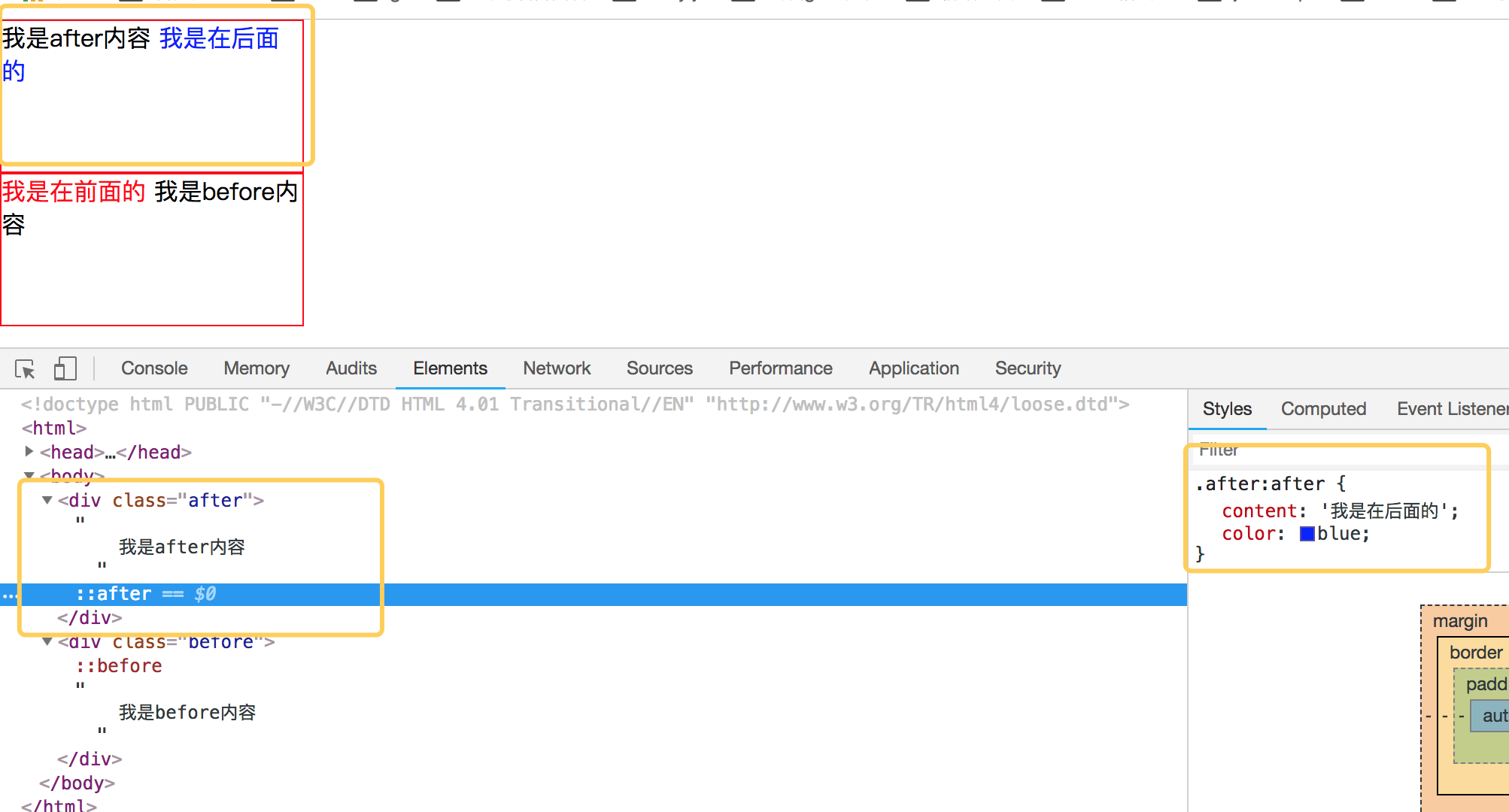
先来理解before和after伪类的用法吧,before从字面上的意思可以理解为前面的意思,它一般和content属性一起使用,把内容插入在其他元素的前面,同理after的含义就是把内容插入到其他元素的后面了。先来看一个简单的demo,如下代码:
<!DOCTYPE html PUBLIC "-//W3C//DTD HTML 4.01 Transitional//EN" "http://www.w3.org/TR/html4/loose.dtd">

<html>

<head>

<meta http-equiv="Content-Type" content="text/html; charset=UTF-8">

<title>Insert title here</title>

<style type="text/css" id="colorFlipFlop">

  * {margin:0; padding: 0;}

  div {

    width: 200px;

    height: 100px;

    border: 1px solid red;

  }

  .after:after {

    content: '我是在后面的';

    color: blue;

  }

  .before:before {

    content: '我是在前面的';

    color: red;

  }

</style>

</head>

<body>

  <div class="after">

    我是after内容

  </div>

  <div class="before">

    我是before内容

  </div>

</body>

</html>
效果如下:
简单理解完 before 和 after后,我们来看看如何使用 before 和 after来制作小三角形吧。
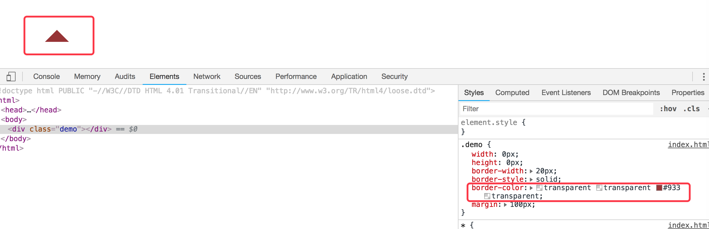
1. 首先我们来看看 css border属性,当我们把div中的border-color 设置成不同的颜色后,代码如下:
<!DOCTYPE html PUBLIC "-//W3C//DTD HTML 4.01 Transitional//EN" "http://www.w3.org/TR/html4/loose.dtd">

<html>

<head>

<meta http-equiv="Content-Type" content="text/html; charset=UTF-8">

<title>Insert title here</title>

<style type="text/css" id="colorFlipFlop">

  * {margin:0; padding: 0;}

  .demo {

    width: 50px;

    height: 50px;

    border-width: 20px;

    border-style: solid;

    border-color: #CCC #00F #933 #0C9;

    margin: 100px;

  }

</style>

</head>

<body>

  <div class="demo"></div>

</body>

</html>
效果如下图:

如果我们现在把div的宽度和高度设置为0的话,那么四边就会变成三角形了,如下代码:
<!DOCTYPE html PUBLIC "-//W3C//DTD HTML 4.01 Transitional//EN" "http://www.w3.org/TR/html4/loose.dtd">

<html>

<head>

<meta http-equiv="Content-Type" content="text/html; charset=UTF-8">

<title>Insert title here</title>

<style type="text/css" id="colorFlipFlop">

  * {margin:0; padding: 0;}

  .demo {

    width: 0px;

    height: 0px;

    border-width: 20px;

    border-style: solid;

    border-color: #CCC #00F #933 #0C9;

    margin: 100px;

  }

</style>

</head>

<body>

  <div class="demo"></div>

</body>

</html>
效果变为如下:

应该可以理解掉吧,如上把宽度和高度设置为0的话,中间那个宽50px和高50px变为0,中间那块就没有了。
现在我们需要一个三角形,那么我们现在只需要把其他三边的颜色设置为透明就可以了,将其他三边颜色设置为透明,即color的值为transparent. 如下代码:
<!DOCTYPE html PUBLIC "-//W3C//DTD HTML 4.01 Transitional//EN" "http://www.w3.org/TR/html4/loose.dtd">

<html>

<head>

<meta http-equiv="Content-Type" content="text/html; charset=UTF-8">

<title>Insert title here</title>

<style type="text/css" id="colorFlipFlop">

  * {margin:0; padding: 0;}

  .demo {

    width: 0px;

    height: 0px;

    border-width: 20px;

    border-style: solid;

    border-color: transparent transparent #933 transparent;

    margin: 100px;

  }

</style>

</head>

<body>

  <div class="demo"></div>

</body>

</html>
然后效果如下:
现在小三角形可以实现了,当然如果需要不同的方向的三角形可以设置对应不同的 border-color 位置对应的透明。
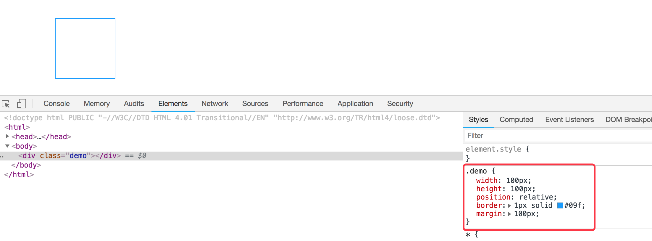
我们现在需要实现的是使用before和after这样的伪类来实现气泡框类似的效果。先看下一个简单的demo,如下:
<div class="demo"></div>

<style>

  * {margin:0; padding: 0;}

  .demo {

    width: 100px;

    height: 100px;

    position: relative;

    border: 1px solid #09f;

    margin: 100px;

  }

</style>
效果如下:
然后需要把小三角形定位上去即可。利用上面的介绍实现的小三角形的效果放在该元素的伪类上来。
我们需要在该div元素后面加一个小三角形,需要使用到伪类after,然后把伪类上的小三角定位上去即可,如下代码所示:
<!DOCTYPE html PUBLIC "-//W3C//DTD HTML 4.01 Transitional//EN" "http://www.w3.org/TR/html4/loose.dtd">

<html>

<head>

<meta http-equiv="Content-Type" content="text/html; charset=UTF-8">

<title>Insert title here</title>

<style type="text/css" id="colorFlipFlop">

  * {margin:0; padding: 0;}

  .demo {

    width: 100px;

    height: 100px;

    position: relative;

    border: 1px solid #09f;

    margin: 100px;

  }

  .demo:after {

    width: 0px;

    height: 0px;

    border-width: 12px;

    border-style: solid;

    border-color: transparent transparent #933 transparent;

    position: absolute;

    content: ' ';

    left: 39px;

    top: -24px;

  }

</style>

</head>

<body>

  <div class="demo"></div>

</body>

</html>
如上代码,我们使用了伪元素after,把小三角定位上去,实现的效果变成如下了:

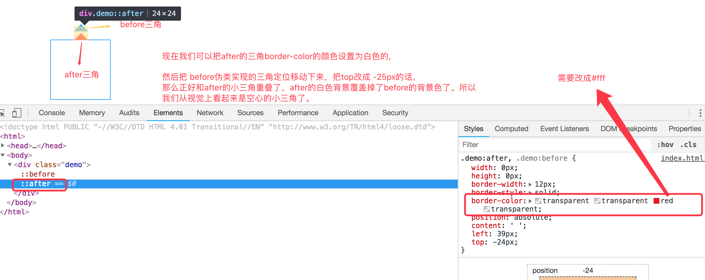
空心三角
现在效果基本实现了气泡框的效果,但是呢上面的小三角是实心的,在很多应用场景中,小三角形是空心的,我们现在需要使用到另外一个伪类元素before。
空心三角的设计思路其实和实心的三角类似,使用的是before伪类,也是把小三角定位上去,但是before伪类设置的小三角可能没有after设置小三角宽度大而已,并且before实现的小三角设置颜色为白色的实心三角,然后两个小三角实现重叠一下,这样的话,从视觉上看到的貌似是空心的三角了。如下代码:
<!DOCTYPE html PUBLIC "-//W3C//DTD HTML 4.01 Transitional//EN" "http://www.w3.org/TR/html4/loose.dtd">

<html>

<head>

<meta http-equiv="Content-Type" content="text/html; charset=UTF-8">

<title>Insert title here</title>

<style type="text/css" id="colorFlipFlop">

  * {margin:0; padding: 0;}

  .demo {

    width: 100px;

    height: 100px;

    position: relative;

    border: 1px solid #09f;

    margin: 100px;

  }

  .demo:after, .demo:before {

    width: 0px;

    height: 0px;

    border-width: 12px;

    border-style: solid;

    border-color: transparent transparent #fff transparent;

    position: absolute;

    content: ' ';

    left: 39px;

    top: -24px;

  }

  .demo:before {

    top: -25px;

    border-color: transparent transparent #09f transparent;

  }

</style>

</head>

<body>

  <div class="demo"></div>

</body>

</html>
如下图所示:

理解使用before,after伪类实现小三角形气泡框的更多相关文章
- CSS-用伪类制作小箭头(轮播图的左右切换btn)
先上学习地址:http://www.htmleaf.com/Demo/201610234136.html 作者对轮播图左右按钮的处理方法一改往常,不是简单地用btn.prev+btn.next的图片代 ...
- 利用border和伪类画出三角形 ps:好久没写博客了。。。
有一个半月没有写博客了,这段时间,小哥我经历了自入行前端最为黑暗的时期,迷茫,空虚,不想写代码,不想做研究了.连打游戏都没有兴趣,如同行尸走肉一般.还好,毕业论文的初稿完成后,整个时间段最恶心最难熬的 ...
- CSS伪类选择器实现三角形
使用css实现常用的三角效果 项目中三角: .breadcrumb{ height: 40px; line-height: 40px; padding: 0 20px; border-top: 1px ...
- 关于使用css伪类实现小图标
效果: .person_use>span{ display:block; width:0; height:0; border-width:10px; border-style:solid; bo ...
- 【CSS】伪类和伪元素选择器
伪类 基于当前元素所处的状态或具有的特性,用于设置元素自身的特殊效果. a:link 规定所有未被点击的链接: a:visited 匹配多有已被点击过的链接: a:active 匹配所有鼠标按下 ...
- CSS3伪类和伪元素的特性和区别尤其是 ::after和::before
伪类和伪元素的理解 官方解释: 伪类一开始单单只是用来表示一些元素的动态状态,典型的就是链接的各个状态(LVHA).随后CSS2标准扩展了其概念范围,使其成为了所有逻辑上存在但在文档树中却无须标识的“ ...
- 关于css伪类,伪元素详解总结
伪类 伪类就是一种虚构的状态或者说是一个具有特殊属性的元素可以使用CSS进行样式修饰.常见的几种伪类是: :link , :visited , :hover , :active , :first-ch ...
- 小tip:CSS计数器+伪类实现数值动态计算与呈现【转】
[原文]http://www.zhangxinxu.com/wordpress/2014/12/css-counters-pseudo-class-checked-numbers/ 一.CSS计数器为 ...
- 理解是最好的记忆方法 之 CSS中a链接的④个伪类为何有顺序
理解是最好的记忆方法 之 CSS中a链接的④个伪类为何有顺序 在CSS中,a标签有4种伪类,分别为: a:link, a:visited, a:hover, a:active 对其稍有了解的前端er都 ...
随机推荐
- 洛谷P4926 [1007]倍杀测量者(差分约束)
题意 题目链接 Sol 题目中的两个限制条件相当于是 \[A_i \geqslant (K_i - T)B_i\] \[A_i(K_i + T) \geq B_i\] 我们需要让这两个至少有一个不满足 ...
- TS学习随笔(一)->安装和基本数据类型
去年学过一段时间的TS,但由于在工作中不常用.就生疏了,最近项目要求用TS,那我就再回去搞搞TS,写一篇记录一下自己学习TS的进度以及TS知识点 首先,关于TS的定义我就不在这描述了,想看百度一下你就 ...
- SAP MM PO 中的Delivery Date并非保存在EKPO表里
采购订单行项目中的deliverydate并非如同其它字段值一样是保存在采购订单行项目表EKPO里的, 而是从EKET表里抓取最早的Delivery Date作为该Item的delivery date ...
- IDEA项目搭建十四——Web站点Controller基类及布局页静态资源设计
一.简介 站点搭建完成后,编写页面时一般会有如下几个需求 1.嵌套静态页面时有很大一部分通用代码,如css.js这部分可以使用thymeleaf的局部片段代码块组成 2.这些静态资源默认放在程序中,但 ...
- 被低估的.net(中) - 广州.net俱乐部2019年纲领
这是被低估的.net系列的中篇.上篇在这里:被低估的.net(上) - 微软MonkeyFest 2018广州分享会活动回顾 中篇本来不是这样的,中篇的草稿大纲其实在写上篇之前就写好了,嗯,当时给张队 ...
- 矢量图面层和线层相交得到相交后的线层文件(gis相交)
目的:将arcgis里的面层和线层相交(重叠)部分的线单独生成一个shp文件,用于道路路网密度计算等. 注意:进行相交运算后生成的是线要素文件,相当于把面线相交部分的线单独拿了出来. 操作例子:将图示 ...
- 章节七、3-ArrayList和LinkedList对比
一.创建集合并添加元素(从末尾位置添加) package ZangJie7; import java.util.ArrayList; import java.util.LinkedList; impo ...
- pycharm 中按照文档引包方式,引包错误
* python使用pycharm ide,如果电脑上有多个解释器的,在项目解释器配置的应该是当前使用的解释器: * 可以把当前使用的解释器目录添加到系统环境变量中,这样就不会报错了 另外,如果目录中 ...
- SQLServer基础之数据页类型:GAM,SGAM,PFS
简介 我们已经知道SQL Server IO最小的单位是页,连续的8个页是一个区.SQL Server需要一种方式来知道其所管辖的数据库中的空间使用情况,这就是GAM页和SGAM页. GAM页 GAM ...
- linux局域网搭建yum仓库(本地(file)、网络(ftp、http))
linux局域网搭建yum仓库(本地(file).网络(ftp.http)) yum配置文件解释: [ ]:定义仓库,base为仓库的名字,可任意 name:仓库的简短文字描述 baseurl:仓库的 ...