理解使用before,after伪类实现小三角形气泡框
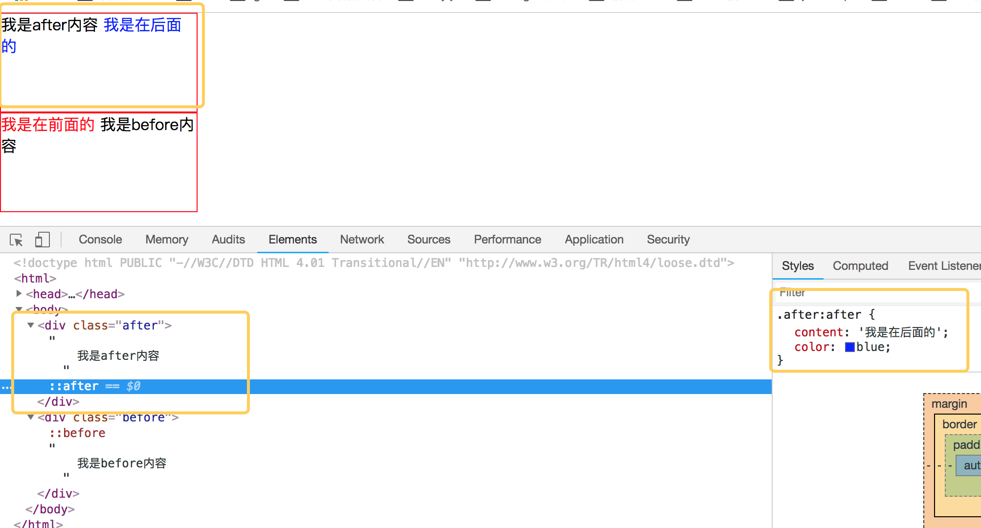
先来理解before和after伪类的用法吧,before从字面上的意思可以理解为前面的意思,它一般和content属性一起使用,把内容插入在其他元素的前面,同理after的含义就是把内容插入到其他元素的后面了。先来看一个简单的demo,如下代码:
<!DOCTYPE html PUBLIC "-//W3C//DTD HTML 4.01 Transitional//EN" "http://www.w3.org/TR/html4/loose.dtd">

<html>

<head>

<meta http-equiv="Content-Type" content="text/html; charset=UTF-8">

<title>Insert title here</title>

<style type="text/css" id="colorFlipFlop">

  * {margin:0; padding: 0;}

  div {

    width: 200px;

    height: 100px;

    border: 1px solid red;

  }

  .after:after {

    content: '我是在后面的';

    color: blue;

  }

  .before:before {

    content: '我是在前面的';

    color: red;

  }

</style>

</head>

<body>

  <div class="after">

    我是after内容

  </div>

  <div class="before">

    我是before内容

  </div>

</body>

</html>
效果如下:
简单理解完 before 和 after后,我们来看看如何使用 before 和 after来制作小三角形吧。
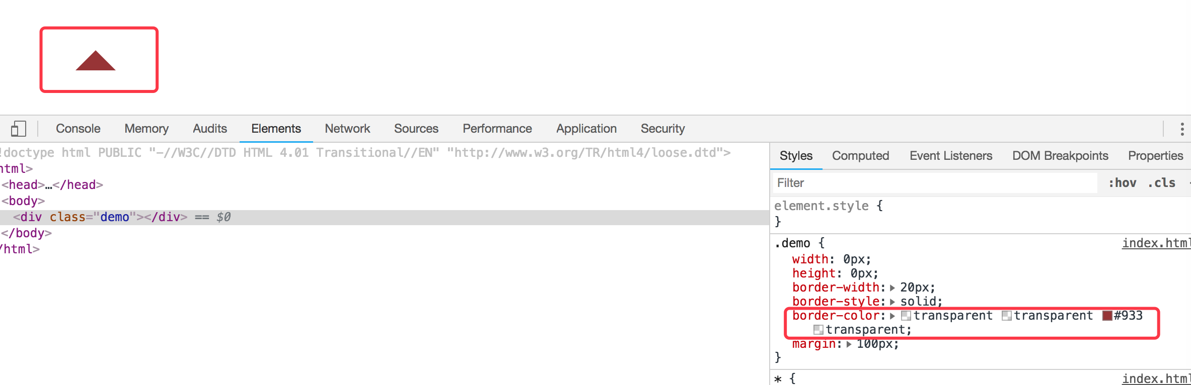
1. 首先我们来看看 css border属性,当我们把div中的border-color 设置成不同的颜色后,代码如下:
<!DOCTYPE html PUBLIC "-//W3C//DTD HTML 4.01 Transitional//EN" "http://www.w3.org/TR/html4/loose.dtd">

<html>

<head>

<meta http-equiv="Content-Type" content="text/html; charset=UTF-8">

<title>Insert title here</title>

<style type="text/css" id="colorFlipFlop">

  * {margin:0; padding: 0;}

  .demo {

    width: 50px;

    height: 50px;

    border-width: 20px;

    border-style: solid;

    border-color: #CCC #00F #933 #0C9;

    margin: 100px;

  }

</style>

</head>

<body>

  <div class="demo"></div>

</body>

</html>
效果如下图:

如果我们现在把div的宽度和高度设置为0的话,那么四边就会变成三角形了,如下代码:
<!DOCTYPE html PUBLIC "-//W3C//DTD HTML 4.01 Transitional//EN" "http://www.w3.org/TR/html4/loose.dtd">

<html>

<head>

<meta http-equiv="Content-Type" content="text/html; charset=UTF-8">

<title>Insert title here</title>

<style type="text/css" id="colorFlipFlop">

  * {margin:0; padding: 0;}

  .demo {

    width: 0px;

    height: 0px;

    border-width: 20px;

    border-style: solid;

    border-color: #CCC #00F #933 #0C9;

    margin: 100px;

  }

</style>

</head>

<body>

  <div class="demo"></div>

</body>

</html>
效果变为如下:

应该可以理解掉吧,如上把宽度和高度设置为0的话,中间那个宽50px和高50px变为0,中间那块就没有了。
现在我们需要一个三角形,那么我们现在只需要把其他三边的颜色设置为透明就可以了,将其他三边颜色设置为透明,即color的值为transparent. 如下代码:
<!DOCTYPE html PUBLIC "-//W3C//DTD HTML 4.01 Transitional//EN" "http://www.w3.org/TR/html4/loose.dtd">

<html>

<head>

<meta http-equiv="Content-Type" content="text/html; charset=UTF-8">

<title>Insert title here</title>

<style type="text/css" id="colorFlipFlop">

  * {margin:0; padding: 0;}

  .demo {

    width: 0px;

    height: 0px;

    border-width: 20px;

    border-style: solid;

    border-color: transparent transparent #933 transparent;

    margin: 100px;

  }

</style>

</head>

<body>

  <div class="demo"></div>

</body>

</html>
然后效果如下:
现在小三角形可以实现了,当然如果需要不同的方向的三角形可以设置对应不同的 border-color 位置对应的透明。
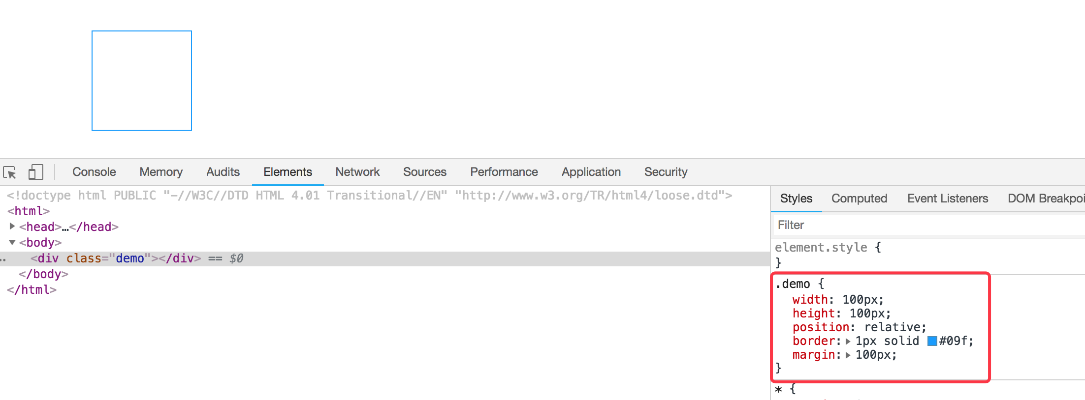
我们现在需要实现的是使用before和after这样的伪类来实现气泡框类似的效果。先看下一个简单的demo,如下:
<div class="demo"></div>

<style>

  * {margin:0; padding: 0;}

  .demo {

    width: 100px;

    height: 100px;

    position: relative;

    border: 1px solid #09f;

    margin: 100px;

  }

</style>
效果如下:
然后需要把小三角形定位上去即可。利用上面的介绍实现的小三角形的效果放在该元素的伪类上来。
我们需要在该div元素后面加一个小三角形,需要使用到伪类after,然后把伪类上的小三角定位上去即可,如下代码所示:
<!DOCTYPE html PUBLIC "-//W3C//DTD HTML 4.01 Transitional//EN" "http://www.w3.org/TR/html4/loose.dtd">

<html>

<head>

<meta http-equiv="Content-Type" content="text/html; charset=UTF-8">

<title>Insert title here</title>

<style type="text/css" id="colorFlipFlop">

  * {margin:0; padding: 0;}

  .demo {

    width: 100px;

    height: 100px;

    position: relative;

    border: 1px solid #09f;

    margin: 100px;

  }

  .demo:after {

    width: 0px;

    height: 0px;

    border-width: 12px;

    border-style: solid;

    border-color: transparent transparent #933 transparent;

    position: absolute;

    content: ' ';

    left: 39px;

    top: -24px;

  }

</style>

</head>

<body>

  <div class="demo"></div>

</body>

</html>
如上代码,我们使用了伪元素after,把小三角定位上去,实现的效果变成如下了:

空心三角
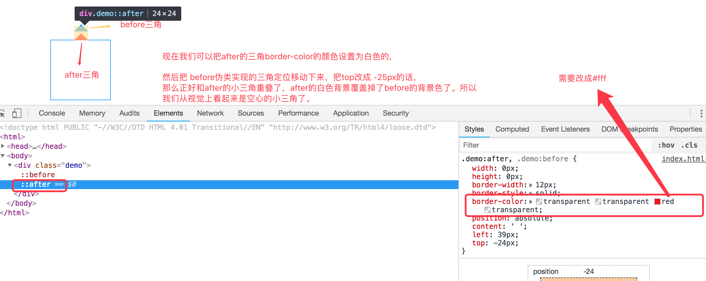
现在效果基本实现了气泡框的效果,但是呢上面的小三角是实心的,在很多应用场景中,小三角形是空心的,我们现在需要使用到另外一个伪类元素before。
空心三角的设计思路其实和实心的三角类似,使用的是before伪类,也是把小三角定位上去,但是before伪类设置的小三角可能没有after设置小三角宽度大而已,并且before实现的小三角设置颜色为白色的实心三角,然后两个小三角实现重叠一下,这样的话,从视觉上看到的貌似是空心的三角了。如下代码:
<!DOCTYPE html PUBLIC "-//W3C//DTD HTML 4.01 Transitional//EN" "http://www.w3.org/TR/html4/loose.dtd">

<html>

<head>

<meta http-equiv="Content-Type" content="text/html; charset=UTF-8">

<title>Insert title here</title>

<style type="text/css" id="colorFlipFlop">

  * {margin:0; padding: 0;}

  .demo {

    width: 100px;

    height: 100px;

    position: relative;

    border: 1px solid #09f;

    margin: 100px;

  }

  .demo:after, .demo:before {

    width: 0px;

    height: 0px;

    border-width: 12px;

    border-style: solid;

    border-color: transparent transparent #fff transparent;

    position: absolute;

    content: ' ';

    left: 39px;

    top: -24px;

  }

  .demo:before {

    top: -25px;

    border-color: transparent transparent #09f transparent;

  }

</style>

</head>

<body>

  <div class="demo"></div>

</body>

</html>
如下图所示:

理解使用before,after伪类实现小三角形气泡框的更多相关文章
- CSS-用伪类制作小箭头(轮播图的左右切换btn)
先上学习地址:http://www.htmleaf.com/Demo/201610234136.html 作者对轮播图左右按钮的处理方法一改往常,不是简单地用btn.prev+btn.next的图片代 ...
- 利用border和伪类画出三角形 ps:好久没写博客了。。。
有一个半月没有写博客了,这段时间,小哥我经历了自入行前端最为黑暗的时期,迷茫,空虚,不想写代码,不想做研究了.连打游戏都没有兴趣,如同行尸走肉一般.还好,毕业论文的初稿完成后,整个时间段最恶心最难熬的 ...
- CSS伪类选择器实现三角形
使用css实现常用的三角效果 项目中三角: .breadcrumb{ height: 40px; line-height: 40px; padding: 0 20px; border-top: 1px ...
- 关于使用css伪类实现小图标
效果: .person_use>span{ display:block; width:0; height:0; border-width:10px; border-style:solid; bo ...
- 【CSS】伪类和伪元素选择器
伪类 基于当前元素所处的状态或具有的特性,用于设置元素自身的特殊效果. a:link 规定所有未被点击的链接: a:visited 匹配多有已被点击过的链接: a:active 匹配所有鼠标按下 ...
- CSS3伪类和伪元素的特性和区别尤其是 ::after和::before
伪类和伪元素的理解 官方解释: 伪类一开始单单只是用来表示一些元素的动态状态,典型的就是链接的各个状态(LVHA).随后CSS2标准扩展了其概念范围,使其成为了所有逻辑上存在但在文档树中却无须标识的“ ...
- 关于css伪类,伪元素详解总结
伪类 伪类就是一种虚构的状态或者说是一个具有特殊属性的元素可以使用CSS进行样式修饰.常见的几种伪类是: :link , :visited , :hover , :active , :first-ch ...
- 小tip:CSS计数器+伪类实现数值动态计算与呈现【转】
[原文]http://www.zhangxinxu.com/wordpress/2014/12/css-counters-pseudo-class-checked-numbers/ 一.CSS计数器为 ...
- 理解是最好的记忆方法 之 CSS中a链接的④个伪类为何有顺序
理解是最好的记忆方法 之 CSS中a链接的④个伪类为何有顺序 在CSS中,a标签有4种伪类,分别为: a:link, a:visited, a:hover, a:active 对其稍有了解的前端er都 ...
随机推荐
- 2014/08/31 Zushi
今天是逗子森户海滨浴场开放的最后一天,趁着最后的光景来这里透透气. 在学皮划艇准备下海的人们,貌似还挺有趣. 来自云端的上帝之手. 谁愿意和我一起向着夕阳弄桨. 夕阳西下,那里是家乡的方向. 灯塔和神 ...
- 你不可不知的Java引用类型【总结篇】
四种引用类型总结 引用级别:强引用 > 软引用 > 弱引用 > 虚引用 理解 就如最开始说的,设置四种引用类型,是为了更好的控制对象的生命周期,让代码能够一定程度上干涉GC过程,所以 ...
- Android 如何解决dialog弹出时无法捕捉Activity的back事件
Android 如何解决dialog弹出时无法捕捉Activity的back事件 在一些情况下,我们需要捕捉back键事件,然后在捕捉到的事件里写入我们需要进行的处理,通常可以采用下面三种办法捕捉到b ...
- tab 切换实现方法
ul li 实现方法(只适用于,一个页面只有一组ul>li) <!--menu--> <div class="nav"> <ul class=& ...
- CSS布局---居中方法
在web页面布局中居中是我们常遇到的情况,而居中分为水平居中与垂直居中 文本的居中 CSS中对文本的居中做的非常友好,我们是需要text-align, line-height 两个属性就可以控制文本的 ...
- 简易付XP版本无法获取server.xml配置文件处理方案
博客地址:https://blog.csdn.net/zdw_wym/article/details/40892535 把它添加到C:/WINDOWS/Microsoft.NET/Framework/ ...
- Linux重命名网卡名称
1.查看当前网卡: nmcli connection show 可以看到我有两个网卡,其中一个为中文名称,我想将配置 2 修改为net-DHCP 2.cd到/etc/sysconfig/network ...
- postgre中类似oracle的sql%rowcount用法
get diagnostics cnt := row_count; 现在有两个表tab1和tab2,两个表的格式相同,tab1中有1000条数据,tab2中0条数据 创建测试功能函数 create o ...
- 思科4506E做ehterchannel故障排查
思科4506E做ehterchannel故障排查 转载于:https://blog.51cto.com/eric1026/1910912 一.故障描述 某客户有两台4506E汇聚交换机,需要做ethe ...
- git 使用命令删除远程分支和本地分支
删除远程分支命令: git push origin :<远程分支名称> git push origin --delete <远程分支名称> 删除本地分支: git bran ...