
CSS3 小黄人案例
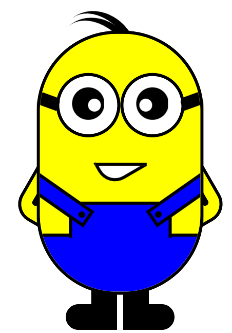
使用 CSS3 和 HTML5 制作一个小黄人。
结构代码:
   <div class="wrap">

         <!-- 头发 -->

         <div class="hair">

             <div class="hair_1"></div>

             <div class="hair_2"></div>

         </div>

         <!-- 身体 -->

         <div class="body">

             <!-- 眼睛 -->

             <div class="eyes">

                 <!-- 左眼 -->

                 <div class="eyes_l">

                     <div class="l_black"></div>

                     <div class="l_white"></div>

                 </div>

                 <!-- 右眼 -->

                 <div class="eyes_r">

                     <div class="r_black"></div>

                     <div class="r_white"></div>

                 </div>

             </div>

             <!-- 嘴巴 -->

             <div class="mouth"></div>

             <!-- 裤子 -->

             <div class="trousers">

                 <!-- 裤子上 -->

                 <div class="trousers_t">

                     <div class="t_l_belt"></div>

                     <div class="t_r_belt"></div>

                 </div>

                 <!-- 裤子下 -->

                 <div class="trousers_b"></div>

             </div>

         </div>

         <!-- 手臂 -->

         <div class="hand">

             <div class="hand_l"></div>

             <div class="hand_r"></div>

         </div>

         <!-- 腿脚 -->

         <div class="foot">

             <div class="foot_l"></div>

             <div class="foot_r"></div>

         </div>

     </div>
CSS 样式:
     .wrap {

             width: 400px;

             height: 600px;

             margin: 0 auto;

             border: 1px solid red;

             position: relative;

         }

         /*身体*/

         .body {

             width: 250px;

             height: 400px;

             border: 5px solid #000;

             border-radius: 125px;

             position: absolute;

             top: 50%;

             left: 50%;

             transform: translate(-50%,-50%);

             background-color: yellow;

             overflow: hidden;

         }

         /*头发*/

         .hair_1,

         .hair_2 {

             width: 130px;

             height: 100px;

             border-top: 10px solid #000;

             border-radius:50%;

             position: absolute;

         }

         .hair_1 {

             left: 100px;

             top: 80px;

             transform: rotate(45deg);

         }

         .hair_2 {

             left: 102px;

             top: 70px;

             transform: rotate(50deg);

         }

         /*手臂*/

         .hand_l,

         .hand_r {

             width: 100px;

             height: 100px;

             border: 5px solid #000;

             position: absolute;

             border-radius: 30px;

             background-color: yellow;

             z-index: -1

         }

         .hand_l {

             left:50px;

             top:300px;

             transform: rotate(30deg);

         }

         .hand_r {

             right:50px;

             top:300px;

             transform: rotate(-30deg);

         }

         .hand_l::after,

         .hand_r::after {

             content: "";

             width: 30px;

             height: 10px;

             position: absolute;

             background: #000;

             border-radius:5px;

         }

         .hand_l::after {

             left: 6px;

             top: 60px;

             transform: rotate(-90deg);

         }

         .hand_r::after {

             right: 6px;

             top:60px;

             transform: rotate(-90deg);

         }

         /*腿*/

         .foot_l,

         .foot_r {

             width: 40px;

             height: 70px;

             background-color: #000;

             position: absolute;

             top:490px;

             z-index: -1;

         }

         .foot_l {

             left:155px;

         }

         .foot_r {

             right:155px;

         }

         /*脚*/

         .foot_l::after,

         .foot_r::after {

             content: "";

             width: 60px;

             height: 40px;

             background-color: #000;

             border-radius: 20px;

             position: absolute;

             top: 30px;

         }

         .foot_l::after {

             left: -40px;

         }

         .foot_r::after {

             right: -40px;

         }

         /*眼睛*/

         .eyes{

             /*width: 100%;

             height: 100px;*/

             /*border: 1px solid red;*/

             position: absolute;

             top: 60px;

             left: 25px;

         }

         .eyes_l,

         .eyes_r {

             width: 90px;

             height: 90px;

             border: 5px solid #000;

             border-radius: 50%;

             background-color: #fff;

             float: left;

         }

         .eyes_l::after,

         .eyes_r::after {

             content: "";

             width: 31px;

             height: 20px;

             position: absolute;

             background-color: #000;

             top: 35px;

         }

         .eyes_l::after {

             left: -26px;

             transform: rotate(20deg);

             border-radius: 2px 7px 0px 2px;

         }

         .eyes_r::after {

             right: -26px;

             transform: rotate(-20deg);

             border-radius: 8px 2px 0px 2px;

         }

         /*黑色眼珠*/

         .l_black,

         .r_black {

             width: 50px;

             height: 50px;

             background-color: #000;

             border-radius: 50%;

             position: absolute;

             top: 23px;

         }

         .l_black {

             left: 25px;

         }

         .r_black {

             left: 125px;

         }

         /*白眼珠*/

         .l_white,

         .r_white {

             width: 20px;

             height: 20px;

             background-color: #fff;

             border-radius: 50%;

             position: absolute;

             top: 40px;

         }

         .l_white {

             left: 50px;

         }

         .r_white {

             left: 130px;

         }

         /*嘴巴*/

         .mouth {

             width: 60px;

             height: 35px;

             border: 5px solid #000;

             border-radius: 0 0 0 30px;

             position: absolute;

             background-color: #fff;

             left: 90px;

             top: 180px;

             transform: rotate(-30deg);

         }

         .mouth::after {

             content: "";

             width: 80px;

             height: 40px;

             background-color: yellow;

             position: absolute;

             border-bottom: 5px solid #000;

             left: 1px;

             top: -22px;

             transform: rotate(30deg);

         }

         /*裤子上*/

         .trousers {

             width: 100%;

             height: 150px;

             position:absolute;

             top: 260px;

         }

         .trousers_t {

             width: 150px;

             height: 51px;

             background-color: blue;

             border: 5px solid #000;

             border-bottom: none;

             position: absolute;

             left: 45px;

             z-index:;

         }

         .trousers_b {

             width: 250px;

             height: 86px;

             background-color: blue;

             position: absolute;

             top: 50px;

             border-top: 5px solid #000;

             /*border-radius: 0 0 125px 125px;*/

         }

         /*肩带*/

         .t_l_belt,

         .t_r_belt {

             width: 100px;

             height: 20px;

             background-color: blue;

             border: 5px solid #000;

             position: absolute;

             top: -24px;

         }

         .t_l_belt {

             left:-74px;

             transform: rotate(35deg);

         }

         .t_r_belt {

             right: -74px;

             transform: rotate(-35deg);

         }

         .t_l_belt::after,

         .t_r_belt::after {

             content: "";

             position: absolute;

             width: 10px;

             height: 10px;

             background-color: #000;

             border-radius: 50%;

             top: 5px;

         }

         .t_l_belt::after{

             left: 87px;

         }

         .t_r_belt::after {

             left: 3px;

         }

         /*动画*/

         .hair_1,

         .hair_2 {

             animation: hair 5s ease-in infinite;

         }

         @keyframes hair {

             10% {

                 transform: rotate(45deg);

             }

             20% {

                 transform: rotate(56deg);

             }

             50% {

                 transform: rotate(45deg);

             }

             80% {

                 transform: rotate(56deg);

             }

             100% {

                 transform: rotate(45deg);

             }

         }

         .l_black,

         .r_black {

             animation: eye 5s linear infinite;

         }

         @keyframes eye {

             10% {

                 transform: translate(0);

             }

             20% {

                 transform: translate(20px);

             }

             50% {

                 transform: translate(0);

             }

             80% {

                 transform: translate(-20px);

             }

             100% {

                 transform: translate(0);

             }

         }

         .l_white,

         .r_white {

             animation: eyewhite 5s linear infinite;

         }

         @keyframes eyewhite {

             10% {

                 transform: translate(0,0);

             }

             20% {

                 transform: translate(20px,5px);

             }

             50% {

                 transform: translate(0,0);

             }

             80% {

                 transform: translate(-20px,5px);

             }

             100% {

                 transform: translate(0,0);

             }

         }
效果图:
CSS3 小黄人案例的更多相关文章
- CSS3小黄人
CSS3实现小黄人 效果图: 代码如下,复制即可使用: <!DOCTYPE HTML> <HTML> <head> <title>CSS3实现小黄人&l ...
- 纯CSS3画出小黄人并实现动画效果
前言 前两天我刚发布了一篇CSS3实现小黄人动画的博客,但是实现的CSS3动画是基于我在站酷网找到的一张小黄人的jpg格式图片,并自己用PS抠出需要实现动画的部分,最后才完成的动画效果.但是,其实我的 ...
- CSS3实现小黄人动画
转载请注明出处,谢谢! 每次看到CSS3动画就心痒痒想试一下,记得一个多月前看了白树哥哥的一篇博客,突然开窍,于是拿他提供的demo试了一下,感觉很棒!下图为demo提供的动画帧设计稿. 自己也想说搞 ...
- css3实现小黄人
效果就像这样: 不废话,直接上代码! hrml代码: <!DOCTYPE html> <html> <head lang="zh"> <m ...
- [置顶]
几行代码实现ofo首页小黄人眼睛加速感应转动
最新版的ofo 小黄车的首页小黄人眼睛随重力而转动,感觉有点炫酷,学习一下吧,以下代码是在xamarin android下实现 ofo首页效果图: xamarin android实现效果: 实现思路: ...
- Python turtle模块小黄人程序
讲解Python初级课程的turtle模块,简单粗暴的编写了小黄人的程序.程序还需要进一步优化.难点就是要搞清楚turtle在绘制图形过程中的方向变化. import turtle t = turtl ...
- 小黄人IP营销的四种玩法思维导图
小黄人IP营销的四种玩法思维导图 ------------------------------ 本人微信公众帐号: 心禅道(xinchandao) 本人微信公众帐号:双色球预测合买(ssqyuce)
- 静态分析第三发 so文件分析(小黄人快跑)
本文作者:i春秋作家——HAI_ 0×00 工具 1.IDA pro 2.Android Killer 0×01 环境 小黄人快跑 下载地址http://download.csdn.net/downl ...
- 音频算法之小黄人变声 附完整C代码
前面提及到<大话音频变声原理 附简单示例代码>与<声音变调算法PitchShift(模拟汤姆猫) 附完整C++算法实现代码> 都稍微讲过变声的原理和具体实现. 大家都知道,算法 ...
随机推荐
- [转]怎样与 CORS 和 cookie 打交道
原文地址:https://segmentfault.com/a/1190000018756960 前言 CORS 与 cookie 在前端是个非常重要的问题,不过在大多数情况下,因为前后端的 doma ...
- MathML
MathML https://developer.mozilla.org/en-US/docs/Web/MathML/Examples/MathML_Pythagorean_Theorem Mathe ...
- spring 支持集中 bean scope?
Spring bean 支持 5 种 scope: Singleton - 每个 Spring IoC 容器仅有一个单实例. Prototype - 每次请求都会产生一个新的实例. Request - ...
- (CSDN 迁移) JAVA多线程实现-可回收缓存线程池(newCachedThreadPool)
在前两篇博客中介绍了单线程化线程池(newSingleThreadExecutor).可控最大并发数线程池(newFixedThreadPool).下面介绍的是第三种newCachedThreadPo ...
- [教程]Tensorflow + win10 + CPU + Python3.6+ 安装教程
由于各种原因,清华镜像源已经彻底挂掉了,但是目前网上的各种教程基本上都是采取设置清华镜像源来加快下载速度,所以这给小白带来了很大的困扰!这里我将通过合理上网工具来直接下载源镜像. 注意:本次教程适用于 ...
- SGU 126. Boxes --- 模拟
<传送门> 126. Boxes time limit per test: 0.25 sec. memory limit per test: 4096 KB There are two b ...
- java-工厂
class Mouse{ public void sayHi(){}; } class DellMouse extends Mouse { @Override public void sayHi() ...
- Java设计RestfulApi接口,实现统一格式返回
创建返回状态码枚举 package com.sunny.tool.api.enums; /** * @Author sunt * @Description 响应枚举状态码 * @Date 2019/1 ...
- 题解 CF53E 【Dead Ends】
题意: 给一个n(n<=10)个节点的无向图,图里面有m条边,以这m条边构建生成树,求所有生成树中只含有k个度数为1的点的方案数. 题解: 看见这个数量级就一定会想到状态压缩dp... 那让我们 ...
- 57 容器(十一)——Collections容器工具类
Collections是一个工具类,它提供了与集合操作有关的方法,好比数组中的Arrays工具类.(jdk中的工具类名都是xxxs,有关工具类名参考:https://zhuanlan.zhihu.co ...