
2014圣诞节一款纯css3实现的雪人动画特效
在2014年的圣诞节,爱编程小编给大家分分享一款纯css3实现的雪人动画特效。该实例实现一个雪人跳动的特效,效果图如下:
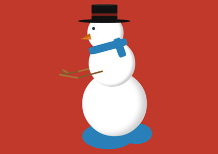
实现的代码。
html代码:
 <span class="text">lolwut<small>-@rsmswlln</small></span>

    <div class="body">

        <div class="hat">

            <div class="ribbon">

            </div>

        </div>

        <div class="face">

        </div>

        <div class="scarf">

        </div>

        <div class="right-arm">

            <div class="hand">

            </div>

        </div>

        <div class="left-arm">

            <div class="hand">

            </div>

        </div>

    </div>

    <div class="puddle">

    </div>
css代码:
 body {

  background: #c0392b;

}

.body {

  width: 250px;

  height: 250px;

  background: #ffffff;

  border-radius: 50%;

  box-shadow: inset -20px -5px 35px rgba(0, 0, 0, 0.2);

  position: absolute;

  right:;

  left:;

  margin: 300px auto;

  animation: jump 1s infinite;

}

.body:before {

  z-index:;

  content: "";

  width: 180px;

  height: 180px;

  background: #ffffff;

  border-radius: 50%;

  box-shadow: inset -10px -5px 10px rgba(0, 0, 0, 0.2);

  position: relative;

  display: inline-block;

  top: -120px;

  left: 25px;

}

.body:after {

  content: "";

  width: 140px;

  height: 140px;

  background: #ffffff;

  border-radius: 50%;

  box-shadow: inset -10px -5px 10px rgba(0, 0, 0, 0.2);

  position: relative;

  display: inline-block;

  top: -400px;

  left: 20px;

}

.body > .hat {

  width: 200px;

  height: 15px;

  border-radius: 50%;

  background-color: #111111;

  position: absolute;

  z-index:;

  top: -200px;

  left: -15px;

}

.body > .hat:before {

  content: "";

  width: 100px;

  height: 65px;

  background-color: #111111;

  display: inline-block;

  position: relative;

  top: -55px;

  left: 51px;

}

.body > .hat:after {

  z-index:;

  content: "";

  display: inline-block;

  position: relative;

  top: -145px;

  left: 51px;

  width: 100px;

  height: 5px;

  border-radius: 50%;

  background-color: #2b2b2b;

}

.body > .hat > .ribbon {

  height: 10px;

  width: 100px;

  background-color: #6d2018;

  position: relative;

  top: -90px;

  left: 51px;

  z-index:;

}

.body > .face {

  z-index:;

  width: 12px;

  height: 12px;

  background-color: #2c3e50;

  border-radius: 50%;

  position: absolute;

  top: -170px;

  left: 38px;

}

.body > .face:before {

  content: "";

  background-color: transparent;

  display: inline-block;

  position: relative;

  top: 30px;

  left: -45px;

  transform: rotate(-15deg);

  border-top: 12px solid transparent;

  border-bottom: 12px solid transparent;

  border-right: 40px solid #e67e22;

}

.body > .face:after {

  content: "";

  background-color: transparent;

  display: inline-block;

  position: relative;

  top:;

  left: -46px;

  transform: rotate(-15deg);

  border-top: 12px solid transparent;

  border-right: 40px solid #bf6516;

}

.body > .scarf {

  z-index:;

  width: 150px;

  height: 30px;

  background-color: #2980b9;

  position: absolute;

  top: -110px;

  left: 25px;

  transform: rotate(-15deg);

  border-radius: 20%;

}

.body > .scarf:after {

  content: "";

  width: 75px;

  height: 30px;

  background-color: #2980b9;

  display: inline-block;

  position: relative;

  top: 16px;

  left: 80px;

  transform: rotate(85deg);

  border-radius: 20%;

}

.body > .left-arm,

.body .right-arm {

  z-index:;

  width: 100px;

  height: 6px;

  background-color: #825a2c;

  position: absolute;

  top: 10px;

  left: -20px;

  transform: rotate(-15deg);

  animation: rub-right 0.5s infinite;

}

.body > .left-arm > .hand,

.body .right-arm > .hand {

  width: 25px;

  height: 6px;

  background-color: #825a2c;

  position: absolute;

  top: -32px;

  left: -60px;

  transform: rotate(75deg);

}

.body > .left-arm:after,

.body .right-arm:after {

  content: "";

  width: 75px;

  height: 6px;

  background-color: #a87439;

  display: inline-block;

  position: relative;

  top: -24px;

  left: -70px;

  transform: rotate(25deg);

}

.body > .left-arm.left-arm,

.body .right-arm.left-arm {

  background-color: #a87439;

  animation: rub-left 0.5s infinite;

  top: -15px;

  z-index:;

}

.body > .left-arm.left-arm > .hand,

.body .right-arm.left-arm > .hand {

  background-color: #a87439;

  top: -14px;

  transform: rotate(45deg);

}

.body > .left-arm.left-arm:after,

.body .right-arm.left-arm:after {

  background-color: #825a2c;

  transform: rotate(5deg);

  top: -12px;

  left: -74px;

}

.puddle {

  z-index: -1;

  width: 200px;

  height: 100px;

  background: #2980b9;

  border-radius: 50%;

  position: absolute;

  right:;

  left: -50px;

  margin: 500px auto;

}

.puddle:after {

  content: "";

  width: 120px;

  height: 80px;

  display: inline-block;

  border-radius: 50%;

  left: 150px;

  position: relative;

  background-color: #2980b9;

}

.text {

  text-align: center;

  font-family: 'Lobster', cursive;

  font-size: 74px;

  display: inline-block;

  transform: rotate(-15deg);

  position: absolute;

  margin: 50px 30px;

  color: #ffffff;

  text-shadow: 3px 3px 2px rgba(0, 0, 0, 0.5);

}

.text > small {

  font-size: 20px;

  display: block;

}

@keyframes rub-left {

  0% {

    margin-left: 0px;

    margin-top:;

  }

  50% {

    margin-left: 5px;

    margin-top: 1px;

  }

  100% {

    margin-left: 0px;

    margin-top:;

  }

}

@keyframes rub-right {

  0% {

    margin-left: 4px;

  }

  50% {

    margin-left: 0px;

  }

  100% {

    margin-left: 4px;

  }

}

@keyframes jump {

  0% {

    margin: 300px auto;

  }

  40% {

    margin: 250px auto;

  }

  80% {

    margin: 300px auto;

  }

}
via:http://www.w2bc.com/Article/13508
2014圣诞节一款纯css3实现的雪人动画特效的更多相关文章
- 纯css3 加载loading动画特效
最近项目中要实现当页面还没有加载完给用户提示正在加载的loading,本来是想做个图片提示的,但是图片如果放大电脑的分辨率就会感觉到很虚,体验效果很不好.于是就采用css3+js实现这个loading ...
- 纯CSS3绘制神奇宝贝伊布动画特效
在线演示 本地下载
- 纯css3实现的文字亮光特效
今天给大家分享一款纯css3实现的文字亮光特效.这款特效文字上一道亮光逐渐扫过文字.效果非常漂亮.一起看下效果: 在线预览 源码下载 实现的代码. html代码: <span class=& ...
- 推荐10款纯css3实现的实用按钮
在2014年的双11即将来临之季,爱编程小编为大家整理10款纯css3实现的按钮.希望这对坚守在前端的码农们有所帮助.亲,如果你有好的资源也可在本文留言,让从事编码的程序员们抱团.工作更轻松. No1 ...
- 一款纯css3实现的条纹加载条
之前为大家带来了很多加载动画. 基于prefixfree.js的进度加载条 ,基于jquery带百分比的响应式进度加载条.今天给大家分享一款纯css3实现的条纹加载条.带有响应式的效果.效果图如下 : ...
- 7款纯CSS3实现的炫酷动画应用
1.纯CSS3实现人物摇头动画 这次我们要来分享一款超级可爱的纯CSS3人物摇头动画,初始化的时候人物的各个部位是利用CSS3动画效果拼接而成,接下来就是人物听音乐的场景,一边听音乐一边摇着脑袋,十分 ...
- 7款纯CSS3实现的炫酷动画应用|慕课网只学有用的!
关于我们 | 时尚廊 ♦ 时尚廊,中国大陆地区首家以"Lounge"为概念的艺文空间 ♦ 7款纯CSS3实现的炫酷动画应用|慕课网只学有用的! 7款纯CSS3实现的炫酷动画应用
- 16款纯CSS3实现的loading加载动画
分享16款纯CSS3实现的loading加载动画.这是一款实用的可替代GIF格式图片的CSS3加载动画代码.效果图如下: 在线预览 源码下载 实现的代码. html代码: <div clas ...
- 一款纯css3实现的漂亮的404页面
之前为大家分享了那些创意有趣的404页面, html5和css3打造一款创意404页面, HTML5可爱的404页面动画很逗的机器人.今天再给大家分享一款纯css3实现的漂亮的404页面.效果图如下: ...
随机推荐
- 高性能CSS
避免使用@import 有两种方式加载样式文件,一种是link元素,另一种是CSS 2.1加入@import.而在外部的CSS文件中使用@import会使得页面在加载时增加额外的延迟.虽然规则允许在样 ...
- js和jquery判断事件流
$('body').on('click',function(e){ var $target = $(e.target); if($target.parents('.fixNav>div').le ...
- HDU 2897 邂逅明下 (博弈)
题意: 给你n.p.q,每次操作是令n减小 [p, q]区间中的数,当n < p时必须全部取完了,取完最后一次的人算输,问先手必胜还是必败. 解题思路: 这种非常类似巴什博弈,可以找出必胜区间和 ...
- TextView子类的常用属性
TextView常见的子类包括EditText,Button,CheckBox, RadioButton等. 1.EditText EditText继承自TextView,因此TextView所有属性 ...
- Hidden Markov Model Toolbox for Matlab
官网:http://www.cs.ubc.ca/~murphyk/Software/HMM/hmm.html Download Click here. Unziping creates a direc ...
- C#应用视频教程3.1 USB工业相机测试
图像处理是工控很有价值的一个领域,比如人脸识别,车牌识别,还有产品的位置识别,瑕疵检测,对于个人学习来说,我们无法直接上手几万块的成熟工业相机(高端的康耐视要6万左右,而且是黑白的,要测试一些带颜色的 ...
- 深入理解Git (三) - 微命令上篇
1 git hash-object 曾经讲过Git用Hash值作为Git对象的名字,那么详细是哪个命令呢? 我们能够先改动一个文件: echo "hongchangfirst" & ...
- Entity Framework Code First关系映射约定【l转发】
本篇随笔目录: 1.外键列名默认约定 2.一对多关系 3.一对一关系 4.多对多关系 5.一对多自反关系 6.多对多自反关系 在关系数据库中,不同表之间往往不是全部都单独存在,而是相互存在关联的.两个 ...
- execve 系列函数
exec系列函数(execl.execlp.execle.execv.execvp) 1带 p 的exec函数:execlp,execvp,表示第一个参数path不用输入完整路径,只有给出命令名即可, ...
- Adobe Acrobat Pro 修改背景色
Adobe Acrobat Pro 如何修改背景色 CreateTime--2017年8月1日10:05:58Author:Marydon 参考:百度经验 在菜单栏选择“编辑”,下拉栏中选择最后一 ...