QtQuickcontrols2控件使用参考
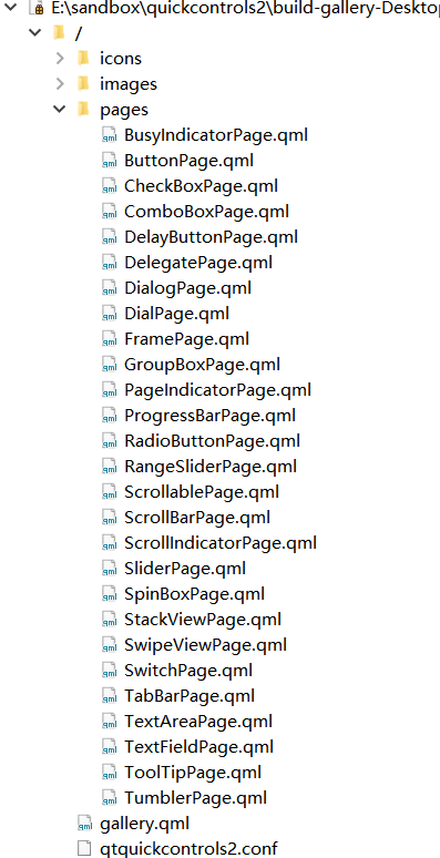
随着Qt的版本升级,其自带的controls控件库也不断升级,目前已经到了2.3的版本。本文通过解读Qt自带的gallery例程,说明新版本controls控件库的相关特性。其具体位置于:
| 界面 | 代码 |
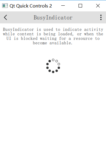 |
BusyIndicator{
id:busyindicator
visible:true
anchors.horizontalCenter:parent.horizontalCenter
}
|
| 界面 | 代码 |
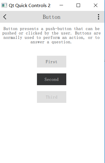 |
ColumnLayout{
anchors.horizontalCenter:parent.horizontalCenter
Button{
text:"First"
Layout.fillWidth:true
}
Button{
id:button
text:"Second"
highlighted:true
Layout.fillWidth:true
}
Button{
text:"Third"
enabled:false
Layout.fillWidth:true
}
}
|
| 界面 | 代码 |
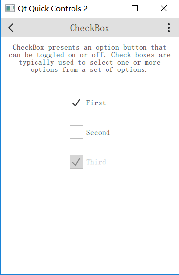 |
Column{
anchors.horizontalCenter:parent.horizontalCenter
CheckBox{
text:"First"
checked:true
}
CheckBox{
text:"Second"
}
CheckBox{
text:"Third"
checked:true
enabled:false
}
}
|
| 界面 | 代码 |
 |
ComboBox{
model:["First","Second","Third"]
anchors.horizontalCenter:parent.horizontalCenter
}
////////////////////////////////////////////////////////////////////////////////////////////////////
ComboBox{
editable:true
model:ListModel{
id:model
ListElement{text:"Banana"}
ListElement{text:"Apple"}
ListElement{text:"Coconut"}
}
onAccepted:{
if(find(editText)===-1)
model.append({text:editText})
}
anchors.horizontalCenter:parent.horizontalCenter
}
|
| 界面 | 代码 |
 |
DelayButton{
text:"DelayButton"
anchors.horizontalCenter:parent.horizontalCenter
}
|
| 界面 | 代码 |
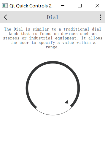 |
Dial{
value:0.5
anchors.horizontalCenter:parent.horizontalCenter
}
|
| 界面 | 代码 |
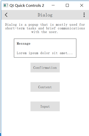 |
Button{
text:"Message"
anchors.horizontalCenter:parent.horizontalCenter
width:buttonWidth
onClicked:messageDialog.open()
Dialog{
id:messageDialog
title:"Message"
Label{
text:"Loremipsumdolorsitamet..."
}
}
}
|
| 界面 | 代码 |
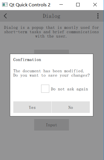 |
Button{
id:button
text:"Confirmation"
anchors.horizontalCenter:parent.horizontalCenter
width:buttonWidth
onClicked:confirmationDialog.open()
Dialog{
id:confirmationDialog
parent:Overlay.overlay
modal:true
title:"Confirmation"
standardButtons:Dialog.Yes|Dialog.No
Column{
anchors.fill:parent
Label{
text:"Thedocumenthasbeenmodified.\nDoyouwanttosaveyourchanges?"
}
CheckBox{
text:"Donotaskagain"
anchors.right:parent.right
}
}
}
}
|
| 界面 | 代码 |
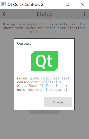 |
Button{
text:"Content"
anchors.horizontalCenter:parent.horizontalCenter
width:buttonWidth
onClicked:contentDialog.open()
Dialog{
id:contentDialog
*2
parent:Overlay.overlay
modal:true
title:"Content"
standardButtons:Dialog.Close
Flickable{
id:flickable
clip:true
anchors.fill:parent
contentHeight:column.height
Column{
id:column
width:parent.width
Image{
id:logo
anchors.horizontalCenter:parent.horizontalCenter
fillMode:Image.PreserveAspectFit
source:"../images/qt-logo.png"
}
Label{
width:parent.width
text:"Loremipsumdolorsitamet,consecteturadipiscingelit.Nuncfinibus"
wrapMode:Label.Wrap
}
}
ScrollIndicator.vertical:ScrollIndicator{
parent:contentDialog.contentItem
anchors.top:flickable.top
anchors.bottom:flickable.bottom
anchors.right:parent.right
}
}
}
}
|
| 界面 | 代码 |
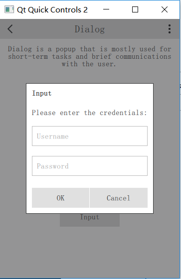 |
Button{
text:"Input"
anchors.horizontalCenter:parent.horizontalCenter
width:buttonWidth
onClicked:inputDialog.open()
Dialog{
id:inputDialog
//直接设置在窗体中间
parent:Overlay.overlay
focus:true
modal:true
title:"Input"
standardButtons:Dialog.Ok|Dialog.Cancel
ColumnLayout{
anchors.fill:parent
Label{
elide:Label.ElideRight
text:"Pleaseenterthecredentials:"
Layout.fillWidth:true
}
TextField{
focus:true
placeholderText:"Username"
Layout.fillWidth:true
}
TextField{
placeholderText:"Password"
echoMode:TextField.PasswordEchoOnEdit
Layout.fillWidth:true
}
}
}
}
|
| 界面 | 代码 |
 |
|
| 界面 | 代码 |
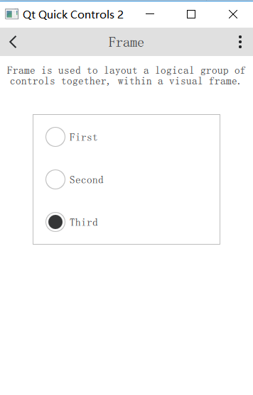 |
Frame{
anchors.horizontalCenter:parent.horizontalCenter
Column{
width:page.itemWidth
RadioButton{
text:"First"
checked:true
width:parent.width
}
RadioButton{
id:button
text:"Second"
width:parent.width
}
RadioButton{
text:"Third"
width:parent.width
}
}
}
|
| 界面 | 代码 |
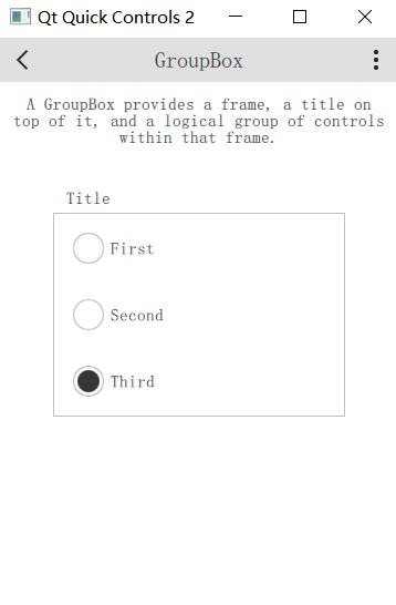 |
GroupBox{
title:"Title"
anchors.horizontalCenter:parent.horizontalCenter
Column{
width:page.itemWidth
RadioButton{
text:"First"
checked:true
width:parent.width
}
RadioButton{
id:button
text:"Second"
width:parent.width
}
RadioButton{
text:"Third"
width:parent.width
}
}
}
|
| 界面 | 代码 |
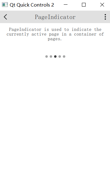 |
ScrollablePage{
id:page
Column{
width:parent.width
Label{
width:parent.width
wrapMode:Label.Wrap
horizontalAlignment:Qt.AlignHCenter
text:"PageIndicatorisusedtoindicatethecurrentlyactivepageinacontainerofpages."
}
PageIndicator{
anchors.horizontalCenter:parent.horizontalCenter
}
}
}
|
| 界面 | 代码 |
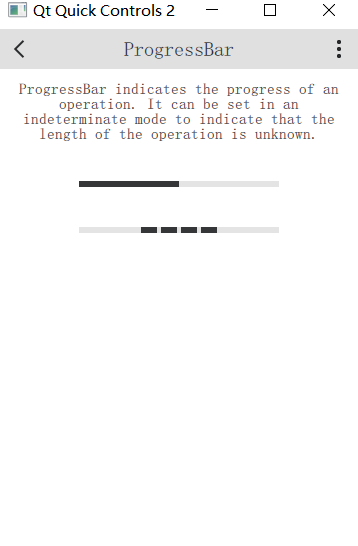 |
ProgressBar{
id:bar
value:0.5
anchors.horizontalCenter:parent.horizontalCenter
}
ProgressBar{
indeterminate:true
anchors.horizontalCenter:parent.horizontalCenter
}
|
| 界面 | 代码 |
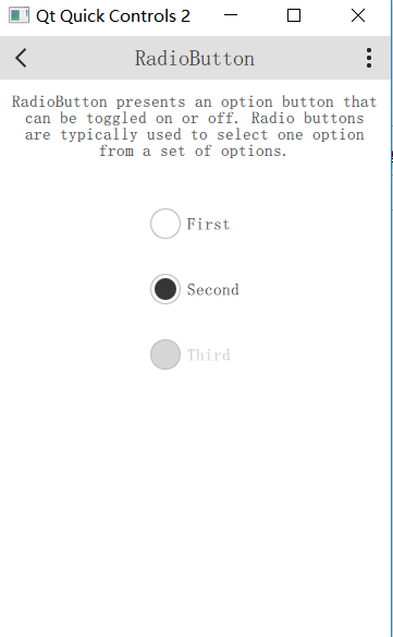 |
Column{
anchors.horizontalCenter:parent.horizontalCenter
RadioButton{
text:"First"
}
RadioButton{
text:"Second"
checked:true
}
RadioButton{
text:"Third"
enabled:false
}
}
|
| 界面 | 代码 |
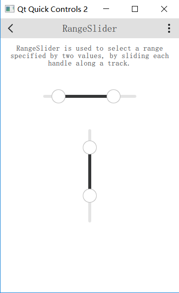 |
RangeSlider{
id:slider
first.value:0.25
second.value:0.75
anchors.horizontalCenter:parent.horizontalCenter
}
RangeSlider{
orientation:Qt.Vertical
first.value:0.25
second.value:0.75
anchors.horizontalCenter:parent.horizontalCenter
}
|
| 界面 | 代码 |
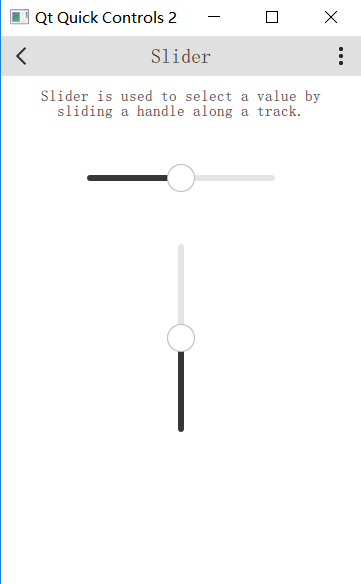 |
Slider{
id:slider
value:0.5
anchors.horizontalCenter:parent.horizontalCenter
}
Slider{
orientation:Qt.Vertical
value:0.5
anchors.horizontalCenter:parent.horizontalCenter
}
|
| 界面 | 代码 |
 |
SpinBox{
id:box
anchors.horizontalCenter:parent.horizontalCenter
editable:true
}
|
| 界面 | 代码 |
 |
StackView{
id:stackView
initialItem:page
Component{
id:page
Pane{
id:pane
//TODO:fixnullparentondestruction
Column{
width:parent.width
Label{
width:parent.width
wrapMode:Label.Wrap
horizontalAlignment:Qt.AlignHCenter
text:"StackViewprovidesastack-basednavigationmodelwhichcanbeusedwithasetofinterlinkedpages."
+"Itemsarepushedontothestackastheusernavigatesdeeperintothematerial,andpoppedoffagain"
+"whenhechoosestogoback."
}
Button{
id:button
text:"Push"
anchors.horizontalCenter:parent.horizontalCenter
width:Math.max(button.implicitWidth,Math.min(button.implicitWidth*2,pane.availableWidth/3))
onClicked:stackView.push(page)
}
Button{
text:"Pop"
width:Math.max(button.implicitWidth,Math.min(button.implicitWidth*2,pane.availableWidth/3))
anchors.horizontalCenter:parent.horizontalCenter
onClicked:stackView.pop()
}
}
}
}
}
|
| 界面 | 代码 |
 |
ScrollBar.vertical:ScrollBar{}
|
| 界面 | 代码 |
 |
SwipeView{
id:view
anchors.fill:parent
Repeater{
Pane{
width:view.width
height:view.height
Column{
width:parent.width
Label{
width:parent.width
wrapMode:Label.Wrap
horizontalAlignment:Qt.AlignHCenter
text:"SwipeViewprovidesanavigationmodelthatsimplifieshorizontalpagedscrolling."
+"Thepageindicatoronthebottomshowswhichisthepresentlyactivepage."
}
Image{
source:"../images/arrows.png"
anchors.horizontalCenter:parent.horizontalCenter
}
}
}
}
}
PageIndicator{
count:view.count
currentIndex:view.currentIndex
anchors.bottom:parent.bottom
anchors.horizontalCenter:parent.horizontalCenter
}
|
| 界面 | 代码 |
 |
Switch{
text:"First"
}
Switch{
text:"Second"
checked:true
}
Switch{
text:"Third"
enabled:false
}
|
| 界面 | 代码 |
 |
SwipeView{
id:swipeView
anchors.fill:parent
currentIndex:tabBar.currentIndex
Repeater{
Pane{
width:swipeView.width
height:swipeView.height
Column{
width:parent.width
Label{
width:parent.width
wrapMode:Label.Wrap
horizontalAlignment:Qt.AlignHCenter
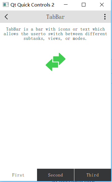
text:"TabBarisabarwithiconsortextwhichallowstheuser"
+"toswitchbetweendifferentsubtasks,views,ormodes."
}
Image{
source:"../images/arrows.png"
anchors.horizontalCenter:parent.horizontalCenter
}
}
}
}
}
footer:TabBar{
id:tabBar
currentIndex:swipeView.currentIndex
TabButton{
text:"First"
}
TabButton{
text:"Second"
}
TabButton{
text:"Third"
}
}
|
| 界面 | 代码 |
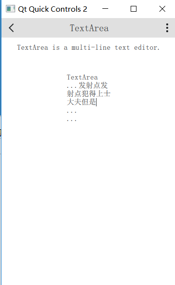 |
TextArea{
width:Math.max(implicitWidth,Math.min(implicitWidth*3,pane.availableWidth/3))
anchors.horizontalCenter:parent.horizontalCenter
wrapMode:TextArea.Wrap
text:"TextArea\n...\n...\n..."
}
|
| 界面 | 代码 |
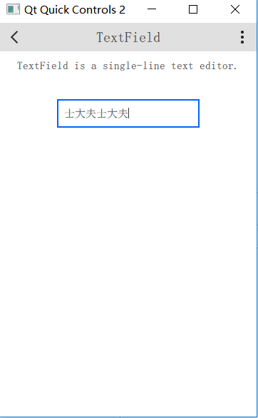 |
TextField{
id:field
placeholderText:"TextField"
anchors.horizontalCenter:parent.horizontalCenter
}
|
| 界面 | 代码 |
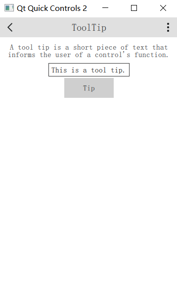 |
Button{
text:"Tip"
anchors.horizontalCenter:parent.horizontalCenter
ToolTip.visible:pressed
ToolTip.text:"Thisisatooltip."
}
|
| 界面 | 代码 |
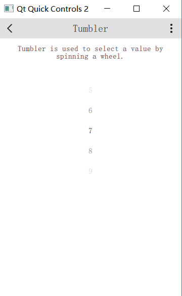 |
Tumbler{
anchors.horizontalCenter:parent.horizontalCenter
}
|
QtQuickcontrols2控件使用参考的更多相关文章
- RichEdit控件 SDK 参考手册
RichEdit控件 SDK 参考手册 摘要: 本文对Rich Edit控件底层消息机制进行了讲解,以期读者对Windows平台下的Rich Edit控件有一个更深入的认识,同时对于使用Win32 S ...
- qtquickcontrols2控件集(使用参考重构)
随着Qt的版本升级,其自带的controls控件库也不断升级,目前已经到了2.3的版本.本文通过重构并且解读Qt自带的gallery例程,说明新版本controls控件库的相关特性 来自 ...
- Windows窗口样式速查参考,Delphi窗口控件的风格都有它们来决定(附Delphi何时用到它们,并举例说明)good
/* 窗口样式参考列表(都是GetWindowLong的GWL_STYLE风格,都是TCreateParams.Sytle的一部分),详细列表如下:https://msdn.microsoft.com ...
- 【完全开源】百度地图Web service API C#.NET版,带地图显示控件、导航控件、POI查找控件
目录 概述 功能 如何使用 参考帮助 概述 源代码主要包含三个项目,BMap.NET.BMap.NET.WindowsForm以及BMap.NET.WinformDemo. BMap.NET 对百度地 ...
- WinForm 简单蒙版实现控件遮盖
在Web上面要实现一个遮罩层或者说是蒙版吧,有了DIV那不算什么难事,只要给div定好位置和大小,把颜色的Alpha值设一下就有透明的效果.不过在Winform中实现起来就没那么简单了事.尝试过用一个 ...
- 《ASP.NET1200例》ListView 控件与DataPager控件的结合<二>
ASP.NET使用ListView数据绑定控件和DataPager实现数据分页显示 为什么使用ListView+DataPager的方式实现分页显示? .net提供的诸多数据绑定控件,每一种都有它自己 ...
- iOS 利用constraint实现2个控件上下的空白是相等的
说的有点乱,先看个图把 其实这个constrant的目的就是控制两个方形的控件上方和下方的空白大小. 对于每一个方块来说,他们上方和下方的空白是相同的.这种“居中”的设计到处可见.一个控件想实现这种居 ...
- 在WinForm中使用委托来在其他线程中改变控件的显示
假设winform中有两个控件: 1.ListView用来显示进度的文本提示,ID:listView_progressInfo 2.ProgressBar用来显示进度,ID:progressBar1 ...
- Xamarin.forms 自定义tabview控件
一 问题描述 forms本身ui代码是翻译为平台原生代码,forms按照xaml技术进行对android和ios两种ui模型进行公共抽象出了几种page和view,在空杯博客已经有详细介绍 http: ...
随机推荐
- HDU 1166 - 敌兵布阵 - [单点修改、区间查询zkw线段树]
题还是那个题:http://www.cnblogs.com/dilthey/p/6827959.html 不过我们今天换一种线段树实现来做这道题: 关于zkw线段树的讲解:https://zhuanl ...
- wf-pagination-javascript 分页
1 <?php isset($_REQUEST['form_single_page_num']) && !empty($_REQUEST['form_single_page_nu ...
- GUID Partition Table (GPT)
https://en.wikipedia.org/wiki/GUID_Partition_Table https://zh.wikipedia.org/wiki/全局唯一标识分区表 GUID Part ...
- LoadRunner-关联相关(解决方法二)
用例为:添加通知,下发给用户. 录制好脚本,replay时脚本未报错,但实际登录网页操作未完成(只添加了通知,未下发给用户). LR自动关联没有内容,手动查看服务器response,在保存时有一个id ...
- Python性能鸡汤(转)
英文原文:http://blog.monitis.com/index.php/2012/02/13/python-performance-tips-part-1/ 英文原文:http://blog.m ...
- 001-windows下Elasticsearch安装、Elasticsearch-header安装
一.window安装Elasticsearch安装 elasticsearch的客户端版本必须与服务端版本主版本保持一致. 1.java安装[略] 2.elasticsearch下载 地址:https ...
- qsv转换为mp4
1:下载 装换工具:http://www.downza.cn/soft/27484.html 2:双击打开exe可执行程序. 3:添加要转换的文件,和转换后要存储的位置 4:开始转换,转换为flv格 ...
- [LeetCode] 256. Paint House_Easy tag: Dynamic Programming
There are a row of n houses, each house can be painted with one of the three colors: red, blue or gr ...
- 两个list对应元素相加
a=[1,2,3] b=[4,5,6] 现将list a与 list b按位相加,其结果为[5,7,9] 方法一: c=[a[i]+b[i] for i in range(min(len(a),len ...
- 利用javascript实现css操作
在很多情况下,都需要对网页上元素的样式进行动态的修改.在JavaScript中提供几种方式动态的修改样式,下面将介绍方法的使用.效果.以及缺陷. 1.使用obj.className来修改样式表的类名. ...