
UWP Button添加圆角阴影(二)
阴影
对于阴影呢,WindowsCommunityToolkit中已经有封装好的DropShadowPanel啦,只要引用Microsoft.Toolkit.Uwp.UI.Controls这个Nuget包就可以使用啦。
直接把阴影套在咱们的圆角Button外面呢,会出现圆角的Button映出直角的阴影的丑陋状况。对于这种情况肯定是有处理方式的。
看DropShadowPanel的源码,对Content的特殊类型做了处理。下面我详细的说下。
CompositionAPI中的DropShadow这个东西,非常反人类的两点:
- 只有SpriteVisual拥有Shadow熟悉,也就是说你不能直接给Xaml元素的Visual附加阴影;
- 给SpriteVisual设置阴影后,这个阴影是绘制在SpriteVisual上面的。
所以呢,你去看DropShadowPanel的源码,是ContentPresenter后面附了个什么东西当SpriteVisual的Host,然后在Host的ChildVisual也就是SpriteVisual上面设置阴影。也就是说,这个阴影,和Content是没毛关系的。
那么,官方Demo中Image、Shape、TextBlock的阴影是怎么做到的呢?这就要提到他们三个拥有的一个方法了。说实话,这是我第一次见到多个控件拥有相同的方法,却没有继承相同的接口的情况。。。方法名叫GetAlphaMask(),可以返回一个CompositionSurfaceBrush,Brush的内容是控件的内容填黑,其他地方留空,给DropShadow.Mask设置成这个Brush,阴影就会按照这个轮廓去绘制。
破案之后呢,思路就(救)出来了,按照这个方法,我们只要给DropShadowPanel的Content设置一个Rectangle,就能获得圆角的阴影啦。
既然上面已经有一个Rectangle当背景,这里就再利用一下,给背景外面套个DropShadowPanel,接下来结构变成了这样子。
<Style TargetType="Button" x:Key="CornerRadiusShadowButtonStyle">

    <Setter Property="Template">

        <Setter.Value>

            <ControlTemplate TargetType="Button">

                <Grid x:Name="RootGrid">

                    <VisualStateManager.VisualStateGroups>

                        <VisualStateGroup x:Name="CommonStates">

                            <VisualState x:Name="Normal" />

                            <VisualState x:Name="PointerOver">

                                <Storyboard>

                                </Storyboard>

                            </VisualState>

                            <VisualState x:Name="Pressed">

                                <Storyboard>

                                </Storyboard>

                            </VisualState>

                            <VisualState x:Name="Disabled">

                                <Storyboard>

                                </Storyboard>

                            </VisualState>

                        </VisualStateGroup>

                    </VisualStateManager.VisualStateGroups>

                    <control:DropShadowPanel x:Name="Shadow" xmlns:control="using:Microsoft.Toolkit.Uwp.UI.Controls">

                        <Rectangle x:Name="Background"></Rectangle>

                    </control:DropShadowPanel>

                    <ContentPresenter x:Name="ContentPresenter">

                    </ContentPresenter>

                </Grid>

            </ControlTemplate>

        </Setter.Value>

    </Setter>

</Style>
注意这里有个小坑,DropShadowPanel的HorizontalContentAlignment默认是Left,Content里如果只装Rectangle,是撑不开的。。。要做如下设置:
<control:DropShadowPanel x:Name="Shadow" xmlns:control="using:Microsoft.Toolkit.Uwp.UI.Controls" HorizontalContentAlignment="Stretch">

    <Rectangle x:Name="Background" Fill="{TemplateBinding Background}" HorizontalAlignment="Stretch" VerticalAlignment="Stretch" RadiusX="5" RadiusY="5" />

</control:DropShadowPanel>
接下来就是编写VisualState了,如果要对DropShadowPanel进行有过渡的动画,需要在DoubleAnimation中设置EnableDependentAnimation="True",不然只播放起始和终止状态。详情请见:情节提要动画 - 从属动画和独立动画。
注:调试过程中热更新DropShadowPanel的BlurRadius和Offset动画,再播放会掉帧,重新运行一下就好了。
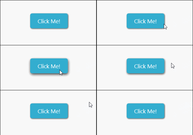
但是用DoubleAnimation去控制CompositionAPI中的动画是很不好的,Composition有自己的Animation系统,我们将会在下一篇文章中一起给DropShadowPanel附加隐式(过渡)动画。
下面是完整的代码:
<Style TargetType="Button" x:Key="CornerRadiusShadowButtonStyle">

    <Setter Property="Background" Value="{ThemeResource ButtonBackground}" />

    <Setter Property="Foreground" Value="{ThemeResource ButtonForeground}" />

    <Setter Property="BorderBrush" Value="Transparent" />

    <Setter Property="BorderThickness" Value="0" />

    <Setter Property="Padding" Value="20,10,20,10" />

    <Setter Property="HorizontalAlignment" Value="Left" />

    <Setter Property="VerticalAlignment" Value="Center" />

    <Setter Property="FontFamily" Value="{ThemeResource ContentControlThemeFontFamily}" />

    <Setter Property="FontWeight" Value="Normal" />

    <Setter Property="FontSize" Value="{ThemeResource ControlContentThemeFontSize}" />

    <Setter Property="UseSystemFocusVisuals" Value="True" />

    <Setter Property="FocusVisualMargin" Value="-3" />

    <Setter Property="Template">

        <Setter.Value>

            <ControlTemplate TargetType="Button">

                <Grid x:Name="RootGrid">

                    <VisualStateManager.VisualStateGroups>

                        <VisualStateGroup x:Name="CommonStates">

                            <VisualStateGroup.Transitions>

                                <VisualTransition To="Normal" >

                                    <Storyboard>

                                        <DoubleAnimation Storyboard.TargetName="Shadow" Storyboard.TargetProperty="OffsetY" To="1" Duration="0:0:0.1" EnableDependentAnimation="True" />

                                        <DoubleAnimation Storyboard.TargetName="Shadow" Storyboard.TargetProperty="BlurRadius" To="5" Duration="0:0:0.1" EnableDependentAnimation="True" />

                                    </Storyboard>

                                </VisualTransition>

                                <VisualTransition To="PointerOver" >

                                    <Storyboard>

                                        <DoubleAnimation Storyboard.TargetName="Shadow" Storyboard.TargetProperty="OffsetY" To="2" Duration="0:0:0.1" EnableDependentAnimation="True" />

                                        <DoubleAnimation Storyboard.TargetName="Shadow" Storyboard.TargetProperty="BlurRadius" To="8" Duration="0:0:0.1" EnableDependentAnimation="True" />

                                    </Storyboard>

                                </VisualTransition>

                                <VisualTransition To="Pressed" >

                                    <Storyboard>

                                        <DoubleAnimation Storyboard.TargetName="Shadow" Storyboard.TargetProperty="OffsetY" To="3" Duration="0:0:0.1" EnableDependentAnimation="True" />

                                        <DoubleAnimation Storyboard.TargetName="Shadow" Storyboard.TargetProperty="BlurRadius" To="12" Duration="0:0:0.1" EnableDependentAnimation="True" />

                                    </Storyboard>

                                </VisualTransition>

                            </VisualStateGroup.Transitions>

                            <VisualState x:Name="Normal" >

                                <Storyboard>

                                    <DoubleAnimation Storyboard.TargetName="Shadow" Storyboard.TargetProperty="OffsetY" To="1" Duration="0" EnableDependentAnimation="True" />

                                    <DoubleAnimation Storyboard.TargetName="Shadow" Storyboard.TargetProperty="BlurRadius" To="5" Duration="0" EnableDependentAnimation="True" />

                                </Storyboard>

                            </VisualState>

                            <VisualState x:Name="PointerOver">

                                <Storyboard>

                                    <DoubleAnimation Storyboard.TargetName="Shadow" Storyboard.TargetProperty="OffsetY" To="2" Duration="0" EnableDependentAnimation="True" />

                                    <DoubleAnimation Storyboard.TargetName="Shadow" Storyboard.TargetProperty="BlurRadius" To="8" Duration="0" EnableDependentAnimation="True" />

                                </Storyboard>

                            </VisualState>

                            <VisualState x:Name="Pressed">

                                <Storyboard>

                                    <DoubleAnimation Storyboard.TargetName="Shadow" Storyboard.TargetProperty="OffsetY" To="3" Duration="0" EnableDependentAnimation="True" />

                                    <DoubleAnimation Storyboard.TargetName="Shadow" Storyboard.TargetProperty="BlurRadius" To="12" Duration="0" EnableDependentAnimation="True" />

                                </Storyboard>

                            </VisualState>

                            <VisualState x:Name="Disabled">

                                <Storyboard>

                                    <ObjectAnimationUsingKeyFrames Storyboard.TargetName="Background" Storyboard.TargetProperty="Fill">

                                        <DiscreteObjectKeyFrame KeyTime="0" Value="{ThemeResource ButtonBackgroundDisabled}" />

                                    </ObjectAnimationUsingKeyFrames>

                                </Storyboard>

                            </VisualState>

                        </VisualStateGroup>

                    </VisualStateManager.VisualStateGroups>

                    <control:DropShadowPanel x:Name="Shadow" xmlns:control="using:Microsoft.Toolkit.Uwp.UI.Controls" HorizontalContentAlignment="Stretch"

                                             BlurRadius="5" ShadowOpacity="0.8" OffsetX="1" OffsetY="1" Color="Black">

                        <Rectangle x:Name="Background" Fill="{TemplateBinding Background}" HorizontalAlignment="Stretch" VerticalAlignment="Stretch" RadiusX="5" RadiusY="5" />

                    </control:DropShadowPanel>

                    <ContentPresenter x:Name="ContentPresenter"

                        BorderBrush="{TemplateBinding BorderBrush}"

                        BorderThickness="{TemplateBinding BorderThickness}"

                        Content="{TemplateBinding Content}"

                        ContentTransitions="{TemplateBinding ContentTransitions}"

                        ContentTemplate="{TemplateBinding ContentTemplate}"

                        Padding="{TemplateBinding Padding}"

                        HorizontalContentAlignment="{TemplateBinding HorizontalContentAlignment}"

                        VerticalContentAlignment="{TemplateBinding VerticalContentAlignment}"

                        AutomationProperties.AccessibilityView="Raw" />

                </Grid>

            </ControlTemplate>

        </Setter.Value>

    </Setter>

</Style>
UWP Button添加圆角阴影(二)的更多相关文章
- UWP Button添加圆角阴影(三)
原文:UWP Button添加圆角阴影(三) Composition DropShadow是CompositionAPI中的东西,使用Storyboard设置某个属性,就是频繁的触发put_xxx() ...
- UWP Button添加圆角阴影(一)
原文:UWP Button添加圆角阴影(一) 众所周知,17763之前的UWP控件,大部分是没有圆角属性的:而阴影也只有17763中的ThemeShadow可以直接在xaml中使用,之前的版本只能用D ...
- 为input输入框添加圆角并去除阴影
<input type="text" name="bianhao" value="" placeholder="请输入商品编 ...
- (二)AS给button添加点击事件
三种方法给Button添加点击事件 (一)通过button的id,添加继承View.OnClickListener的监听实现 <Button android:id="@+id/btn_ ...
- WPF之路二: button添加背景图片点击后图片闪烁问题
在为button添加背景图片的时候,点击后发现图片闪烁,我们仔细观察,其实Button不仅仅只是在点击后会闪烁,在其通过点击或按Tab键获得焦点后都会闪烁,而通过点击其他按钮或通过按Tab键让Butt ...
- [Xcode 实际操作]二、视图与手势-(5)给图像视图添加圆角效果
目录:[Swift]Xcode实际操作 本文将演示给矩形图片添加圆角效果 import UIKit class ViewController: UIViewController { override ...
- Cocos Creator 为Button添加事件的两种方法
Button添加事件 Button 目前只支持 Click 事件,即当用户点击并释放 Button 时才会触发相应的回调函数.通过脚本代码添加回调方法一这种方法添加的事件回调和使用编辑器添加的事件回调 ...
- CSS3圆角,阴影,透明
CSS实现圆角,阴影,透明的方法很多,传统的方法都比较复杂,用CSS3就方便很多了,虽然现在各浏览器对CSS3的支持还不是很好,但不久的将来CSS3就会普及. 1.圆角 CSS3实现圆角有两种方法. ...
- HackTwelve 为背景添加圆角边框
1.概要: ShapeDrawable是一个为UI控件添加特效的好工具.这个技巧适用于那些可以添加背景的控件 2.添加圆角边框其实就是添加的背景那里不是直接添加图片,而是添加一个XML文件即可 ...
随机推荐
- JS原型与原型链
1.原型(公用属性) 首先,我们来讲讲浏览器的初始状态,就是在无代码的情况下,浏览器所分配到的内存的使用情况,首先浏览器会创建一个全局对象global,而在这个全局对象global内含有许多的全局函数 ...
- html5 data-*自定义属性取值
demo: <!DOCTYPE HTML> <html> <head> <title></title> <meta http-equi ...
- ajax在jQuery中的应用 (1)加载异步数据
- 浅谈 [Ljava.lang.Object 异常
http://blog.csdn.net/goodleiwei/article/details/7059567 主要原因:取出的是对象的数组,需要遍历单个的对象并获取想用的属性值
- IDEA如何把写好的java文件/项目打包成一个jar的文件
一.命令行的方法 打开cmd,输入jar -cvf [打包后的文件名].jar [要打包的目录]. 二.IDEA的方法 写完一个java程序把它封装成一个jar的包 这样就可以在别的jar上面运行这 ...
- python学习之ansible api
Python API 2.0 从2.0的事情开始更复杂一些,但是你会得到更多离散和可读的类: #!/usr/bin/env python import json from collections im ...
- OSS 视频存储
我这里加了 封面图片 可以不理睬! 我没有存oss. 阿里的OSS 自己可以去官网下载 我这里放到 Vendor 下的. 1 # 注意这里OSS中 请设置 存储空间名称为公共的 才能直接使用这里返回的 ...
- awk 用法(转)
原文:https://www.cnblogs.com/xudong-bupt/p/3721210.html awk是行处理器: 相比较屏幕处理的优点,在处理庞大文件时不会出现内存溢出或是处理缓慢的问题 ...
- MFC连接MySQL
其实,以前弄过sql,mysql应该是顺理成章很简单的事情,但很无奈,傻傻地弄了很久,还请教了别人,别人告诉我的跟我在网上查到的都是一样的,但还是不行,归根接地就是“mysql-connector-o ...
- excel2007vba绘图1
参考:http://club.excelhome.net/thread-480025-1-1.html '----------------------------------------------- ...