知识点4: 配置echarts折线图和饼图
- 折线图
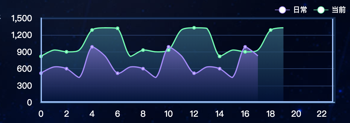
效果图
html
<template>

    <div id="v11-charts3"></div>

</template>
js
  export default {

    methods: {

      // 初始化

        init(){

            this.chart3 = echarts.init(document.getElementById('v11-charts3'));

            this.chart3.setOption(option3);

        }

      },
 option3: {

    // 直角坐标系内绘制表格

    grid: {

      show: true,

      left: 23,

      top: 25,

      right: 24,

      bottom: 14,

      borderColor: '#0a2549',

      containLabel: true,

      borderWidth: 4

    },

    // 图例组件

    legend: {

      left: 'right',

      textStyle: {

        color: '#fff'

      },

      // 图例的数据数组

      data:[

        {

          name: '日常'

        },

        {name: '当前'}

      ]

    },

    // 图例的 tooltip 配置

    tooltip: {

      show: true,

      trigger: 'axis',

      axisPointer: {

        type: 'line'

      }

    },

    // 直角坐标系 grid 中的 x 轴

    xAxis: {

      type: 'category',

      // name: '(TB)',

      nameLocation: 'start',

      nameGap: 30,

      boundaryGap: false,

      // 坐标轴轴线相关设置

      axisLine: {

        show: true,

        lineStyle: {

          color: '#6a9bcc',

          width: 2

        }

      },

      // 坐标轴刻度标签的相关设置

      axisLabel: {

        show: true,

        fontSize: 14,

        margin: 12,

        fontFamily: 'Microsoft YaHei',

        color: '#ffffff'

      },

      // 坐标轴刻度相关设置

      axisTick: {

        show: false

      },

      data: [0, 1, 2, 3, 4, 5, 6, 7, 8, 9, 10, 11, 12, 13, 14, 15, 16, 17, 18, 19, 20, 21, 22, 23]

    },

    // 直角坐标系 grid 中的 y 轴

    yAxis: {

      type: 'value',

      show: true,

      splitNumber: 4,

      //y轴颜色

      axisLine: {

        show: true,

        lineStyle: {

          color: '#99c2ff',

          width: 2

        }

      },

      axisLabel: {

        show: true,

        fontSize: 14,

        margin: 15,

        fontFamily: 'Microsoft YaHei',

        color: '#ffffff'

      },

      // 坐标轴在 grid 区域中的分隔线

      splitLine: {

        show: true,

        lineStyle: {

          color: '#294277',

          width: 1,

          type: 'solid'

        }

      },

      axisTick: {

        show: false

      }

    },

    // 系列列表

    series: [

      {

        type: 'line',

        name: '当前',

        symbolSize: 2,

        smooth: true,

        itemStyle: {

          normal: {

            color: '#00ffaa',

              // lineStyle: {

              //     color: "#2ec7c9"

              // }

            borderColor:'#00ffaa',

            borderWidth:'4',

            // 线条样式

            lineStyle: {

              normal: {

                color: '#00ffaa',

                width: 2

              }

            },

        }

      },

        // 区域填充样式

        areaStyle: {

          normal: {

            color: new echarts.graphic.LinearGradient(0, 0, 0, 1, [{

              offset: 0,

              // color: 'rgba(101, 84, 170, 0.3)' // 0% 处的颜色

              color: '#276d85'

            }, {

              offset: 1,

              // color: 'rgba(16, 27, 77, 0)' // 100% 处的颜色

              color: '#011441'

            }], false)

          }

        },

        data: [820, 932, 901, 934, 1290, 1330, 1320, 820, 932, 901, 934, 1290, 1330, 1320, 820, 932, 901, 934, 1290, 1330,]

      },

      {

        type: 'line',

        name: '日常',

        symbolSize: 2,

        smooth: true,

        //拐点样式

        itemStyle: {

          normal: {

            //本应该是拐点颜色,此处成了线条颜色,不知道啥原因

            color: '#ad85ff',

            //拐点边框颜色

            borderColor:'#ad85ff',

            borderWidth:'4',

            // 线条样式

            lineStyle: {

              normal: {

                // color: '#ac84fe',

                width: 2

              }

            },

        }

        },

        //区域样式

        areaStyle: {

          normal: {

            color: new echarts.graphic.LinearGradient(0, 0, 0, 1, [{

              offset: 0,

              // color: 'rgba(12, 42, 82, 0.8)' // 0% 处的颜色

              color: '#836bcd'

            }, {

              offset: 1,

              // color: 'rgba(3, 243, 167, 0)' // 100% 处的颜色

              color: '#00123b'

            }], false)

          }

        },

        data: [520, 632, 601, 444, 990, 830, 520, 632, 601, 444, 990, 830, 520, 632, 601, 444, 990, 830]

      }

    ]

  },
- 饼图(option配置不同)
效果图

option1: {

    series: [

      {

        type: 'pie',

        silent: true,

        radius: ['30%', '60%'],

        startAngle: 0,

        label: {

          normal: {

            show: true,

            position: 'outside',

            fontSize: 20,

            align: 'center',

            fontFamily: 'MF_LangQian',

            // formatter: '{b}',

            formatter: function(params) {

              if (params.name === '') {

                return 0 + '%'

              }

            }

          }

        },

        labelLine: {

          normal: {

            show: true,

            length: 40,

            lineStyle: {

              width: 2

            }

          }

        },

        itemStyle: {

          normal: {

            borderWidth: 3,

            borderColor: 'rgba(1,9,22,0.9)'

          },

          emphasis: {

            borderWidth: 0,

            shadowBlur: 5,

            shadowOffsetX: 0,

            shadowColor: 'rgba(0, 0, 0, 0.2)'

          }

        },

        data: [

          {

            value: 55,

            name: '0',

            itemStyle: {

              normal: {

                // 图形的颜色

                color: '#faef6f'

                // color: 'yellow'

              }

            }

          },

          {

            value: 55,

            name: '59',

            itemStyle: {

              normal: {

                color: '#00d5ff'

              }

            }

          },

          {

            value: 55,

            name: '51',

            itemStyle: {

              normal: {

                color: '#26bd59'

              }

            }

          },

          {

            value: 55,

            name: '14',

            itemStyle: {

              normal: {

                color: '#d6c956'

              }

            }

          }

        ]

      }

    ]

  }
知识点4: 配置echarts折线图和饼图的更多相关文章
- 数据可视化(Echart) :柱状图、折线图、饼图等六种基本图表的特点及适用场合
数据可视化(Echart) 柱状图.折线图.饼图等六种基本图表的特点及适用场合 参考网址 效果图 源码 <!DOCTYPE html> <html> <head> ...
- vue使用axios读取本地json文件来显示echarts折线图
编辑器:HBuilderx axios文档:http://www.axios-js.com/zh-cn/docs/ echarts实例:https://echarts.apache.org/examp ...
- 安卓图表引擎AChartEngine(三) - 示例源码折线图、饼图和柱状图
折线图: package org.achartengine.chartdemo.demo.chart; import java.util.ArrayList; import java.util.Lis ...
- 实现Echarts折线图的虚实转换
需求:医院的体温单,在统计体温时,对于正常情况下统计的体温数据,需要显示实线:对于进行物理降温后统计的体温数据,需要显示虚线. 现有的体温单是运用 Echarts 折线图,统一用实线显示.因此在这基础 ...
- HighCharts之2D柱状图、折线图和饼图的组合图
HighCharts之2D柱状图.折线图和饼图的组合图 1.实例源码 ColumnLinePie.html: <!DOCTYPE html> <html> <head&g ...
- echarts折线图动态改变数据时的一个bug
echarts折线图中当增加dataZoom,修改start大于0的时候,会出现折线混乱,变成竖直的线,绘制有问题. 解决方法,在dataZoom中增加filterMode: 'empty' http ...
- d3.js 教程 模仿echarts折线图
今天我们来仿echarts折线图,这个图在echarts是折线图堆叠,但是我用d3改造成了普通的折线图,只为了大家学习(其实在简单的写一个布局就可以).废话不多说商行代码. 1 制作 Line 类 c ...
- ECharts折线图堆叠设置为不堆叠的方法
下图是ECharts折线图堆叠的官方源码,设置折线图不堆叠只需要将每一个stack的值设置为不一样的名称或者将stack属性删除即可. option = { title: { text: '折线图堆叠 ...
- 利用pandas读取Excel表格,用matplotlib.pyplot绘制直方图、折线图、饼图
利用pandas读取Excel表格,用matplotlib.pyplot绘制直方图.折线图.饼图 数据: 折线图代码: import pandas as pdimport matplotlib. ...
随机推荐
- escape()、encodeURI()、encodeURIComponent() 编码解码
escape().encodeURI().encodeURIComponent()区别详解 JavaScript中有三个可以对字符串编码的函数,分别是: escape,encodeURI,encode ...
- 用dlopen,dlsym加载动态链接库.so中函数
代码如下 static void *findSymbol(const char *path, const char *symbol) { void *handle = dlopen(path, RTL ...
- delphi正则表达式学习笔记(三)
Delphi 中经常使用的正则表达式 在 Delphi 中使用正则表达式, 目前 PerlRegEx 应该是首选, 准备彻底而细致地研究它. 官方网站: http://www.regular-e x ...
- oracle取出多个字段列中的最大值和最小值
greatest 函数和least函数 select serverid, greatest(e.core0, e.core1, e.score2 ) from e
- gt,gte,lt,lte缩写的含义
gt: greater than 大于 gte: greater than or equal 大于等于 lt: less than 小于 lte: less than or equal 小于等于
- c# 枚举的定义,枚举的用法,获取枚举值
1.定义枚举类型 public enum Test { 男 = , 女 = } 2.获取枚举值 public void EnumsAction() { var s = Test.男;//男 var a ...
- 最小化安装CentOS 7后,图形界面的安装(GNOME、KDE等)
安装图形化界面: 1.首先安装X(X Window System),命令为 yum groupinstall "X Window System" 2.检查一下我们已经安装的软件以及 ...
- redis下操作String
redis操作string string是redis最基本的类型 最大能存储512MB数据 string类型是二进制安全的,即可以为任何数据,比如数字.图片.序列化对象等 基本命令 设置 设置键值 s ...
- Linux 搜索日志信息
在工作中我们经常要通过日志来查找问题,但有时候日志太多又不知道日志什么时候打印的,这时我们可以通过一下方法来查找: 1.进入到日志文件存放的目录下 2.grep 关键字 * 例如要查找多有有 ...
- 学习笔记:ES6
http://es6.ruanyifeng.com/ ECMAScript 6 https://frankfang.github.io/es-6-tutorials/ ES 6 新特性列表 2017- ...