
Css3实现波浪效果2
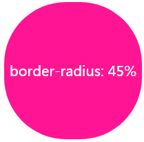
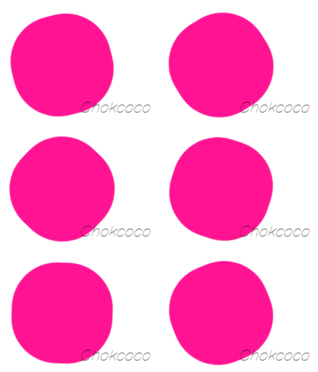
一、不规则圆,旋转实现波浪效果
  .info {

            width: 200px;

            height: 200px;

            ;

            background: #009A61;

            border-radius: 45%;

            color: white;

            text-align: center;

            line-height: 200px;

            animation: roateOne 2s linear infinite;

        }

        @keyframes roateOne {

            from {

                transform: rotate(0);

            }

            to {

                transform: rotate(180deg);

            }

        }
二、2个大圆的旋转
.info {

    height: 100vh;

    align-items: center;

    position: relative;

    border: 1px solid red;

    background-color: rgb(118, 218, 255);

    overflow: hidden;

}

.info::before,

.info::after {

    content: "";

    position: absolute;

    left: 50%;

    min-width: 300vw;

    min-height: 300vw;

    background: #fff;

    animation: roateOne 10s linear infinite;

}

.info::before {

    bottom: 15vh;

    border-radius: 45%;

}

.info::after {

    bottom: 12vh;

    opacity: 0.5;

    border-radius: 47%;

}

@keyframes roateOne {

    0% {

        transform: translate(-50%, 0) rotateZ(0deg);

    }

    50% {

        transform: translate(-50%, -2%) rotateZ(180deg);

    }

    100% {

        transform: translate(-50%, 0%) rotateZ(360deg);

    }

}

三、常见样式
.container {

    position: absolute;

    width: 200px;

    height: 200px;

    padding: 5px;

    border: 5px solid rgb(118, 218, 255);

    left: 50%;

    top: 50%;

    transform: translate(-50%, -50%);

    border-radius: 50%;

    overflow: hidden;

}

.info {

    width: 200px;

    height: 200px;

    position: relative;

    background-color: rgb(118, 218, 255);

    border-radius: 50%;

    overflow: hidden;

}

.info::before,

.info::after {

    content: "";

    position: absolute;

    left: 50%;

    min-width: 400px;

    min-height: 400px;

    background: #fff;

    animation: roateOne 10s linear infinite;

}

.info::before {

    bottom: 50px;

    border-radius: 45%;

}

.info::after {

    bottom: 40px;

    opacity: 0.5;

    border-radius: 47%;

}

@keyframes roateOne {

    0% {

        transform: translate(-50%, 0) rotateZ(0deg);

    }

    50% {

        transform: translate(-50%, -2%) rotateZ(180deg);

    }

    100% {

        transform: translate(-50%, 0%) rotateZ(360deg);

    }

}
    <div class="container">

        <div class="info">

            Wave

        </div>

    </div>
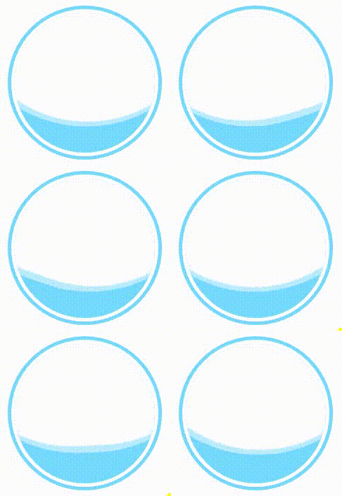
显示效果:
更多:
HTML5 background-color和background-image问题共用问题
Css3实现波浪效果2的更多相关文章
- Css3实现波浪效果3-静态波纹
一.外框宽度等比例3个椭圆拼合 .container { position: absolute; width: 400px; height: 200px; border: 5px solid rgb( ...
- Image Wall - jQuery & CSS3 图片墙效果
今天我们要为您展示如何基于 jQuery 和 CSS3 创建一个整洁的图片墙效果.我们的想法是在页面上洒上一些大小不同的缩略图,并在当我们点击图片时候显示丝带,会显示一些描述,再次点击缩略图时,丝带将 ...
- css3的transition效果和transfor效果
<!doctype html> <html> <head> <meta charset="utf-8" /> <title&g ...
- Canvas之动态波浪效果_陈在真Sunny_chen_新浪博客
Canvas之动态波浪效果_陈在真Sunny_chen_新浪博客 Canvas之动态波浪效果 (2012-04-26 09:04:51) 转载▼
- css3幻灯片换位效果
<title>css3幻灯片换位效果</title> <style type="text/css"> .flowGallery {width: ...
- 第八十节,CSS3边框图片效果
CSS3边框图片效果 学习要点: 1.属性初探 2.属性解释 3.简写和版本 本章主要探讨HTML5中CSS3中边框图片背景的效果,通过这个新属性让边框更加的丰富多彩. 一.属性解释 CSS3 ...
- 纯 CSS 实现波浪效果!
一直以来,使用纯 CSS 实现波浪效果都是十分困难的. 因为实现波浪的曲线需要借助贝塞尔曲线. 而使用纯 CSS 的方式,实现贝塞尔曲线,额,暂时是没有很好的方法. 当然,借助其他力量(SVG.CAN ...
- html+css3实现长方体效果
网上大都是正方体的效果,由于做一个东西需要,写了一个HTML+css3实现的长方体,有需要的也可以看看. 2017-07-25 21:30:23 h ...
- iOS 波浪效果的实现
iOS 波浪效果的实现 p.p1 { margin: 0.0px 0.0px 0.0px 0.0px; font: 14.0px Menlo; color: #4f8187; background-c ...
随机推荐
- 【原创】java socket 和.net socket 通讯 demo
结束符协议"##" import java.io.BufferedReader; import java.io.IOException; import java.io.InputS ...
- Android ADB命令 adb devices 出现error:protocol fault (no status)
问题背景:安装apk是报error:protocol fault<no status>或error:device not found手机驱动有问题 出现的问题如下:adb devices ...
- orleans exception序列化
options.FallbackSerializationProvider = typeof(ILBasedSerializer).GetTypeInfo();
- RFC2616-HTTP1.1-Status Code(状态码规定部分—单词注释版)
part of Hypertext Transfer Protocol -- HTTP/1.1RFC 2616 Fielding, et al. 10 Status Code Definitions ...
- shell delete with line number
If you want to delete lines 5 through 10 and 12: sed -e '5,10d;12d' file This will print the results ...
- 51Nod.1766.树上最远点对(树的直径 RMQ 线段树/ST表)
题目链接 \(Description\) 给定一棵树.每次询问给定\(a\sim b,c\sim d\)两个下标区间,从这两个区间中各取一个点,使得这两个点距离最远.输出最远距离. \(n,q\leq ...
- GCC卡常
#pragma GCC optimize("Ofast,no-stack-protector") #pragma GCC optimize("-funsafe-loop- ...
- Struts2网页面传值两种方式
第一种方式: /** 列表 */ public String list() throws Exception { List<Role> roleList = roleService.fin ...
- Python爱好者社区历史文章列表(每周append更新一次)
2月22日更新: 0.Python从零开始系列连载: Python从零开始系列连载(1)——安装环境 Python从零开始系列连载(2)——jupyter的常用操作 Python从零开始系列连载( ...
- python系统编程(十一)
同步应用 多个线程有序执行 from threading import Thread,Lock from time import sleep class Task1(Thread): def run( ...