WPF 自定义标题栏
在做客户端应用程序时,往往觉得Windows自带的标题栏没有样式,不太好看,下面分享自自定义的一个Windows工具
效果图: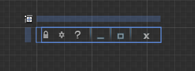
<Style x:Key="Buttonclock" TargetType="{x:Type Button}">

            <Setter Property="Template">

                <Setter.Value>

                    <ControlTemplate TargetType="{x:Type Button}">

                        <Grid Width="">

                            <Border BorderThickness=""/>

                            <ContentPresenter x:Name="contentPresenter" HorizontalAlignment="{TemplateBinding HorizontalContentAlignment}" RecognizesAccessKey="True" SnapsToDevicePixels="{TemplateBinding SnapsToDevicePixels}" VerticalAlignment="{TemplateBinding VerticalContentAlignment}" Opacity="0.7"/>

                        </Grid>

                        <ControlTemplate.Triggers>

                            <Trigger Property="IsFocused" Value="True"/>

                            <Trigger Property="IsDefaulted" Value="True"/>

                            <Trigger Property="IsMouseOver" Value="True">

                                <Setter Property="Opacity" TargetName="contentPresenter" Value=""/>

                            </Trigger>

                            <Trigger Property="IsMouseOver" Value="False">

                                <Setter Property="Opacity" TargetName="contentPresenter" Value="0.7"/>

                            </Trigger>

                            <Trigger Property="IsPressed" Value="True">

                                <Setter Property="Opacity" TargetName="contentPresenter" Value=""/>

                            </Trigger>

                            <Trigger Property="IsEnabled" Value="False"/>

                        </ControlTemplate.Triggers>

                    </ControlTemplate>

                </Setter.Value>

            </Setter>

        </Style>
<Style x:Key="Buttonmini_minwindow" TargetType="{x:Type Button}">

            <Setter Property="Template">

                <Setter.Value>

                    <ControlTemplate TargetType="{x:Type Button}">

                        <ControlTemplate.Resources>

                            <Storyboard x:Key="Sbmini1">

                                <ObjectAnimationUsingKeyFrames Storyboard.TargetProperty="(UIElement.Visibility)" Storyboard.TargetName="rectangle">

                                    <DiscreteObjectKeyFrame KeyTime="" Value="{x:Static Visibility.Visible}"/>

                                </ObjectAnimationUsingKeyFrames>

                                <DoubleAnimationUsingKeyFrames Storyboard.TargetProperty="(UIElement.Opacity)" Storyboard.TargetName="rectangle">

                                    <EasingDoubleKeyFrame KeyTime="" Value=""/>

                                    <EasingDoubleKeyFrame KeyTime="0:0:0.2" Value=""/>

                                </DoubleAnimationUsingKeyFrames>

                                <DoubleAnimationUsingKeyFrames Storyboard.TargetProperty="(UIElement.Opacity)" Storyboard.TargetName="contentPresenter">

                                    <EasingDoubleKeyFrame KeyTime="" Value="0.6"/>

                                    <EasingDoubleKeyFrame KeyTime="0:0:0.2" Value=""/>

                                </DoubleAnimationUsingKeyFrames>

                            </Storyboard>

                            <Storyboard x:Key="Sbmini2">

                                <ObjectAnimationUsingKeyFrames Storyboard.TargetProperty="(UIElement.Visibility)" Storyboard.TargetName="rectangle">

                                    <DiscreteObjectKeyFrame KeyTime="0:0:0.2" Value="{x:Static Visibility.Visible}"/>

                                </ObjectAnimationUsingKeyFrames>

                                <DoubleAnimationUsingKeyFrames Storyboard.TargetProperty="(UIElement.Opacity)" Storyboard.TargetName="rectangle">

                                    <SplineDoubleKeyFrame KeyTime="" Value=""/>

                                    <SplineDoubleKeyFrame KeyTime="0:0:0.2" Value=""/>

                                </DoubleAnimationUsingKeyFrames>

                                <DoubleAnimationUsingKeyFrames Storyboard.TargetProperty="(UIElement.Opacity)" Storyboard.TargetName="contentPresenter">

                                    <SplineDoubleKeyFrame KeyTime="" Value=""/>

                                    <SplineDoubleKeyFrame KeyTime="0:0:0.2" Value="0.6"/>

                                </DoubleAnimationUsingKeyFrames>

                            </Storyboard>

                        </ControlTemplate.Resources>

                        <Grid>

                            <Rectangle x:Name="rectangle" RadiusX="" Stroke="{x:Null}" Height="" Width="" Visibility="Hidden">

                                <Rectangle.Fill>

                                    <LinearGradientBrush EndPoint="0.5,1" StartPoint="0.5,0">

                                        <GradientStop Color="#003099E2" Offset=""/>

                                        <GradientStop Color="#67FDFDFD" Offset="0.072"/>

                                    </LinearGradientBrush>

                                </Rectangle.Fill>

                            </Rectangle>

                            <ContentPresenter x:Name="contentPresenter" HorizontalAlignment="{TemplateBinding HorizontalContentAlignment}" RecognizesAccessKey="True" SnapsToDevicePixels="{TemplateBinding SnapsToDevicePixels}" VerticalAlignment="{TemplateBinding VerticalContentAlignment}" Opacity="0.6"/>

                            <Border BorderBrush="Black" BorderThickness="" Opacity="">

                                <Border.Background>

                                    <RadialGradientBrush>

                                        <GradientStop Color="#00000000" Offset=""/>

                                        <GradientStop Color="White" Offset=""/>

                                    </RadialGradientBrush>

                                </Border.Background>

                            </Border>

                        </Grid>

                        <ControlTemplate.Triggers>

                            <Trigger Property="IsDefaulted" Value="True"/>

                            <Trigger Property="IsMouseOver" Value="True">

                                <Trigger.ExitActions>

                                    <BeginStoryboard x:Name="Sbmini2_BeginStoryboard" Storyboard="{StaticResource Sbmini2}"/>

                                </Trigger.ExitActions>

                                <Trigger.EnterActions>

                                    <BeginStoryboard Storyboard="{StaticResource Sbmini1}"/>

                                </Trigger.EnterActions>

                            </Trigger>

                            <Trigger Property="IsMouseOver" Value="False"/>

                            <Trigger Property="IsPressed" Value="True">

                                <Setter Property="Margin" TargetName="contentPresenter" Value=""/>

                                <Setter Property="Visibility" TargetName="rectangle" Value="Visible"/>

                                <Setter Property="Fill" TargetName="rectangle">

                                    <Setter.Value>

                                        <LinearGradientBrush EndPoint="0.5,1" StartPoint="0.5,0">

                                            <GradientStop Color="#003099E2" Offset=""/>

                                            <GradientStop Color="#671F1F1F" Offset="0.072"/>

                                        </LinearGradientBrush>

                                    </Setter.Value>

                                </Setter>

                            </Trigger>

                            <Trigger Property="IsEnabled" Value="False"/>

                        </ControlTemplate.Triggers>

                    </ControlTemplate>

                </Setter.Value>

            </Setter>

        </Style>
<Style x:Key="Buttonclose_mainwidow" TargetType="{x:Type Button}">

            <Setter Property="Template">

                <Setter.Value>

                    <ControlTemplate TargetType="{x:Type Button}">

                        <ControlTemplate.Resources>

                            <Storyboard x:Key="sbstory1">

                                <DoubleAnimationUsingKeyFrames Storyboard.TargetProperty="(UIElement.Opacity)" Storyboard.TargetName="rectangle">

                                    <EasingDoubleKeyFrame KeyTime="" Value=""/>

                                    <EasingDoubleKeyFrame KeyTime="0:0:0.2" Value=""/>

                                </DoubleAnimationUsingKeyFrames>

                                <DoubleAnimationUsingKeyFrames Storyboard.TargetProperty="(UIElement.Opacity)" Storyboard.TargetName="image">

                                    <EasingDoubleKeyFrame KeyTime="" Value="0.6"/>

                                    <EasingDoubleKeyFrame KeyTime="0:0:0.2" Value=""/>

                                </DoubleAnimationUsingKeyFrames>

                            </Storyboard>

                            <Storyboard x:Key="sbstory2">

                                <DoubleAnimationUsingKeyFrames Storyboard.TargetProperty="(UIElement.Opacity)" Storyboard.TargetName="image">

                                    <EasingDoubleKeyFrame KeyTime="" Value=""/>

                                    <EasingDoubleKeyFrame KeyTime="0:0:0.2" Value="0.6"/>

                                </DoubleAnimationUsingKeyFrames>

                                <DoubleAnimationUsingKeyFrames Storyboard.TargetProperty="(UIElement.Opacity)" Storyboard.TargetName="rectangle">

                                    <EasingDoubleKeyFrame KeyTime="" Value=""/>

                                    <EasingDoubleKeyFrame KeyTime="0:0:0.2" Value=""/>

                                </DoubleAnimationUsingKeyFrames>

                            </Storyboard>

                        </ControlTemplate.Resources>

                        <Grid>

                            <Rectangle x:Name="rectangle" Margin="-12.167,0,0,-9.167" RadiusY="5.5" RadiusX="" Stroke="#FF379FE6" StrokeThickness="" Width="Auto" Clip="M12.167,0 L54.167,0 L54.167,20 L12.167,20 z" Opacity="">

                                <Rectangle.Fill>

                                    <LinearGradientBrush EndPoint="0.5,1" StartPoint="0.5,0">

                                        <GradientStop Color="#99D91A1D" Offset="0.396"/>

                                        <GradientStop Color="#00D91A1D" Offset="0.726"/>

                                        <GradientStop Color="#7FFE5B5E"/>

                                        <GradientStop Color="#BFD6070B" Offset="0.104"/>

                                    </LinearGradientBrush>

                                </Rectangle.Fill>

                            </Rectangle>

                            <Image Source="/PermissionsDemo;component/image/csmmainwidow_Images/icons92.png" Stretch="None" Height="" Width="" Margin="0,0,0,-3" Opacity="" Visibility="Hidden"/>

                            <ContentPresenter HorizontalAlignment="{TemplateBinding HorizontalContentAlignment}" RecognizesAccessKey="True" SnapsToDevicePixels="{TemplateBinding SnapsToDevicePixels}" VerticalAlignment="{TemplateBinding VerticalContentAlignment}"  Content="" />

                            <Image x:Name="image" Margin="0,0,0,-3" Source="/PermissionsDemo;component/image/csmmainwidow_Images/icons85.png" Stretch="None" Width="" Height="" Visibility="Visible" Opacity="0.6"/>

                        </Grid>

                        <ControlTemplate.Triggers>

                            <Trigger Property="IsFocused" Value="True"/>

                            <Trigger Property="IsDefaulted" Value="True"/>

                            <Trigger Property="IsMouseOver" Value="True">

                                <Trigger.ExitActions>

                                    <BeginStoryboard x:Name="sbstory2_BeginStoryboard" Storyboard="{StaticResource sbstory2}"/>

                                </Trigger.ExitActions>

                                <Trigger.EnterActions>

                                    <BeginStoryboard Storyboard="{StaticResource sbstory1}"/>

                                </Trigger.EnterActions>

                            </Trigger>

                            <Trigger Property="IsMouseOver" Value="False"/>

                            <Trigger Property="IsPressed" Value="True">

                                <Setter Property="Opacity" TargetName="rectangle" Value="0.8"/>

                                <Setter Property="Margin" TargetName="image" Value="1,0,0,-4"/>

                            </Trigger>

                            <Trigger Property="IsEnabled" Value="False"/>

                        </ControlTemplate.Triggers>

                    </ControlTemplate>

                </Setter.Value>

            </Setter>

        </Style>
<Grid x:Name="LayoutRoot" Width="" Height="">

        <DockPanel LastChildFill="False" HorizontalAlignment="Right" Height="">

            <Button Style="{StaticResource Buttonclock}">

                <Image Source="/PermissionsDemo;component/image/csmmainwidow_Images/icons96.png" Stretch="Fill" Width="" Height="" RenderOptions.BitmapScalingMode="NearestNeighbor"  />

            </Button>

            <Button Style="{StaticResource Buttonclock}" Margin="12,0,0,0">

                <Image Source="/PermissionsDemo;component/image/csmmainwidow_Images/icons95.png" Stretch="Fill" Width="" Height="" RenderOptions.BitmapScalingMode="NearestNeighbor"  />

            </Button>

            <Button Style="{StaticResource Buttonclock}" Margin="12,0">

                <Image Height="" Source="/PermissionsDemo;component/image/csmmainwidow_Images/question.png" Stretch="Fill" Width="" RenderOptions.BitmapScalingMode="NearestNeighbor" />

            </Button>

            <Border BorderBrush="#66FFFFFF" BorderThickness="1,0" Width="">

                <Border.OpacityMask>

                    <LinearGradientBrush EndPoint="0.5,1" StartPoint="0.5,0">

                        <GradientStop Color="#99000000" Offset="0.323"/>

                        <GradientStop Offset=""/>

                    </LinearGradientBrush>

                </Border.OpacityMask>

                <Border.Background>

                    <LinearGradientBrush EndPoint="0.5,1" StartPoint="0.5,0">

                        <GradientStop Color="#FF25679B" Offset=""/>

                        <GradientStop Color="#002B72A9" Offset=""/>

                        <GradientStop Color="#FF2975AF" Offset="0.6"/>

                    </LinearGradientBrush>

                </Border.Background>

            </Border>

            <Button  Margin="" Style="{StaticResource Buttonmini_minwindow}" Width="" VerticalAlignment="Center">

                <Rectangle Fill="#FFF4F4F5" Height="" VerticalAlignment="Bottom" Stroke="#C021698F" Width="" Margin="0,10,0,0"/>

            </Button>

            <Border BorderBrush="#66FFFFFF" BorderThickness="1,0" Width="">

                <Border.OpacityMask>

                    <LinearGradientBrush EndPoint="0.5,1" StartPoint="0.5,0">

                        <GradientStop Color="#99000000" Offset="0.323"/>

                        <GradientStop Offset=""/>

                    </LinearGradientBrush>

                </Border.OpacityMask>

                <Border.Background>

                    <LinearGradientBrush EndPoint="0.5,1" StartPoint="0.5,0">

                        <GradientStop Color="#FF25679B" Offset=""/>

                        <GradientStop Color="#002B72A9" Offset=""/>

                        <GradientStop Color="#FF2975AF" Offset="0.6"/>

                    </LinearGradientBrush>

                </Border.Background>

            </Border>

            <Button  Margin="" Style="{StaticResource Buttonmini_minwindow}" Width="" VerticalAlignment="Center">

                <Path Data="M2.5,2.5 L2.5,6.5 7.5,6.5 7.5,2.5 z M0.5,0.5 L9.5,0.5 9.5,8.5 0.5,8.5 z" HorizontalAlignment="Center" Height="" Stretch="Fill" VerticalAlignment="Center" Width="" Stroke="#C021698F" Margin="0,4,0,0">

                    <Path.Fill>

                        <LinearGradientBrush EndPoint="0.5,1" StartPoint="0.5,0">

                            <GradientStop Color="#FFE7E7E7" Offset=""/>

                            <GradientStop Color="WhiteSmoke"/>

                        </LinearGradientBrush>

                    </Path.Fill>

                </Path>

            </Button>

            <Border BorderBrush="#66FFFFFF" BorderThickness="1,0" Width="">

                <Border.OpacityMask>

                    <LinearGradientBrush EndPoint="0.5,1" StartPoint="0.5,0">

                        <GradientStop Color="#99000000" Offset="0.323"/>

                        <GradientStop Offset=""/>

                    </LinearGradientBrush>

                </Border.OpacityMask>

                <Border.Background>

                    <LinearGradientBrush EndPoint="0.5,1" StartPoint="0.5,0">

                        <GradientStop Color="#FF25679B" Offset=""/>

                        <GradientStop Color="#002B72A9" Offset=""/>

                        <GradientStop Color="#FF2975AF" Offset="0.6"/>

                    </LinearGradientBrush>

                </Border.Background>

            </Border>

            <Button RenderOptions.BitmapScalingMode="NearestNeighbor" Content="Button" HorizontalAlignment="Center" Margin="0,-1,0,0" Style="{StaticResource Buttonclose_mainwidow}" Width=""/>

        </DockPanel>

    </Grid>
由于自己初学WPF,代码中可能有点冗余。
下面是工具栏中图片资源: mainwidow_Images.7z
页面资源文件源码:Titel.7z
WPF 自定义标题栏的更多相关文章
- WPF 自定义标题栏 自定义菜单栏
自定义标题栏 自定义列表,可以直接修改WPF中的ListBox模板,也用这样类似的效果.但是ListBox是不能设置默认选中状态的. 而我们需要一些复杂的UI效果,还是直接自定义控件来的快 GitHu ...
- WPF中自定义标题栏时窗体最大化处理之WindowChrome
注意: 本文方法基础是WindowChrome,而WindowChrome在.NET Framework 4.5之后才集成发布的.见:WindowChrome Class 在.NET Framewor ...
- WPF 自定义柱状图 BarChart
WPF 自定义柱状图 当前的Telerik控件.DevExpress控件在图表控件方面做得不错,但是有时项目中需要特定的样式,不是只通过修改图表的模板和样式就能实现的. 或者说,通过修改当前的第三方控 ...
- WPF 自定义 MessageBox (相对完善版)
WPF 自定义 MessageBox (相对完善版) 基于WPF的自定义 MessageBox. 众所周知WPF界面美观.大多数WPF元素都可以简单的修改其样式,从而达到程序的风格统一.可是当 ...
- WPF 自定义 MessageBox (相对完善版 v1.0.0.6)
基于WPF的自定义 MessageBox. 众所周知WPF界面美观.大多数WPF元素都可以简单的修改其样式,从而达到程序的风格统一.可是当你不得不弹出一个消息框通知用户消息时(虽然很不建议在程序中频繁 ...
- wpf 自定义窗口,最大化时覆盖任务栏解决方案
原文:wpf 自定义窗口,最大化时覆盖任务栏解决方案 相信很多人使用wpf时会选择自定义美观的窗口,因此会设置WindowStyle="None" 取消自带的标题栏.但这样使用 W ...
- UWP中实现自定义标题栏
UWP中实现自定义标题栏 0x00 起因 在UWP开发中,有时候我们希望实现自定义标题栏,例如在标题栏中加入搜索框.按钮之类的控件.搜了下资料居然在一个日文网站找到了一篇介绍这个主题的文章: http ...
- 【Win10开发】自定义标题栏
UWP 现在已经可以自定义标题栏了,毕竟看灰色时间长了也会厌烦,开发者们还是希望能够将自己的UI做的更加漂亮,更加与众不同.那么废话不多说,我们开始吧! 首先要了解ApplicationViewTit ...
- Android开发-取消程序标题栏或自定义标题栏
注:本文由Colin撰写,版权所有!转载请注明原文地址,谢谢合作! 在Android开发中,跟据需要我们有时候需要自定义应用程序的标题栏或者取消程序的标题栏,下面本菜鸟在此记录与分享一下自己使用的方法 ...
随机推荐
- Grid (read-only) objects and methods (client-side reference)获取子表单对象的一些方法 Crm 2016
https://msdn.microsoft.com/en-us/library/dn932126.aspx#BKMK_GridControl Updated: November 29, 2016 A ...
- jquery换肤
<script src="script/jquery-2.1.0.js"></script> <link href="style/ ...
- iOS 之 UICollectionView
1. iOS 之 UICollectionView 之 原理介绍 2. iOS 之 UICollectionView 之 开发步骤 之 OC 3. iOS 之 UICollectionView 之 开 ...
- ViewSwitcher的功能与用法
ViewSwtcher代表了视图切换组件,它本身继承了FrameLayout,因此可以将多个View层叠在一起,每次只显示一个组件.当程序控制从一个View切换到另一个View时,ViewSwitch ...
- Pomelo的Protobuf
pomelo的protobuf实现,借助了javascript的动态性,使得应用程序可以在运行时解析proto文件,不需要进行proto文件的编译.pomelo的实现中,为了更方便地解析proto文件 ...
- js冒泡排序及计算其运行时间
<!DOCTYPE html><html lang="en"><head> <meta charset="UTF-8" ...
- 基于Ubuntu 14.04构建mysql5.6 Docker镜像
我们的目的是创建一个基于Ubuntu 14.04 的MySQL的 Docker Image,并且在新创建出来的容器里自动启动MySQL服务接受外部连接 步骤: 1. 首先创建一个目录并在目录下创建一个 ...
- POJ2479(dp)
Maximum sum Time Limit: 1000MS Memory Limit: 65536K Total Submissions: 39089 Accepted: 12221 Des ...
- PowerPoint实用知识
纯手打,可能有错别字,使用的版本是office2013 转载请注明出处 http://www.cnblogs.com/hnnydxgjj/p/6347256.html ,谢谢 母版的使用 制作PPT的 ...
- IOS学习之block代码块
前言: block这个名词对于做一般开发者来说可能会觉得稀奇古怪而非常陌生,但是对于iOS工程师来说,在整个开发中到处都是它的影子,今天一大早觉得在假期学习一下它,对明年的iOS开发工作做个准备,突然 ...