Angular Material 18+ 高级教程 – 大杂烩
前言
本篇记入一些 Angular Material 的小东西。
Override Material Icon Button Size
参考:Stack Overflow – Change size of mat-icon-button
通常当我们想修改 size 的时候,第一个想法是改它的 density。
但是 density 只能缩小,不能放大,所以,要放大还得用上一些黑魔法。
常见的黑魔法 (override Material styles) 有好几招:
第一招是 override CSS variables,这是最安全有效的方式,但是 Angular Material 不一定有提供。
第二招就是 ::ng-deep 或者全局 styles.scss。
我们来看一个具体例子
<button class="close-btn" mat-icon-button aria-label="Close">

  <mat-icon class="icon" fontIcon="close" />

</button>
上面这是一个 icon button。

默认 size 是 48px。
我们拆开来一个一个看,
首先 button 是 48px 然后带 padding 12px
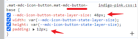
所以里面扣到来 icon 是 24px

除了 button size 是 CSS variable 其它都是属性值,那我们一次换到完呗。
.close-btn {

  --size: 256px;

  --mdc-icon-button-state-layer-size: var(--size);

  --mdc-icon-button-icon-size: calc(var(--size) / 2);

  padding: calc(var(--size) / 4);

  .icon {

    font-size: calc(var(--size) / 2);

    width: calc(var(--size) / 2);

    height: calc(var(--size) / 2);

  }

}
效果

虽然看上去是 ok 了,但其实还有一条落网之鱼


这个 element 的 class 没有 _ngcontent-ng-xxxx 所以我们要用 ::ng-deep 才能修改它。
.close-btn {

  --size: 256px;

  ::ng-deep .mat-mdc-button-touch-target {

    width: var(--size);

    height: var(--size);

  }

}
搞定,最后封装起来。
@mixin set-mat-icon-button-size($size) {

  --size: #{$size};

  --mdc-icon-button-state-layer-size: var(--size);

  --mdc-icon-button-icon-size: calc(var(--size) / 2);

  padding: calc(var(--size) / 4);

  mat-icon {

    font-size: calc(var(--size) / 2);

    width: calc(var(--size) / 2);

    height: calc(var(--size) / 2);

  }

  ::ng-deep .mat-mdc-button-touch-target {

    width: var(--size);

    height: var(--size);

  }

}

.close-btn {

  @include set-mat-icon-button-size(256px);

}
scale vs density
scale 指的是整个组件的每一个部分都同比例 scale。
比如 icon button 的话,那就是 padding 和 icon size 一起 scale。
通常整体 scale up 体验是正确的,但反过来整体 scale down 则是错误的。
因为主体不能太小丫,所以遇到这种情况应该使用 density 而不是 scale down。
density 和 scale down 是不同的,density 只会缩小空间 (e.g. padding) 尺寸,不改变主体 (e.g. icon) 尺寸。
总结:想让 icon button 变大可以用上面的 scale up 方法,想让 icon button 变小,请使用 built-in 的 density。
Override Material Button Color
默认情况下 Material Button 的颜色是由 primary theme 决定的。
$color-theme: mat.define-theme(

  (

    color: (

      theme-type: light,

      primary: mat.$blue-palette,

      tertiary: mat.$green-palette,

    ),

  )

);
效果

假如这些 button 被放到一个 background-color: primary 的 toolbar 里,它的 contrast 就毁了。
background-color: mat.get-theme-color($color-theme, 'primary');
效果

这种情况下,我们需要把的 button color 从原本的 primary 变成 on-primary,这样 contrast 才会正确。
首先,我们可以通过
:root {

  @include mat.button-base($base-theme);

  @include mat.button-color($color-theme);

}
加上
ng build
获取到所有和 button 有关的 color variables,这样我们就知道要修改什么了。


:root {

  --mdc-text-button-container-shape: 9999px;

  --mdc-protected-button-container-shape: 9999px;

  --mdc-filled-button-container-shape: 9999px;

  --mdc-outlined-button-outline-width: 1px;

  --mdc-outlined-button-container-shape: 9999px;

  --mat-text-button-horizontal-padding: 12px;

  --mat-text-button-with-icon-horizontal-padding: 16px;

  --mat-text-button-icon-spacing: 8px;

  --mat-text-button-icon-offset: -4px;

  --mat-protected-button-horizontal-padding: 24px;

  --mat-protected-button-icon-spacing: 8px;

  --mat-protected-button-icon-offset: -8px;

  --mat-filled-button-horizontal-padding: 24px;

  --mat-filled-button-icon-spacing: 8px;

  --mat-filled-button-icon-offset: -8px;

  --mat-outlined-button-horizontal-padding: 24px;

  --mat-outlined-button-icon-spacing: 8px;

  --mat-outlined-button-icon-offset: -8px;

  --mdc-text-button-label-text-color: #343dff;

  --mdc-text-button-disabled-label-text-color: rgba(27, 27, 31, 0.38);

  --mdc-protected-button-container-elevation-shadow:

    0px 2px 1px -1px rgba(0, 0, 0, 0.2),

    0px 1px 1px 0px rgba(0, 0, 0, 0.14),

    0px 1px 3px 0px rgba(0, 0, 0, 0.12);

  --mdc-protected-button-disabled-container-elevation-shadow:

    0px 0px 0px 0px rgba(0, 0, 0, 0.2),

    0px 0px 0px 0px rgba(0, 0, 0, 0.14),

    0px 0px 0px 0px rgba(0, 0, 0, 0.12);

  --mdc-protected-button-focus-container-elevation-shadow:

    0px 2px 1px -1px rgba(0, 0, 0, 0.2),

    0px 1px 1px 0px rgba(0, 0, 0, 0.14),

    0px 1px 3px 0px rgba(0, 0, 0, 0.12);

  --mdc-protected-button-hover-container-elevation-shadow:

    0px 3px 3px -2px rgba(0, 0, 0, 0.2),

    0px 3px 4px 0px rgba(0, 0, 0, 0.14),

    0px 1px 8px 0px rgba(0, 0, 0, 0.12);

  --mdc-protected-button-pressed-container-elevation-shadow:

    0px 2px 1px -1px rgba(0, 0, 0, 0.2),

    0px 1px 1px 0px rgba(0, 0, 0, 0.14),

    0px 1px 3px 0px rgba(0, 0, 0, 0.12);

  --mdc-protected-button-container-color: #fffbff;

  --mdc-protected-button-label-text-color: #343dff;

  --mdc-protected-button-disabled-container-color: rgba(27, 27, 31, 0.12);

  --mdc-protected-button-disabled-label-text-color: rgba(27, 27, 31, 0.38);

  --mdc-filled-button-container-color: #343dff;

  --mdc-filled-button-label-text-color: #ffffff;

  --mdc-filled-button-disabled-container-color: rgba(27, 27, 31, 0.12);

  --mdc-filled-button-disabled-label-text-color: rgba(27, 27, 31, 0.38);

  --mdc-outlined-button-disabled-outline-color: rgba(27, 27, 31, 0.12);

  --mdc-outlined-button-disabled-label-text-color: rgba(27, 27, 31, 0.38);

  --mdc-outlined-button-label-text-color: #343dff;

  --mdc-outlined-button-outline-color: #777680;

  --mat-text-button-state-layer-color: #343dff;

  --mat-text-button-disabled-state-layer-color: #46464f;

  --mat-text-button-ripple-color: rgba(52, 61, 255, 0.12);

  --mat-text-button-hover-state-layer-opacity: 0.08;

  --mat-text-button-focus-state-layer-opacity: 0.12;

  --mat-text-button-pressed-state-layer-opacity: 0.12;

  --mat-protected-button-state-layer-color: #343dff;

  --mat-protected-button-disabled-state-layer-color: #46464f;

  --mat-protected-button-ripple-color: rgba(52, 61, 255, 0.12);

  --mat-protected-button-hover-state-layer-opacity: 0.08;

  --mat-protected-button-focus-state-layer-opacity: 0.12;

  --mat-protected-button-pressed-state-layer-opacity: 0.12;

  --mat-filled-button-state-layer-color: #ffffff;

  --mat-filled-button-disabled-state-layer-color: #46464f;

  --mat-filled-button-ripple-color: rgba(255, 255, 255, 0.12);

  --mat-filled-button-hover-state-layer-opacity: 0.08;

  --mat-filled-button-focus-state-layer-opacity: 0.12;

  --mat-filled-button-pressed-state-layer-opacity: 0.12;

  --mat-outlined-button-state-layer-color: #343dff;

  --mat-outlined-button-disabled-state-layer-color: #46464f;

  --mat-outlined-button-ripple-color: rgba(52, 61, 255, 0.12);

  --mat-outlined-button-hover-state-layer-opacity: 0.08;

  --mat-outlined-button-focus-state-layer-opacity: 0.12;

  --mat-outlined-button-pressed-state-layer-opacity: 0.12;

}
我们拿 basic button 作为例子,和 color 有关的 variables 有
--mdc-text-button-label-text-color

--mat-text-button-state-layer-color

--mat-text-button-ripple-color

--mdc-text-button-disabled-label-text-color;

--mat-text-button-disabled-state-layer-color;
最后两个是和 disabled 相关的,我们简化一些,就不管 disabled 的 color 了,关注头三个就好了。
/* 1. button color 改用 on-primary,在 bg primary color 下,contrast 就出的来  */

$btn-color: mat.get-theme-color($color-theme, 'on-primary');

/* 2. 把颜色拆分,因为下面要搭配 alpha */

$btn-color-value: #{color.hue($btn-color)} #{color.saturation($btn-color)} #{color.lightness($btn-color)};

/* 3. 为了方便打理,把 SCSS variables 放入 CSS variables */

--btn-color: #{$btn-color};

--btn-color-value: #{$btn-color-value};

/* 4. 接着就可以换颜色了 */

--mdc-text-button-label-text-color: var(--btn-color);

--mat-text-button-state-layer-color: var(--btn-color);

/* 5. Ripple color 需要搭配 alpha */

--mat-text-button-ripple-color: hsl(var(--btn-color-value) / var(--mat-text-button-pressed-state-layer-opacity));
效果

basic button contrast ok 了。
接着是 stroked 和 flat button,也是一样的步骤。
/* stroked button 就是 outlined-button,做法和 basic button 大同小异 */

--mdc-outlined-button-label-text-color: var(--btn-color);

--mdc-outlined-button-outline-color: var(--btn-color);

--mat-outlined-button-state-layer-color: var(--btn-color);

--mat-outlined-button-ripple-color: hsl(

  var(--btn-color-value) / var(--mat-outlined-button-pressed-state-layer-opacity)

);
flat button 需要多一个 on-btn-color,它就是 on-primary 的 constract 也就是 primary 咯。
$on-btn-color: mat.get-theme-color($color-theme, 'primary');

$on-btn-color-value: #{color.hue($on-btn-color)} #{color.saturation($on-btn-color)} #{color.lightness($on-btn-color)};

--on-btn-color: #{$on-btn-color};

--on-btn-color-value: #{$on-btn-color-value};
接着
/* flat button 就是 filled-button,做法和 basic button 大同小异 */

--mdc-filled-button-container-color: var(--btn-color);

--mdc-filled-button-label-text-color: var(--on-btn-color);

--mat-filled-button-state-layer-color: var(--on-btn-color);

--mat-filled-button-ripple-color: rgb(var(--on-btn-color) / var(--mat-filled-button-pressed-state-layer-opacity));
最终效果

最后讲一下关于 disabled 的情况
disabled 要改成什么颜色不好说,要看 background-color 具体是什么颜色,像 primary,我也不知道什么颜色合适
我们了解一下它原本的就好了呗。
--mdc-outlined-button-disabled-outline-color: rgba(27, 27, 31, 0.12);

--mdc-outlined-button-disabled-label-text-color: rgba(27, 27, 31, 0.38);

--mat-outlined-button-disabled-state-layer-color: #46464f;
#46464f 是 on-surface-variant
27, 27, 31 是 on-surface
alpha 0.12 和 0.38 是 hardcode 来的,我们无法拿到。
Override Material Checkbox Design
下图是 Google Ads 里的 checkbox

它有好几个地方和 Angular Material 原生的 checkbox 不一样。
Alignment
Angular Material 的 checkbox 是 align-items: center

像这样

而 Google Ads 是这样

我们可以这样去修改
.mat-mdc-checkbox .mdc-form-field {

  align-items: unset;

  .mdc-label {

    padding-top: calc((var(--mdc-checkbox-state-layer-size) - var(--mat-checkbox-label-text-line-height)) / 2);

  }

}
去掉原本的 align-items,添加 padding-top 就可以了

至于计算方式可以参考它旁边的 checkbox icon

这个 18px 是 icon size 来的,相关源码在 _checkbox-theme.scss (是在 material-components-web MDC 项目,不是 Angular Material 哦)


我们要 align 的是 text 不是 icon 所以不使用 18px,而是使用 text 的 line-height --mat-checkbox-label-text-line-height (默认是 20px)。
所以最终的 formula 是
padding-top: calc((var(--mdc-checkbox-state-layer-size) - var(--mat-checkbox-label-text-line-height)) / 2);
Full checkbox clickable

红框是 Angular Material <mat-checkbox> 的范围,只有左边的 checkbox 和文字可以点击,右边空白区域点击无效。
Google Ads 的 checkbox 则是全部可以点击

我们可以这样去修改
Styles
mat-checkbox {

  cursor: pointer;

}
HTML
<mat-checkbox #checkbox (click)="handleCheckboxClick($event, checkbox)">

  check me

</mat-checkbox>
监听点击事件
Scripts
export class SimpleTestComponent {

  handleCheckboxClick(event: Event, checkbox: MatCheckbox) {

    if (!(event.target instanceof HTMLElement)) return;

    if (

      event.target instanceof HTMLInputElement ||

      event.target instanceof HTMLLabelElement ||

      event.target.classList.contains('mat-mdc-checkbox-touch-target')

    ) {

      return;

    }

    checkbox._onTouchTargetClick();

  }

}
如果点击的是 input, label 或者 .mat-mdc-checkbox-touch-target 那就不需要处理 (因为原本就会处理了),其余的地方就使用 MatCheckbox._onTouchTargetClick 方法更新。
注:_onTouchTargetClick 是私有方法,不安全,但我也没有找到更好的方法了,直接改 checked 或者用 toggle 改 checked 都不会触发 @Output change,所以都不理想。
效果

Highlight on hover
下图是 Google Ads 的 checkbox

它和 Angular Material 有两个区别,第一是 hover 的范围大,第二是 checked 时 hover 会变色。
下图是 Angular Material 的 checkbox

我们可以这样去修改
mat-checkbox {

  width: 256px;

  border: 1px solid red;

  cursor: pointer;

  &:hover {

    ::ng-deep .mdc-checkbox__native-control {

      /* 没有 checked 时 hover 出现圆背景 */

      &:not(:focus):not(:checked):not(:indeterminate) ~ .mdc-checkbox__ripple {

        opacity: var(--mdc-checkbox-unselected-hover-state-layer-opacity);

        background-color: var(--mdc-checkbox-unselected-focus-state-layer-color);

      }

      /* 有 checked 时 hover 出现圆背景,圆背景色不同 */

      &:not(:focus):checked ~ .mdc-checkbox__ripple,

      &:not(:focus):indeterminate ~ .mdc-checkbox__ripple {

        opacity: var(--mdc-checkbox-selected-hover-state-layer-opacity);

        background-color: var(--mdc-checkbox-selected-focus-state-layer-color);

      }

      /* 没有 checked 时 hover checkbox 框的颜色加深 */

      &:not(:focus):not(:checked):not(:indeterminate) ~ .mdc-checkbox__background {

        border-color: var(--mdc-checkbox-unselected-hover-icon-color);

      }

      $color-theme: mat.define-theme(

        (

          color: (

            theme-type: light,

            primary: mat.$blue-palette,

            tertiary: mat.$green-palette,

          ),

        )

      );

      /* 原本 checkbox 的颜色四 40,这里拿一个深一点的颜色 30 */

      $color: mat.get-theme-color($color-theme, primary, 30);

      /* 有 checked 时 hover checkbox 框和框内变深色 */

      &:checked ~ .mdc-checkbox__background,

      &:indeterminate ~ .mdc-checkbox__background {

        border-color: $color !important;

        background-color: $color !important;

      }

    }

  }

}
好,罗里吧嗦一堆,大致上是这样。
Smaller
Material checkbox 的最大 dimension 是 48x48px


红框就是 touch area。

touch area 比较大,<mat-checkbox> 是里面的蓝框,它只有 40x40px。
而最里面的 input 框只有 18x18px

假如我们想缩写 material checkbox,可以使用 density
@function define-density-theme($scale) {

  @return mat.define-theme(

    (

      density: (

        scale: $scale,

      ),

    )

  );

}

mat-checkbox {

  @include mat.checkbox-density(define-density-theme(-2));

}
效果.

红框 touch-area 会被 display none,没了。
蓝框变成 32x32px。
最里面的 input 框则依然是 18x18px,因为 density 只会改变 spacing (空间),不会改变其它具体的东西。
如果我们偏偏就是想要让 input 框变小呢?
像 Google Ads 和 Gmail 的 input 框就只有 16px 而已


我们看看它的结构和 CSS Styles,有 2 个 element 决定了 18px


还有


都是写死的,无法透过 CSS Variables 修改,只能用杀手锏了 ::ng-deep 了
mat-checkbox {

  @include mat.checkbox-density(define-density-theme(-2));

  ::ng-deep {

    .mdc-checkbox {

      flex: 0 0 16px;

      width: 16px;

      height: 16px;

      padding: calc((var(--mdc-checkbox-state-layer-size) - 16px) / 2);

    }

    .mdc-checkbox__background {

      width: 16px;

      height: 16px;

      top: calc((var(--mdc-checkbox-state-layer-size) - 16px) / 2);

      left: calc((var(--mdc-checkbox-state-layer-size) - 16px) / 2);

    }

  }

}
效果

Override Material Form Field Styles
看这篇 Override MatFormField Styling
Override Material Snackbar Styles
下图 Material Snackbar

下图是 Google Tag Manager 里的 Material Snackbar

显然,Google Tag Manager 的短短,肥肥更可爱。
要 override snackbar 并不容易,因为它是用 Overlay 做的。
我们在 Overlay 文章讲解过,Overlay 会被 append 到 body,所以只有全局 styles 才对它有效。
同理,要 override snackbar 也需要使用全局 styles。
App 组件
export class AppComponent {

  private snackBar = inject(MatSnackBar);

  private snackBarRef: MatSnackBarRef<TextOnlySnackBar> | null = null;

  show() {

    this.snackBarRef = this.snackBar.open('Loading...', undefined, {

      horizontalPosition: 'start',

      verticalPosition: 'bottom',

      // 1. 添加 panel class,作为 CSS selector

      panelClass: 'my-loading-snack-bar',

    });

  }

  hide() {

    this.snackBarRef!.dismiss();

  }

}
在打开 snackbar 的时候要给予它一个 panel class 作为 CSS selector。
然后在全局 styles.scss
.my-loading-snack-bar {

  margin-left: 24px !important;

  margin-bottom: 24px !important;

  .mdc-snackbar__label {

    padding-left: 24px !important;

    padding-right: 16px !important;

  }

  .mdc-snackbar__surface {

    min-width: unset !important;

  }

}
选择指定的 snackbar overlay override styles,这样就可以了。
另外,不只是 snackbar,只要是有使用 Overlay 的 Material 组件 (Menu, Select, Dialog 等等) 一样都是透过设置 panelClass + 全局 styles 来实现 override。
SelectionModel
SelectionModel 是一个 class,它是 Angular Material 提供的一个小小功能。虽然小,但还挺好用的。

在 Angular Material Table 其中一个 examples -- Table with selection 里就使用到了 SelectionModel。
Simple use cases
顾名思义 SelectionModel 就是拿来做 select 和维护 model 用的。
new SelectionModel
type SelectedType = string;

const multiple = false;

const defaultSelected = ['a'];

const emitChanges = true;

const compareWithFn: SelectionModel<SelectedType>['compareWith'] = (v1, v2) => v1 === v2;

const selectionModel = new SelectionModel<SelectedType>(multiple, defaultSelected, emitChanges, compareWithFn);
首先是实例化一个 SelectionModel 对象。
实例化时可以传入一些参数作为配置:
multiple
select 有分 single 和 multiple,就像 <select multiple> 那样,默认是 single
default selected
selected 就是指 SelectionModel 的 values。
注:它的类型一定是 array,不管是 single 还是 multiple,Angular Material 都统一用 array。
emitChanges
如果没有想要监听 selected 变更,那可以关掉,默认是 true
compareWithFn
上面的例子 selected 的类型是 string,一般对比的方法是 ===,如果是对象就不一样了,可能是 obj.id === obj.id
默认是 v1 === v2
好,我们往下看它的功就能体会上面这些配置的不同了。
selected
const multiple = false;

const defaultSelected = ['Derrick'];

const selectionModel = new SelectionModel<string>(multiple, defaultSelected);

console.log(selectionModel.selected); // ['Derrick']
selected 就是调出当前已选择的全部值。
无论是 multiple 与否,它都返回 array。
multiple 的例子
const multiple = true;

const defaultSelected = ['Derrick', 'David'];

const selectionModel = new SelectionModel<string>(multiple, defaultSelected);

console.log(selectionModel.selected); // ['Derrick', 'David']
clear
clear 就是清空 selected
const multiple = false;

const defaultSelected = ['Derrick'];

const selectionModel = new SelectionModel<string>(multiple, defaultSelected);

console.log(selectionModel.selected); // ['Derrick']

selectionModel.clear();

console.log(selectionModel.selected); // []
select
single select 的例子
const selectionModel = new SelectionModel<string>();

selectionModel.select('Derrick');

console.log(selectionModel.selected); // ['Derrick']
选了再选
const selectionModel = new SelectionModel<string>();

selectionModel.select('Derrick');     // 先 select 'Derrick'

selectionModel.select('David');       // 再 select 'David'

console.log(selectionModel.selected); // ['David'] 最后是 'David'
multiple select 的例子
const selectionModel = new SelectionModel<string>(true);

selectionModel.select('Derrick');     // 先 select 'Derrick'

selectionModel.select('David');       // 再 select 'David'

console.log(selectionModel.selected); // ['David', 'David'] 最后两个都有
single 最终只会有一个 selected,multiple 就会有多个。
注:selected 是会依据顺序的哦,先 select 的就在前面,后 select 就在后面。
duplicated select?
const selectionModel = new SelectionModel<string>(true);

selectionModel.select('Derrick');     // 先 select 'Derrick'

selectionModel.select('Derrick');     // 再 select 多一次 'Derrick'

console.log(selectionModel.selected); // ['Derrick'] 最后只有一个 'Derrick'
SelectionModel 内部是用 Set 来保存 selected 的,所以它不会出现 duplicated 的情况

deselect
deselect 就是指定去掉某个 selected
const selectionModel = new SelectionModel<string>(true);

selectionModel.select('David', 'Jay');

console.log(selectionModel.selected); // ['David', 'Jay']

selectionModel.deselect('David');

console.log(selectionModel.selected); // ['Jav'] 剩下 'Jay', 'David' 被去掉了
如果指定的不存在,那操作会被无视。
const selectionModel = new SelectionModel<string>(true);

selectionModel.select('David', 'Jay');

console.log(selectionModel.selected); // ['David', 'Jay']

selectionModel.deselect('Stefanie');  // 本来就没有 Stefanie,所以 selected 不会有任何变化,也不会报错,它只是被无视而已。

console.log(selectionModel.selected); // ['David', 'Jay']
toggle
toggle 就是,当前有就 deselect,当前没有就 select。
const selectionModel = new SelectionModel<string>(true);

selectionModel.select('David', 'Jay');

console.log(selectionModel.selected); // ['David', 'Jay']

selectionModel.toggle('Stefanie');    // 当前没有 'Stefanie',所以它会被 select 进去

selectionModel.toggle('Jay');         // 当前有 'Jay',所以它会被 deselect 出去

console.log(selectionModel.selected); // ['David', 'Stefanie']
isSelected
查看当前是否有指定的 selected
const selectionModel = new SelectionModel<string>(true);

selectionModel.select('David', 'Jay');

console.log(selectionModel.isSelected('Jay'));      // true

console.log(selectionModel.isSelected('Stefanie')); // false
hasValue 和 isEmpty
查看当前是否有任何 selected。hasValue 和 isEmpty 用途是一样的,只是表诉不同 (相反) 而已。
const selectionModel = new SelectionModel<string>(true);

selectionModel.select('David', 'Jay');

console.log(selectionModel.hasValue()); // true

console.log(selectionModel.isEmpty());  // false
hasValue = true 就是有 selected,isEmpty 是 true 就是没有 selected (空的意思)。
setSelection
setSelection 就是先 clear 再 select
const selectionModel = new SelectionModel<string>(true);

selectionModel.select('David', 'Jay');

selectionModel.setSelection('Stefanie', 'Richard');

console.log(selectionModel.selected); // ['Stefanie', 'Richard']
相等于
selectionModel.clear();

selectionModel.select('Stefanie', 'Richard');
isMultipleSelection
查看是 single 还是 multiple
const selectionModel = new SelectionModel<string>(true);

console.log(selectionModel.isMultipleSelection()); // true
sort
上面我们有提到,selected 的顺序是依据 select 先来后到排序的,sort 方法可以对 selected 重新排序
const selectionModel = new SelectionModel<string>(true);

selectionModel.select('z');

selectionModel.select('y');

selectionModel.select('x');

console.log(selectionModel.selected); // [ 'z', 'y', 'x' ] 按 select 先来后到

selectionModel.selected.sort((v1 , v2) => v1.localeCompare(v2)); // 按 a-z 排序

console.log(selectionModel.selected); // [ 'x', 'y', 'z' ] 顺序换了
change
change 是一个 RxJS Subject,用来监听 selected 变更
const selectionModel = new SelectionModel<string>(true);

selectionModel.changed.subscribe(({ added, removed, source }) => {

  console.log(source === selectionModel); // true, source 就是 selectionModel 对象

  console.log(added);                     // 新添加的 selected

  console.log(removed);                   // 被去掉的 selected

});

selectionModel.select('David', 'Jay');    // added = ['David', 'Jay']

selectionModel.deselect('David');         // removed = ['David']

selectionModel.setSelection('Stefanie');  // added = ['Stefanie'], removed = ['Jay']
每次变更可以获得新添加的 selected,和被去掉的 deselected。
compareWith
用来定义对比 selected 的函数
const selectionModel = new SelectionModel<Date>(true);

selectionModel.select(new Date(1970, 1, 1));

selectionModel.select(new Date(1970, 1, 1));

console.log(selectionModel.selected.length); // 2
默认是 ===,由于 Date 对象是引用类型,所以上面 2 个对象是不相等的 (虽然是同一天)。
const selectionModel = new SelectionModel<Date>(true);

selectionModel.compareWith = (date1, date2) => date1.getTime() === date2.getTime(); // 定义对比的方式 -- 不比对象引用,改比 epoch time

selectionModel.select(new Date(1970, 1, 1));

selectionModel.select(new Date(1970, 1, 1));

console.log(selectionModel.selected.length); // 1
加了 compareWith 就相等了。
随便提一嘴。在没有定义 compareWith 的情况下,SelectionModel 内部是用 Set 来维护 selected,用的是 Set 的 compareWith 逻辑。
const values = new Set();

values.add(0);

values.add(-0);

values.add(NaN);

values.add(NaN);

console.log(values.size); // 2
0 和 -1 是相等的,NaN 和 NaN 是相等的。
这些和 ===, Object.is 有所不同哦
console.log('x', 0 === -0);            // true

console.log('x', NaN === NaN);         // false

console.log('y', Object.is(0, -1));    // false

console.log('y', Object.is(NaN, NaN)); // true
但显然 Set 的符合直觉,所以安心用就可以了。
假如有自定义 compareWith,那 SelectionModel 会那 Set 来 for loop 一个一个用自定义的 compareWith 做对比,找出 selected。
像这样


先 loop 一轮 compare,然后再用 Set 的 has 跑多一轮。
其实这种情况直接用 Array 不要用 Set 性能会更好。看样子它是为了统一管理,或者 compareWith 是后来加上去的逻辑,所以才选择这样实现。
Interactive disabled buttons
当一个 button 被 disabled 以后,用户就完全不能交互了 (click, hover, focus 等都无效)。
注:这里指的是 Angular Material 的 button,游览器原生 button disabled 以后 hover 是可以的,只是 click 和 focus 不行。
很多时候用户是懵的,他知道 disabled 代表不能操作,但是为什么不能操作呢?
这时如果能有一个 tooltips 提示他,体验就完整了。
这就是 Interactive disabled buttons 的用意。
<button mat-fab extended disabled (click)="delete()">

  <mat-icon>delete</mat-icon>

  Delete

</button>

<button mat-fab extended disabled disabledInteractive (click)="delete()">

  <mat-icon>delete</mat-icon>

  Delete

</button>
有两个 button,第一个是单纯的 disabled,第二个是 interactive disabled。
效果

第一个完全不能交互,第二个看上去不能交互,但其实可以交互 (hoverable, clickable)。
完整版通常长这样
<button mat-fab extended

  [disabled]="disabled()" [disabledInteractive]="disabled()"

  matTooltip="Can only be deleted when its status is 'Processing'"

  [matTooltipDisabled]="!disabled()"

  (click)="!disabled() && delete()"

>

  <mat-icon>delete</mat-icon>

  Delete

</button>
提醒:它可以交互,所以我们需要自己判断是否处理 click 事件哦。
效果

另外,比起单纯的 disabled,button 除了有 class mat-mdc-button-disabled 还多了一个 mat-mdc-button-disabled-interactive。
目录
想查看目录,请移步 Angular 18+ 高级教程 – 目录
Angular Material 18+ 高级教程 – 大杂烩的更多相关文章
- Angular Material 教程之布局篇
Angular Material 教程之布局篇 (一) : 布局简介https://segmentfault.com/a/1190000007215707 Angular Material 教程之布局 ...
- Angular Material TreeTable Component 使用教程
一. 安装 npm i ng-material-treetable --save npm i @angular/material @angular/cdk @angular/animations -- ...
- Angular Material design设计
官网: https://material.io/design/ https://meterial.io/components 优秀的Meterial design站点: http://material ...
- Siki_Unity_2-9_C#高级教程(未完)
Unity 2-9 C#高级教程 任务1:字符串和正则表达式任务1-1&1-2:字符串类string System.String类(string为别名) 注:string创建的字符串是不可变的 ...
- Angular Material Starter App
介绍 Material Design反映了Google基于Android 5.0 Lollipop操作系统的原生应用UI开发理念,而AngularJS还发起了一个Angular Material ...
- 基于 Angular Material 的 Data Grid 设计实现
自 Extensions 组件库发布以来,Data Grid 成为了使用及咨询最多的组件.最开始 Data Grid 的设计非常简陋,经过一番重构,组件质量有了质的提升. Extensions 组件库 ...
- Pandas之:Pandas高级教程以铁达尼号真实数据为例
Pandas之:Pandas高级教程以铁达尼号真实数据为例 目录 简介 读写文件 DF的选择 选择列数据 选择行数据 同时选择行和列 使用plots作图 使用现有的列创建新的列 进行统计 DF重组 简 ...
- ios cocopods 安装使用及高级教程
CocoaPods简介 每种语言发展到一个阶段,就会出现相应的依赖管理工具,例如Java语言的Maven,nodejs的npm.随着iOS开发者的增多,业界也出现了为iOS程序提供依赖管理的工具,它的 ...
- 【读书笔记】.Net并行编程高级教程(二)-- 任务并行
前面一篇提到例子都是数据并行,但这并不是并行化的唯一形式,在.Net4之前,必须要创建多个线程或者线程池来利用多核技术.现在只需要使用新的Task实例就可以通过更简单的代码解决命令式任务并行问题. 1 ...
- 【读书笔记】.Net并行编程高级教程--Parallel
一直觉得自己对并发了解不够深入,特别是看了<代码整洁之道>觉得自己有必要好好学学并发编程,因为性能也是衡量代码整洁的一大标准.而且在<失控>这本书中也多次提到并发,不管是计算机 ...
随机推荐
- 算法金 | 来了,pandas 2.0
大侠幸会,在下全网同名「算法金」 0 基础转 AI 上岸,多个算法赛 Top 「日更万日,让更多人享受智能乐趣」 今日 210+/10000,内含 Pandas 是一个强大的数据分析库,广泛应用于科学 ...
- java开发,入职第一天都干什么,带提前了解
2024.7.24,帝都今晚大雨,在雨声磅礴的夜晚适合干什么,没错适合敲代码,写博客,今晚来聊下入职一个新公司,第一天都干什么. 无论是刚毕业的新手小白,还是工作十余年的职场老人,入职一家新公司,只要 ...
- python 返回实例对象个数
python 返回实例对象个数 Python 没有提供任何内部机制来跟踪一个类有多少个实例被创建了,或者记录这些实例是些什么东西.如果需要这些功能,你可以显式加入一些代码到类定义或者__init__( ...
- 【Spring】05 注解开发
环境搭建 配置ApplicationContext.xml容器文件[半注解实现] <?xml version="1.0" encoding="UTF-8" ...
- 【Spring】04 注解实现自动装配
1.使用注解实现自动装配 注解的基础源于JDK1.5的新特性 在Spring2.5开始支持了注解功能 如何使用? 1.导入约束 xmlns:context="http://www.sprin ...
- 【Layui】15 日期时间选择器 Laydate
文档地址: https://www.layui.com/demo/laydate.html [基本案例] 基本日期与国际日期 <fieldset class="layui-elem-f ...
- 大连人工智能计算平台——华为昇腾AI平台——高性能计算HPC——如何在MPI中支持multiprocessing和fork操作——如何在HPC平台上使用pytorch——是否可以通过调度器的提交参数绕过HPC的计费系统
本文要讨论的就是如何在MPI中支持multiprocessing和fork操作,但是这个问题同时也是如何在HPC平台如何使用pytorch的问题,可以说这两个问题其实是同一个问题,而这个问题的解决过程 ...
- 代码随想录Day6
454.四数相加Ⅱ 给你四个整数数组 nums1.nums2.nums3 和 nums4 ,数组长度都是 n ,请你计算有多少个元组 (i, j, k, l) 能满足: 0 <= i, j, k ...
- notepad++安装HexEdit插件
notepad++安装HexEdit插件 打开notepad++,选择插件->插件管理 在这里找到HexEdit点击安装就可以 点击完,notepad++会自动重启,重启完成就安装好了
- MFC的CBitmapButton的使用指南
注意:此按钮使用前应该将按钮的属性:Owner Draw->True 注意:此按钮使用前应该将按钮的属性:Owner Draw->True 注意:此按钮使用前应该将按钮的属性:Owner ...