R 语言柱状图示例笔记
由于微信不允许外部链接,你需要点击文章尾部左下角的 "阅读原文",才能访问文章中链接。
一、基础柱状图
1. barplot 命令
基于barplot基础柱状图颜色、方向及分组的绘图示例。
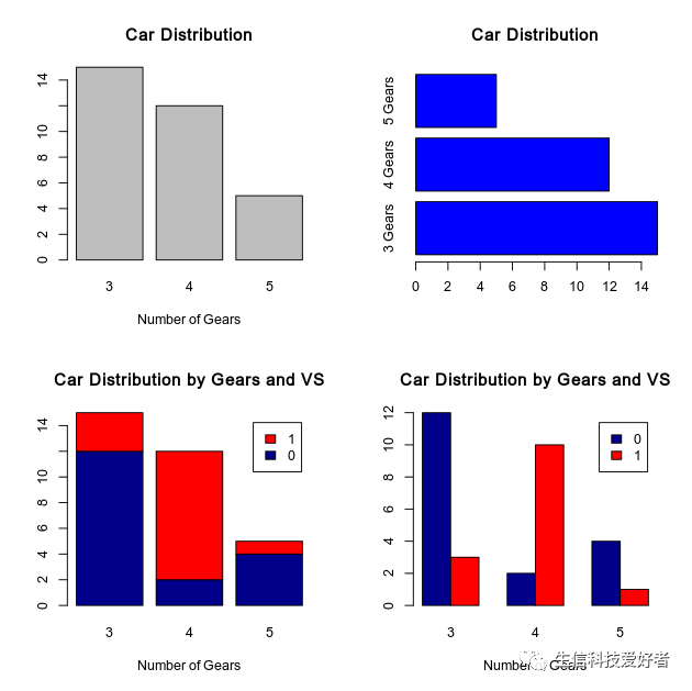
par(mfrow=c(2,2))
counts <- table(mtcars$gear)
barplot(counts, main="Car Distribution", xlab="Number of Gears")
barplot(counts, main="Car Distribution", horiz=TRUE,names.arg=c("3 Gears", "4 Gears", "5 Gears"),col="blue")
counts2 <- table(mtcars$vs, mtcars$gear)
barplot(counts2, main="Car Distribution by Gears and VS",xlab="Number of Gears", col=c("darkblue","red"),legend = rownames(counts2))
barplot(counts2, main="Car Distribution by Gears and VS",xlab="Number of Gears", col=c("darkblue","red"),legend = rownames(counts2),beside=TRUE)
2. ggplot2 包绘制柱状图
使用ggplot2包的柱状图颜色、方向及分组的绘图示例。
library('ggplot2')
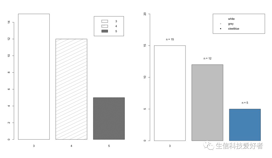
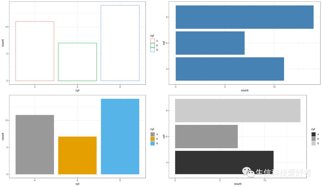
p1<-ggplot(data=mtcars,aes(x=cyl,col=cyl)) + geom_bar(stat="count",fill="white") + theme_bw()
p2<-ggplot(data=mtcars,aes(x=cyl)) + geom_bar(stat="count",fill="steelblue") + theme_bw() + coord_flip()
p3<-ggplot(data=mtcars,aes(x=cyl,fill=cyl)) + geom_bar(stat="count") + theme_bw() +scale_fill_manual(values=c("#999999", "#E69F00", "#56B4E9"))
p4<-ggplot(data=mtcars,aes(x=cyl,fill=cyl)) + geom_bar(stat="count") + theme_bw() +scale_fill_grey() + coord_flip()
gridExtra::grid.arrange(p1, p2,p3,p4,nrow=2)
2.1 柱状图添加标签
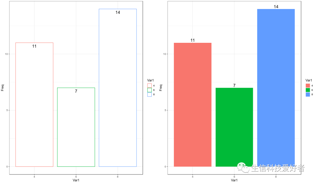
data <- data.frame(table(mtcars$cyl))

p1 <- ggplot(data=newmatrix,aes(x=Var1,y=Freq,col=Var1)) +
    geom_bar(stat="identity",fill="white") +
    theme_bw() +
    geom_text(aes(label=Freq), vjust=1.6, color="black", size=5)

p2 <- ggplot(data=newmatrix,aes(x=Var1,y=Freq,fill=Var1)) +
    geom_bar(stat="identity") +
    theme_bw()+ geom_text(aes(label=Freq),vjust=-0.3, color="black", size=5)

gridExtra::grid.arrange(p1,p2,nrow=1)
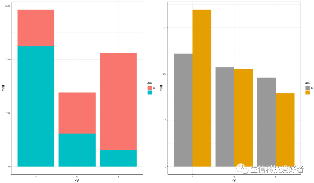
2.2 按组绘制柱状图
mtcars$am <- as.factor(mtcars$am)

p1 <- ggplot(data=mtcars,aes(x=cyl,y=mpg,fill=am)) +
    geom_bar(stat="identity") +
    theme_bw()
p2 <- ggplot(data=mtcars,aes(x=cyl,y=mpg,fill=am)) +
    geom_bar(stat="identity",position=position_dodge()) +
    theme_bw() +
    scale_fill_manual(values=c('#999999','#E69F00'))

gridExtra::grid.arrange(p1,p2,nrow=1)
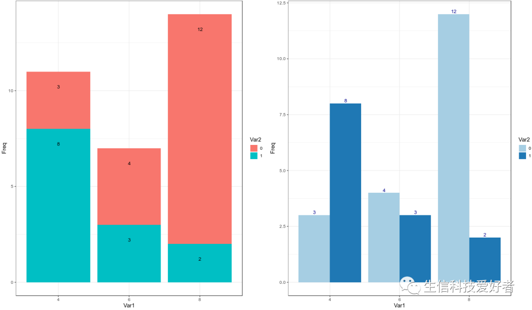
2.3 柱状图添加标签
counts2 <- data.frame(table(mtcars$cyl,mtcars$am))
p1 <- ggplot(data=counts2,aes(x=Var1,y=Freq,fill=Var2)) +
    geom_bar(stat="identity") +
    theme_bw() +
    geom_text(aes(label=Freq), vjust=5,position='stack', color="black",size=3.5)

p2 <- ggplot(data=counts2,aes(x=Var1,y=Freq,fill=Var2)) +
    geom_bar(stat="identity",position=position_dodge()) +
    theme_bw() +
    scale_fill_brewer(palette="Paired") +
    geom_text(aes(label=Freq),vjust=-0.3, color="darkblue",
            position=position_dodge(0.9), size=3.5)

gridExtra::grid.arrange(p1,p2,nrow=1)
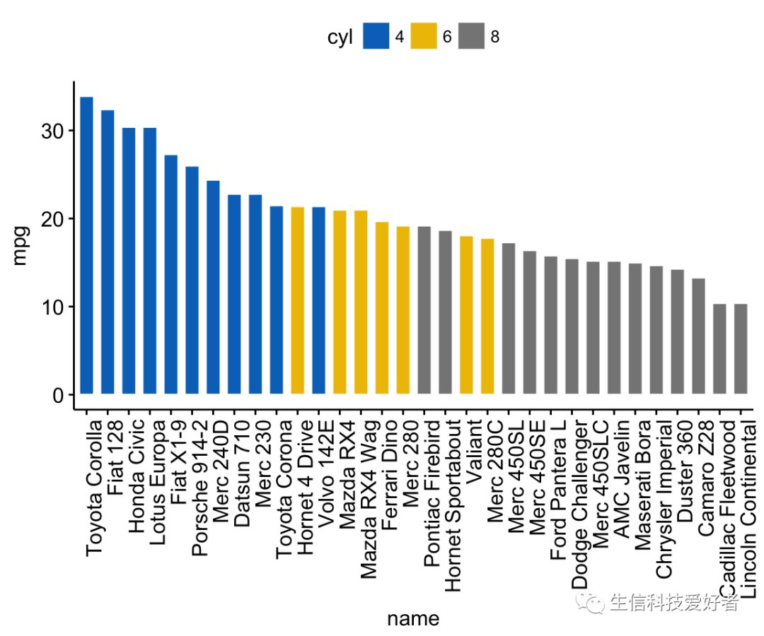
3. ggpubr 包绘制柱状图
library(ggpubr)
dfm <- mtcars
dfm$cyl <- as.factor(dfm$cyl)
dfm$name <- rownames(dfm)
ggbarplot(dfm, x="name", y="mpg",fill="cyl",color="white",palette="jco",
          sort.val="desc",sort.by.groups=FALSE,x.text.angle=90)
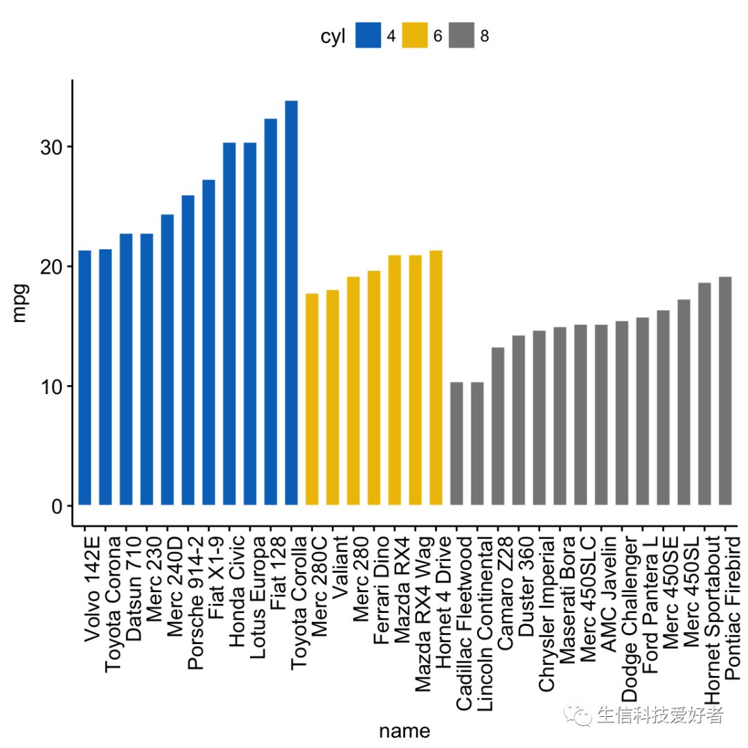
3.1 分组绘制柱状图
ggbarplot(dfm, x="name", y ="mpg", fill="cyl", color="white", palette="jco",
          sort.val="asc", sort.by.groups=TRUE, x.text.angle=90)
3.2 zsore 校正及分组
dfm$mpg_z <- (dfm$mpg -mean(dfm$mpg))/sd(dfm$mpg)
dfm$mpg_grp <- factor(ifelse(dfm$mpg_z < 0, "low", "high"),levels = c("low", "high"))
ggbarplot(dfm, x = "name", y = "mpg_z",fill = "mpg_grp", color = "white",
          palette = "jco", sort.val = "asc",sort.by.groups = FALSE,x.text.angle = 90,
          ylab = "MPG z-score",xlab = FALSE,legend.title = "MPG Group")
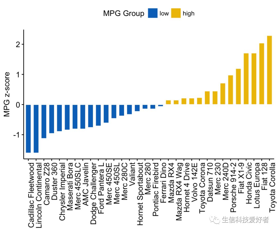
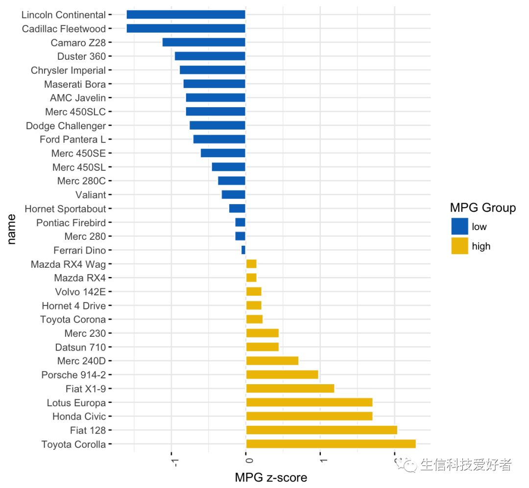
3.3 图像旋转
ggbarplot(dfm, x = "name", y = "mpg_z",fill = "mpg_grp",color = "white",
          palette = "jco",sort.val = "desc",sort.by.groups = FALSE,
          x.text.angle = 90,ylab = "MPG z-score",legend.title = "MPG Group",
          rotate = TRUE,ggtheme = theme_minimal())
二、添加误差线(Error bar)
1. barplot+segments+arrows 绘制误差线
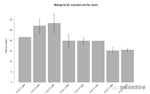
1.1 绘制普通柱状图
构建数据集
myData <- aggregate(mtcars$mpg,by = list(cyl = mtcars$cyl, gears = mtcars$gear), FUN = function(x) c(mean = mean(x), sd = sd(x),n = length(x)))
myData <- do.call(data.frame, myData)
myData
  cyl gears x.mean      x.sd x.n
1   4     3 21.500        NA   1
2   6     3 19.750 2.3334524   2
3   8     3 15.050 2.7743959  12
4   4     4 26.925 4.8073604   8
5   6     4 19.750 1.5524175   4
6   4     5 28.200 3.1112698   2
7   6     5 19.700        NA   1
8   8     5 15.400 0.5656854   2
- 计算标准差
myData$se <- myData$x.sd / sqrt(myData$x.n)
colnames(myData) <- c("cyl", "gears", "mean", "sd", "n", "se")
myData$names <- c(paste(myData$cyl, "cyl /", myData$gears, " gear"))
- 定义作图范围
par(mar = c(5, 6, 4, 5) + 0.1)
plotTop <- max(myData$mean) +myData[myData$mean == max(myData$mean), 6] * 3
barCenters <- barplot(height = myData$mean, names.arg = myData$names,
                      beside = true, las = 2, ylim = c(0, plotTop),
                      cex.names = 0.75, xaxt = "n",
                      main = "Mileage by No. Cylinders and No. Gears",
                      ylab = "Miles per Gallon",  border = "black", axes = TRUE)
- 横坐标
text(x = barCenters, y = par("usr")[3] - 1, srt = 45,
     adj = 1, labels = myData$names, xpd = TRUE)
- Error bar
segments(barCenters, myData$mean - myData$se  2, barCenters,
         myData$mean + myData$se  2, lwd = 1.5)
arrows(barCenters, myData$mean - myData$se  2, barCenters,
       myData$mean + myData$se  2, lwd = 1.5, angle = 90,code = 3, length = 0.05)
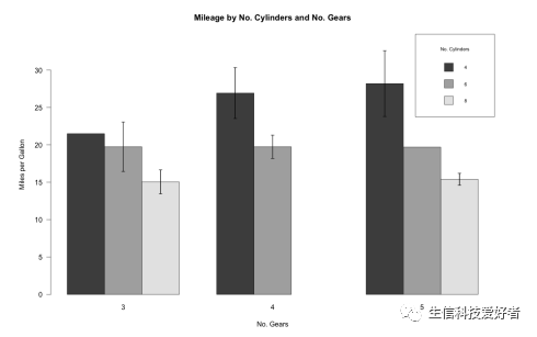
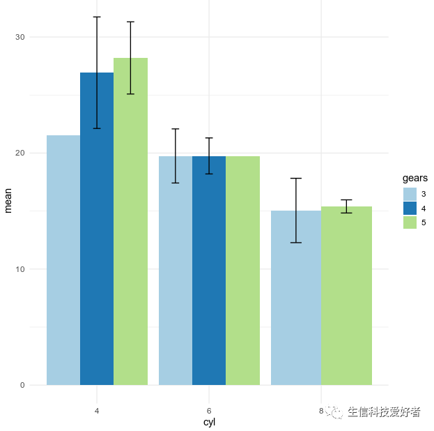
1.2 按照分组绘制柱状图
tabbedMeans <- tapply(myData$mean,list(myData$cyl,myData$gears),function(x) c(x = x))
tabbedSE <- tapply(myData$se, list(myData$cyl, myData$gears),function(x) c(x = x))
barCenters <- barplot(height = tabbedMeans,beside = TRUE, las = 1,ylim = c(0, plotTop),
                      cex.names = 0.75,main = "Mileage by No. Cylinders and No. Gears",
                      ylab = "Miles per Gallon",xlab = "No. Gears",border = "black",
                      axes = TRUE,legend.text = TRUE,
                      args.legend = list(title = "No.Cylinders",x = "topright",cex = .7))
segments(barCenters, tabbedMeans-tabbedSE*2, barCenters,tabbedMeans+tabbedSE*2, lwd = 1.5)
arrows(barCenters, tabbedMeans-tabbedSE * 2, barCenters,tabbedMeans+tabbedSE*2,
       lwd = 1.5, angle = 90,code = 3, length = 0.05)
2. ggplot2 包绘带误差线的制柱状图
myData$gears <- as.factor(myData$gears)
ggplot(myData,aes(x=cyl,y=mean,fill=gears)) +
    geom_bar(stat="identity",position=position_dodge()) +
    geom_errorbar(aes(ymin=mean-sd,ymax=mean+sd),width=.2,position=position_dodge(.9)) +
    scale_fill_brewer(palette="Paired") +
    theme_minimal()
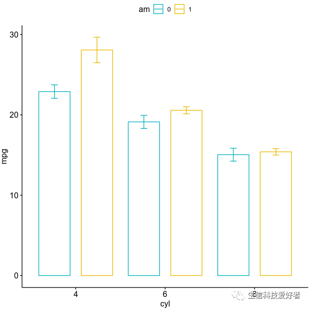
3. ggbarplot 绘制绘带误差线的制柱状图
ggbarplot(mtcars,x="cyl",y="mpg",color="am",add="mean_se",
          palette=c("#00AFBB","#E7B800"), position=position_dodge())
柱状图的介绍就先到这里,其他可替代柱状图的图形包含棒棒糖图(Lollipop)、环形柱状图等未在本文中展开介绍,有兴趣的小伙伴可参考文章最后的参考资料。
三、参考资料
Alboukadel Kassambara,《Bar Plots -R base Graphs》,STHDA
Selva Prabhakaran,《Top 50 ggplot2 Visualizations》,r-statistics.co
Alboukadel Kassambara,《ggpubr: Publication Ready Plots》,STHDA
Alboukadel Kassambara,《Plot Means/Medians and Error Bars》,STHDA
Alboukadel Kassambara,《ggplot2- barplot1》》,STHDA
Winston Chang,《ggplot2- barplot2》,Cookbook for R
Chris Wetherill,《Building Barplots with errorbars》,datascience+
SWD team,《bring on the bar charts — storytelling with data》,storytellingwithdata.com


本文分享自微信公众号 - 生信科技爱好者(bioitee)。
如有侵权,请联系 support@oschina.cn 删除。
本文参与“OSC源创计划”,欢迎正在阅读的你也加入,一起分享。
R 语言柱状图示例笔记的更多相关文章
- R语言可视化学习笔记之添加p-value和显著性标记
R语言可视化学习笔记之添加p-value和显著性标记 http://www.jianshu.com/p/b7274afff14f?from=timeline 上篇文章中提了一下如何通过ggpubr ...
- [R语言] ggplot2入门笔记1—ggplot2简要教程
文章目录 1 ggplot2入门笔记1-ggplot2简要教程 1. 设置 The Setup 2. 图层 The Layers 3. 标签 The Labels 4. 主题 The Theme 5. ...
- 从零开始系列-R语言基础学习笔记之二 数据结构(二)
在上一篇中我们一起学习了R语言的数据结构第一部分:向量.数组和矩阵,这次我们开始学习R语言的数据结构第二部分:数据框.因子和列表. 一.数据框 类似于二维数组,但不同的列可以有不同的数据类型(每一列内 ...
- 从零开始系列--R语言基础学习笔记之一 环境搭建
R是免费开源的软件,具有强大的数据处理和绘图等功能.下面是R开发环境的搭建过程. 一.点击网址 https://www.r-project.org/ ,进入"The R Project fo ...
- R语言实战读书笔记(三)图形初阶
这篇简直是白写了,写到后面发现ggplot明显更好用 3.1 使用图形 attach(mtcars)plot(wt, mpg) #x轴wt,y轴pgabline(lm(mpg ~ wt)) #画线拟合 ...
- R语言实战读书笔记(二)创建数据集
2.2.2 矩阵 matrix(vector,nrow,ncol,byrow,dimnames,char_vector_rownames,char_vector_colnames) 其中: byrow ...
- R语言的学习笔记 (持续更新.....)
1. DATE 处理 1.1 日期格式一个是as.Date(XXX) 和strptime(XXX),前者为Date格式,后者为POSIXlt格式 1.2 用法:as.Date(XXX,"%Y ...
- [R语言] ggplot2入门笔记4—前50个ggplot2可视化效果
文章目录 通用教程简介(Introduction To ggplot2) 4 ggplot2入门笔记4-前50个ggplot2可视化效果 1 相关性(Correlation) 1.1 散点图(Scat ...
- [R语言] ggplot2入门笔记3—通用教程如何自定义ggplot2
通用教程简介(Introduction To ggplot2) 代码下载地址 以前,我们看到了使用ggplot2软件包制作图表的简短教程.它很快涉及制作ggplot的各个方面.现在,这是一个完整而完整 ...
- [R语言] ggplot2入门笔记2—通用教程ggplot2简介
文章目录 通用教程简介(Introduction To ggplot2) 2 ggplot2入门笔记2-通用教程ggplot2简介 1. 了解ggplot语法(Understanding the gg ...
随机推荐
- odoo 开发入门教程系列-安全-简介
安全-简介 前一章中我们已经创建了第一个打算用于存储业务数据的表.在odoo这样的一个商业应用中,第一个考虑的问题就是谁(Odoo 用户(或者组用户))可以访问数据.odoo为指定用户组用户提供了一个 ...
- Auto Photoshop StableDiffusion - 这是一款可以在 Photoshop 中使用 AI 智能 Automatic1111 进行插画、海报等设计的插件
简介 Auto Photoshop StableDiffusion - 这是一款可以在 Photoshop 中使用 AI 智能 Automatic1111 进行插画.海报等设计的插件,此插件可以是你在 ...
- python3常用模块和方法
1.使用索引反转字符串 str="hello" print(str[::-1]) 2.zip函数获取可迭代对象,将它们聚合到一个元组中,然后返回结果.语法是zip(*iterabl ...
- selenuim文件的下载
文件下载:谷歌浏览器则会自动实现下载,不会弹出框提示,会直接下载谷歌的默认路径:火狐浏览器下载会弹出提示框,此时火狐需要添加浏览器的配置参数信息: 火狐的相关浏览器配置参数可以通过about:conf ...
- 一些随笔No.3
1.开发应以业务为导向,技术只是手段 2.视觉上和程序上不一定是完全符合 比如,我所说的阻塞是视觉层面,或者是对用户而言的阻塞,而不是程序意义上的.我也许会传完参的同时销毁原组件,生成一个看起来一模一 ...
- 网络框架重构之路plain2.0(c++23 without module) 综述
最近互联网行业一片哀叹,这是受到三年影响的后遗症,许多的公司也未能挺过寒冬,一些外资也开始撤出市场,因此许多的IT从业人员加入失业的行列,而且由于公司较少导致许多人求职进度缓慢,很不幸本人也是其中之一 ...
- python:调用内置函数
问题描述:尝试下博客园如何上传GIF # hzh 每天进步一点点 # 2022/5/13 17:24 import colorama import time import os colorama.in ...
- nlp数据预处理:词库、词典与语料库
在nlp的数据预处理中,我们通常需要根据原始数据集做出如题目所示的三种结构.但是新手(我自己)常常会感到混乱,因此特意整理一下 1.词库 词库是最先需要处理出的数据形式,即将原数据集按空格分词或者使用 ...
- TF-IDF定义及实现
TF-IDF定义及实现 定义 TF-IDF的英文全称是:Term Frequency - Inverse Document Frequency,中文名称词频-逆文档频率,常用于文本挖掘,资讯检索等 ...
- StarRocks 3.0 集群安装手册
本文介绍如何以二进制安装包方式手动部署最新版 StarRocks 3.0集群. 什么是 StarRocks StarRocks 是新一代极速全场景 MPP (Massively Parallel Pr ...