css新增UI方案
一、文本新增样式
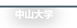
opacity 不透明度
        h1{

                margin: 100px auto;

                opacity: 0.5;

            }

        </style>

    </head>

    <body>

        <h1>中山大学</h1>

    </body>
效果

rgba透明度(选中的就透明)一般应用在背景透明,文字不透明。是rgb的一个拓展,a的值在(0,1)之间,就是针对前面的颜色的一个透明度/不透明度的描述.
  h1{

            margin: 100px auto;

            color: rgba(255, 0, 0, 0.8);文字的(255,0,0)颜色的不透明度为0.8

            background-color: rgb(1,1,1);

        }

    </style>

    </head>

    <body>

        <h1>中山大学</h1>

    </body>
text-shadow:文字阴影,可以多层,阴影值之间可以用逗号隔开。前两个设置是偏移量,后面是模糊程度。
实战:做一个浮雕文字和文字模糊的效果
浮雕文字:
        h1{

        margin: 200px auto;

        color: white;

        text-shadow: black 1px 1px 10px;

    }

    </head>

    <body>

        <h1>中山大学</h1>

    </body>
效果:
文字模糊(悬浮在文字上面就出现模糊):
    h1{

        text-align: center;

        color: black;

    }

    h1:hover{

        color: white;

        text-shadow: black 1px 1px 100px;

    }

    </style>

    </head>

    <body>

        <h1>中山大学</h1>

    </body>
效果前后:

文字描边:
简介:CSS text-stroke属性的语法并不复杂,和border,background属性类似,其实是若干个CSS属性合并后的名称写法,不过仅仅是下面这两个CSS属性合体:text-stroke-width和text-stroke-color,也就是描边的宽度和描边的颜色,和border不同,对于text-stroke属性,我们无法指定描边的类型,只能是实线描边,不支持点线或者虚线,也无法指定描边是外描边还是内描边还是居中描边。
具体操作实现的代码如下:
        div{

                font-size: 50px;

                text-align: center;

                margin: 100px auto;

                -webkit-text-stroke: 2px pink;

            }

        </style>

    </head>

    <body>

        <div >

            中山大学

        </div>
效果:

文字排版
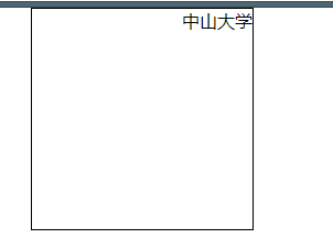
direction:控制文字的方向,一定要配合unicode-bid:bidi-override;来使用。
            div{

            width: 200px;

            height: 200px;

            margin: 0px auto;

            border: 1px solid;

            direction: rtl;

        }

        </style>

      </head>

      <body>

      <div >

          中山大学

      </div>
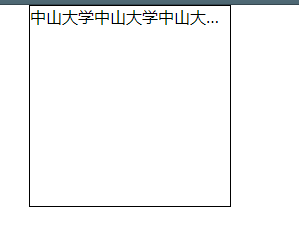
溢出省略号
1、首先多余的数据不让它进行换行
(white-space: nowrap;
overflow: hidden;)
2、再使他出现省略号(text-overflow: ellipsis;)
text-overflow :确定如何向用户发出未显示的溢出内容信号
它可以被剪切
显示一个省略号(‘.....’)
    div{

                width: 200px;

                height: 200px;

                margin: 0px auto;

                border: 1px solid;

                white-space: nowrap;

                overflow: hidden;

                text-overflow: ellipsis;

            }

        </style>

    </head>

    <body>

        <div >

            中山大学中山大学中山大学中山大学中山大学中山大学中山大学中山大学中山大学中山大学中山大学中山大学中山大学中山大学中山大学中山大学中山大学中山大学中山大学中山大学中山大学

        </div>

    </body>
效果:
二、盒模型新增样式
盒模型阴影
默认值:none 不可继承
值:inset
默认阴影在边框外,使用inset后,阴影在边框内
《offset-x》和《offset-y》
这是头两个《length》值,用来设置阴影偏移量。
《offset-x》设置水平偏移量,如果是负值则阴影位于元素左边
《offset-y》设置垂直偏移量,如果是负值则阴影位于元素上面
如果两者都是0,那么阴影位于元素后面。
这是如果设置了《blur-radius》或《spread-radius》则有模糊效果
《spread-radius》
这是第四个《length》值,取正值时,阴影扩大,取负值时,阴影收藏。默认为0,此时阴影与元素同样大。
《color》
阴影颜色,如果没有指定,则由浏览器决定。
不一样的颜色阴影用逗号隔开,第一个展示在最上面。
代码:
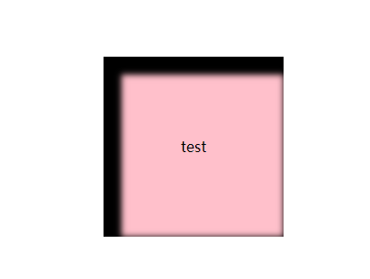
盒子居中代码并且出现盒子阴影:
    div{

            position: absolute;

            width: 200px;

            height: 200px;

            left: 0;

            right: 0;

            top: 0;

            bottom: 0;

            margin: auto;

            background: pink;

            text-align: center;

            line-height: 200px;

            box-shadow: inset 10px 10px 10px 10px black;(盒子阴影)

        }

            </style>

        </head>

        <body>

            <div >

                test

            </div>
效果:
(2)图片倒影
首先实现图片的居中,可以根据上面那种方式实现居中,也可以根据以下方式实现居中
    html,body{

                height: 100%;

            }

            body{

                text-align: center;

            }

            body:after{

                content: '';

                display: inline-block;

                height: 100%;

                vertical-align: middle;

            }

            img{

                vertical-align: middle;

            }

            因为img都是看做是替换元素,都是inline级别的元素,两个inline级别的元素,就都可以进行一个垂直居中,谁高就听谁的,after最高。

            vertical-align: middle;

            body的高度一定要百分之一百,要不然就只是图片的高度
接下来实现图片倒影
-webkit-box-reflect 设置元素的倒影(准确来说不算是css3的东西,类似文字描边,)
默认值:none 不可继承
值:(必须是123的顺序)
倒影的方向
第一个值,above,below,right,left
倒影的距离
第二个值,长度单位
渐变
第三个值
resize
css允许你控制一个元素的可调整大小性
(注意,一定要配合overflow:auto来使用)
默认值:none 不可以继承
值:
none
元素不能被用户缩放
both 允许用户在水平和垂直方向上调整元素的大小。
horizontal
允许用户在水平方向上调整元素的大小
vertical
允许用户在垂直方向上调整元素的大小
代码:
            body{

                text-align: center;

            }

            body:after{

                content: '';

                display: inline-block;

                height: 100%;

                vertical-align: middle;

            }

            div{

                display: inline-block;

                vertical-align: middle;

                height: 200px;

                width: 200px;

                background: pink;

                overflow: auto;

                resize: horizontal;

            }
box-sizing的作用是width和height的大小不会因为padding而撑大,会在此大小基础上,使得pading在里面生效,真正的width变小了(就是加边框那些就不会破坏布局)参数有(border-box,content-box,padding-box)
在这里讲一下另外一种居中方式(第三种)
                div{

                width: 200px;

                height: 200px;

                position: absolute;

                left: 50%;

                top: 50%;

                background: pink;

                margin-left: -100px;

                margin-top: -100px;

            }
新增UI样式
(1)圆角
border-radius(50%刚好是正方形的一个圆,大的话也是,小就不是一个圆,椭圆了)
css的新增的样式都是为了提高性能和提高用户体验
默认值:0 不可继承
值:
固定的px值定义圆形半径或者椭圆的半长轴,半短轴。不能用负值
使用百分数定义圆形半径或椭圆的半长轴。水平半轴相对于盒模型的宽度,垂直半轴相对于盒模型的高度,不能用负值。
这是一个简写属性,用来设置
border-top-left-radius,
border-top-right-radius
border-bottom-right-radius
border-bottom-left-radius
还可以多个值,代表不一样的形状。(在移动端,尽量使用px值)
半径的第一个语法取值可取-~4个值
border-radius:radius
border-radius:top-left-and-bottom-right top-right-and-bottom-left
border-radius:top-left top-right-and-bottom-right bottom-right
border-radius:top-left top-right bottom-right bottom-left
半径的第二个语法值也可取1~4个值
border-radius:(first radius values)/radius
border-radius:(first radius values)top-left-and-bottom-right top-right-and-bottom-left
border-radius:(first radius values)top-left top-right-and-bottom-right bottom-right
border-radius:(first radius values)top-left top-right bottom-right bottom-left
border-radius: 50%;=border-radius: 100px
border-radius: 100px/50px 50px;
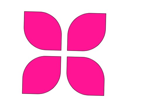
实战:制作风筝
画出四个小容器(div)分别有缝隙,然后制作圆角实现
代码:
<style type="text/css">

    *{

      margin: 0;

      padding: 0;

    }

    /*去掉系统的滚动条功能*/

    html,body{

      height: 100%;

      overflow: hidden;

    }

    #wrap{

      position: absolute;

      width: 300px;

      height: 300px;

      left: 0;

      right: 0;

      top: 0;

      bottom: 0;

      margin: auto;

      transition: 2s;

    }

    #wrap>div{

      margin: 10px;

      width: 130px;

      height: 130px;

      border: 1px solid black;

      float: left;

      box-sizing: border-box;

      background: deeppink;

    }

    #wrap div:nth-child(1),#wrap div:nth-child(4){

      border-radius: 0 60%;

    }

    #wrap div:nth-child(2),#wrap div:nth-child(3){

      border-radius: 60% 0;

    }

    #wrap:hover{

      transform: rotate(45deg);

    }

  </style>

</head>

<body>

<div id="wrap">

  <div></div>

  <div></div>

  <div></div>

  <div></div>

</div>
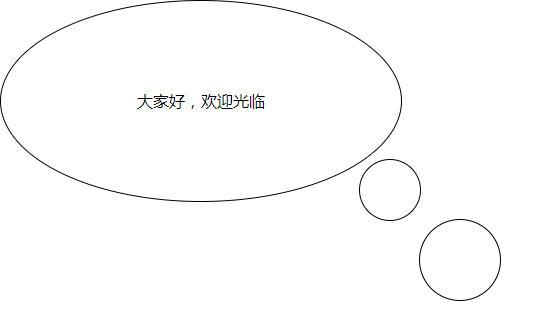
对话框实现
注意:after和before一定要给内容
要给相对定位和绝对定位
#wrap{

      width: 400px;

      height: 200px;

      border: 1px solid;

      border-radius: 50%;

      text-align: center;

      line-height: 200px;

      position: relative;

    }

    #wrap:before{

      content: '';

      display: block;

      width: 80px;

      height: 80px;

      border: 1px solid;

      position: absolute;

      right: -100px;

      bottom: -100px;

      border-radius: 50%;

    }

    #wrap:after{

      content: '';

      width: 60px;

      height: 60px;

      border: 1px solid;

      display: block;

      position: absolute;

      right: -20px;

      bottom: -20px;

      border-radius: 50%;

    }

  </style>

</head>

<body>

<div id="wrap">

  大家好,欢迎光临

</div>
效果:
css新增UI方案的更多相关文章
- css新增UI样式
1.圆角 border-radius <style> .box{width:200px;height:300px;border:1px solid #000;border-radius:1 ...
- css选择器和新增UI样式总结
经过两天的学习,初步对css3选择器和新增UI样式有了进一步的理解.
- CSS3新的UI方案
文本新增样式 一.opacity:指定了一个元素的透明度 0~1 二.新增颜色模式rgba:很好的解决了背景透明,字体颜色不透明的需求. 三.文字阴影:text-shadow用来为文字添加阴影,而且可 ...
- (转)[Unity3D]UI方案及制作细节(NGUI/EZGUI/原生UI系统) 内附unused-assets清除实例
转载请留下本文原始链接,谢谢.本文会不定期更新维护,最近更新于2013.09.17. http://blog.sina.com.cn/s/blog_5b6cb9500101bplv.html ...
- [Unity3D]UI方案及制作细节(NGUI/EZGUI/原生UI系统)
转载请留下本文原始链接,谢谢.本文会不定期更新维护,最近更新于2013.09.17. http://blog.sina.com.cn/s/blog_5b6cb9500101bplv.html ...
- [前端开发] 8 个很有用的免费CSS的UI工具箱
搞web开发的不能不提到前端,下面就和大家分享下8个很有用的免费CSS的UI工具箱 1) UI CSS ui.css 是一个用来创建简洁的 Web 用户界面的工具,下载的文件只包含一个 css 文件. ...
- 12. 前后端联调 + ( proxy代理 ) + ( axios拦截器 ) + ( css Modules模块化方案 ) + ( css-loader ) + ( 非路由组件如何使用history ) + ( bodyParser,cookieParser中间件 ) + ( utility MD5加密库 ) + ( nodemon自动重启node ) + +
(1) proxy 前端的端口在:localhost:3000后端的端口在:localhost:1234所以要在webpack中配置proxy选项 (proxy是代理的意思) 在package.jso ...
- boi剖析 - 基于webpack的css sprites实现方案
本文是58到家前端工程化集成解决方案boi的博文系列之一.boi是基于webpack打造的一站式前端工程化解决方案,现已开源Github. 作为前端构建工具不可或缺的一个环节,自动生成css spri ...
- css初始化代码方案
(从已经死了一次又一次终于挂掉的百度空间人工抢救出来的,发表日期 2014-06-24) 为了消除各浏览器对css默认的设置,保持网页在各浏览器中的外观保持一致,初始化css就显得非常必要了!很多时候 ...
随机推荐
- Jlink-10 pin 的定义(stm32使用)官方定义
因为在网上找了好久才找到正确的接法,所以专门记载了下来,因为stm32芯片这几个功能引脚会内置上拉电阻,所以不需要再外接电阻了.
- ruby rspec+jenkins+ci_report持续集成生成junit测试报告
1.加载ci_report gem install ci_reporter_rspec 2.给测试工程编写rakefile require 'ci/reporter/rake/rspec' requi ...
- 数构与算法 | 什么是大 O 表示算法时间复杂度
正文: 开篇我们先思考这么一个问题:一台老式的 CPU 的计算机运行 O(n) 的程序,和一台速度提高的新式 CPU 的计算机运 O(n2) 的程序.谁的程运行效率高呢? 答案是前者优于后者.为什么呢 ...
- sourcetree的安装及使用
sourcetree下载地址:https://www.sourcetreeapp.com/ 点击安装包安装 此前需要跳转到bitbucket登录,我没有账号,所以我直接跳转到到https://bitb ...
- Centos7 安装 Python 的笔记
Centos7 安装 Python 的笔记 注意:系统自带的Python2.7不要改动,最好也不要出错,不然yum之类的工具可能会出错. 安装Python3.7.0 TensorFlow对Python ...
- 【BZOJ4016】[FJOI2014]最短路径树问题
[BZOJ4016][FJOI2014]最短路径树问题 题面 bzoj 洛谷 题解 虽然调了蛮久,但是思路还是蛮简单的2333 把最短路径树构出来,然后点分治就好啦 ps:如果树构萎了,这组数据可以卡 ...
- MySQL入门篇(四)之MySQL主从复制
一.MySQL主从复制原理 随机站点访问量的鞥集啊,单台的MySQL服务器压力也不断地增加,此时需要对MySQL进行优化,如果在MySQL优化无明显改善时期,可以使用高可用.主从复制.读写分离.分库分 ...
- Docker入门篇(二)之docker的单主机网络
Docker 安装时会自动在host上创建三个网络,我们可用 docker network ls命令查看: [root@localhost ~]# docker network ls NETWORK ...
- QQ在线交谈一句代码搞定
现在有很多网页都有QQ在线咨询,还有什么QQ客服什么的,看着很高大上的一个功能,其实要实现很简单,只需要一句代码就搞定. 还是按以前的套路,先看效果图,再晒源代码 点击图标 再点击 就可以聊天了 再来 ...
- javaweb(七)——HttpServletResponse对象(一)
Web服务器收到客户端的http请求,会针对每一次请求,分别创建一个用于代表请求的request对象.和代表响应的response对象.request和response对象即然代表请求和响应,那我们要 ...