Bootstrap收尾
一 响应式布局
二 Bootstrap补充
三 常用插件
一 响应式布局
响应式介绍
   - 响应式布局是什么?
      同一个网页在不同的终端上呈现不同的布局等
   - 响应式怎么实现的?
      1. CSS3 media query 媒体查询
      2. JS去控制网页的布局和样式等
         - 缺点:工作量大,网页响应慢
         - 优点: 专治疑难杂症
      3. 用框架
         - Bootstrap
<!DOCTYPE html>

<html lang="en">

<head>

    <meta charset="UTF-8">

    <title>Title</title>

    <link rel="stylesheet" href="bootstrap-3.3.7-dist/css/bootstrap.min.css">

    <style>

        body {

            overflow-x: hidden;

        }

        @media screen and (max-width: 767px) {

            .r1 {

                position: relative;

                right: 0;

                transition: all .25s ease-out;

            }

            .r1 .my-sidebar {

                right: -50%;

            }

            .r1.active {

                right: 50%;

            }

            .my-sidebar {

                position: absolute;

                top: 0;

                width: 50%

            }

        }

    </style>

</head>

<body>

<nav class="navbar navbar-inverse">

    <div class="container">

        <!-- Brand and toggle get grouped for better mobile display -->

        <div class="navbar-header">

            <button type="button" class="navbar-toggle collapsed" data-toggle="collapse"

                    data-target="#bs-example-navbar-collapse-1" aria-expanded="false">

                <span class="sr-only">Toggle navigation</span>

                <span class="icon-bar"></span>

                <span class="icon-bar"></span>

                <span class="icon-bar"></span>

            </button>

            <a class="navbar-brand" href="#">Brand</a>

        </div>

        <!-- Collect the nav links, forms, and other content for toggling -->

        <div class="collapse navbar-collapse" id="bs-example-navbar-collapse-1">

            <ul class="nav navbar-nav">

                <li class="active"><a href="#">Link <span class="sr-only">(current)</span></a></li>

                <li><a href="#">Link</a></li>

                <li class="dropdown">

                    <a href="#" class="dropdown-toggle" data-toggle="dropdown" role="button"

                       aria-haspopup="true" aria-expanded="false">Dropdown <span class="caret"></span></a>

                    <ul class="dropdown-menu">

                        <li><a href="#">Action</a></li>

                        <li><a href="#">Another action</a></li>

                        <li><a href="#">Something else here</a></li>

                        <li role="separator" class="divider"></li>

                        <li><a href="#">Separated link</a></li>

                        <li role="separator" class="divider"></li>

                        <li><a href="#">One more separated link</a></li>

                    </ul>

                </li>

            </ul>

        </div><!-- /.navbar-collapse -->

    </div><!-- /.container-fluid -->

</nav>

<div class="container">

    <div class="row r1">

        <div class="col-md-9 col-sm-9">

            <p class="pull-right visible-xs">

                <button class="btn-xs btn btn-primary" id="toggle-sidebar">Toggle</button>

            </p>

            <div class="jumbotron">

                <h1>Hello, world!</h1>

                <p>This is a simple hero unit, a simple jumbotron-style component for calling extra attention to

                    featured content or information.</p>

                <p><a class="btn btn-primary btn-lg" href="#" role="button">Learn more</a></p>

            </div>

            <div class="row">

                <div class="col-md-4 col-sm-6">

                    <h2>Heading</h2>

                    <p>Donec id elit non mi porta gravida at eget metus. Fusce dapibus, tellus ac cursus commodo, tortor

                        mauris condimentum nibh, ut fermentum massa justo sit amet risus. Etiam porta sem malesuada

                        magna mollis euismod. Donec sed odio dui.</p>

                    <p>

                        <a href="#" class="btn btn-default" role="button">View details>></a>

                    </p>

                </div>

                <div class="col-md-4 col-sm-6">

                    <h2>Heading</h2>

                    <p>Donec id elit non mi porta gravida at eget metus. Fusce dapibus, tellus ac cursus commodo, tortor

                        mauris condimentum nibh, ut fermentum massa justo sit amet risus. Etiam porta sem malesuada

                        magna mollis euismod. Donec sed odio dui.</p>

                    <p>

                        <a href="#" class="btn btn-default" role="button">View details</a></p>

                    </p>

                </div>

            </div>

        </div>

        <div class="col-sm-3 my-sidebar" id="s1">

            <ul class="list-group">

                <li class="list-group-item ">Cras justo odio</li>

                <li class="list-group-item">Dapibus ac facilisis in</li>

                <li class="list-group-item">Morbi leo risus</li>

                <li class="list-group-item">Porta ac consectetur ac</li>

                <li class="list-group-item">Vestibulum at eros</li>

            </ul>

        </div>

    </div>

</div>

<script src="jquery-3.2.1.js"></script>

<script src="bootstrap-3.3.7-dist/js/bootstrap.min.js"></script>

<script>

    $(document).ready(function () {

    $("#toggle-sidebar").click(function () {

      $(".r1").toggleClass("active");

    });

  });

</script>

</body>

</html>
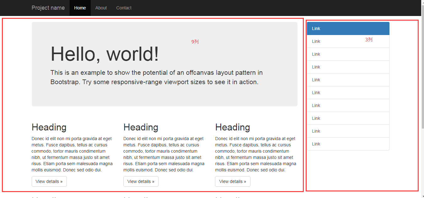
响应式布局例子
二 Bootstrap补充
- meta标签
<!DOCTYPE html>

<html lang="en">

<head>

    <meta charset="UTF-8">

    <meta http-equiv="X-UA-Compatible" content="IE=edge">

    <meta name="viewport" content="width=device-width, initial-scale=1">

    <title>媒体查询示例</title>

    <style>

        body {

            background-color: green;

        }

    </style>

    <link rel="stylesheet" href="link.css" media="screen and (max-width: 480px)">

</head>

<body>

</body>

</html>
JS媒体对象
body { background-color: red}
对应的css代码
<!DOCTYPE html>

<html lang="en">

<head>

    <meta charset="UTF-8">

    <title>媒体查询示例</title>

    <link rel="stylesheet" href="link2.css">

</head>

<body>

</body>

</html>
JS媒体对象
body { background-color: green}//默认的样式

@media screen and (max-width: 480px) {

    body {

        background-color: red;

    }

}
对应的css代码
   - modal
和模态框使用的
$("#myModal").modal("show")
- 轮播
<!DOCTYPE html>

<html lang="en">

<head>

    <meta charset="UTF-8">

    <meta http-equiv="X-UA-Compatible" content="IE=edge">

    <meta name="viewport" content="width=device-width, initial-scale=1">

    <title>轮播示例</title>

    <link rel="stylesheet" href="../bootstrap-3.3.7/css/bootstrap.min.css">

</head>

<body>

<!--<div class="container">-->

    <!--<div class="row">-->

        <!--<div class="col-md-12">-->

            <div id="carousel-example-generic" class="carousel slide" data-ride="carousel">

                <!-- Indicators -->

                <ol class="carousel-indicators">

                    <li data-target="#carousel-example-generic" data-slide-to="0" class="active"></li>

                    <li data-target="#carousel-example-generic" data-slide-to="1"></li>

                    <li data-target="#carousel-example-generic" data-slide-to="2"></li>

                </ol>

                <!-- Wrapper for slides -->

                <div class="carousel-inner" role="listbox">

                    <div class="item active">

                        <img src="img/banner_1.jpg" alt="...">

                        <div class="carousel-caption">

                            世情薄,人情恶,雨送黄昏花易落。

                        </div>

                    </div>

                    <div class="item">

                        <img src="img/banner_2.jpg" alt="...">

                        <div class="carousel-caption">

                            晓风干,泪痕残,欲笺心情,独语斜阑, 难 难 难。

                        </div>

                    </div>

                    <div class="item">

                        <img src="img/banner_3.jpg" alt="...">

                        <div class="carousel-caption">

                            人成各,今非昨。病魂常似秋千索。

                        </div>

                    </div>

                </div>

                <!-- Controls -->

                <a class="left carousel-control" href="#carousel-example-generic" role="button" data-slide="prev">

                    <span class="glyphicon glyphicon-chevron-left" aria-hidden="true"></span>

                    <span class="sr-only">Previous</span>

                </a>

                <a class="right carousel-control" href="#carousel-example-generic" role="button" data-slide="next">

                    <span class="glyphicon glyphicon-chevron-right" aria-hidden="true"></span>

                    <span class="sr-only">Next</span>

                </a>

            </div>

        <!--</div>-->

    <!--</div>-->

<!--</div>-->

<script src="../jquery-3.2.1.js"></script>

<script src="../bootstrap-3.3.7/js/bootstrap.min.js"></script>

</body>

</html>
轮播代码
   - collapse

   - tooltip
<!DOCTYPE html>

<html lang="en">

<head>

    <meta charset="UTF-8">

    <meta http-equiv="X-UA-Compatible" content="IE=edge">

    <meta name="viewport" content="width=device-width, initial-scale=1">

    <title>Bootstrap补充</title>

    <link rel="stylesheet" href="bootstrap-3.3.7/css/bootstrap.min.css">

</head>

<body>

<div id="d1">

    <button type="button" class="btn btn-default" data-toggle="tooltip" data-placement="bottom" title="今天不适合讲课">Tooltip on left</button>

</div>

<div id="d2">

    <button type="button" class="btn btn-default" data-container="body" data-toggle="popover" data-placement="right" data-content="Vivamus sagittis lacus vel augue laoreet rutrum faucibus.">

  Popover on 右侧

</button>

</div>

<div id="d3">

    <a class="btn btn-primary" role="button" data-toggle="collapse" href="#p1" aria-expanded="false" aria-controls="collapseExample">

  Link with href

</a>

    <div class="collapse" id="p1" aria-expanded="true" style="">

      <div class="well">

        世情薄,人情恶,雨送黄昏花易落。

      </div>

    </div>

</div>

<script src="jquery-3.2.1.js"></script>

<script src="bootstrap-3.3.7/js/bootstrap.min.js"></script>

<script>

    $("button").tooltip();//消息提示的位置

    $("#d2 button").popover();//弹出框的位置

</script>

</body>

</html>
代码
   - 自定义Bootstrap组件,
      - 找到自定义那一页
      - 勾选我用到的组件
      - 拉到最后面,点击下载

三 常用插件
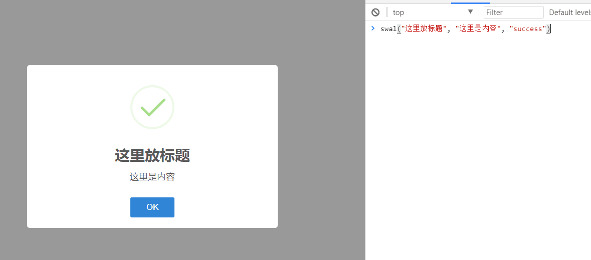
- Sweet Alert
使用步骤:1下载 2解压找到里面的dist(主要是dist)和animate.css  3引入到自己的文件里就行了
注:如果是html就要用animate
<!DOCTYPE html>

<html lang="en">

<head>

    <meta charset="UTF-8">

    <meta http-equiv="X-UA-Compatible" content="IE=edge">

    <meta name="viewport" content="width=device-width, initial-scale=1">

    <title>sweetalert2</title>

    <link rel="stylesheet" href="sweetalert2/sweetalert2.min.css">

    <link rel="stylesheet" href="animate.css">

</head>

<body>

<script src="../jquery-3.2.1.js"></script>

<script src="sweetalert2/sweetalert2.min.js"></script>

<script>

    //    swal({

    //        title: '你真的确定吗?',

    //        text: "当前操作是删库,可能你需要回去收拾一下行李,准备跑路。。。",

    //        type: 'warning',

    //        showCancelButton: true,

    //        confirmButtonColor: '#3085d6',

    //        cancelButtonColor: '#d33',

    //        confirmButtonText: '是的,我准备好离职了!',

    //        cancelButtonText: '是的,我准备好离职了!'

    //        // 点击确认按钮后,执行这个then

    //    }).then(function () {

    //        // 做逻辑判断

    //        console.log("做逻辑判断...");

    //        swal(

    //            '删除成功!',

    //            '留给你的时间不多了',

    //            'success'

    //        )

    //    })

    swal({

        title: 'Sweet!',

        text: 'Modal with a custom image.',

        imageUrl: 'http://www.iyi8.com/uploadfile/2016/1215/20161215120822999.jpg',

        imageWidth: 400,

        imageHeight: 200,

        imageAlt: 'Custom image',

        animation: false

    })

</script>

</body>

</html>
例子
@charset "UTF-8";

/*!

 * animate.css -http://daneden.me/animate

 * Version - 3.5.2

 * Licensed under the MIT license - http://opensource.org/licenses/MIT

 *

 * Copyright (c) 2017 Daniel Eden

 */

.animated {

  animation-duration: 1s;

  animation-fill-mode: both;

}

.animated.infinite {

  animation-iteration-count: infinite;

}

.animated.hinge {

  animation-duration: 2s;

}

.animated.flipOutX,

.animated.flipOutY,

.animated.bounceIn,

.animated.bounceOut {

  animation-duration: .75s;

}

@keyframes bounce {

  from, 20%, 53%, 80%, to {

    animation-timing-function: cubic-bezier(0.215, 0.610, 0.355, 1.000);

    transform: translate3d(0,0,0);

  }

  40%, 43% {

    animation-timing-function: cubic-bezier(0.755, 0.050, 0.855, 0.060);

    transform: translate3d(0, -30px, 0);

  }

  70% {

    animation-timing-function: cubic-bezier(0.755, 0.050, 0.855, 0.060);

    transform: translate3d(0, -15px, 0);

  }

  90% {

    transform: translate3d(0,-4px,0);

  }

}

.bounce {

  animation-name: bounce;

  transform-origin: center bottom;

}

@keyframes flash {

  from, 50%, to {

    opacity: 1;

  }

  25%, 75% {

    opacity: 0;

  }

}

.flash {

  animation-name: flash;

}

/* originally authored by Nick Pettit - https://github.com/nickpettit/glide */

@keyframes pulse {

  from {

    transform: scale3d(1, 1, 1);

  }

  50% {

    transform: scale3d(1.05, 1.05, 1.05);

  }

  to {

    transform: scale3d(1, 1, 1);

  }

}

.pulse {

  animation-name: pulse;

}

@keyframes rubberBand {

  from {

    transform: scale3d(1, 1, 1);

  }

  30% {

    transform: scale3d(1.25, 0.75, 1);

  }

  40% {

    transform: scale3d(0.75, 1.25, 1);

  }

  50% {

    transform: scale3d(1.15, 0.85, 1);

  }

  65% {

    transform: scale3d(.95, 1.05, 1);

  }

  75% {

    transform: scale3d(1.05, .95, 1);

  }

  to {

    transform: scale3d(1, 1, 1);

  }

}

.rubberBand {

  animation-name: rubberBand;

}

@keyframes shake {

  from, to {

    transform: translate3d(0, 0, 0);

  }

  10%, 30%, 50%, 70%, 90% {

    transform: translate3d(-10px, 0, 0);

  }

  20%, 40%, 60%, 80% {

    transform: translate3d(10px, 0, 0);

  }

}

.shake {

  animation-name: shake;

}

@keyframes headShake {

  0% {

    transform: translateX(0);

  }

  6.5% {

    transform: translateX(-6px) rotateY(-9deg);

  }

  18.5% {

    transform: translateX(5px) rotateY(7deg);

  }

  31.5% {

    transform: translateX(-3px) rotateY(-5deg);

  }

  43.5% {

    transform: translateX(2px) rotateY(3deg);

  }

  50% {

    transform: translateX(0);

  }

}

.headShake {

  animation-timing-function: ease-in-out;

  animation-name: headShake;

}

@keyframes swing {

  20% {

    transform: rotate3d(0, 0, 1, 15deg);

  }

  40% {

    transform: rotate3d(0, 0, 1, -10deg);

  }

  60% {

    transform: rotate3d(0, 0, 1, 5deg);

  }

  80% {

    transform: rotate3d(0, 0, 1, -5deg);

  }

  to {

    transform: rotate3d(0, 0, 1, 0deg);

  }

}

.swing {

  transform-origin: top center;

  animation-name: swing;

}

@keyframes tada {

  from {

    transform: scale3d(1, 1, 1);

  }

  10%, 20% {

    transform: scale3d(.9, .9, .9) rotate3d(0, 0, 1, -3deg);

  }

  30%, 50%, 70%, 90% {

    transform: scale3d(1.1, 1.1, 1.1) rotate3d(0, 0, 1, 3deg);

  }

  40%, 60%, 80% {

    transform: scale3d(1.1, 1.1, 1.1) rotate3d(0, 0, 1, -3deg);

  }

  to {

    transform: scale3d(1, 1, 1);

  }

}

.tada {

  animation-name: tada;

}

/* originally authored by Nick Pettit - https://github.com/nickpettit/glide */

@keyframes wobble {

  from {

    transform: none;

  }

  15% {

    transform: translate3d(-25%, 0, 0) rotate3d(0, 0, 1, -5deg);

  }

  30% {

    transform: translate3d(20%, 0, 0) rotate3d(0, 0, 1, 3deg);

  }

  45% {

    transform: translate3d(-15%, 0, 0) rotate3d(0, 0, 1, -3deg);

  }

  60% {

    transform: translate3d(10%, 0, 0) rotate3d(0, 0, 1, 2deg);

  }

  75% {

    transform: translate3d(-5%, 0, 0) rotate3d(0, 0, 1, -1deg);

  }

  to {

    transform: none;

  }

}

.wobble {

  animation-name: wobble;

}

@keyframes jello {

  from, 11.1%, to {

    transform: none;

  }

  22.2% {

    transform: skewX(-12.5deg) skewY(-12.5deg);

  }

  33.3% {

    transform: skewX(6.25deg) skewY(6.25deg);

  }

  44.4% {

    transform: skewX(-3.125deg) skewY(-3.125deg);

  }

  55.5% {

    transform: skewX(1.5625deg) skewY(1.5625deg);

  }

  66.6% {

    transform: skewX(-0.78125deg) skewY(-0.78125deg);

  }

  77.7% {

    transform: skewX(0.390625deg) skewY(0.390625deg);

  }

  88.8% {

    transform: skewX(-0.1953125deg) skewY(-0.1953125deg);

  }

}

.jello {

  animation-name: jello;

  transform-origin: center;

}

@keyframes bounceIn {

  from, 20%, 40%, 60%, 80%, to {

    animation-timing-function: cubic-bezier(0.215, 0.610, 0.355, 1.000);

  }

  0% {

    opacity: 0;

    transform: scale3d(.3, .3, .3);

  }

  20% {

    transform: scale3d(1.1, 1.1, 1.1);

  }

  40% {

    transform: scale3d(.9, .9, .9);

  }

  60% {

    opacity: 1;

    transform: scale3d(1.03, 1.03, 1.03);

  }

  80% {

    transform: scale3d(.97, .97, .97);

  }

  to {

    opacity: 1;

    transform: scale3d(1, 1, 1);

  }

}

.bounceIn {

  animation-name: bounceIn;

}

@keyframes bounceInDown {

  from, 60%, 75%, 90%, to {

    animation-timing-function: cubic-bezier(0.215, 0.610, 0.355, 1.000);

  }

  0% {

    opacity: 0;

    transform: translate3d(0, -3000px, 0);

  }

  60% {

    opacity: 1;

    transform: translate3d(0, 25px, 0);

  }

  75% {

    transform: translate3d(0, -10px, 0);

  }

  90% {

    transform: translate3d(0, 5px, 0);

  }

  to {

    transform: none;

  }

}

.bounceInDown {

  animation-name: bounceInDown;

}

@keyframes bounceInLeft {

  from, 60%, 75%, 90%, to {

    animation-timing-function: cubic-bezier(0.215, 0.610, 0.355, 1.000);

  }

  0% {

    opacity: 0;

    transform: translate3d(-3000px, 0, 0);

  }

  60% {

    opacity: 1;

    transform: translate3d(25px, 0, 0);

  }

  75% {

    transform: translate3d(-10px, 0, 0);

  }

  90% {

    transform: translate3d(5px, 0, 0);

  }

  to {

    transform: none;

  }

}

.bounceInLeft {

  animation-name: bounceInLeft;

}

@keyframes bounceInRight {

  from, 60%, 75%, 90%, to {

    animation-timing-function: cubic-bezier(0.215, 0.610, 0.355, 1.000);

  }

  from {

    opacity: 0;

    transform: translate3d(3000px, 0, 0);

  }

  60% {

    opacity: 1;

    transform: translate3d(-25px, 0, 0);

  }

  75% {

    transform: translate3d(10px, 0, 0);

  }

  90% {

    transform: translate3d(-5px, 0, 0);

  }

  to {

    transform: none;

  }

}

.bounceInRight {

  animation-name: bounceInRight;

}

@keyframes bounceInUp {

  from, 60%, 75%, 90%, to {

    animation-timing-function: cubic-bezier(0.215, 0.610, 0.355, 1.000);

  }

  from {

    opacity: 0;

    transform: translate3d(0, 3000px, 0);

  }

  60% {

    opacity: 1;

    transform: translate3d(0, -20px, 0);

  }

  75% {

    transform: translate3d(0, 10px, 0);

  }

  90% {

    transform: translate3d(0, -5px, 0);

  }

  to {

    transform: translate3d(0, 0, 0);

  }

}

.bounceInUp {

  animation-name: bounceInUp;

}

@keyframes bounceOut {

  20% {

    transform: scale3d(.9, .9, .9);

  }

  50%, 55% {

    opacity: 1;

    transform: scale3d(1.1, 1.1, 1.1);

  }

  to {

    opacity: 0;

    transform: scale3d(.3, .3, .3);

  }

}

.bounceOut {

  animation-name: bounceOut;

}

@keyframes bounceOutDown {

  20% {

    transform: translate3d(0, 10px, 0);

  }

  40%, 45% {

    opacity: 1;

    transform: translate3d(0, -20px, 0);

  }

  to {

    opacity: 0;

    transform: translate3d(0, 2000px, 0);

  }

}

.bounceOutDown {

  animation-name: bounceOutDown;

}

@keyframes bounceOutLeft {

  20% {

    opacity: 1;

    transform: translate3d(20px, 0, 0);

  }

  to {

    opacity: 0;

    transform: translate3d(-2000px, 0, 0);

  }

}

.bounceOutLeft {

  animation-name: bounceOutLeft;

}

@keyframes bounceOutRight {

  20% {

    opacity: 1;

    transform: translate3d(-20px, 0, 0);

  }

  to {

    opacity: 0;

    transform: translate3d(2000px, 0, 0);

  }

}

.bounceOutRight {

  animation-name: bounceOutRight;

}

@keyframes bounceOutUp {

  20% {

    transform: translate3d(0, -10px, 0);

  }

  40%, 45% {

    opacity: 1;

    transform: translate3d(0, 20px, 0);

  }

  to {

    opacity: 0;

    transform: translate3d(0, -2000px, 0);

  }

}

.bounceOutUp {

  animation-name: bounceOutUp;

}

@keyframes fadeIn {

  from {

    opacity: 0;

  }

  to {

    opacity: 1;

  }

}

.fadeIn {

  animation-name: fadeIn;

}

@keyframes fadeInDown {

  from {

    opacity: 0;

    transform: translate3d(0, -100%, 0);

  }

  to {

    opacity: 1;

    transform: none;

  }

}

.fadeInDown {

  animation-name: fadeInDown;

}

@keyframes fadeInDownBig {

  from {

    opacity: 0;

    transform: translate3d(0, -2000px, 0);

  }

  to {

    opacity: 1;

    transform: none;

  }

}

.fadeInDownBig {

  animation-name: fadeInDownBig;

}

@keyframes fadeInLeft {

  from {

    opacity: 0;

    transform: translate3d(-100%, 0, 0);

  }

  to {

    opacity: 1;

    transform: none;

  }

}

.fadeInLeft {

  animation-name: fadeInLeft;

}

@keyframes fadeInLeftBig {

  from {

    opacity: 0;

    transform: translate3d(-2000px, 0, 0);

  }

  to {

    opacity: 1;

    transform: none;

  }

}

.fadeInLeftBig {

  animation-name: fadeInLeftBig;

}

@keyframes fadeInRight {

  from {

    opacity: 0;

    transform: translate3d(100%, 0, 0);

  }

  to {

    opacity: 1;

    transform: none;

  }

}

.fadeInRight {

  animation-name: fadeInRight;

}

@keyframes fadeInRightBig {

  from {

    opacity: 0;

    transform: translate3d(2000px, 0, 0);

  }

  to {

    opacity: 1;

    transform: none;

  }

}

.fadeInRightBig {

  animation-name: fadeInRightBig;

}

@keyframes fadeInUp {

  from {

    opacity: 0;

    transform: translate3d(0, 100%, 0);

  }

  to {

    opacity: 1;

    transform: none;

  }

}

.fadeInUp {

  animation-name: fadeInUp;

}

@keyframes fadeInUpBig {

  from {

    opacity: 0;

    transform: translate3d(0, 2000px, 0);

  }

  to {

    opacity: 1;

    transform: none;

  }

}

.fadeInUpBig {

  animation-name: fadeInUpBig;

}

@keyframes fadeOut {

  from {

    opacity: 1;

  }

  to {

    opacity: 0;

  }

}

.fadeOut {

  animation-name: fadeOut;

}

@keyframes fadeOutDown {

  from {

    opacity: 1;

  }

  to {

    opacity: 0;

    transform: translate3d(0, 100%, 0);

  }

}

.fadeOutDown {

  animation-name: fadeOutDown;

}

@keyframes fadeOutDownBig {

  from {

    opacity: 1;

  }

  to {

    opacity: 0;

    transform: translate3d(0, 2000px, 0);

  }

}

.fadeOutDownBig {

  animation-name: fadeOutDownBig;

}

@keyframes fadeOutLeft {

  from {

    opacity: 1;

  }

  to {

    opacity: 0;

    transform: translate3d(-100%, 0, 0);

  }

}

.fadeOutLeft {

  animation-name: fadeOutLeft;

}

@keyframes fadeOutLeftBig {

  from {

    opacity: 1;

  }

  to {

    opacity: 0;

    transform: translate3d(-2000px, 0, 0);

  }

}

.fadeOutLeftBig {

  animation-name: fadeOutLeftBig;

}

@keyframes fadeOutRight {

  from {

    opacity: 1;

  }

  to {

    opacity: 0;

    transform: translate3d(100%, 0, 0);

  }

}

.fadeOutRight {

  animation-name: fadeOutRight;

}

@keyframes fadeOutRightBig {

  from {

    opacity: 1;

  }

  to {

    opacity: 0;

    transform: translate3d(2000px, 0, 0);

  }

}

.fadeOutRightBig {

  animation-name: fadeOutRightBig;

}

@keyframes fadeOutUp {

  from {

    opacity: 1;

  }

  to {

    opacity: 0;

    transform: translate3d(0, -100%, 0);

  }

}

.fadeOutUp {

  animation-name: fadeOutUp;

}

@keyframes fadeOutUpBig {

  from {

    opacity: 1;

  }

  to {

    opacity: 0;

    transform: translate3d(0, -2000px, 0);

  }

}

.fadeOutUpBig {

  animation-name: fadeOutUpBig;

}

@keyframes flip {

  from {

    transform: perspective(400px) rotate3d(0, 1, 0, -360deg);

    animation-timing-function: ease-out;

  }

  40% {

    transform: perspective(400px) translate3d(0, 0, 150px) rotate3d(0, 1, 0, -190deg);

    animation-timing-function: ease-out;

  }

  50% {

    transform: perspective(400px) translate3d(0, 0, 150px) rotate3d(0, 1, 0, -170deg);

    animation-timing-function: ease-in;

  }

  80% {

    transform: perspective(400px) scale3d(.95, .95, .95);

    animation-timing-function: ease-in;

  }

  to {

    transform: perspective(400px);

    animation-timing-function: ease-in;

  }

}

.animated.flip {

  -webkit-backface-visibility: visible;

  backface-visibility: visible;

  animation-name: flip;

}

@keyframes flipInX {

  from {

    transform: perspective(400px) rotate3d(1, 0, 0, 90deg);

    animation-timing-function: ease-in;

    opacity: 0;

  }

  40% {

    transform: perspective(400px) rotate3d(1, 0, 0, -20deg);

    animation-timing-function: ease-in;

  }

  60% {

    transform: perspective(400px) rotate3d(1, 0, 0, 10deg);

    opacity: 1;

  }

  80% {

    transform: perspective(400px) rotate3d(1, 0, 0, -5deg);

  }

  to {

    transform: perspective(400px);

  }

}

.flipInX {

  -webkit-backface-visibility: visible !important;

  backface-visibility: visible !important;

  animation-name: flipInX;

}

@keyframes flipInY {

  from {

    transform: perspective(400px) rotate3d(0, 1, 0, 90deg);

    animation-timing-function: ease-in;

    opacity: 0;

  }

  40% {

    transform: perspective(400px) rotate3d(0, 1, 0, -20deg);

    animation-timing-function: ease-in;

  }

  60% {

    transform: perspective(400px) rotate3d(0, 1, 0, 10deg);

    opacity: 1;

  }

  80% {

    transform: perspective(400px) rotate3d(0, 1, 0, -5deg);

  }

  to {

    transform: perspective(400px);

  }

}

.flipInY {

  -webkit-backface-visibility: visible !important;

  backface-visibility: visible !important;

  animation-name: flipInY;

}

@keyframes flipOutX {

  from {

    transform: perspective(400px);

  }

  30% {

    transform: perspective(400px) rotate3d(1, 0, 0, -20deg);

    opacity: 1;

  }

  to {

    transform: perspective(400px) rotate3d(1, 0, 0, 90deg);

    opacity: 0;

  }

}

.flipOutX {

  animation-name: flipOutX;

  -webkit-backface-visibility: visible !important;

  backface-visibility: visible !important;

}

@keyframes flipOutY {

  from {

    transform: perspective(400px);

  }

  30% {

    transform: perspective(400px) rotate3d(0, 1, 0, -15deg);

    opacity: 1;

  }

  to {

    transform: perspective(400px) rotate3d(0, 1, 0, 90deg);

    opacity: 0;

  }

}

.flipOutY {

  -webkit-backface-visibility: visible !important;

  backface-visibility: visible !important;

  animation-name: flipOutY;

}

@keyframes lightSpeedIn {

  from {

    transform: translate3d(100%, 0, 0) skewX(-30deg);

    opacity: 0;

  }

  60% {

    transform: skewX(20deg);

    opacity: 1;

  }

  80% {

    transform: skewX(-5deg);

    opacity: 1;

  }

  to {

    transform: none;

    opacity: 1;

  }

}

.lightSpeedIn {

  animation-name: lightSpeedIn;

  animation-timing-function: ease-out;

}

@keyframes lightSpeedOut {

  from {

    opacity: 1;

  }

  to {

    transform: translate3d(100%, 0, 0) skewX(30deg);

    opacity: 0;

  }

}

.lightSpeedOut {

  animation-name: lightSpeedOut;

  animation-timing-function: ease-in;

}

@keyframes rotateIn {

  from {

    transform-origin: center;

    transform: rotate3d(0, 0, 1, -200deg);

    opacity: 0;

  }

  to {

    transform-origin: center;

    transform: none;

    opacity: 1;

  }

}

.rotateIn {

  animation-name: rotateIn;

}

@keyframes rotateInDownLeft {

  from {

    transform-origin: left bottom;

    transform: rotate3d(0, 0, 1, -45deg);

    opacity: 0;

  }

  to {

    transform-origin: left bottom;

    transform: none;

    opacity: 1;

  }

}

.rotateInDownLeft {

  animation-name: rotateInDownLeft;

}

@keyframes rotateInDownRight {

  from {

    transform-origin: right bottom;

    transform: rotate3d(0, 0, 1, 45deg);

    opacity: 0;

  }

  to {

    transform-origin: right bottom;

    transform: none;

    opacity: 1;

  }

}

.rotateInDownRight {

  animation-name: rotateInDownRight;

}

@keyframes rotateInUpLeft {

  from {

    transform-origin: left bottom;

    transform: rotate3d(0, 0, 1, 45deg);

    opacity: 0;

  }

  to {

    transform-origin: left bottom;

    transform: none;

    opacity: 1;

  }

}

.rotateInUpLeft {

  animation-name: rotateInUpLeft;

}

@keyframes rotateInUpRight {

  from {

    transform-origin: right bottom;

    transform: rotate3d(0, 0, 1, -90deg);

    opacity: 0;

  }

  to {

    transform-origin: right bottom;

    transform: none;

    opacity: 1;

  }

}

.rotateInUpRight {

  animation-name: rotateInUpRight;

}

@keyframes rotateOut {

  from {

    transform-origin: center;

    opacity: 1;

  }

  to {

    transform-origin: center;

    transform: rotate3d(0, 0, 1, 200deg);

    opacity: 0;

  }

}

.rotateOut {

  animation-name: rotateOut;

}

@keyframes rotateOutDownLeft {

  from {

    transform-origin: left bottom;

    opacity: 1;

  }

  to {

    transform-origin: left bottom;

    transform: rotate3d(0, 0, 1, 45deg);

    opacity: 0;

  }

}

.rotateOutDownLeft {

  animation-name: rotateOutDownLeft;

}

@keyframes rotateOutDownRight {

  from {

    transform-origin: right bottom;

    opacity: 1;

  }

  to {

    transform-origin: right bottom;

    transform: rotate3d(0, 0, 1, -45deg);

    opacity: 0;

  }

}

.rotateOutDownRight {

  animation-name: rotateOutDownRight;

}

@keyframes rotateOutUpLeft {

  from {

    transform-origin: left bottom;

    opacity: 1;

  }

  to {

    transform-origin: left bottom;

    transform: rotate3d(0, 0, 1, -45deg);

    opacity: 0;

  }

}

.rotateOutUpLeft {

  animation-name: rotateOutUpLeft;

}

@keyframes rotateOutUpRight {

  from {

    transform-origin: right bottom;

    opacity: 1;

  }

  to {

    transform-origin: right bottom;

    transform: rotate3d(0, 0, 1, 90deg);

    opacity: 0;

  }

}

.rotateOutUpRight {

  animation-name: rotateOutUpRight;

}

@keyframes hinge {

  0% {

    transform-origin: top left;

    animation-timing-function: ease-in-out;

  }

  20%, 60% {

    transform: rotate3d(0, 0, 1, 80deg);

    transform-origin: top left;

    animation-timing-function: ease-in-out;

  }

  40%, 80% {

    transform: rotate3d(0, 0, 1, 60deg);

    transform-origin: top left;

    animation-timing-function: ease-in-out;

    opacity: 1;

  }

  to {

    transform: translate3d(0, 700px, 0);

    opacity: 0;

  }

}

.hinge {

  animation-name: hinge;

}

@keyframes jackInTheBox {

  from {

    opacity: 0;

    transform: scale(0.1) rotate(30deg);

    transform-origin: center bottom;

  }

  50% {

    transform: rotate(-10deg);

  }

  70% {

    transform: rotate(3deg);

  }

  to {

    opacity: 1;

    transform: scale(1);

  }

}

.jackInTheBox {

  animation-name: jackInTheBox;

}

/* originally authored by Nick Pettit - https://github.com/nickpettit/glide */

@keyframes rollIn {

  from {

    opacity: 0;

    transform: translate3d(-100%, 0, 0) rotate3d(0, 0, 1, -120deg);

  }

  to {

    opacity: 1;

    transform: none;

  }

}

.rollIn {

  animation-name: rollIn;

}

/* originally authored by Nick Pettit - https://github.com/nickpettit/glide */

@keyframes rollOut {

  from {

    opacity: 1;

  }

  to {

    opacity: 0;

    transform: translate3d(100%, 0, 0) rotate3d(0, 0, 1, 120deg);

  }

}

.rollOut {

  animation-name: rollOut;

}

@keyframes zoomIn {

  from {

    opacity: 0;

    transform: scale3d(.3, .3, .3);

  }

  50% {

    opacity: 1;

  }

}

.zoomIn {

  animation-name: zoomIn;

}

@keyframes zoomInDown {

  from {

    opacity: 0;

    transform: scale3d(.1, .1, .1) translate3d(0, -1000px, 0);

    animation-timing-function: cubic-bezier(0.550, 0.055, 0.675, 0.190);

  }

  60% {

    opacity: 1;

    transform: scale3d(.475, .475, .475) translate3d(0, 60px, 0);

    animation-timing-function: cubic-bezier(0.175, 0.885, 0.320, 1);

  }

}

.zoomInDown {

  animation-name: zoomInDown;

}

@keyframes zoomInLeft {

  from {

    opacity: 0;

    transform: scale3d(.1, .1, .1) translate3d(-1000px, 0, 0);

    animation-timing-function: cubic-bezier(0.550, 0.055, 0.675, 0.190);

  }

  60% {

    opacity: 1;

    transform: scale3d(.475, .475, .475) translate3d(10px, 0, 0);

    animation-timing-function: cubic-bezier(0.175, 0.885, 0.320, 1);

  }

}

.zoomInLeft {

  animation-name: zoomInLeft;

}

@keyframes zoomInRight {

  from {

    opacity: 0;

    transform: scale3d(.1, .1, .1) translate3d(1000px, 0, 0);

    animation-timing-function: cubic-bezier(0.550, 0.055, 0.675, 0.190);

  }

  60% {

    opacity: 1;

    transform: scale3d(.475, .475, .475) translate3d(-10px, 0, 0);

    animation-timing-function: cubic-bezier(0.175, 0.885, 0.320, 1);

  }

}

.zoomInRight {

  animation-name: zoomInRight;

}

@keyframes zoomInUp {

  from {

    opacity: 0;

    transform: scale3d(.1, .1, .1) translate3d(0, 1000px, 0);

    animation-timing-function: cubic-bezier(0.550, 0.055, 0.675, 0.190);

  }

  60% {

    opacity: 1;

    transform: scale3d(.475, .475, .475) translate3d(0, -60px, 0);

    animation-timing-function: cubic-bezier(0.175, 0.885, 0.320, 1);

  }

}

.zoomInUp {

  animation-name: zoomInUp;

}

@keyframes zoomOut {

  from {

    opacity: 1;

  }

  50% {

    opacity: 0;

    transform: scale3d(.3, .3, .3);

  }

  to {

    opacity: 0;

  }

}

.zoomOut {

  animation-name: zoomOut;

}

@keyframes zoomOutDown {

  40% {

    opacity: 1;

    transform: scale3d(.475, .475, .475) translate3d(0, -60px, 0);

    animation-timing-function: cubic-bezier(0.550, 0.055, 0.675, 0.190);

  }

  to {

    opacity: 0;

    transform: scale3d(.1, .1, .1) translate3d(0, 2000px, 0);

    transform-origin: center bottom;

    animation-timing-function: cubic-bezier(0.175, 0.885, 0.320, 1);

  }

}

.zoomOutDown {

  animation-name: zoomOutDown;

}

@keyframes zoomOutLeft {

  40% {

    opacity: 1;

    transform: scale3d(.475, .475, .475) translate3d(42px, 0, 0);

  }

  to {

    opacity: 0;

    transform: scale(.1) translate3d(-2000px, 0, 0);

    transform-origin: left center;

  }

}

.zoomOutLeft {

  animation-name: zoomOutLeft;

}

@keyframes zoomOutRight {

  40% {

    opacity: 1;

    transform: scale3d(.475, .475, .475) translate3d(-42px, 0, 0);

  }

  to {

    opacity: 0;

    transform: scale(.1) translate3d(2000px, 0, 0);

    transform-origin: right center;

  }

}

.zoomOutRight {

  animation-name: zoomOutRight;

}

@keyframes zoomOutUp {

  40% {

    opacity: 1;

    transform: scale3d(.475, .475, .475) translate3d(0, 60px, 0);

    animation-timing-function: cubic-bezier(0.550, 0.055, 0.675, 0.190);

  }

  to {

    opacity: 0;

    transform: scale3d(.1, .1, .1) translate3d(0, -2000px, 0);

    transform-origin: center bottom;

    animation-timing-function: cubic-bezier(0.175, 0.885, 0.320, 1);

  }

}

.zoomOutUp {

  animation-name: zoomOutUp;

}

@keyframes slideInDown {

  from {

    transform: translate3d(0, -100%, 0);

    visibility: visible;

  }

  to {

    transform: translate3d(0, 0, 0);

  }

}

.slideInDown {

  animation-name: slideInDown;

}

@keyframes slideInLeft {

  from {

    transform: translate3d(-100%, 0, 0);

    visibility: visible;

  }

  to {

    transform: translate3d(0, 0, 0);

  }

}

.slideInLeft {

  animation-name: slideInLeft;

}

@keyframes slideInRight {

  from {

    transform: translate3d(100%, 0, 0);

    visibility: visible;

  }

  to {

    transform: translate3d(0, 0, 0);

  }

}

.slideInRight {

  animation-name: slideInRight;

}

@keyframes slideInUp {

  from {

    transform: translate3d(0, 100%, 0);

    visibility: visible;

  }

  to {

    transform: translate3d(0, 0, 0);

  }

}

.slideInUp {

  animation-name: slideInUp;

}

@keyframes slideOutDown {

  from {

    transform: translate3d(0, 0, 0);

  }

  to {

    visibility: hidden;

    transform: translate3d(0, 100%, 0);

  }

}

.slideOutDown {

  animation-name: slideOutDown;

}

@keyframes slideOutLeft {

  from {

    transform: translate3d(0, 0, 0);

  }

  to {

    visibility: hidden;

    transform: translate3d(-100%, 0, 0);

  }

}

.slideOutLeft {

  animation-name: slideOutLeft;

}

@keyframes slideOutRight {

  from {

    transform: translate3d(0, 0, 0);

  }

  to {

    visibility: hidden;

    transform: translate3d(100%, 0, 0);

  }

}

.slideOutRight {

  animation-name: slideOutRight;

}

@keyframes slideOutUp {

  from {

    transform: translate3d(0, 0, 0);

  }

  to {

    visibility: hidden;

    transform: translate3d(0, -100%, 0);

  }

}

.slideOutUp {

  animation-name: slideOutUp;

}
animate
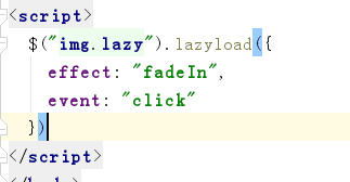
- jQuery lazyload  主要是为了节省流量,点击时才出现
   - 懒加载图片
<!DOCTYPE html>

<html lang="zh-CN">

<head>

  <meta charset="UTF-8">

  <meta http-equiv="x-ua-compatible" content="IE=edge">

  <meta name="viewport" content="width=device-width, initial-scale=1">

  <title>懒加载示例</title>

</head>

<body>

<div>

  <div><img src="img/0.jpg" alt="" class="lazy" data-original="http://pic.pptbz.com/pptpic/201511/2015110586122945.jpg" width="600px" height="400px"></div>

  <div><img src="img/0.jpg" alt="" class="lazy" data-original="http://img1.bitautoimg.com/bitauto/2012/08/10/3aa9e774-574b-4165-b59a-db4f243bdc5a.jpg" width="600px" height="400px"></div>

  <div><img src="img/0.jpg" alt="" class="lazy" data-original="http://dl.bizhi.sogou.com/images/2014/01/09/485496.jpg" width="600px" height="400px"></div>

  <div><img src="img/0.jpg" alt="" class="lazy" data-original="img/4.jpg" width="600px" height="400px"></div>

  <div><img src="img/0.jpg" alt="" class="lazy" data-original="img/5.jpg" width="600px" height="400px"></div>

  <div><img src="img/0.jpg" alt="" class="lazy" data-original="img/6.jpg" width="600px" height="400px"></div>

  <div><img src="img/0.jpg" alt="" class="lazy" data-original="img/1.jpg" width="600px" height="400px"></div>

  <div><img src="img/0.jpg" alt="" class="lazy" data-original="img/2.jpg" width="600px" height="400px"></div>

  <div><img src="img/0.jpg" alt="" class="lazy" data-original="img/3.jpg" width="600px" height="400px"></div>

  <div><img src="img/0.jpg" alt="" class="lazy" data-original="img/4.jpg" width="600px" height="400px"></div>

  <div><img src="img/0.jpg" alt="" class="lazy" data-original="img/5.jpg" width="600px" height="400px"></div>

  <div><img src="img/0.jpg" alt="" class="lazy" data-original="img/6.jpg" width="600px" height="400px"></div>

</div>

<script src="https://cdn.bootcss.com/jquery/3.2.1/jquery.min.js"></script>

<script src="jquery.lazyload.min.js"></script>

<script>

  $("img.lazy").lazyload({

    effect: "fadeIn",

    event: "click"

  })

</script>

</body>

</html>
例子
- Font Awesome
   - 字体图标
<!DOCTYPE html>

<html lang="en">

<head>

    <meta charset="UTF-8">

    <meta http-equiv="X-UA-Compatible" content="IE=edge">

    <meta name="viewport" content="width=device-width, initial-scale=1">

    <title>图标示例</title>

    <link rel="stylesheet" href="font-awesome/css/font-awesome.min.css">

    <link rel="stylesheet" href="bootstrap-3.3.7/css/bootstrap.min.css">

    <link rel="stylesheet" href="toastr/toastr.min.css">

</head>

<body>

<button class="btn btn-lg btn-primary"><i class="fa fa-plug" aria-hidden="true"></i>微信</button>

<span class="fa-stack fa-lg">

  <i class="fa fa-circle-o fa-stack-1x"></i>

  <i class="fa fa-wechat fa-stack-2x"></i>

</span>

<script src="jquery-3.2.1.js"></script>

<script src="toastr/toastr.min.js"></script>

<script>

    toastr.options = {

        "closeButton": true,

        "debug": false,

        "progressBar": false,

        "positionClass": "toast-top-right",

        "onclick": null,

        "showDuration": "300",

        "hideDuration": "1000",

        "timeOut": "5000",

        "extendedTimeOut": "1000",

        "showEasing": "swing",

        "hideEasing": "linear",

        "showMethod": "fadeIn",

        "hideMethod": "fadeOut"

    };

    toastr.info("Flatlab is an Awesome dashboard build with BS3 ", "Toastr Notification")

</script>

</body>

</html>
例子

- Toastr  使用步骤:1下载 2解压找到里面的build 3引入到自己的文件里就行了
   - 通知栏的插件

使用:
基本上都是基于jQuery
1. 先导入插件的CSS文件
2. 导入jQuery
3. 导入插件的JS文件
插件常用的网址
  - [Font Awesome](http://fontawesome.io/)

  - [jQuery lazy load](https://github.com/tuupola/jquery_lazyload)

  - [SweetAlert](https://github.com/t4t5/sweetalert)/[SweetAlert2](https://github.com/limonte/sweetalert2)

  - [Toastr](http://codeseven.github.io/toastr/)

注:http://v3.bootcss.com/    这个是文档,以后要多看。
Bootstrap收尾的更多相关文章
- bootstrap插件学习-bootstrap.scrollspy.js
先看bootstrap.dropdown.js的结构 function ScrollSpy(){} //构造函数 ScrollSpy.prototype = {} //构造器的原型 $.fn.scro ...
- 7.bootstrap HTML编码规范
Bootstrap HTML编码规范 语法 用两个空格来代替制表符(tab) -- 这是唯一能保证在所有环境下获得一致展现的方法. 嵌套元素应当缩进一次(即两个空格). 对于属性的定义,确保全部使用双 ...
- 前端编码规范,个人感觉bootstrap总结的不错,拿出来给大家分享
前端编码规范,个人感觉bootstrap总结的不错,拿出来给大家分享 http://codeguide.bootcss.com/#html-doctype HTML 语法 HTML5 doctype ...
- 旺财速啃H5框架之Bootstrap(五)
在上一篇<<旺财速啃H5框架之Bootstrap(四)>>做了基本的框架,<<旺财速啃H5框架之Bootstrap(二)>>篇里也大体认识了bootst ...
- 旺财速啃H5框架之Bootstrap(四)
上一篇<<旺财速啃H5框架之Bootstrap(三)>>已经把导航做了,接下来搭建内容框架.... 对于不规整的网页,要做成自适应就有点玩大了.... 例如下面这种版式的页面. ...
- bootstrap + requireJS+ director+ knockout + web API = 一个时髦的单页程序
也许单页程序(Single Page Application)并不是什么时髦的玩意,像Gmail在很早之前就已经在使用这种模式.通常的说法是它通过避免页面刷新大大提高了网站的响应性,像操作桌面应用程序 ...
- 参考bootstrap中的popover.js的css画消息弹框
前段时间小颖的大学同学给小颖发了一张截图,图片类似下面这张图: 小颖当时大概的给她说了下,其实小颖也不知道上面那个三角形怎么画嘻嘻,给她说了DOM结构,具体的css让她自己百度,今天小颖自己参考boo ...
- Bootstrap 模态框(Modal)插件
页面效果: html+js: <!DOCTYPE html> <html> <head> <meta charset="utf-8"> ...
- 利用bootstrap的carousel.js实现轮播图动画
前期准备: 1.jquery.js. 2.bootstrap的carousel.js. 3.bootstrap.css. 如果大家不知道在哪下载,可以联系小颖,小颖把这些js和css可以发送给你. 一 ...
随机推荐
- JavaWeb学习 (十五)————JSP指令
一.JSP指令简介 JSP指令(directive)是为JSP引擎而设计的,它们并不直接产生任何可见输出,而只是告诉引擎如何处理JSP页面中的其余部分. 在JSP 2.0规范中共定义了三个指令: pa ...
- 学习实践之DEMO《nodejs模拟POST登陆》
一个简单的PHP接收参数页面 <?php header("content-type:text/html;charset=utf-8"); if($_POST[username ...
- R语言学习笔记(五)绘图(1)
R是一个惊艳的图形构建平台,这也是R语言的强大之处.本文将分享R语言简单的绘图命令. 本文所使用的数据或者来自R语言自带的数据(mtcars)或者自行创建. 首先,让我们来看一个简单例子: ...
- ASP.NET Identity 三(转载)
转载来源:http://www.cnblogs.com/r01cn/p/5194257.html 注:本文是[ASP.NET Identity系列教程]的第三篇.本系列教程详细.完整.深入地介绍了微软 ...
- 数据机构-折半查找法(二分查找法)-Python实现
Python实现二分查找法(基于顺序表) class List: elem=[] #存储顺序表元素 last=-1 #设置初始为-1 SeqList = List() #创建一个顺序表 print(& ...
- 数组式访问-ArrayAccess
以前对ArrayAccess不是很熟悉,现在整理下下有关ArrayAccess相关的知识,ArrayAccess接口就是提供像访问数组一样访问对象的能力的接口. 接口内容如下: ArrayAccess ...
- C#中的out、ref、params详解
out参数: 如果你在一个方法中,返回多个相同类型的值的时候,可以考虑返回一个数组.但是,如果返回多个不同类型的值的时候,返回数组就不行了,那么这个时候,我们可以考虑使用out参数.out参数就侧重于 ...
- JNI和NDK基础
引言 JNI是Java Native Interface(Java本地接口),是为了方便Java调用C和C++等本地代码所封装的一层接口. NDK是Android提供的一个工具集合,通过NDK可以在A ...
- Starting zookeeper ... already running as process 1805错误
启动zookeeper的时候,报Starting zookeeper ... already running as process 1805错误 上面这个错误意思为以作为进程1805运行.系统检测到你 ...
- Servlet—Cookie(显示用户上次访问时间、显示商品浏览历史)
1 . 什么是会话? 会话可简单理解为:用户开一个浏览器,点击多个超链接,访问服务器多个web资源,然后关闭浏览器,整个过程称之为一个会话. 1.1 会话过程中要解决的一些问题? 每个用户在使用浏览器 ...