
CSS3 -- 边框圆角
文章后有彩蛋哦
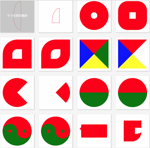
<!DOCTYPE html>
<html lang="en">
<head>
<meta charset="UTF-8">
<title>CSS3 边框</title>
<style>
body, ul, li, dl, dt, dd, h1, h2, h3, h4, h5 {
margin: 0;
padding: 0;
}
body {
background-color: #F7F7F7;
}
.wrapper {
width: 1000px;
margin: 0 auto;
padding: 20px;
box-sizing: border-box;
}
header {
padding: 20px 0;
margin-bottom: 20px;
text-align: center;
}
header h3 {
line-height: 1;
font-weight: normal;
font-size: 28px;
}
.main {
/*overflow: hidden;*/
}
.main:after {
content: '';
clear: both;
display: block;
}
.main .item {
width: 210px;
height: 210px;
margin: 0 30px 30px 0;
display: flex;
position: relative;
background-color: #FFF;
float: left;
box-shadow: 2px 2px 5px #CCC;
}
.main .item:after {
content: attr(data-brief);
display: block;
width: 100%;
height: 100%;
text-align: center;
line-height: 210px;
position: absolute;
top: 0;
left: 0;
color: #FFF;
font-family: '微软雅黑';
font-size: 18px;
background-color: rgba(170, 170, 170, 0);
z-index: -1;
transition: all 0.3s ease-in;
}
.main .item:hover:after {
background-color: rgba(170, 170, 170, 0.6);
z-index: 100;
}
.main .item:nth-child(4n) {
margin-right: 0;
}
/*.main .item:nth-last-child(-n+5) {
margin-bottom: 0;
}*/
/* 以上是骨架样式 */
/* 1、2、3、4 顺时针 */
.border-radius {
width: 180px;
height: 180px;
margin: auto;
border: 1px solid red;
/*border-radius: 50% 30% 20%;*/
}
.square {
border-radius: 0;
}
/*圆形*/
.item:nth-child(1) .border-radius {
border-radius: 90px;
}
/*拱形*/
.item:nth-child(2) .border-radius {
border-radius: 90px 90px 0 0;
}
/*半圆*/
.item:nth-child(3) .border-radius {
height: 90px;
border-radius: 90px 90px 0 0;
}
/*左上角*/
.item:nth-child(4) .border-radius {
/*height: 90px;*/
border-radius: 90px 0 0 0;
}
/*四分之一圆*/
.item:nth-child(5) .border-radius {
width: 90px;
height: 90px;
border-radius: 90px 0 0 0;
}
/*横着的椭圆*/
.item:nth-child(6) .border-radius {
height: 90px;
/*border-radius: 50%;*/
border-radius: 90px 90px 90px 90px / 45px 45px 45px 45px;
/*border-radius: 45px / 90px;*/
}
/*竖着的椭圆*/
.item:nth-child(7) .border-radius {
width: 90px;
border-radius: 45px 45px 45px 45px / 90px 90px 90px 90px;
}
/*半个横着的椭圆*/
.item:nth-child(8) .border-radius {
height: 45px;
border-radius: 90px 90px 0 0 / 45px 45px 0 0;
}
/*半个竖着的椭圆*/
.item:nth-child(9) .border-radius {
width: 45px;
border-radius: 45px 0 0 45px / 90px 0 0 90px;
}
/*四分之一竖着的椭圆*/
.item:nth-child(10) .border-radius {
width: 45px;
height: 90px;
border-radius: 45px 0 0 0 / 90px 0 0 0;
}
/*饼环*/
.item:nth-child(11) .border-radius {
width: 40px;
height: 40px;
border: 70px solid red;
border-radius: 90px;
}
/*圆饼*/
.item:nth-child(12) .border-radius {
width: 40px;
height: 40px;
border: 70px solid red;
border-radius: 60px;
}
/*左上角圆饼*/
.item:nth-child(13) .border-radius {
width: 60px;
height: 60px;
border: 60px solid red;
border-radius: 90px 0 0 0;
}
/*对角圆饼*/
.item:nth-child(14) .border-radius {
width: 60px;
height: 60px;
border: 60px solid red;
border-radius: 90px 0 90px 0;
}
/*四边不同色*/
.item:nth-child(15) .border-radius {
width: 0px;
height: 0px;
border-width: 90px;
border-style: solid;
border-color: red green yellow blue;
}
/*右透明色*/
.item:nth-child(16) .border-radius {
width: 0px;
height: 0px;
border-width: 90px;
border-style: solid;
border-color: red green yellow blue;
border-right-color: transparent;
}
/*圆右透明色*/
.item:nth-child(17) .border-radius {
width: 0px;
height: 0px;
border-width: 90px;
border-style: solid;
border-color: red;
border-right-color: transparent;
border-radius: 90px;
}
/*圆右红透明色*/
.item:nth-child(18) .border-radius {
width: 0px;
height: 0px;
border-width: 90px;
border-style: solid;
border-color: transparent;
border-right-color: red;
border-radius: 90px;
}
/*阴阳图前世*/
.item:nth-child(19) .border-radius {
width: 180px;
height: 0px;
border-top-width: 90px;
border-bottom-width: 90px;
border-style: solid;
border-top-color: red;
border-bottom-color: green;
/*border-right-color: red;*/
border-radius: 90px;
}
/*阴阳图前世2*/
.item:nth-child(20) .border-radius {
width: 180px;
height: 90px;
border-bottom-width: 90px;
border-style: solid;
border-bottom-color: green;
background-color: red;
/*border-right-color: red;*/
border-radius: 90px;
}
/*阴阳图今生*/
.item:nth-child(21) .border-radius {
width: 180px;
height: 90px;
border-bottom-width: 90px;
border-style: solid;
border-bottom-color: green;
background-color: red;
border-radius: 90px;
position: relative;
}
.item:nth-child(21) .border-radius::after,
.item:nth-child(21) .border-radius::before {
content: '';
position: absolute;
top: 50%;
width: 20px;
height: 20px;
/*margin: -10px 0 0 0;*/
border-width: 35px;
border-style: solid;
border-radius: 45px;
}
/*左阴阳*/
.item:nth-child(21) .border-radius::after {
background-color: red;
border-color: green;
}
/*右阴阳*/
.item:nth-child(21) .border-radius::before {
background-color: green;
border-color: red;
right: 0;
}
/*右阴阳*/
.item:nth-child(22) .border-radius {
width: 180px;
height: 90px;
border-bottom-width: 90px;
border-bottom-color: green;
border-bottom-style: solid;
background-color: red;
border-radius: 90px;
position: relative;
}
.item:nth-child(22) .border-radius::after,
.item:nth-child(22) .border-radius::before {
content: '';
position: absolute;
top: 50%;
width: 20px;
height: 20px;
border-width: 35px;
border-style: solid;
border-radius: 45px;
}
.item:nth-child(22) .border-radius::before {
border-color: green;
background-color: red;
}
.item:nth-child(22) .border-radius::after {
right: 0;
border-color: red;
background-color: green;
}
/*消息框*/
.item:nth-child(23) .border-radius {
width: 160px;
height: 80px;
background-color: red;
border-radius: 6px;
position: relative;
}
.item:nth-child(23) .border-radius::after {
content: '';
width: 0;
height: 0;
border-width: 10px;
border-style: solid;
border-color: transparent;
border-right-color: red;
position: absolute;
top: 16px;
left: -20px;
}
/*奇怪的图形*/
.item:nth-child(24) .border-radius {
width: 40px;
height: 40px;
border-width: 45px 0 45px 70px;
border-style: solid;
border-radius: 0 0 60px 0;
border-color: red;
}
/*奇怪的图形2*/
.item:nth-child(25) .border-radius {
width: 100px;
height: 40px;
border-width: 45px 20px 45px 70px;
border-style: solid;
border-radius: 60px;
border-color: red;
}
/*QQ对话*/
.item:nth-child(26) .border-radius {
width: 160px;
height: 80px;
background-color: red;
border-radius: 6px;
position: relative;
}
.item:nth-child(26) .border-radius::after {
content: '';
position: absolute;
top: 0;
right: -20px;
width: 30px;
height: 30px;
border-width: 0 0 30px 30px;
border-style: solid;
border-bottom-color: red;
border-left-color: transparent;
border-radius: 0 0 60px 0;
}
/*圆角的百分比设置 */
.item:nth-child(27) .border-radius {
width: 180px;
/*height: 180px;*/
height: 90px;
border-radius: 50%;
border-radius: 90px/45px;
/*百分比是按横竖两个对应的方向的长度进行计算*/
}
</style>
</head>
<body>
<div class="wrapper">
<header>
<h3>CSS3 边框圆角</h3>
</header>
<div class="main">
<div class="item" data-brief="整圆">
<div class="border-radius"></div>
</div>
<div class="item" data-brief="拱形">
<div class="border-radius"></div>
</div>
<div class="item" data-brief="半圆">
<div class="border-radius"></div>
</div>
<div class="item" data-brief="左上角">
<div class="border-radius"></div>
</div>
<div class="item" data-brief="四分之一圆">
<div class="border-radius"></div>
</div>
<div class="item" data-brief="横着的椭圆">
<div class="border-radius"></div>
</div>
<div class="item" data-brief="竖着的椭圆">
<div class="border-radius"></div>
</div>
<div class="item" data-brief="半个横着的椭圆">
<div class="border-radius"></div>
</div>
<div class="item" data-brief="半个竖着的椭圆">
<div class="border-radius"></div>
</div>
<div class="item" data-brief="四分之一竖着的椭圆">
<div class="border-radius"></div>
</div>
<div class="item" data-brief="饼环">
<div class="border-radius"></div>
</div>
<div class="item" data-brief="圆饼">
<div class="border-radius"></div>
</div>
<div class="item" data-brief="左上角圆饼">
<div class="border-radius"></div>
</div>
<div class="item" data-brief="对角圆饼">
<div class="border-radius"></div>
</div>
<div class="item" data-brief="四边不同色">
<div class="border-radius"></div>
</div>
<div class="item" data-brief="右透明色">
<div class="border-radius"></div>
</div>
<div class="item" data-brief="圆右透明色">
<div class="border-radius"></div>
</div>
<div class="item" data-brief="圆右红透明色">
<div class="border-radius"></div>
</div>
<div class="item" data-brief="阴阳图前世">
<div class="border-radius"></div>
</div>
<div class="item" data-brief="阴阳图前世2">
<div class="border-radius"></div>
</div>
<div class="item" data-brief="阴阳图今生">
<div class="border-radius"></div>
</div>
<div class="item" data-brief="阴阳图今生2">
<div class="border-radius"></div>
</div>
<div class="item" data-brief="消息框">
<div class="border-radius"></div>
</div>
<div class="item" data-brief="奇怪的图形">
<div class="border-radius"></div>
</div>
<div class="item" data-brief="奇怪的图形2">
<div class="border-radius"></div>
</div>
<div class="item" data-brief="QQ对话">
<div class="border-radius"></div>
</div>
<div class="item" data-brief="圆角百分比">
<div class="border-radius"></div>
</div>
</div>
</div>
</body>
</html>
感谢公总号:web前端开发
CSS3 -- 边框圆角的更多相关文章
- CSS3 边框 圆角 背景
CSS3用于控制网页的样式布局. CSS3是最新的CSS标准. 关于transform: transform:rotate(10deg);//顺时针方向旋转10° 浏览器支持情况:低版本的IE浏览 ...
- CSS3——边框 圆角 背景 渐变 文本效果
边框 圆角边框 盒阴影 边界图片 圆角 CSS3 圆角制作器 指定每个角 背景 多重背景图像 大小 图像的定位 背景剪裁 渐变 线性渐变(Linear Gradients)- 向下/向上/向左/向右/ ...
- CSS3边框 圆角效果 border-radius
border-radius是向元素添加圆角边框 使用方法: border-radius:10px; /* 所有角都使用半径为10px的圆角 */ border-radius: 5px 5px 5px ...
- CSS3边框圆角知识
<div class="item" data-brief="整圆"> <div class="border-radius" ...
- CSS3 border-radius边框圆角
在CSS3中提供了对边框进行圆角设定的支持,可对边框1~4个角进行圆角样式设置. 目录 1. 介绍 2. value值的格式和类型 3. border-radius 1~4个参数说明 4. 在线示例 ...
- css3实现边框圆角样式
基本语法: border-radius: 5px; 兼容大多数浏览器: /*兼容Mozilla(Firefox, Flock等浏览器)*/ -moz-border-radius-topleft: ...
- 使用css3来实现边框圆角效果
经常看到别人的网站有个边框来修饰文字区域,类似圆角矩形把文字环绕起来,特别有感觉,于是就试着用图片边框来修饰,但是用图片过多会拉慢网页的加载速度,能不能使用css3来实现边框圆角效果呢?当然borde ...
- CSS3 02. 边框、边框圆角、边框阴影、边框图片、渐变、线性渐变、径向渐变、背景、过渡transition、2D转换
边框圆角 border-radius 每个角可以设置两个值,x值.y值 border-top-left-radius:水平半径 垂直半径 border-radius:水平半径/垂直半径 border- ...
- 从零开始学 Web 之 CSS3(二)颜色模式,文字阴影,盒模型,边框圆角,边框阴影
大家好,这里是「 从零开始学 Web 系列教程 」,并在下列地址同步更新...... github:https://github.com/Daotin/Web 微信公众号:Web前端之巅 博客园:ht ...
随机推荐
- Sping POJO中如何添加验证规则和验证消息提示
1.示例,验证规则和错误提示作为注解写在声明变量的地方 @NotNull private long id; @NotNull @Size(min = 2, max = 30,message=" ...
- 1-2-K Game
题目链接:https://vjudge.net/contest/330119#problem/E 题目大意可以理解为: 1.给出n个物品以及k,Alice与Bob轮流拿1个,或2个,或k个物品,Ali ...
- lab3:系统调用
jos系统调用函数链 记录自己对jos系统调用实现的理解. 用户程序访问系统服务的方法 用户使用系统服务的方式大概分为如下几种: (1)用户程序---->库函数----->系统调用---- ...
- hdu 1024 最大m段不相交线段和
题目传送门//res tp hdu 数据范围1e6,若是开二维会爆 考虑用滚动数组优化 #include<iostream> #include<cstdio> #include ...
- 超简单的js实现提示效果弹出以及延迟隐藏的功能
自动登录勾选提示效果 要求:鼠标移入显示提示信息框:鼠标离开,信息框消失,消失的效果延迟 <!DOCTYPE html> <html lang="en"> ...
- 用shell脚本安装MySQL-5.7.22-Percona版本
#!/bin/bash MySQL_Package=Percona-Server-5.7.22-22-Linux.x86_64.ssl101.tar.gz Package_Source=Percona ...
- html跑马灯/走马灯效果
实现跑马灯的方法很多,其中最简单的是采用一句Html代码来实现,我们在需要出现跑马灯效果的地方插入“<marquee>滚动的文字</marquee>”语句,它的效果如下所示: ...
- k8s-搭建 EFK 日志系统
搭建 EFK 日志系统 大家介绍了 Kubernetes 集群中的几种日志收集方案,Kubernetes 中比较流行的日志收集解决方案是 Elasticsearch.Fluentd 和 Kibana( ...
- 怎样指定当前cookie不能通过js脚本获取
所谓" 不能通过js脚本获取 " 主要指的是: 使用document.cookie / XMLHttpRequest对象 / Request API 等无法获取到当前cookie. ...
- winfrom 保存图片
private void btnSave_Click(object sender, EventArgs e) { SaveFileDialog sfd = new SaveFileDialog(); ...