vue自定义下拉框组件
创建下拉框组件 Select.vue

<template>

  <div class="selects">

    <div

      :class="{selects0show: !isshow,selects0hade: isshow}"

      class="selects0"

      @click="isshow=!isshow"

    >

      <p ref="mybox">请选择</p>

        <img src="@/assets/home/z_x_jt.png" alt srcset />

    </div>

    <div ref="myselect" :class="{show: !isshow,hade: isshow}" class="sel">

      <div

        @click="cutValue(1)"

        ref="mybox1"

        :class="{borders:num ==1}"

        :style="{display: num >=1?'block':'none'}"

      >{{selects1}}</div>

      <div

        @click="cutValue(2)"

        ref="mybox2"

        :class="{borders:num ==2}"

        :style="{display: num >=2?'block':'none'}"

      >{{selects2}}</div>

      <div

        @click="cutValue(3)"

        ref="mybox3"

        :class="{borders:num ==3}"

        :style="{display: num >=3?'block':'none'}"

      >{{selects3}}</div>

      <div

        @click="cutValue(4)"

        ref="mybox4"

        :class="{borders:num ==4}"

        :style="{display: num >=4?'block':'none'}"

      >{{selects4}}</div>

      <div

        @click="cutValue(5)"

        ref="mybox5"

        :class="{borders:num ==5}"

        :style="{display: num >=5?'block':'none'}"

      >{{selects5}}</div>

    </div>

  </div>

</template>

<script>

export default {

  props: {

    num: String, //显示多少个下拉框

    selects1: String, //列表里的文字

    selects2: String,

    selects3: String,

    selects4: String,

    selects5: String

  },

  data() {

    return {

      isshow: true //控制下拉框显示及隐藏

    };

  },

  methods: {

    //点击换文字的方法

    cutValue(val) {

      let _this = this

      cutfun(val)

      _this.isshow = true;

      function cutfun(val){

        if (val == 1) {

          _this.$refs.mybox.innerText = _this.$refs.mybox1.innerText;

        } else if(val == 2){

          _this.$refs.mybox.innerText = _this.$refs.mybox2.innerText;

        } else if(val == 3){

          _this.$refs.mybox.innerText = _this.$refs.mybox3.innerText;

        }else if(val == 4){

           _this.$refs.mybox.innerText = _this.$refs.mybox4.innerText;

        }else if(val == 5){

           _this.$refs.mybox.innerText = _this.$refs.mybox5.innerText;

        }

      _this.$emit("va", val, _this.$refs.mybox.innerText);

      }

    }

  }

};

</script>

<style lang="less" scoped>

//显示下拉框

.show {

  display: block;

}

//隐藏下拉框

.hade {

  display: none;

}

//点击时改变选择框的边框颜色

.selects0show {

  border: 1px solid #01be6e;

}

//恢复边框颜色

.selects0hade {

  border: 1px solid #e4e4e4;

}

//最后一个下拉框底部加边框

.borders {

  border-bottom: 1px solid #01be6e !important;

}

//倒三角

.traing{

    width: 0;

    height: 0;

    border-left: 5px solid transparent;

    border-right: 5px solid transparent;

    border-top: 10px solid #666666;

}

.selects {

  width: 100%;

  height: 100%;

  .selects0 {

    width: 100%;

    height: 100%;

    display: flex;

    justify-content: space-between;

    align-items: center;

    p {

      line-height: 100%;

      display: inline;

      color: #666666;

      font-size: 15px;

      padding-left: 10px;

    }

    img {

      margin-right: 10px;

      transform: translateY(-2px);

    }

  }

  .sel {

    width: 100%;

    height: 100%;

    div {

      width: 100%;

      height: 100%;

      display: flex;

      justify-content: space-between;

      align-items: center;

      line-height: 35px;

      border: 1px solid #01be6e;

      border-top: none;

      padding-left: 10px;

      border-bottom: none;

      background: white;

    }

    div:hover {

      background: #01be6e;

      color: white;

    }

    .selects0:hover {

      background: white;

    }

  }

}

</style>
使用下拉框组件
//注:下拉框组件的宽高依赖于组件的父盒子
<template>
<div class="t_selects">
<!-- 使用下拉框组件 -->
<Myselects
//@va是子组件传给父组件的事件 有两个参数(当前点击下拉框的索引,当前点击下拉框里面的文字)
@va="sunValue"
//num是指定下拉框的个数 最多为5个
num="3"
//selects1-selects5 是自定义下拉框1-5里面的内容
:selects1="selects1"
:selects2="selects2"
:selects3="selects3"
></Myselects>
</div>
</template> <script>
import Selects from "@/components/Selects";
export default {
data() {
return {
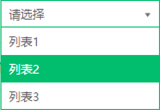
selects1: "列表1",
selects2: "列表2",
selects3: "列表3",
}
}
components: {
Myselects: Selects
},
methods: {
//拿到子组件下拉框里面的索引及内容 参数(当前点击下拉框的索引,当前点击下拉框里面的文字)
sunValue(index,val) {
console.log(index,val);
}
}
}
</script>
//定义父盒子的宽高
<style>
.t_selects {
width: 300;
height: 35px;
z-index: 1000;
}
</style>
效果图:


图片素材
不喜勿喷
vue自定义下拉框组件的更多相关文章
- Combo( 自定义下拉框) 组件
本节课重点了解 EasyUI 中 Combo(自定义下拉框)组件的使用方法,这个组件依赖于ValidateBox(验证框)组件 一. 加载方式自定义下拉框不能通过标签的方式进行创建.<input ...
- 第二百一十二节,jQuery EasyUI,Combo(自定义下拉框)组件
jQuery EasyUI,Combo(自定义下拉框)组件 学习要点: 1.加载方式 2.属性列表 3.事件列表 4.方法列表 本节课重点了解 EasyUI 中 Combo(自定义下拉框)组件的使用方 ...
- 第二百二十四节,jQuery EasyUI,ComboGrid(数据表格下拉框)组件
jQuery EasyUI,ComboGrid(数据表格下拉框)组件 学习要点: 1.加载方式 2.属性列表 3.方法列表 本节课重点了解 EasyUI 中 ComboGrid(数据表格下拉框)组件的 ...
- 自绘制HT For Web ComboBox下拉框组件
传统的HTML5的下拉框select只能实现简单的文字下拉列表,而HTforWeb通用组件中ComboBox不仅能够实现传统HTML5下拉框效果,而且可以在文本框和下拉列表中添加自定义的小图标,让整个 ...
- easyui源码翻译1.32--Combo(自定义下拉框)
前言 扩展自$.fn.validatebox.defaults.使用$.fn.combo.defaults重写默认值对象.下载该插件翻译源码 自定义下拉框显示一个可编辑的文本框和下拉面板在html页面 ...
- ComboTree( 树型下拉框) 组件
本节课重点了解EasyUI中Tree(树)组件的使用方法, 这个组件依赖于Combo(下拉框)和 Tree(树)组件.一. 加载方式//class 加载方式<select id="cc ...
- 第二百二十七节,jQuery EasyUI,ComboTree(树型下拉框)组件
jQuery EasyUI,ComboTree(树型下拉框)组件 学习要点: 1.加载方式 2.属性列表 3.方法列表 本节课重点了解EasyUI中ComboTree(树型下拉框)组件的使用方法,这个 ...
- jquery美化select,自定义下拉框样式
select默认的样式比较丑,有些应用需要美化select,在网上找到一个很好的美化样式效果,本人很喜欢,在这里分享一下. <!DOCTYPE html PUBLIC "-//W3C/ ...
- 关于safari上的select宽高问题小技,自定义下拉框
之前一直用windows做开发,最近换了个mac,在几经折腾之下,安装完了各种开发工具,IDE等,然后欣然打开自己正在开发的网站.突然发现mac上所有的下拉框都变了,都是默认样式,无论padding, ...
随机推荐
- windows异常-环境变量
问题现象: 高级设置:windows 找不到文件 %windir%\systempropertiesadvanced.exe 请确定文件是否正确后,再试一次 基础信息: windows7 专业版 问题 ...
- Python随机数函数
Python随机数函数: ''' choice(seq) 从序列的元素中随机选出一个元素 randrange ([start,] stop [,step]) 从指定范围内,在指定步长递增的集合中 获取 ...
- Qt_Demo_4:汽车管理系统
1 简介 参考视频:https://www.bilibili.com/video/BV1XW411x7AB?p=3 Github:https://github.com/zhengcixi/Qt_De ...
- PDOStatement::errorCode
PDOStatement::errorCode — 获取跟上一次语句句柄操作相关的 SQLSTATE(PHP 5 >= 5.1.0, PECL pdo >= 0.1.0) 说明 语法 st ...
- Java对象(创建过程、内存布局、访问方法)
(Java 普通对象.不包括数组.Class 对象等.) 对象创建过程 类加载 遇到 new 指令时,获取对应的符号引用,并检查该符号引用代表的类是否已被初始化.如果没有就进行类加载. 分配内存 ...
- 关于innerHtml= 与 html() 区别
今天遇到的问题:如果写入的html 有<script>,必须用JQuery 的 html() 才能识别: 使用innerHtml 无法识别<script> 原因机制:待查询
- js数组中如何去除重复值?
在日常开发中,我们可能会遇到将一个数组中里面的重复值去除,那么,我就将我自己所学习到的几种方法分享出来 去除数组重复值方法: 1,利用indexOf()方法去除 思路:创建一个新数组,然后循环要去重的 ...
- Nginx实现静态服务器+https+负载均衡
#user nobody; # 进程数=CPU总核数 worker_processes 2; #error_log logs/error.log; #error_log logs/error.log ...
- tomcat启动失败的解决办法
初次安装tomcat启动失败的解决办法: 1.CATALINA_HOME C:\Program Files\apache-tomcat-8.5.242.path %CATALINA_HOME% ...
- Catalina 默认使用zsh了,你可习惯
zsh 成为默认 shell 淘汰掉我的旧MBP换新后,欢天喜地打开Terminal,感觉有点不对,提示符什么时候变成了 %. 查询了一些资料发现,原来在2019年WWDC期间,苹果推出了macOS ...