matplotlib -- 绘图操作 -- 数据分析三剑客
开发环境
- anaconda
- 集成环境:集成好了数据分析和机器学习中所需要的全部环境
- 安装目录不可以有中文和特殊符号
- jupyter
- anaconda提供的一个基于浏览器的可视化开发工具
import matplotlib.pyplot as plt

import numpy as np
plt.plot()绘制线性图
- 绘制单条线形图
- 绘制多条线形图
- 设置坐标系的比例plt.figure(figsize=(a,b))
- 设置图例legend()
- 设置轴的标识
- 图例保存
- fig = plt.figure()
- plt.plot(x,y)
- figure.savefig()
- 曲线的样式和风格
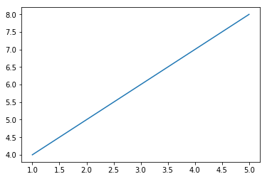
绘制单条线形图
x = np.array([1,2,3,4,5])
y = x + 3
plt.plot(x,y)
[<matplotlib.lines.Line2D at 0x111dc3f28>]
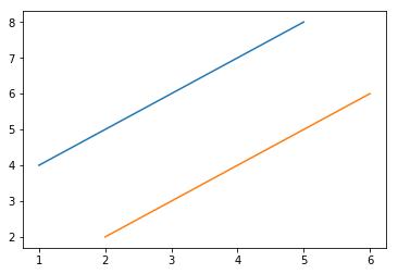
绘制多条线形图
方式一
plt.plot(x,y)

plt.plot(x+1,y-2)
[<matplotlib.lines.Line2D at 0x111e38b00>]

方式二
plt.plot(x,y,x+1,y-2)
[<matplotlib.lines.Line2D at 0x111f80a20>,
<matplotlib.lines.Line2D at 0x111f80be0>]
设置坐标系的比例
- plt.figure(figsize=(a,b))
plt.figure(figsize=(5,9))  # 放置在绘图的plot方法之前

plt.plot(x,y)
[<matplotlib.lines.Line2D at 0x1120aebe0>]

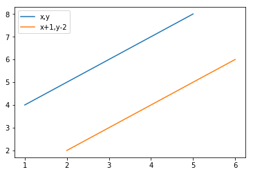
设置图例legend()
plt.plot(x,y,label='x,y')

plt.plot(x+1,y-2,label='x+1,y-2')

plt.legend()  # 图例生效
<matplotlib.legend.Legend at 0x11693a5f8>
设置轴的标识
plt.plot(x,y)

plt.xlabel('temp')

plt.ylabel('dist')

plt.title('dist&temp')
Text(0.5,1,'dist&temp')

图例保存
- fig = plt.figure()
- plt.plot(x,y)
- figure.savefig()
fig = plt.figure()  # 该对象的创建一定要放置在plot绘图之前

plt.plot(x,y,label='x,y')

fig.savefig('./123.png')

曲线的样式和风格
设置颜色和透明度
plt.plot(x,y,c='red',alpha=0.5)
[<matplotlib.lines.Line2D at 0x1170d2ef0>]

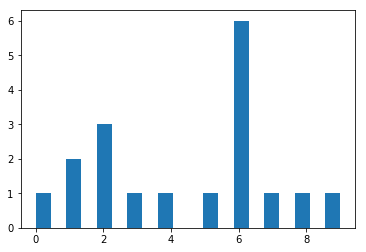
柱状图
- plt.bar()
- 参数
- 第一个参数是索引
- 第二个参数是数据值
- 第三个参数是条形的宽度
- 参数
plt.bar(x,y)
<BarContainer object of 5 artists>

直方图
- 是一个特殊的柱状图,又叫做密度图
- plt.hist()的参数
- bins # 柱子的个数
- 可以是一个bin数量的整数值,也可以是表示bin的一个序列。默认值为10
- normed
- 如果值为True,直方图的值将进行归一化处理,形成概率密度,默认值为False
- color
- 指定直方图的颜色。可以是单一颜色值或颜色的序列。如果指定了多个数据集合,例如DataFrame对象,颜色序列将会设置为相同的顺序。如果未指定,将会使用一个默认的线条颜色
- orientation
- 通过设置orientation为horizontal创建水平直方图。默认值为vertical
- bins # 柱子的个数
data = [1,1,2,2,2,3,4,5,6,6,6,6,6,6,7,8,9,0]

plt.hist(data,bins=20)
(array([1., 0., 2., 0., 3., 0., 1., 0., 1., 0., 0., 1., 0., 6., 0., 1., 0.,
1., 0., 1.]),
array([0. , 0.45, 0.9 , 1.35, 1.8 , 2.25, 2.7 , 3.15, 3.6 , 4.05, 4.5 ,
4.95, 5.4 , 5.85, 6.3 , 6.75, 7.2 , 7.65, 8.1 , 8.55, 9. ]),
<a list of 20 Patch objects>)
饼图
- pie(),饼图也只有一个参数x
- 饼图适合展示各部分占总体的比例,条形图适合比较各部分的大小
arr=[11,22,31,15]  # 整数--显示四个数各占的百分比

plt.pie(arr)
([<matplotlib.patches.Wedge at 0x1178be1d0>,
<matplotlib.patches.Wedge at 0x1178be6a0>,
<matplotlib.patches.Wedge at 0x1178beb70>,
<matplotlib.patches.Wedge at 0x1178c60f0>],
[Text(0.996424,0.465981,''),
Text(-0.195798,1.08243,''),
Text(-0.830021,-0.721848,''),
Text(0.910034,-0.61793,'')])

arr=[0.2,0.3,0.1]  # 小数--表示比例--第一个数占0.2,第二个数占0.3,以此类推...

plt.pie(arr)
([<matplotlib.patches.Wedge at 0x1177d0e80>,
<matplotlib.patches.Wedge at 0x1177da390>,
<matplotlib.patches.Wedge at 0x1177da8d0>],
[Text(0.889919,0.646564,''),
Text(-0.646564,0.889919,''),
Text(-1.04616,-0.339919,'')])

# labels 设置对应的标识

arr=[11,22,31,15]

plt.pie(arr,labels=['a','b','c','d'])
([<matplotlib.patches.Wedge at 0x11794aa90>,
<matplotlib.patches.Wedge at 0x11794af60>,
<matplotlib.patches.Wedge at 0x1179544e0>,
<matplotlib.patches.Wedge at 0x117954a20>],
[Text(0.996424,0.465981,'a'),
Text(-0.195798,1.08243,'b'),
Text(-0.830021,-0.721848,'c'),
Text(0.910034,-0.61793,'d')])

# labeldistance 设置标识到圆心的距离

arr=[11,22,31,15]

plt.pie(arr,labels=['a','b','c','d'],labeldistance=0.3)
([<matplotlib.patches.Wedge at 0x1179e2278>,
<matplotlib.patches.Wedge at 0x1179e2748>,
<matplotlib.patches.Wedge at 0x1179e2c18>,
<matplotlib.patches.Wedge at 0x1179eb198>],
[Text(0.271752,0.127086,'a'),
Text(-0.0533994,0.295209,'b'),
Text(-0.226369,-0.196868,'c'),
Text(0.248191,-0.168526,'d')])

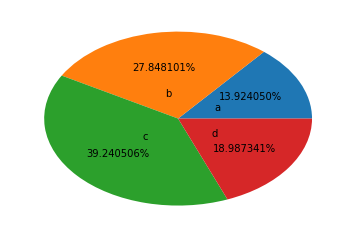
# autopct='%.6f%%'  自动计算出每部分所占的比例,保留六位小数

arr=[11,22,31,15]

plt.pie(arr,labels=['a','b','c','d'],labeldistance=0.3,autopct='%.6f%%')
([<matplotlib.patches.Wedge at 0x117a709e8>,
<matplotlib.patches.Wedge at 0x117a7a128>,
<matplotlib.patches.Wedge at 0x117a7a898>,
<matplotlib.patches.Wedge at 0x117a83048>],
[Text(0.271752,0.127086,'a'),
Text(-0.0533994,0.295209,'b'),
Text(-0.226369,-0.196868,'c'),
Text(0.248191,-0.168526,'d')],
[Text(0.543504,0.254171,'13.924050%'),
Text(-0.106799,0.590419,'27.848101%'),
Text(-0.452739,-0.393735,'39.240506%'),
Text(0.496382,-0.337053,'18.987341%')])
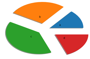
# explode 设置每个部分到圆心的距离

# shadow 设置阴影

arr=[11,22,31,15]

plt.pie(arr,labels=['a','b','c','d'],labeldistance=0.3,shadow=True,explode=[0.2,0.3,0.2,0.4])
([<matplotlib.patches.Wedge at 0x117ab2390>,
<matplotlib.patches.Wedge at 0x117ab2b38>,
<matplotlib.patches.Wedge at 0x117abb390>,
<matplotlib.patches.Wedge at 0x117abbba8>],
[Text(0.45292,0.21181,'a'),
Text(-0.106799,0.590419,'b'),
Text(-0.377282,-0.328113,'c'),
Text(0.579113,-0.393228,'d')])
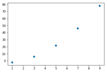
散点图
- scatter()
- 因变量随自变量而变化的大致趋势
x = np.array([1,3,5,7,9])

y = x ** 2 - 3

plt.scatter(x,y)
<matplotlib.collections.PathCollection at 0x117c1d780>
Type Markdown and LaTeX: 2
Type Markdown and LaTeX: 2
Type Markdown and LaTeX: 2
matplotlib -- 绘图操作 -- 数据分析三剑客的更多相关文章
- 数据分析07 /matplotlib绘图
数据分析07 /matplotlib绘图 目录 数据分析07 /matplotlib绘图 1. 绘制线性图:plt.plot() 2. 绘制柱状图:plt.bar() 3. 绘制直方图:plt.his ...
- python数据分析三剑客之: matplotlib绘图模块
matplotlib 一.Matplotlib基础知识 Matplotlib中的基本图表包括的元素 - x轴和y轴 axis 水平和垂直的轴线 - x轴和y轴刻度 tick 刻度标示坐标轴的分隔,包括 ...
- 数据分析三剑客之Matplotlib
Matplotlib绘图和可视化 简介 我的前面两篇文章介绍了 Nimpy ,Pandas .今天来介绍一下Matplotlib. 简单来说,Matplotlib 是 Python 的一个绘图库.它包 ...
- python数据分析使用matplotlib绘图
matplotlib绘图 关注公众号"轻松学编程"了解更多. Series和DataFrame都有一个用于生成各类图表的plot方法.默认情况下,它们所生成的是线形图 %matpl ...
- 数据分析三剑客之numpy
Numpy 简介 数据分析三剑客:Numpy,Pandas,Matplotlib NumPy(Numerical Python) 是 Python 语言的一个扩展程序库,支持大量的维度数组与矩阵运算, ...
- python数据分析三剑客之: Numpy
数据分析三剑客之: Numpy 一丶Numpy的使用 numpy 是Python语言的一个扩展程序库,支持大维度的数组和矩阵运算.也支持针对数组运算提供大量的数学函数库 创建ndarray # 1 ...
- matplotlib 绘图
http://blog.csdn.net/jkhere/article/details/9324823 都打一遍 5 matplotlib-绘制精美的图表 matplotlib 是python最著名的 ...
- matplotlib绘图基本用法-转自(http://blog.csdn.net/mao19931004/article/details/51915016)
本文转载自http://blog.csdn.net/mao19931004/article/details/51915016 <!DOCTYPE html PUBLIC "-//W3C ...
- Matplotlib 绘图 用法
Matplotlib基础知识 一.Matplotlib基础知识 Matplotlib中的基本图表包括的元素 x轴和y轴 axis 水平和垂直的轴线 x轴和y轴刻度 tick 刻度标示坐标轴的分隔,包括 ...
- ssh调用matplotlib绘图报错RuntimeError: Invalid DISPLAY variable
1.问题:在本地用matplotlib绘图可以,但是在ssh远程绘图的时候会报错 RuntimeError: Invalid DISPLAY variable 2.原因:matplotlib的默认ba ...
随机推荐
- [转]CMake与Make最简单直接的区别
写程序大体步骤为: 1.用编辑器编写源代码,如.c文件. 2.用编译器编译代码生成目标文件,如.o. 3.用链接器连接目标代码生成可执行文件,如.exe. 但如果源文件太多,一个一个编译时就会特别麻烦 ...
- 【吐血经验】在 windows 上安装 spark 遇到的一些坑 | 避坑指南
在 windows 上安装 spark 遇到的一些坑 | 避坑指南 最近有个活:给了我一个阿里云桌面(windows 10系统),让我在上面用 scala + spark 写一些东西. 总是报错不断, ...
- Linux安装配置Go语言
Linux安装配置Go语言 官网:https://go.dev/dl/ 从官网下载,选择linux下载压缩包. sudo cp -r go/ /usr/local sudo gedit /etc/pr ...
- 安装Rational rose软件简单教程
安装Rational rose软件简单教程 一.下载文件 百度云盘下载链接:https://pan.baidu.com/s/1QWmTgxKlQtE5flP7dXIF5w 提取码:wjnq 二.装虚拟 ...
- C#调用IronOcr识别文字不理想
识别文字不理想,不知道什么原因,文字太小就几乎无法识别.... void Test() { DateTime d1 = DateTime.Now; var ocr = new IronTesserac ...
- 压力测试-jmeter-copy
1. 场景描述 新申请的服务器,要压测下python算法程序最多能执行多少条数据,有几年没用压力测试工具-jmeter了,重新下载了最新版本,记录下,也希望能帮到准备使用jmeter做压测的朋友. 2 ...
- matlib:图像旋转-缩放
需求 使用MATLAB尝试完成一个自定义的图像攻击软件,功能描述: 1)根据输入参数,完成旋转功能 2)根据输入参数,完成缩放功能 开始 旋转 参数:参数为正,顺时针旋转:参数为负,逆时针旋转 主要代 ...
- 深⼊mysqlONDUPLICATEKEYUPDATE语法的分析
深⼊mysqlONDUPLICATEKEYUPDATE语法的分析mysql "ON DUPLICATE KEY UPDATE" 语法如果在INSERT语句末尾指定了ON DUPLI ...
- MySQL分页性能思考
MySQL分页性能思考 关键词:深度分页 背景 最近有一个需求:在后台管理页面中,需要展示产品信息的列表. 之前版本开发中产品信息是用户填写完所有字段之后能进行保存.在之前的基础上需要支持用户不完全填 ...
- mac安装spark
一.基础信息 spark版本:spark-3.1.3-bin-hadoop3.2 hadoop版本:hadoop-3.2.1 scala版本:scala-2.11.12 建议3.12版本 下载地址: ...