文字闪烁效果 CSS + HTML
文字闪烁效果 CSS
写在前面
好好学习,天天向上!
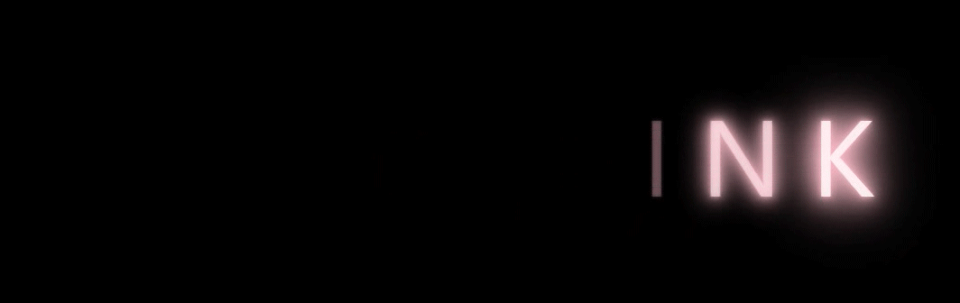
效果图
绝美的效果

实现过程
- 先给没字体添加一些普通的样式,颜色设置为透明
- 给文字设置一个动画效果,通过text-shadow属性来实现变亮的效果,同时通过透明色和白色的切换实现文字闪烁的效果
- 给每个字设置一定的动画延时,从而实现流水的效果
代码部分
HTML
 <div>

        <span>b</span>

        <span>l</span>

        <span>a</span>

        <span>c</span>

        <span>k</span>

        <span>p</span>

        <span>i</span>

        <span>n</span>

        <span>k</span>

 </div>
CSS
body {

    background-color: black;

}

div {

    margin: 200px auto;

    width: 1000px;

    font-family: 'Segoe UI', Tahoma, Geneva, Verdana, sans-serif;

    font-size: 120px;

    color: transparent;

}

span {

    animation: shan 4s linear infinite;

    text-transform: uppercase;

}

div span:nth-child(1){

    animation-delay: 0s;

}

div span:nth-child(2){

    animation-delay: .4s;

}

div span:nth-child(3){

    animation-delay: .8s;

}

div span:nth-child(4){

    animation-delay: 1.2s;

}

div span:nth-child(5){

    animation-delay: 1.6s;

}

div span:nth-child(6){

    animation-delay: 2s;

}

div span:nth-child(7){

    animation-delay: 2.4s;

}

div span:nth-child(8){

    animation-delay: 2.8s;

}

div span:nth-child(9){

    animation-delay: 3.2s;

}

@keyframes shan {

    0% ,100%{

        color: white;

        text-shadow: 0 0 4px  pink ,

                        0 0 10px pink ,

                        0 0 20px pink ,

                        0 0 30px pink ,

                        0 0 40px pink ,

                        0 0 50px pink ,

                        0 0 60px pink ,

                        0 0 70px pink ,

                        0 0 80px pink ,

                        0 0 90px pink ,

                        0 0 100px pink;

    }

    30%,90% {

        color: transparent;

        text-shadow: none;

    }

}
完整代码
<!DOCTYPE html>

<html lang="en">

<head>

    <meta charset="UTF-8">

    <meta http-equiv="X-UA-Compatible" content="IE=edge">

    <meta name="viewport" content="width=device-width, initial-scale=1.0">

    <title>字体闪烁效果</title>

    <style>

        body {

            background-color: black;

        }

        div {

            margin: 200px auto;

            width: 1000px;

            font-family: 'Segoe UI', Tahoma, Geneva, Verdana, sans-serif;

            font-size: 120px;

            color: transparent;

        }

        span {

            animation: shan 4s linear infinite;

            text-transform: uppercase;

        }

        div span:nth-child(1){

            animation-delay: 0s;

        }

        div span:nth-child(2){

            animation-delay: .4s;

        }

        div span:nth-child(3){

            animation-delay: .8s;

        }

        div span:nth-child(4){

            animation-delay: 1.2s;

        }

        div span:nth-child(5){

            animation-delay: 1.6s;

        }

        div span:nth-child(6){

            animation-delay: 2s;

        }

        div span:nth-child(7){

            animation-delay: 2.4s;

        }

        div span:nth-child(8){

            animation-delay: 2.8s;

        }

        div span:nth-child(9){

            animation-delay: 3.2s;

        }

        @keyframes shan {

            0% ,100%{

                color: white;

                text-shadow: 0 0 4px  pink ,

                                0 0 10px pink ,

                                0 0 20px pink ,

                                0 0 30px pink ,

                                0 0 40px pink ,

                                0 0 50px pink ,

                                0 0 60px pink ,

                                0 0 70px pink ,

                                0 0 80px pink ,

                                0 0 90px pink ,

                                0 0 100px pink;

            }

            30%,90% {

                color: transparent;

                text-shadow: none;

            }

        }

    </style>

</head>

<body>

    <div>

        <span>b</span>

        <span>l</span>

        <span>a</span>

        <span>c</span>

        <span>k</span>

        <span>p</span>

        <span>i</span>

        <span>n</span>

        <span>k</span>

    </div>

</body>

</html>
真正的才智是刚毅的志向。 —— 拿破仑
文字闪烁效果 CSS + HTML的更多相关文章
- css动画 文字闪烁效果
/*定义页面基础CSS*/ body{ font-family: 'microsoft yahei',Arial,sans-serif; color: #EFEFEF; background: #22 ...
- css文字闪烁效果
<!DOCTYPE html> <html> <head lang="en"> <meta charset="UTF-8&quo ...
- 文字分列 CSS属性
column 这里有一系列新的CSS属性,可以帮助你很轻松的实现文字的多列布局.让我们瞧瞧: .three-column { padding: 1em; -moz-column-count: 3; - ...
- 省略文字的css
在显示一行文字时,如果容器太小,为了显示出省略字符,可以使用 ellipsis { white-space: nowrap; overflow: hidden; text-overflow: elli ...
- 文本框文字垂直居中 CSS
<html> <head> <style type="text/css"> #text { height:20px; vertical-alig ...
- 文字描边css
-webkit-text-stroke: 3.3px #2A75BF; -webkit-text-fill-color:#fff; 该方法在安卓端貌似不支持,显示为一团 或: -webkit-text ...
- 点亮文字(CSS)
html <!DOCTYPE html><html lang="en"><head> <meta charset="UTF-8& ...
- 两边是线 ,中间是文字 的CSS写法 而且还是自适应的
- 一段隐藏文字的css代码,记录下
<span style="width:1px; height:1px; color:#fff; outline-width:hidden; overflow:hidden; displ ...
随机推荐
- 2021软工-CSDN APP分析
项目 内容 这个作业属于哪个课程 2021春季计算机学院软件工程(罗杰 任健) 这个作业的要求在哪里 案例分析作业要求 我在这个课程的目标是 提升软件开发能力,提高团队协作能力 这个作业在哪个具体方面 ...
- Kernighan《UNIX 传奇:历史与回忆》杂感
Brian W. Kernighan 是一个伟大的技术作家,我买了他写的几乎所有书.他近些年的书我买的是 Kindle 电子版,不占地方. 以下是我手上保存的纸版书: Kernighan 的书大多与别 ...
- hdu2833 Floyd + dp
题意: 给你一个无向图,给你两组起点和终点,问你这两组起点和终点的最短路上最多有多少个交点... 思路: 开一个数组dp[i][j]记录最短路上i,j之间的点有多少个,这个数组是根 ...
- UVA11300分金币
题意: 圆桌旁作者n个人,每个人都有一定数量的金币,他们每次可以给相邻的人一枚金币(可以给多次),问所有人金币数都相同的话最少要给多少次金币.思路: 这个题目感觉很好,首先我们可 ...
- 常见设备/CMS弱口令
目录 tomcat Apache axis2 Apache ActiveMQ zabbix RabbitMQ zentao
- XCTF-unfinish
unfinish 之前做过这个题,这是之前写的WP:链接
- 如何使用java搭建一款高性能的Mqtt集群broker!
SMQTT是一款开源的MQTT消息代理Broker, SMQTT基于Netty开发,底层采用Reactor3反应堆模型,支持单机部署,支持容器化部署,具备低延迟,高吞吐量,支持百万TCP连接,同时支持 ...
- Asp.NetCore Web开发之RazorPage
这节讲一下Razor页面. 首先要明确,Razor 不是一种编程语言.它是服务器端的标记语言,配合C#语言,就可以像PHP语言语言一样(但它们并不相同),处理HTML页面逻辑.它是Asp.NetCor ...
- [题解] CF786B Legacy
前言 题目链接 题意 有 \(n\) 个点,\(q\) 次连边,以及起点 \(s\) .连边具体分三种: \(1\) \(v\) \(u\) \(w\) 从 \(v\) 到 \(u\) 连一条边. \ ...
- Windows服务与会话的理解
服务 Windows NT操作系统是基于客户/服务器模式的(C/S).将操作系统中最基本的部分放到内核中,而把操作系统的绝大多数部分都放到微内核外面的一组服务器(进程)中实现.如对进程管理的进程管理服 ...