
CSS position &居中(水平,垂直)
css position是个很重要的知识点:
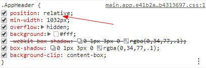
知乎Header部分:
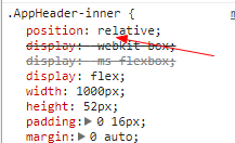
知乎Header-inner部分:
position属性值:
fixed:生成绝对定位的元素,相对浏览器窗口进行定位(位置可通过:left,right,top,bottom改变);与文档流无关,不占据空间(可能与其它元素重叠)
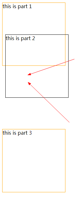
relative:生成相对定位的元素(相对于元素正常位置)(left,right,top,bottom);relative的元素经常用作absolute的元素的容器块;原先占据的空间依然保留
absolute:生成绝对定位的元素(相对第一个已定位的父元素进行定位;若没有则相对<html>)(left,right,top,bottom);与文档流无关,不占据空间(可能与其它元素重叠)
static:默认值。没有定位,元素出现在正常的文件流中(left,right,top,bottom,z-index无效!)
inherit:继承从父元素的position值
fixed示例:
 <!DOCTYPE html>

 <html lang="en">

 <head>

     <meta charset="UTF-8">

     <meta name="viewport" content="width=device-width, initial-scale=1.0">

     <meta http-equiv="X-UA-Compatible" content="ie=edge">

     <title>cascading style sheet</title>

     <style>

         #test{

             width: 500px;

             height: 100px;

             position: fixed;

             top: 0px;

             left: 500px;

             border: 1px solid burlywood;

             background-color: #F2F2F2;

             z-index: 2;

         }

         .test1{

             margin-top: 100px;

         }

         .test1, .test2, .test3, .test4, .test5{

             width: 200px;

             height: 300px;

             border: 1px solid black;

             position: relative;

             left: 500px;

             background-color: gray;

         }

     </style>

 </head>

 <body>

     <div id="test"></div>

     <div class="test1">1</div>

     <div class="test2">2</div>

     <div class="test3">3</div>

     <div class="test4">4</div>

     <div class="test5">5</div>

 </body>

 </html>
#test部分始终固定在上方,不发生移动。
relative示例:(原先占据的空间依然保留!)
 <!DOCTYPE html>

 <html lang="en">

 <head>

     <meta charset="UTF-8">

     <meta name="viewport" content="width=device-width, initial-scale=1.0">

     <meta http-equiv="X-UA-Compatible" content="ie=edge">

     <title>position:relative</title>

     <style>

         .test1, .test2, .test3{

             width: 200px;

             height: 200px;

             border: 1px solid orange;

         }

         .test2{

             border-color: black;

             position: relative;

             top:-100px;

             left: 10px;

         }

     </style>

 </head>

 <body>

     <div class="test1">this is part 1</div>

     <div class="test2">this is part 2</div>

     <div class="test3">this is part 3</div>

 </body>

 </html>
运行结果:(箭头所指这部分区域空间依然保留!!!)
凡是可能发生重叠的position属性,均能使用z-index!
- 没有指定z-index:代码后面的在上面(“后来者居上”);
- z-index越大的在上面!
注意:当使用position或者float属性时,通常<body>要预设定义margin和padding。这样可以避免在不同的浏览器中出现差异!
如果省略<!DOCTYPE>声明,IE8及以下版本会在右侧增加17px的外边距!这似乎是为了滚动条预留的空间!所以,请始终设置<!DOCTYPE>声明!!!
布局之水平居中:
1.元素居中对齐(比如<div>):
使用margin:0 auto;(上下margin为0,左右自动分配(居中!))!注意:此方法元素需设置width属性(除了width:100%)
 <!DOCTYPE html>

 <html lang="en">

 <head>

     <meta charset="UTF-8">

     <meta name="viewport" content="width=device-width, initial-scale=1.0">

     <meta http-equiv="X-UA-Compatible" content="ie=edge">

     <title>居中</title>

     <style>

         /* 预设置样式 */

         body{

             margin: 0;

             padding: 0;

         }

         .test1{

             border: 1px solid gold;

             width: 150px;

             height: 150px;

             margin: 0 auto;

         }

     </style>

 </head>

 <body>

     <div class="test1">this is test1</div>

 </body>

 </html>
2.图像居中对齐(先设置display:block;再margin:0 auto);
3.文本居中对齐(text-align:center;)
4.左右对齐:(①position:absolute;再设置left或right属性值②float:left;或者float:right)
布局之垂直居中:
方法一:line-height:
 <!DOCTYPE html>

 <html lang="en">

 <head>

     <meta charset="UTF-8">

     <meta name="viewport" content="width=device-width, initial-scale=1.0">

     <meta http-equiv="X-UA-Compatible" content="ie=edge">

     <title>居中</title>

     <style>

         /* 预设置样式 */

         body{

             margin: 0;

             padding: 0;

         }

         .test1{

             border: 1px solid gold;

             width: 150px;

             height: 150px;

             line-height: 150px;

         }

     </style>

 </head>

 <body>

     <div class="test1">this is test1</div>

 </body>

 </html>
这个方法有一个缺陷,适用于:“只有一行话”。原理:就是块元素(div)高度有多高,(行高)line-height就有多高!
不止一行话:
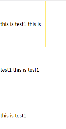
方法二:使用padding:
这种方法不会有上面line-height的“缺陷”,原理:好像就是"撑开"来一样!(个人比较推荐!)
 <!DOCTYPE html>

 <html lang="en">

 <head>

     <meta charset="UTF-8">

     <meta name="viewport" content="width=device-width, initial-scale=1.0">

     <meta http-equiv="X-UA-Compatible" content="ie=edge">

     <title>居中</title>

     <style>

         /* 预设置样式 */

         body{

             margin: 0;

             padding: 0;

         }

         .test1{

             border: 1px solid gold;

             width: 200px;

             padding: 100px 0px;

             text-align: center;

         }

     </style>

 </head>

 <body>

     <div class="test1">this is test1 this is test1 this is test1 this is test1 this is test1 </div>

 </body>

 </html>
方法三:使用display:flex;align-items:center;
 <!DOCTYPE html>

 <html lang="en">

 <head>

     <meta charset="UTF-8">

     <meta name="viewport" content="width=device-width, initial-scale=1.0">

     <meta http-equiv="X-UA-Compatible" content="ie=edge">

     <title>居中</title>

     <style>

         /* 预设置样式 */

         body{

             margin: 0;

             padding: 0;

         }

         .test1{

             border: 1px solid gold;

             width: 200px;

             height: 200px;

             display: flex;

             align-items: center;

             text-align: center;

             margin: 0 auto;

         }

     </style>

 </head>

 <body>

     <div class="test1">this is test1 this is test1 this is test1 this is test1 this is test1 </div>

 </body>

 </html>
方法四:使用position和transform
 <!DOCTYPE html>

 <html lang="en">

 <head>

     <meta charset="UTF-8">

     <meta name="viewport" content="width=device-width, initial-scale=1.0">

     <meta http-equiv="X-UA-Compatible" content="ie=edge">

     <title>居中</title>

     <style>

         /* 预设置样式 */

         body{

             margin: 0;

             padding: 0;

         }

         .test1{

             border: 1px solid gold;

             width: 200px;

             height: 200px;

             position: relative;

         }

         .test1 p{

             position: absolute;

             left: 50%;

             top: 50%;

             transform: translate(-50%,-50%);

             -webkit-transform: translate(-50%,-50%);

             -ms-transform: translate(-50%,-50%);

         }

     </style>

 </head>

 <body>

     <div class="test1"> <p>this is test1</p> </div>

 </body>

 </html>
CSS position &居中(水平,垂直)的更多相关文章
- 解读CSS布局之-水平垂直居
对一个元素水平垂直居中,在我们的工作中是会经常遇到的,也是CSS布局中很重要的一部分,本文就来讲讲CSS水平垂直居中的一些方法.由于我们大搜车的日常工作中已经不再需要理会低版本IE,所以本文所贴出的方 ...
- CSS 基础 例子 水平 & 垂直对齐
一.元素居中对齐 margin:auto 水平居中对齐一个元素(如 <div>),即div本身在容器中的对齐,用margin:auto,而且,需要设置 width 属性(或者设置 100% ...
- CSS 中的各种居中 (水平、垂直)
导读: CSS 的居中有水平居中和垂直居中,这两种居中又分为行内元素居中和块级元素居中.根据父.子元素的高度是否清楚,又会使得不同的居中用不同方法.本文就其中一些情况做下简单说明,以作笔记之用,仅供大 ...
- CSS 各类 块级元素 行级元素 水平 垂直 居中问题
元素的居中问题是每个初学者碰到的第一个大问题,在此我总结了下各种块级 行级 水平 垂直 的居中方法,并尽量给出代码实例. 首先请先明白块级元素和行级元素的区别 行级元素 一块级元素 1 水平居中: ( ...
- css3-7 如何让页面元素水平垂直都居中(元素定位要用css定位属性)
css3-7 如何让页面元素水平垂直都居中(元素定位要用css定位属性) 一.总结 一句话总结:元素定位要用css定位属性,而且一般脱离文档流更加好操作.先设置为绝对定位,上左都50%,然后margi ...
- CSS实现水平垂直同时居中的5种思路
× 目录 [1]水平对齐+行高 [2]水平+垂直对齐 [3]margin+垂直对齐[4]absolute[5]flex 前面的话 水平居中和垂直居中已经单独介绍过,本文将介绍水平垂直同时居中的5种思路 ...
- CSS实现水平垂直同时居中的6种思路
前面的话 水平居中和垂直居中已经单独介绍过,本文将介绍水平垂直同时居中的6种思路 水平对齐+行高 [思路一]text-align + line-height实现单行文本水平垂直居中 <style ...
- (前端)面试300问之(2)CSS元素居中【水平、垂直、2者同时居中】
一 仅水平居中 1 行内元素 1)给父元素添加 text-align:center 即可 <div class="parent"> <span class=&qu ...
- CSS 布局 - 水平 & 垂直对齐
CSS 布局 - 水平 & 垂直对齐 一.元素居中对齐 要水平居中对齐一个元素(如 <div>), 可以使用 margin: auto;. 设置到元素的宽度将防止它溢出到容器的边缘 ...
随机推荐
- DATAPUMP进程查询
SELECT * FROM DBA_DATAPUMP_SESSIONS; SELECT * FROM DBA_DATAPUMP_JOBS; 例如: SYS@orclasm > SELECT * ...
- Java ServiceLoader(SPI)学习
1. 几个不错的关于ServiceLoader的文章,大家可以先参考一下 1) http://www.myexception.cn/program/1355384.html 这篇的后面的问题分析不错 ...
- vue项目使用vue-photo-preview插件实现点击图片放大预览和移动
官方链接: http://npm.taobao.org/package/vue-photo-preview # 安装 npm install vue-photo-preview --save # 引入 ...
- 【PyQt5-Qt Designer】窗口操作
1.窗口最上栏最大化 最小化 关闭按钮显示 #设置最小化与最大化按钮 self.setWindowFlags(QtCore.Qt.Window) 将其添加到Ui_*** 布局代码中即可 2.窗口知识 ...
- es6 学习二 Generator
安装babel的拓展包(Polyfill) ,对Generator的转义 这是一个补完babel支持es6的拓展包,配置步骤为3个: 打开命令行键入 npm install --save-dev ba ...
- mysqldump备份数据出错
收到nagios报警,提示mysql备份失败,线上使用的是逻辑备份,也就是使用mysqldump,由于数据比较小,也就没在乎速度神马的问题.好吧,那就查查是什么原因导致备份失败,由于备份是写成脚本定时 ...
- shell 变量的数值计算实践 expr
expr(evaluate(求值)expressions(表达式))命令既可以用于整数运算,也可以用于相关字符串长度.匹配等的运算处理 expr 用做计算 必须有一个空格才会计算 [root@salt ...
- 基于Kinetic框架实现超酷的风铃悬挂摆动效果
版权声明:本文为博主原创文章,未经博主同意不得转载. https://blog.csdn.net/iefreer/article/details/37049987 在踏得网开发过程中,我们在引导页面中 ...
- UDP网络通信
网络概念 一.目的 二.IP地址 三.端口 一.目的 目的 : 主要用于让两个用户端的服务器或者客户端,可以实现资源共享和信息传递 二.IP地址 1.作用 : 计算机网络中一台计算机的标识 2.种类 ...
- 微信小程序使用阿里图标-iconfont
步骤一:下载项目图标 步骤二:解压文件,重命名 iconfont.css为 iconfont.wxss ,并复制 到项目 static文件夹 icon文件夹下 ...