FacertGrid()的使用
查看数据的前五行
tips = sns.load_dataset("tips")
tips.head()
引入数据,布置横向画布
g = sns.FacetGrid(tips, col='time')
g = sns.FacetGrid(tips, col='time')
g.map(plt.hist, "tip") #以tip为横轴画柱状图

g = sns.FacetGrid(tips, col="sex", hue="smoker")
g.map(plt.scatter, "total_bill", "tip", alpha=.7) #绘制散点图,设置横纵轴,设置透明度
g.add_legend() #加上如下图标注的图例

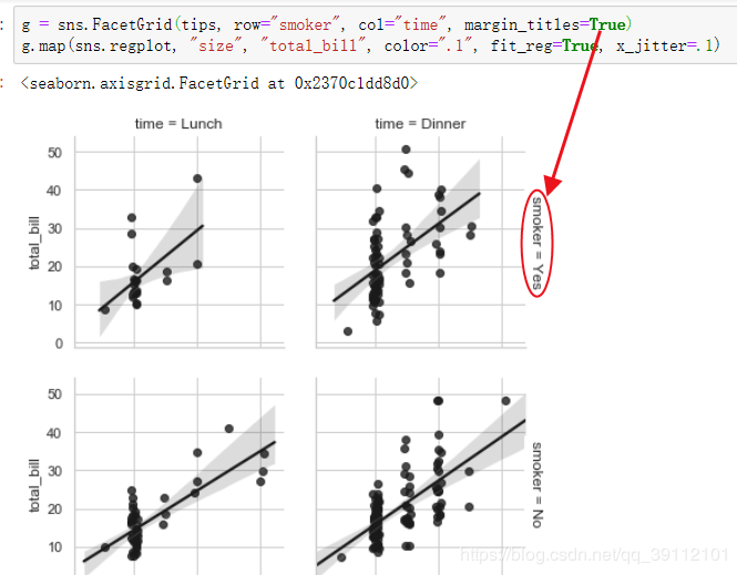
g = sns.FacetGrid(tips, row="smoker", col="time", margin_titles=True) #设置行列布局方式
g.map(sns.regplot, "size", "total_bill", color=".1", fit_reg=True, x_jitter=.1) #fit_reg画出回归线,x_jitter为摆动程度
画出柱形图
g = sns.FacetGrid(tips, col="day", size=4, aspect=.5)
g.map(sns.barplot, "sex", "total_bill")

from pandas import Categorical
ordered_days = tips.day.value_counts().index
print(ordered_days)
查看day的排列顺序
CategoricalIndex(['Sat', 'Sun', 'Thur', 'Fri'], categories=['Thur', 'Fri', 'Sat', 'Sun'], ordered=False, dtype='category')
重新设置行的排列顺序
ordered_days = Categorical(["Thur", "Sun", "Fri", "Sat"])
g = sns.FacetGrid(tips, row="day", row_order=ordered_days, size=1.7, aspect=4)
g.map(sns.boxplot, "total_bill")

(盒图能够自动识别哪个变量是离散型,哪个是连续型,然后对连续型构造盒图。)
例如以下代码
 import seaborn as sns

 import numpy as np

 import pandas as pd

 import matplotlib as mpl

 from pandas import Categorical

 import matplotlib.pyplot as plt

 tips = sns.load_dataset("tips")   #seaborn内置数据集,DaraFram类型

 print(tips.head())

 ordered_days = Categorical(["Thur", "Sun", "Fri", "Sat"])

 print(type(ordered_days))

 print(ordered_days)

 g = sns.FacetGrid(tips, row="day", row_order=ordered_days, size=1.7, aspect=4)

 g.map(sns.boxplot, "total_bill", "sex")

 plt.show()
运行结果如下,函数识别出sex是离散型变量,所以对sex进行分类,然后在每一个类别上对连续型变量total_bill构造盒图。

还可以用FacertGrid的palette参数给hue的列的不同类设置不同颜色,代码如下
 import seaborn as sns

 import numpy as np

 import pandas as pd

 import matplotlib as mpl

 from pandas import Categorical

 import matplotlib.pyplot as plt

 tips = sns.load_dataset("tips")   #seaborn内置数据集,DaraFram类型

 print(tips.head())

 pal = dict(Lunch="seagreen", Dinner="gray")

 g = sns.FacetGrid(data=tips, hue="time", palette=pal, size=5)

 g.map(plt.scatter, "total_bill", "tip", s=50, alpha=0.7, linewidths=0.5, edgecolors="white")

 g.add_legend()

 plt.show()
运行结果如下

如果再设置marker参数,可指定用什么图标画散点,可以是三角形或圆形等
 import seaborn as sns

 import numpy as np

 import pandas as pd

 import matplotlib as mpl

 from pandas import Categorical

 import matplotlib.pyplot as plt

 tips = sns.load_dataset("tips")   #seaborn内置数据集,DaraFram类型

 print(tips.head())

 pal = dict(Lunch="seagreen", Dinner="gray")

 g = sns.FacetGrid(data=tips, hue="time", palette=pal, size=5, hue_kws={"marker":['^', 'v']})

 g.map(plt.scatter, "total_bill", "tip", s=50, alpha=0.7, linewidths=0.5, edgecolors="white")

 g.add_legend()

 plt.show()

还有一些小调整:set_axis_labels()函数可以自定义x和y轴名字,set(xticks, yticks)可以自定义x和y轴的刻度。fig.subplots_adjust()函数可以调整子图之间
的间隔和距离边框的大小。edgecolors可以设置散点周围的边缘颜色。
 import seaborn as sns

 import numpy as np

 import pandas as pd

 import matplotlib as mpl

 from pandas import Categorical

 import matplotlib.pyplot as plt

 tips = sns.load_dataset("tips")   #seaborn内置数据集,DaraFram类型

 print(tips.head())

 with sns.axes_style("white"):

     g = sns.FacetGrid(tips, row="sex", col="smoker", margin_titles=True, size=2.5)

 g.map(plt.scatter, "total_bill", "tip", color="#334488", edgecolors="white", lw=0.5)

 g.set_axis_labels("Total_bill", "Tip")

 g.set(xticks=[10, 30, 50], yticks=[2, 6, 10])

 g.fig.subplots_adjust(wspace=0.25, hspace=0.25)

 plt.show()

可以用PairGrid对数据中的列进行两两配对绘制散点图,当然也可以指定要配对的列。
import seaborn as sns
import numpy as np
import pandas as pd
import matplotlib as mpl
from pandas import Categorical
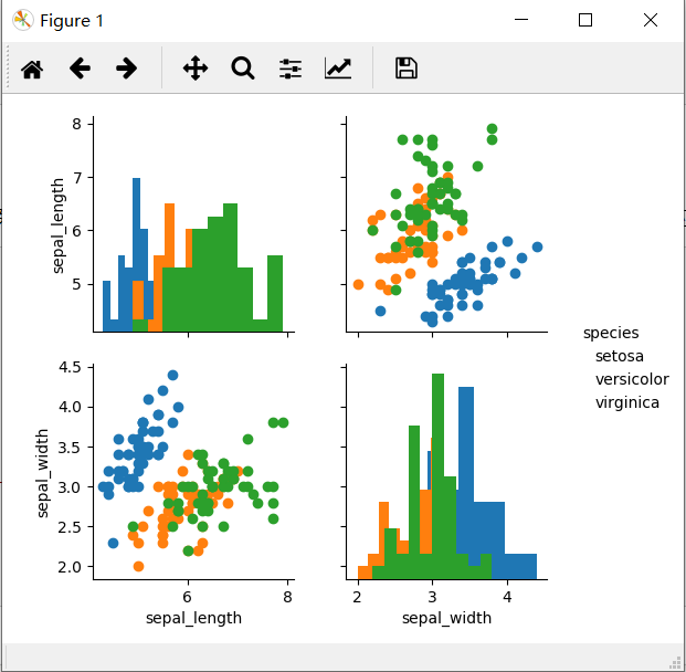
import matplotlib.pyplot as plt iris = sns.load_dataset("iris")
g = sns.PairGrid(data=iris, vars=["sepal_length", "sepal_width"], hue="species")
g.add_legend()
g.map_offdiag(plt.scatter)
g.map_diag(plt.hist)
plt.show()
函数PairGrid()中的vars参数指定要两两进行绘图的列,这些列是数据集的子列。map_offdiag和map_diag分别设置非对角的和对角的图使用的统计图类型。
 import seaborn as sns

 import numpy as np

 import pandas as pd

 import matplotlib as mpl

 from pandas import Categorical

 import matplotlib.pyplot as plt

 iris = sns.load_dataset("iris")

 g = sns.PairGrid(data=iris, vars=["sepal_length", "sepal_width"], hue="species")

 g.add_legend()

 g.map_offdiag(plt.scatter)

 g.map_diag(plt.hist)

 plt.show()
FacertGrid()的使用的更多相关文章
随机推荐
- Tensorrt之tf-trt
使用python接口, 另外一种方式就是使用tf-trt,优化后的模型还是pb.优化的过程主要是一些层的合并啊之类的,加速结果不是特别明显,测了两个网络, 加速了10%的样子.优化后仍是pb,因此可以 ...
- SpringMVC 中的注解@RequestParam与@PathVariable的区别
@PathVariable绑定URI模板变量值 @PathVariable是用来获得请求url中的动态参数的 @PathVariable用于将请求URL中的模板变量映射到功能处理方法的参数上.//配置 ...
- python的xlrd、xlwt模块、openpyxl /pymsql使用
xlrd模块: https://www.cnblogs.com/machangwei-8/p/10736528.html#_label0 xlwt模块 https://www.cnblogs.com/ ...
- Django对中间件的调用思想、csrf中间件详细介绍、Django settings源码剖析、Django的Auth模块
目录 使用Django对中间件的调用思想完成自己的功能 功能要求 importlib模块介绍 功能的实现 csrf中间件详细介绍 跨站请求伪造 Django csrf中间件 form表单 ajax c ...
- c++string int转化简单写法
#include<iostream> #include<string> #include<sstream> //定义了stringstream类 using nam ...
- JavaScript 中的 for 循环---------------引用
在ECMAScript5(简称 ES5)中,有三种 for 循环,分别是: 简单for循环 for-in forEach 下面先来看看大家最常见的一种写法: 当数组长度在循环过程中不会改变时,我们应将 ...
- Olympic Game
每次奥运会期间,大家都非常关注奖牌榜排名的情况. 现在我们假设奖牌榜的排名规则,按优先级从高到低如下: 金牌 数量多的排在前面: 银牌 数量多的排在前面: 铜牌 数量多的排在前面: 若以上三个条件仍无 ...
- python-魔法属性和反射
python魔法属性和反射 #!/usr/bin/python3 # coding:utf-8 # Auther:AlphaPanda # Description:与类相关的魔法属性 # Versio ...
- chalk插件 使终端输出的字带颜色
1.使终端输出红色字体: const chalk = require('chalk'); console.log(chalk.red('this is red!') 这时运行终端,打印的this is ...
- String,Integer,int类型之间的相互转换
String, Integer, int 三种类型之间可以两两进行转换 1. 基本数据类型到包装数据类型的转换 int -> Integer (两种方法) Integer it1 = new I ...