
CSS3 的动画属性
通过 CSS3,我们能够创建动画,这可以在许多网页中取代动画图片、Flash 动画以及 JavaScript。
㈠@keyframes 规则
⑴浏览器支持
Firefox 支持替代的 @-moz-keyframes 规则。
Opera 支持替代的 @-o-keyframes 规则。
Safari 和 Chrome 支持替代的 @-webkit-keyframes 规则。
⑵定义和用法
通过 @keyframes 规则,能够创建动画。
创建动画的原理是,将一套 CSS 样式逐渐变化为另一套样式。
在动画过程中,能够多次改变这套 CSS 样式。
以百分比来规定改变发生的时间,或者通过关键词 "from" 和 "to",等价于 0% 和 100%。
0% 是动画的开始时间,100% 动画的结束时间。
为了获得最佳的浏览器支持,应该始终定义 0% 和 100% 选择器。
注释:请使用动画属性来控制动画的外观,同时将动画与选择器绑定。
⑶语法
@keyframes animationname {keyframes-selector{css-styles;}}
keyframes-selector:动画时长的百分比。
合法的值:
- 0-100%
- from(与 0% 相同)
- to(与 100% 相同)
⑷代码示例:
@keyframes myfirst

{

from {background: red;}

to {background: yellow;}

}

@-moz-keyframes myfirst /* Firefox */

{

from {background: red;}

to {background: yellow;}

}

@-webkit-keyframes myfirst /* Safari 和 Chrome */

{

from {background: red;}

to {background: yellow;}

}

@-o-keyframes myfirst /* Opera */

{

from {background: red;}

to {background: yellow;}

}
㈡CSS3 动画属性
⑴所有属性总结:
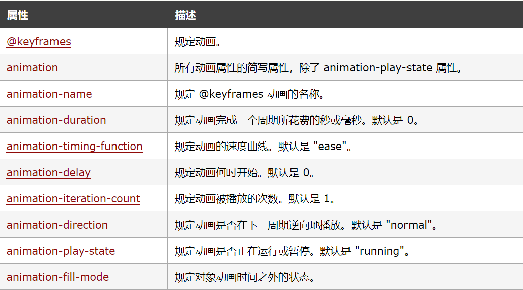
⑵属性的具体语法与值的介绍
①animation-duration 属性
1.语法:animation-duration:time
2.值:time:规定完成动画所花费的时间。默认值是 0,意味着没有动画效果。
3.animation-duration 属性定义动画完成一个周期所需要的时间,以秒或毫秒计。
②animation-timing-function 属性
1.语法:animation-timing-function: value;
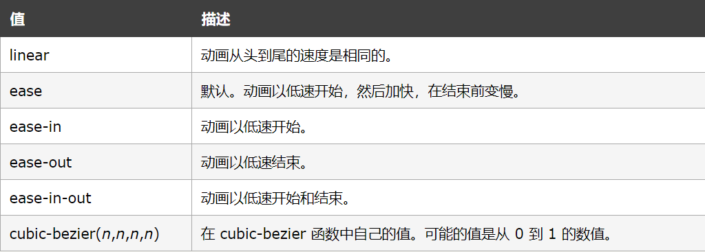
2.animation-timing-function 规定动画的速度曲线。速度曲线定义动画从一套 CSS 样式变为另一套所用的时间。
3.animation-timing-function 属性值:
③animation-delay 属性
1.语法:animation-delay: time;
2.值:time:可选。定义动画开始前等待的时间,以秒或毫秒计。默认值是 0。
3.animation-delay 属性定义动画何时开始。允许负值,-2s 使动画马上开始,但跳过 2 秒进入动画。
④animation-iteration-count 属性
1.语法:animation-iteration-count: n|infinite;
2.值:n:定义动画播放次数的数值。 infinite:规定动画应该无限次播放。
3.animation-iteration-count 属性定义动画的播放次数。
⑤animation-direction 属性
1.语法:animation-direction: normal|alternate;
2.值:normal:默认值。动画应该正常播放。 alternate:动画应该轮流反向播放。
3.animation-direction 属性定义是否应该轮流反向播放动画。
4.如果 animation-direction 值是 "alternate",则动画会在奇数次数(1、3、5 等等)正常播放,而在偶数次数(2、4、6 等等)向后播放。
5.注意:如果把动画设置为只播放一次,则该属性没有效果。
⑥animation-play-state 属性
1.语法:animation-play-state: paused|running;
2.值:paused:规定动画已暂停。 running:规定动画正在播放。
3.animation-play-state 属性规定动画正在运行还是暂停。
⑦animation-fill-mode 属性
1.语法:animation-fill-mode : none | forwards | backwards | both;
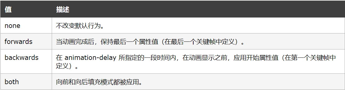
2.animation-fill-mode 属性规定动画在播放之前或之后,其动画效果是否可见。
3.注意:其属性值是由逗号分隔的一个或多个填充模式关键词。
4.animation-fill-mode 属性值:如下图所示
㈢CSS3 动画
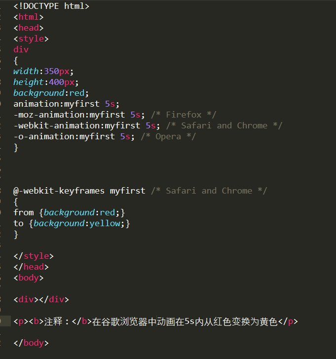
在 @keyframes 中创建动画时,把它捆绑到某个选择器,否则不会产生动画效果。
通过规定至少以下两项 CSS3 动画属性,即可将动画绑定到选择器:
⑴规定动画的名称
⑵规定动画的时长
示例:把 "myfirst" 动画捆绑到 div 元素,时长:5 秒:
㈣动画属性示例
⑴当动画为 25% 及 50% 时改变背景色,然后当动画 100% 完成时再次改变:
<!DOCTYPE html>

<html>

<head>

<style>

div

{

width:300px;

height:300px;

background:red;

animation:myfirst 5s;

-moz-animation:myfirst 5s; /* Firefox */

-webkit-animation:myfirst 5s; /* Safari and Chrome */

-o-animation:myfirst 5s; /* Opera */

}

@keyframes myfirst

{

0%   {background-color:red;}

25%  {background-color:yellow;}

50%  {background-color:blue;}

100% {background-color:green;}

}

@-moz-keyframes myfirst /* Firefox */

{

0%   {background-color:red;

25%  {background-color:yellow;}

50%  {background-color:blue;}

100% {background-color:green;}

}

@-webkit-keyframes myfirst /* Safari and Chrome */

{

0%   {background-color:red;}

25%  {background-color:yellow;}color

50%  {background-color:blue;}

100% {background-color:green;}

}

@-o-keyframes myfirst /* Opera */

{

0%   {background-color:red;}

25%  {background-color:yellow;}

50%  {background-color:blue;}

100% {background-color:green;}

}

</style>

</head>

<body>

<div></div>

<p><b>注释:</b>在支持的浏览器中显示,当动画完成时,会变回初始的样式。</p>

</body>

</html>
⑵改变背景色和位置:
<!DOCTYPE html>

<html>

<head>

<style>

div

{

width:400px;

height:400px;

background:red;

position:relative;

animation:myfirst 5s;

-moz-animation:myfirst 5s; /* Firefox */

-webkit-animation:myfirst 5s; /* Safari and Chrome */

-o-animation:myfirst 5s; /* Opera */

}

@keyframes myfirst

{

0%   {background:red; left:0px; top:0px;}

25%  {background:yellow; left:200px; top:0px;}

50%  {background:blue; left:200px; top:200px;}

75%  {background:green; left:0px; top:200px;}

100% {background:red; left:0px; top:0px;}

}

@-moz-keyframes myfirst /* Firefox */

{

0%   {background:red; left:0px; top:0px;}

25%  {background:yellow; left:200px; top:0px;}

50%  {background:blue; left:200px; top:200px;}

75%  {background:green; left:0px; top:200px;}

100% {background:red; left:0px; top:0px;}

}

@-webkit-keyframes myfirst /* Safari and Chrome */

{

0%   {background:red; left:0px; top:0px;}

25%  {background:yellow; left:200px; top:0px;}

50%  {background:blue; left:200px; top:200px;}

75%  {background:green; left:0px; top:200px;}

100% {background:red; left:0px; top:0px;}

}

@-o-keyframes myfirst /* Opera */

{

0%   {background:red; left:0px; top:0px;}

25%  {background:yellow; left:200px; top:0px;}

50%  {background:blue; left:200px; top:200px;}

75%  {background:green; left:0px; top:200px;}

100% {background:red; left:0px; top:0px;}

}

</style>

</head>

<body>

<p><b>注释:</b>动画初始状态红色,像右移动200px黄色,向下移动200px蓝色,向左移动200px绿色,向上移动200px红色,回到起点。</p>

<div></div>

</body>

</html>
⑶名为myfirst的动画,等待2s后,以匀速开始播放动画,播放一个周期为5s,之后动画开始轮流反向播放一个5s的周期,动画无限次循环播放。
<!DOCTYPE html>

<html>

<head>

<style>

div

{

width:260px;

height:260px;

background:red;

position:relative;

animation-name:myfirst;

animation-duration:5s;

animation-timing-function:linear;

animation-delay:2s;

animation-iteration-count:infinite;

animation-direction:alternate;

animation-play-state:running;

/* Firefox: */

-moz-animation-name:myfirst;

-moz-animation-duration:5s;

-moz-animation-timing-function:linear;

-moz-animation-delay:2s;

-moz-animation-iteration-count:infinite;

-moz-animation-direction:alternate;

-moz-animation-play-state:running;

/* Safari and Chrome: */

-webkit-animation-name:myfirst;

-webkit-animation-duration:5s;

-webkit-animation-timing-function:linear;

-webkit-animation-delay:2s;

-webkit-animation-iteration-count:infinite;

-webkit-animation-direction:alternate;

-webkit-animation-play-state:running;

/* Opera: */

-o-animation-name:myfirst;

-o-animation-duration:5s;

-o-animation-timing-function:linear;

-o-animation-delay:2s;

-o-animation-iteration-count:infinite;

-o-animation-direction:alternate;

-o-animation-play-state:running;

}

@keyframes myfirst

{

0%   {background:red; left:0px; top:0px;}

25%  {background:yellow; left:200px; top:0px;}

50%  {background:blue; left:200px; top:200px;}

75%  {background:green; left:0px; top:200px;}

100% {background:red; left:0px; top:0px;}

}

@-moz-keyframes myfirst /* Firefox */

{

0%   {background:red; left:0px; top:0px;}

25%  {background:yellow; left:200px; top:0px;}

50%  {background:blue; left:200px; top:200px;}

75%  {background:green; left:0px; top:200px;}

100% {background:red; left:0px; top:0px;}

}

@-webkit-keyframes myfirst /* Safari and Chrome */

{

0%   {background:red; left:0px; top:0px;}

25%  {background:yellow; left:200px; top:0px;}

50%  {background:blue; left:200px; top:200px;}

75%  {background:green; left:0px; top:200px;}

100% {background:red; left:0px; top:0px;}

}

@-o-keyframes myfirst /* Opera */

{

0%   {background:red; left:0px; top:0px;}

25%  {background:yellow; left:200px; top:0px;}

50%  {background:blue; left:200px; top:200px;}

75%  {background:green; left:0px; top:200px;}

100% {background:red; left:0px; top:0px;}

}

</style>

</head>

<body>

<p><b>注释:</b>名为myfirst的动画,等待2s后,以匀速开始播放动画,播放一个周期为5s,之后动画开始轮流反向播放一个5s的周期,动画无限次循环播放。</p>

<div></div>

</body>

</html>
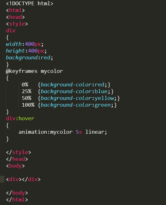
⑷鼠标放在动画上,以5s为周期进行播放,当鼠标放上动画开始,鼠标离开动画截止回到原始状态。
希望有所帮助。
CSS3 的动画属性的更多相关文章
- CSS3展现精彩的动画效果 css3的动画属性
热火朝天的css3无疑吸引了很多前端开发者的眼球,然而在css3中的动画属性则是新功能中的主打招牌,说到css3的动画属性不得不让人想起这三个属性:Transform﹑Transition﹑Anima ...
- CSS3中动画属性transform、transition 和 animation
CSS3中和动画有关的属性有三个 transform.transition 和 animation.下面来一一说明: transform 从字面来看transform的释义为改变,使 ...
- CSS3中动画属性transform、transition和animation
Transform:变形 在网页设计中,CSS被习惯性的理解为擅长表现静态样式,动态的元素必须借助于javascript才可以实现,而CSS3的出现改变了这一思维方式.CSS3除了增加革命性的创新功能 ...
- css3 animation 动画属性简介
animation 动画属性介绍 animation 属性是一个简写属性,用于设置动画属性: 1. animation-name----规定需要绑定到选择器的 keyframe 名称. 语法:anim ...
- CSS3的动画属性
transition.animation和transform是CSS3中三个制作动画的重要属性,本篇文章主要对其进行学习了解. 一.transition transition允许css的属性值在一定的 ...
- css3之动画属性transform、transition、animation
工作当中,会遇到很多有趣的小动画,使用css3代替js会节省工作量,css3一些属性浏览器会出现不兼容,加浏览器的内核前缀 -moz-. -webkit-. -o- 1.transform rotat ...
- CSS3 @keyframes 动画
CSS3的@keyframes,它可以取代许多网页动画图像,Flash动画,和JAVAScripts. CSS3的动画属性 下面的表格列出了 @keyframes 规则和所有动画属性: 浏览器支持 表 ...
- CSS3动画属性Transform解读
无论你是前端还是设计师,相信你在网页二维空间上的操作早已经得心应手,JS处理时间线的动画也早已经 烂熟于胸.从今天开始,我跟大家分享一些“新”的东西,网页的第三个维度,以及纯CSS实现的动画.限于篇幅 ...
- CSS3制作动画的三个属性
CSS3属性中有关于制作动画的三个属性:Transform,Transition,Animation:我们一起学习完了Transform和Transition,让我们对元素实现了一些基本的动画效果,这 ...
随机推荐
- HTML笔记(三) 表格和列表
本篇记录表格 (table) 和有序列表 (ordered list) \ 无序列表 (unordered list) 的部分用法 1.表格table 表格标签 使用 <table> 定义 ...
- 设置mysql 5.7 可以外部访问的办法
这里记录一下. 一台服务器上面的mysql出现了 无法外面连的情况解决办法: . 先尝试在宿主机上面登录 mysql -uroot -p 输入密码,可以登录. 然后 use mysql # 切换数据库 ...
- mapreduce运行的bug收录
在8088端口可以看到日志文件(主要看error),操作如下: 1.window jdk版本最好和linux jdk 版本一致,不然容易出现莫名奇妙的bug 之前出现一个bug: Unsupporte ...
- java_实现一个类只能声明一个对象
public class StaticDemo { public int a=10; private static StaticDemo s= new StaticDemo(); private St ...
- 用纯 CSS 创作一个在容器中反弹的小球
效果预览 在线演示 按下右侧的"点击预览"按钮可以在当前页面预览,点击链接可以全屏预览. https://codepen.io/comehope/pen/jKVbyE 可交互视频教 ...
- jQuery可拖拽旋转的3D图片墙
在线演示 本地下载
- (转)Cvte提前批
1. 加密解密了解么?几种算法,讲一下你了解的(链接) 算法选择:对称加密AES,非对称加密: ECC,消息摘要: MD5,数字签名:DSA 常见加密算法 1.DES(Data Encryption ...
- spring boot JPA 数据库连接池释放
当JPA获取数据库数据连接时,如果连接数超过最大连接数的配置,系统就会报错: Unable to acquire JDBC Connection 和: Caused by: java.sql.SQLT ...
- C# 面向对象3 静态和非静态的区别
静态和非静态的区别 1.在非静态类中,既可以有实例成员(非静态成员),也可以有静态成员. 2.在调用实例成员的时候,需要使用对象名.实例成员; 在调用静态成员的时候,需要使用类名.静态成员名; 总结: ...
- 使用iview 的表单组件验证 Upload 组件
使用iview 的表单组件验证 Upload 组件 结果: 点击提交按钮, 没有填的form 项, 提示错误, 当填入数据后提示验证成功 代码: <template> <div id ...