Data Visualisation Cheet Sheet
Univariate plotting with pandas

import pandas as pd

reviews = pd.read_csv("../input/wine-reviews/winemag-data_first150k.csv", index_col=)

reviews.head()

//bar

reviews['province'].value_counts().head().plot.bar()

(reviews['province'].value_counts().head() / len(reviews)).plot.bar()

reviews['points'].value_counts().sort_index().plot.bar()

//line chart

reviews['points'].value_counts().sort_index().plot.line()

//area chart

reviews['points'].value_counts().sort_index().plot.area()

//histograms

reviews[reviews['price'] < ]['price'].plot.hist()

reviews['price'].plot.hist()

reviews[reviews['price'] > ]

//pie chart

reviews['province'].value_counts().head().plot.pie()
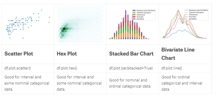
Bivariate plotting with pandas
import pandas as pd

reviews = pd.read_csv("../input/wine-reviews/winemag-data_first150k.csv", index_col=0)

reviews.head()

//Scatter plot

reviews[reviews['price'] < 100].sample(100).plot.scatter(x='price', y='points')

//hexplot 数据相关性

reviews[reviews['price'] < 100].plot.hexbin(x='price', y='points', gridsize=15)

//stackplot 数据堆叠

wine_counts.plot.bar(stacked=True)

wine_counts.plot.area()

//Bivariate line chart 线集成

wine_counts.plot.line()
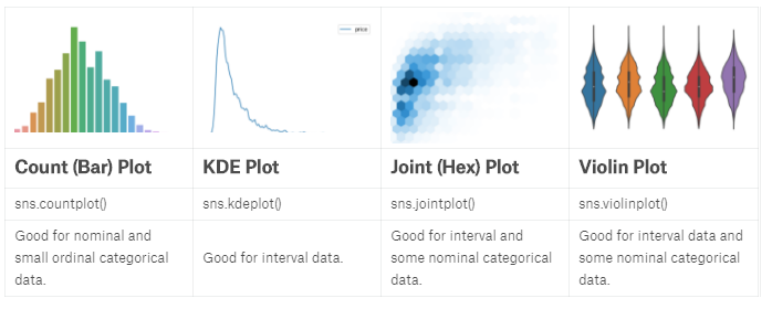
Plotting with seaborn
import pandas as pd

reviews = pd.read_csv("../input/wine-reviews/winemag-data_first150k.csv", index_col=0)

import seaborn as sns

//Countplot

sns.countplot(reviews['points'])

//KDE Plot 平滑去噪

sns.kdeplot(reviews.query('price < 200').price)

//对比线图

reviews[reviews['price'] < 200]['price'].value_counts().sort_index().plot.line()

//二维ked

sns.kdeplot(reviews[reviews['price'] < 200].loc[:, ['price', 'points']].dropna().sample(5000))

//Distplot

sns.distplot(reviews['points'], bins=10, kde=False)

//jointplot

sns.jointplot(x='price', y='points', data=reviews[reviews['price'] < 100])

sns.jointplot(x='price', y='points', data=reviews[reviews['price'] < 100], kind='hex', gridsize=20)

//Boxplot and violin plot   25%-75%,中线

df = reviews[reviews.variety.isin(reviews.variety.value_counts().head(5).index)]

sns.boxplot(

    x='variety',

    y='points',

    data=df

)
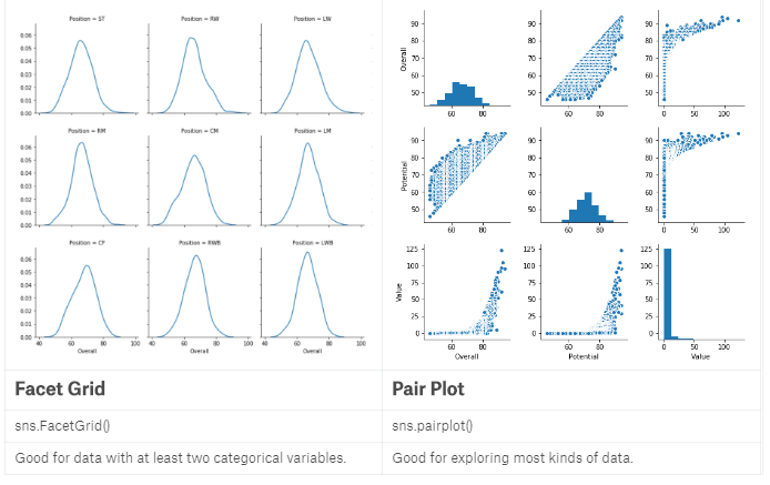
Faceting with seaborn
import pandas as pd

pd.set_option('max_columns', None)

df = pd.read_csv("../input/fifa-18-demo-player-dataset/CompleteDataset.csv", index_col=0)

import re

import numpy as np

import seaborn as sns

footballers = df.copy()

footballers['Unit'] = df['Value'].str[-1]

footballers['Value (M)'] = np.where(footballers['Unit'] == '', 0,

                                    footballers['Value'].str[1:-1].replace(r'[a-zA-Z]',''))

footballers['Value (M)'] = footballers['Value (M)'].astype(float)

footballers['Value (M)'] = np.where(footballers['Unit'] == 'M',

                                    footballers['Value (M)'],

                                    footballers['Value (M)']/1000)

footballers = footballers.assign(Value=footballers['Value (M)'],

                                 Position=footballers['Preferred Positions'].str.split().str[0])

//The FacetGrid

df = footballers[footballers['Position'].isin(['ST', 'GK'])]

g = sns.FacetGrid(df, col="Position")

g.map(sns.kdeplot, "Overall")

df = footballers

g = sns.FacetGrid(df, col="Position", col_wrap=6)//,每行6列

g.map(sns.kdeplot, "Overall")

df = footballers[footballers['Position'].isin(['ST', 'GK'])]

df = df[df['Club'].isin(['Real Madrid CF', 'FC Barcelona', 'Atlético Madrid'])]

g = sns.FacetGrid(df, row="Position", col="Club",

                  row_order=['GK', 'ST'],

                  col_order=['Atlético Madrid', 'FC Barcelona', 'Real Madrid CF'])

g.map(sns.violinplot, "Overall") //violin图

//Pairplot 数据分析第一步

sns.pairplot(footballers[['Overall', 'Potential', 'Value']])
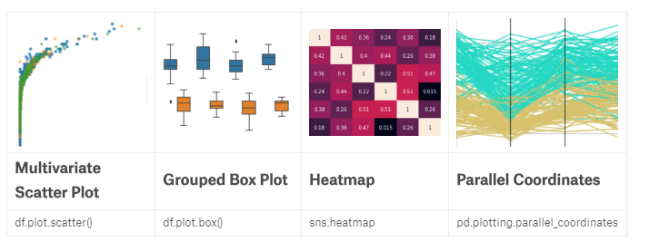
Multivariate plotting
import pandas as pd

pd.set_option('max_columns', None)

df = pd.read_csv("../input/fifa-18-demo-player-dataset/CompleteDataset.csv", index_col=0)

import re

import numpy as np

footballers = df.copy()

footballers['Unit'] = df['Value'].str[-1]

footballers['Value (M)'] = np.where(footballers['Unit'] == '', 0,

                                    footballers['Value'].str[1:-1].replace(r'[a-zA-Z]',''))

footballers['Value (M)'] = footballers['Value (M)'].astype(float)

footballers['Value (M)'] = np.where(footballers['Unit'] == 'M',

                                    footballers['Value (M)'],

                                    footballers['Value (M)']/1000)

footballers = footballers.assign(Value=footballers['Value (M)'],

                                 Position=footballers['Preferred Positions'].str.split().str[0])

//Multivariate scatter plots

import seaborn as sns

sns.lmplot(x='Value', y='Overall', hue='Position',

           data=footballers.loc[footballers['Position'].isin(['ST', 'RW', 'LW'])],

           fit_reg=False)

sns.lmplot(x='Value', y='Overall', markers=['o', 'x', '*'], hue='Position',

           data=footballers.loc[footballers['Position'].isin(['ST', 'RW', 'LW'])],

           fit_reg=False

          )

//Grouped box plot 分组的优势

f = (footballers

         .loc[footballers['Position'].isin(['ST', 'GK'])]

         .loc[:, ['Value', 'Overall', 'Aggression', 'Position']]

    )

f = f[f["Overall"] >= 80]

f = f[f["Overall"] < 85]

f['Aggression'] = f['Aggression'].astype(float)

sns.boxplot(x="Overall", y="Aggression", hue='Position', data=f)

//Heatmap

f = (

    footballers.loc[:, ['Acceleration', 'Aggression', 'Agility', 'Balance', 'Ball control']]

        .applymap(lambda v: int(v) if str.isdecimal(v) else np.nan)

        .dropna()

).corr()

sns.heatmap(f, annot=True)

//Parallel Coordinates

from pandas.plotting import parallel_coordinates

f = (

    footballers.iloc[:, 12:17]

        .loc[footballers['Position'].isin(['ST', 'GK'])]

        .applymap(lambda v: int(v) if str.isdecimal(v) else np.nan)

        .dropna()

)

f['Position'] = footballers['Position']

f = f.sample(200)

parallel_coordinates(f, 'Position')
plotly
import pandas as pd
reviews = pd.read_csv("../input/wine-reviews/winemag-data-130k-v2.csv", index_col=0)
reviews.head() from plotly.offline import init_notebook_mode, iplot
init_notebook_mode(connected=True) #离线注入笔记本模式 import plotly.graph_objs as go
iplot([go.Scatter(x=reviews.head(1000)['points'], y=reviews.head(1000)['price'], mode='markers')]) iplot([go.Histogram2dContour(x=reviews.head(500)['points'],
y=reviews.head(500)['price'],
contours=go.Contours(coloring='heatmap')),
go.Scatter(x=reviews.head(1000)['points'], y=reviews.head(1000)['price'], mode='markers')]) #surface图
df = reviews.assign(n=0).groupby(['points', 'price'])['n'].count().reset_index() #先point分组再price分,再添加的‘n’列上执行计数,最后对首列的index重新排序
df = df[df["price"] < 100]
v = df.pivot(index='price', columns='points', values='n').fillna(0).values.tolist() #重塑数组后用0填充NAN值,再把values列变成list
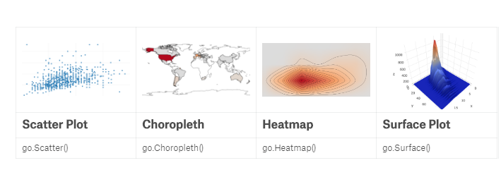
iplot([go.Surface(z=v)]) #地理图
df = reviews['country'].replace("US", "United States").value_counts() iplot([go.Choropleth(
locationmode='country names',
locations=df.index.values,
text=df.index,
z=df.values
)])
Data Visualisation Cheet Sheet的更多相关文章
- Object对象方法 cheet sheet
defineProperty create Object.create(prototype [, propertiesObject ]) prototype:没什么可说的,指定对象的原型 proper ...
- 使用Python对Twitter进行数据挖掘(Mining Twitter Data with Python)
目录 1.Collecting data 1.1 Register Your App 1.2 Accessing the Data 1.3 Streaming 2.Text Pre-processin ...
- 学习笔记之Data Visualization
Data visualization - Wikipedia https://en.wikipedia.org/wiki/Data_visualization Data visualization o ...
- Mining Twitter Data with Python
目录 1.Collecting data 1.1 Register Your App 1.2 Accessing the Data 1.3 Streaming 2.Text Pre-processin ...
- Import Data from *.xlsx file to DB Table through OAF page(转)
Use Poi.jar Import Data from *.xlsx file to DB Table through OAF page Use Jxl.jar Import Data from ...
- 【翻译】Awesome R资源大全中文版来了,全球最火的R工具包一网打尽,超过300+工具,还在等什么?
0.前言 虽然很早就知道R被微软收购,也很早知道R在统计分析处理方面很强大,开始一直没有行动过...直到 直到12月初在微软技术大会,看到我软的工程师演示R的使用,我就震惊了,然后最近在网上到处了解和 ...
- R统计分析处理
[翻译]Awesome R资源大全中文版来了,全球最火的R工具包一网打尽,超过300+工具,还在等什么? 阅读目录 0.前言 1.集成开发环境 2.语法 3.数据操作 4.图形显示 5.HTML部件 ...
- Sed&awk笔记之awk篇
http://blog.csdn.net/a81895898/article/details/8482333 Awk是什么 Awk.sed与grep,俗称Linux下的三剑客,它们之间有很多相似点,但 ...
- R工具包一网打尽
这里有很多非常不错的R包和工具. 该想法来自于awesome-machine-learning. 这里是包的导航清单,看起来更方便 >>>导航清单 通过这些翻译了解这些工具包,以后干 ...
随机推荐
- Jeecg-Boot 2.0 版本发布,基于Springboot+Vue 前后端分离快速开发平台
目录 Jeecg-Boot项目简介 源码下载 升级日志 Issues解决 v1.1升级到v2.0不兼容地方 系统截图 Jeecg-Boot项目简介 Jeecg-boot 是一款基于代码生成器的智能开发 ...
- 如何应用AxureRP做原型设计
什么是原型呢?这个在之前介绍为什么需要进行原型设计当中有提到,原型是产品的最初形态,确认用户对产品界面和操作功能可用性的需求,高保真的原型接近于产品的最终形态,但仍只是原型.产品原型简单的说就是产品设 ...
- rsync命令集合
rsync -avz rsync://logs@211.151.78.206/www_logs/2014/03/27/* /mnt/hgfs/iautoslogs/
- springboot 2+ druid
springboot 1+ druid druid 配置 import com.alibaba.druid.pool.DruidDataSource; import com.alibaba.druid ...
- 通过three.js实现简易3D打印模型切片展示
现在的页面展示要求越来越高,美的展示总能吸引更多的访客.最近在学习3D打印中的切片算法,刚刚入门,发现通过three.js框架可以很好展示出3D切片细节(虽然我做的比较简单). //========= ...
- Nginx的几个重要模块
ngx_http_ssl_module 让Nginx可以支持HTTPS的模块,此模块下的大多数指令都应用在http,server上下文 ①ssl on | off; 是否开启ssl功能 ②ssl_ce ...
- const 有什么用途
可以定义const 常量:const可以修饰函数的参数.返回值,甚至函数的定义体.被const 修饰的东西都受到强制保护,可以预防意外的变动,能提高程序的健壮性
- windows下 将tomcat做成服务,并于oracle后启动
一.将tomcat做成服务 1.下载解压版的tomcat 6.*, 设置java.tomcat的环境(这个就不说了). 2.运行->cmd->到tomcat安装目录的bin目录: 3.运行 ...
- Schedule(Hackerrank Quora Haqathon)
题目链接 Problem Statement At Quora, we run all our unit tests across many machines in a test cluster on ...
- SQL Server中存储过程与函数的区别
本质上没区别.只是函数有如:只能返回一个变量的限制.而存储过程可以返回多个.而函数是可以嵌入在sql中使用的,可以在select中调用,而存储过程不行.执行的本质都一样. 函数限制比较多,比如不能用临 ...