聊聊用CSS3来玩立方体
声明:本文为原创文章,如需转载,请注明来源WAxes,谢谢!
虽然现在很多浏览器都还不支持css3的3D转换,不过估计也已经有很多人都有玩css3的3D了。。。。。。所以我这篇也就相当于水一下了,哈哈。
用css3写3D立方体用到的属性不多,就那么几个:perspective,transform-style,以及transform。目前来说能完美支持3D的好像就只有chrome以及safari,也就是webkit引擎。所以本文的css3代码都只加了webkit前缀,因为产生3D的关键属性perspective其他浏览器都不支持,所以其他浏览器是应该是看不了3D的,所以看本文的例子请用chrome或者safari来看哦。
好吧,废话不多说,进入主题:先上DEMO: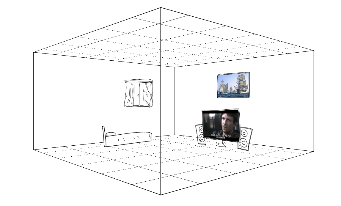 链接:3Dhouses (不要吐槽图片,因为找不到合适的素材,楼主只能自己画了,不过画是次要的哈,别介意)
【html的布局】
先说html该如何来布局:
<div class="cube">

        <div class="ant">

            <div class="face face-right"><img src="data:image/face-right.png" alt=""></div>

            <div class="face face-left"><img src="data:image/face-left.png" alt=""></div>

            <div class="face face-in"><img src="data:image/face-in.png" alt=""></div>

            <div class="face face-out"><img src="data:image/face-out.png" alt=""></div>

            <div class="face face-bottom"><img src="data:image/face-bottom.png" alt=""></div>

            <div class="face face-top"><img src="data:image/face-bottom.png" alt=""></div>

            <div class="face nohidden face-right"></div>

            <div class="face nohidden face-left"></div>

            <div class="face nohidden face-in"></div>

            <div class="face nohidden face-out"></div>

            <div class="house tv"><img src="data:image/tv.png" alt=""></div>

            <div class="house bed"><img src="data:image/bed.png" alt=""></div>

        </div>

    </div>
一个立方体总共有六个面,所以,我们首先需要六个div:上面的faceout这些就是六个面。下面的nohidden类的div是我为了产生边,提升立体感加上去的,因为上面的那几个面有加backface-visibility: hidden属性,所以当div背对我们的时候是看不见的(当然,连border也是看不见咯,具体你可以自己测试一下),加了下面那些div就是为了营造更强的空间感吧,楼主表达能力有限,如果不是很懂,待会我会把所有代码贴出,可以拷贝回去自己测试一下,还是挺好玩的。
好吧,回归主题,立方体是六个面,同时他还需要一个外壳,如果你想让整个立方体动起来,就需要一个外壳,让六个面的位置定好后,然后让那个外壳动起来,里面的六个面位置也就跟着变了,这其中涉及一个很关键的属性:transform-style,这个属性是使被转换的子元素保留其 3D 转换,意思就是如果没有这个属性,当你的外壳转动起来的时候,内部的六个面的3D效果就会消失了,所以一定要在外壳上加上:transform-style: preserve-3d。
除了外壳外,还需要一个3D区域,也就是上面的cube类div。在cube里加上perspective属性就可以让cube里面产生3D效果,上面也有说过perspective是设置元素被查看位置的视图,他能让里面的元素产生透视效果,也就是3D。这个属性如今只有webkit引擎支持。。
【CSS】
html写好后,就开始写css:
.cube{

            width: 800px;

            height: 400px;

            -webkit-perspective: 1000px;

            margin:200px auto 0 auto;

        }

        .ant{

            width: 100%;

            height: 100%;

            -webkit-transform-style: preserve-3d;

            -webkit-transform: translate3d(0,0,-200px) rotateY(0deg);

            -webkit-animation:xuanzhuan 10s infinite linear;

        }

        .face{

            width: 100%;

            height: 100%;

            position: absolute;

            border:1px solid;

            -webkit-backface-visibility: hidden;

            /*background-color: #FFF;*/

            overflow: hidden;

            z-index:;

        }

        .nohidden{

            -webkit-backface-visibility: visible;

        }

        .face img{

            width: 100%;

            height: 100%;

        }

        .face-right{

            -webkit-transform: translate3d(400px , 0 , 0px) rotateY(-90deg);

        }

        .face-left{

            -webkit-transform: translate3d(-400px , 0 , 0px) rotateY(90deg);

        }

        .face-in{

            -webkit-transform: translate3d(0px , 0 , -400px) rotateY(0deg);

        }

        .face-out{

            -webkit-transform: translate3d(0px , 0 , 400px) rotateY(180deg);

        }

        .face-bottom{

            height: 800px;

            -webkit-transform: translate3d(0px , 0px , 0px) rotateX(90deg);

        }

        .face-top{

            height: 800px;

            -webkit-transform: translate3d(0px , -400px , 0px) rotateX(-90deg);

        }

        .house{

            position: absolute;

            height: 200px;

            z-index:;

        }

        .tv{

            -webkit-transform: translate3d(200px , 230px , 300px) rotateY(180deg);

        }

        .bed{

            height: 100px;

            -webkit-transform: translate3d(550px , 310px , 0px) rotateY(-90deg);

        }

        .house img{

            height: 100%;

        }

        @-webkit-keyframes xuanzhuan{

            from{

                -webkit-transform: translate3d(0,0,-200px) rotateY(0deg);

            }

            to{

                -webkit-transform: translate3d(0,0,-200px) rotateY(360deg);

            }

        }
perspective和transform-style都说过了,就不说了,说一下六个面的布置,就用到了transform方法了,其实也很容易理解:就是通过transform里的translate3d以及rotate旋转来调整六个面的位置和角度,同时提醒一下,写transform时,先写translate再写rotate和先写rotate再写translate出来的效果是不一样的,虽然两个都可以做出3D效果,但是参数是不一样的,前者可能更容易理解。先平移再旋转。而后者是旋转了之后,不能用xy平移,而是通过z轴才行了。
当CSS也写好后,就可以加个动画效果看看了,这个就不多说了,就是通过animation很容易做的。
下面贴出完整代码
<!DOCTYPE html>

<html>

<head>

    <meta http-equiv="Content-Type" content="text/html;charset=UTF-8">

    <meta name="viewport" content="initial-scale=1.0,minimum-scale=1.0,maximum-scale=1.0,user-scalable=0">

    <style>

        body{

            margin:0;

            padding:0;

        }

        .cube{

            width: 800px;

            height: 400px;

            -webkit-perspective: 1000px;

            margin:200px auto 0 auto;

        }

        .ant{

            width: 100%;

            height: 100%;

            -webkit-transform-style: preserve-3d;

            -webkit-transform: translate3d(0,0,-200px) rotateY(0deg);

            -webkit-animation:xuanzhuan 10s infinite linear;

        }

        .face{

            width: 100%;

            height: 100%;

            position: absolute;

            border:1px solid;

            -webkit-backface-visibility: hidden;

            /*background-color: #FFF;*/

            overflow: hidden;

            z-index: 10;

        }

        .nohidden{

            -webkit-backface-visibility: visible;

        }

        .face img{

            width: 100%;

            height: 100%;

        }

        .face-right{

            -webkit-transform: translate3d(400px , 0 , 0px) rotateY(-90deg);

        }

        .face-left{

            -webkit-transform: translate3d(-400px , 0 , 0px) rotateY(90deg);

        }

        .face-in{

            -webkit-transform: translate3d(0px , 0 , -400px) rotateY(0deg);

        }

        .face-out{

            -webkit-transform: translate3d(0px , 0 , 400px) rotateY(180deg);

        }

        .face-bottom{

            height: 800px;

            -webkit-transform: translate3d(0px , 0px , 0px) rotateX(90deg);

        }

        .face-top{

            height: 800px;

            -webkit-transform: translate3d(0px , -400px , 0px) rotateX(-90deg);

        }

        .house{

            position: absolute;

            height: 200px;

            z-index: 100;

        }

        .tv{

            -webkit-transform: translate3d(200px , 230px , 300px) rotateY(180deg);

        }

        .bed{

            height: 100px;

            -webkit-transform: translate3d(550px , 310px , 0px) rotateY(-90deg);

        }

        .house img{

            height: 100%;

        }

        @-webkit-keyframes xuanzhuan{

            from{

                -webkit-transform: translate3d(0,0,-200px) rotateY(0deg);

            }

            to{

                -webkit-transform: translate3d(0,0,-200px) rotateY(360deg);

            }

        }

    </style>

    <title>Document</title>

</head>

<body>

    <div class="cube">

        <div class="ant">

            <div class="face face-right"><img src="data:image/face-right.png" alt=""></div>

            <div class="face face-left"><img src="data:image/face-left.png" alt=""></div>

            <div class="face face-in"><img src="data:image/face-in.png" alt=""></div>

            <div class="face face-out"><img src="data:image/face-out.png" alt=""></div>

            <div class="face face-bottom"><img src="data:image/face-bottom.png" alt=""></div>

            <div class="face face-top"><img src="data:image/face-bottom.png" alt=""></div>

            <div class="face nohidden face-right"></div>

            <div class="face nohidden face-left"></div>

            <div class="face nohidden face-in"></div>

            <div class="face nohidden face-out"></div>

            <div class="house tv"><img src="data:image/tv.png" alt=""></div>

            <div class="house bed"><img src="data:image/bed.png" alt=""></div>

        </div>

    </div>

</body>

</html>
如果能做出上面那个立方体的时候,网上那些看似很炫的css3的3D轮播图也就很容易做出来了 3D轮播图
3D轮播图
这个的原理就不解释了,自己看代码吧,都一个样的,每一块就是一个3D模型,我这个只是做出了效果,没去做轮播了,做轮播也很容易,用js控制更换图片的src就行了。对了,还有一点就是注意一下每个块的排序,我之前以为用z-index可以,但是好像不行,就只能通过排序来调整各个块的层级关系了。
下面贴出3D轮播的代码:
<!DOCTYPE html PUBLIC "-//W3C//DTD XHTML 1.0 Transitional//EN" "http://www.w3.org/TR/xhtml1/DTD/xhtml1-transitional.dtd">

<html xmlns="http://www.w3.org/1999/xhtml" xml:lang="en">

<head>

    <meta http-equiv="Content-Type" content="text/html;charset=UTF-8">

    <title>3D轮播图</title>

    <style>

        body{margin:0;padding:0;}

        .cube{

            width: 800px;

            height: 600px;

            -webkit-perspective: 1000px;

            margin:150px auto 0 auto;

            position: relative;

        }

        .ant{

            width: 200px;

            height: 100%;

            display: block;

            -webkit-transform-style: preserve-3d;

            -webkit-transform: translate3d(0,0,-400px);

            position:absolute;

        }

        .ant-1{left: 0px;}

        .ant-2{left: 200px;}

        .ant-3{left: 400px;}

        .ant-4{left: 600px;}

        .ant-1 img{left: 0px;}

        .ant-2 img{left: -200px;}

        .ant-3 img{left: -400px;}

        .ant-4 img{left: -600px;}

        .face{

            width: 100%;

            height: 100%;

            overflow: hidden;

            position: absolute;

            border:1px solid;

        }

        .face img{

            display: block;

            width: 800px;

            height: 100%;

            position: absolute;

        }

        .face-top{

            -webkit-transform: translate3d(0,-300px,0px) rotateX(90deg);

        }

        .face-bottom{

            -webkit-transform: translate3d(0,300px,0px) rotateX(-90deg);

        }

        .face-in{

            -webkit-transform: translate3d(0,0,-300px) rotateX(180deg);

        }

        .face-out{

            -webkit-transform: translate3d(0,0,300px) rotateX(0deg);

        }

        .face-left{

            background-color: #999;

            width: 600px;

            -webkit-transform: translate3d(-300px,0,0px) rotateY(90deg);

        }

        .face-right{

            background-color: #999;

            width: 600px;

            -webkit-transform: translate3d(-100px,0,0px) rotateY(-90deg);

        }

        .Animate{

            -webkit-animation:xuanzhuan 10s infinite linear;

        }

        @-webkit-keyframes xuanzhuan{

            0%{

                -webkit-transform: translate3d(0,0,-400px) rotateX(0deg);

            }

            50%{

                -webkit-transform: translate3d(0,0,-400px) rotateX(-360deg);

            }

            100%{

                -webkit-transform: translate3d(0,0,-400px) rotateX(0deg);

            }

        }

    </style>

    <script>

        var PIC_NUM = 5; //图片分成的块数

        window.onload = function(){

            var index = 1;

            document.querySelector(".ant-"+index).className += " Animate";

            setTimeout(function(){

                index++;

                document.querySelector(".ant-"+index).className += " Animate";

                setTimeout(function(){

                    index++;

                    document.querySelector(".ant-"+index).className += " Animate";

                    setTimeout(function(){

                        index++;

                        document.querySelector(".ant-"+index).className += " Animate";

                    },600)

                },600)

            } , 600);

        }

    </script>

</head>

<body>

    <ul class="cube">

        <li class="ant ant-1">

            <div class="face face-top">

                <img src="data:image/face-in.png" alt="" />

            </div>

            <div class="face face-bottom">

                <img src="data:image/face-in.png" alt="" />

            </div>

            <div class="face face-left"></div>

            <div class="face face-right"></div>

            <div class="face face-in">

                <img src="data:image/face-in.png" alt="" />

            </div>

            <div class="face face-out">

                <img src="data:image/face-in.png" alt="" />

            </div>

        </li>

        <li class="ant ant-2">

            <div class="face face-top">

                <img src="data:image/face-in.png" alt="" />

            </div>

            <div class="face face-bottom">

                <img src="data:image/face-in.png" alt="" />

            </div>

            <div class="face face-left"></div>

            <div class="face face-right"></div>

            <div class="face face-in">

                <img src="data:image/face-in.png" alt="" />

            </div>

            <div class="face face-out">

                <img src="data:image/face-in.png" alt="" />

            </div>

        </li>

        <li class="ant ant-4">

            <div class="face face-top">

                <img src="data:image/face-in.png" alt="" />

            </div>

            <div class="face face-bottom">

                <img src="data:image/face-in.png" alt="" />

            </div>

            <div class="face face-left"></div>

            <div class="face face-right"></div>

            <div class="face face-in">

                <img src="data:image/face-in.png" alt="" />

            </div>

            <div class="face face-out">

                <img src="data:image/face-in.png" alt="" />

            </div>

        </li>

        <li class="ant ant-3">

            <div class="face face-top">

                <img src="data:image/face-in.png" alt="" />

            </div>

            <div class="face face-bottom">

                <img src="data:image/face-in.png" alt="" />

            </div>

            <div class="face face-left"></div>

            <div class="face face-right"></div>

            <div class="face face-in">

                <img src="data:image/face-in.png" alt="" />

            </div>

            <div class="face face-out">

                <img src="data:image/face-in.png" alt="" />

            </div>

        </li>

    </ul>

</body>

</html>
没有用js封装成轮播图模块也是为了让代码更清晰易懂吧。。。。水完收工=。=|||
聊聊用CSS3来玩立方体的更多相关文章
- 基于css3的3D立方体旋转特效
今天给大家分享一款基于css3的3D立方体旋转特效.这款特效适用浏览器:360.FireFox.Chrome.Safari.Opera.傲游.搜狗.世界之窗. 不支持IE8及以下浏览器.效果图如下 : ...
- 【CSS3】3D立方体动画
关于CSS3的3D立方体动画 知识点: 1.每个元素有独立的坐标系 2.坐标系随当前元素的改变而发生改变 3.立方体由静态transform参数构成 4.通过给容器添加动画使立方体运动 效果图: &l ...
- 纯css3 3D图片立方体旋转动画特效
纯css3 3D立方体模块,鼠标触碰,模块炸开,大立方体中套小立方体 效果展示 手机扫描二维码体验效果: 效果图如下: 源码下载:http://hovertree.com/h/bjaf/0qmul8g ...
- 超绚丽CSS3多色彩发光立方体旋转动画
CSS3添加了几个动画效果的属性,通过设置这些属性,可以做出一些简单的动画效果而不需要再去借助JavaScript.css3动画的属性主要分为三类:transform.transition以及anim ...
- CSS3 3D图片立方体旋转
html <!DOCTYPE html> <html> <head> <meta charset="utf-8"> <titl ...
- CSS3之3D立方体效果
下面代码可实现3D立方体,比较好理解,就是让每个面先平移到指定位置,然后旋转90度 <!DOCTYPE html> <html lang="en"> < ...
- C#语法糖系列 —— 第三篇:聊聊闭包的底层玩法
有朋友好奇为什么将 闭包 归于语法糖,这里简单声明下,C# 中的所有闭包最终都会归结于 类 和 方法,为什么这么说,因为 C# 的基因就已经决定了,如果大家了解 CLR 的话应该知道, C#中的类最终 ...
- 用CSS3写一个立方体
<!DOCTYPE HTML> <html> <head> <meta http-equiv="Content-Type" content ...
- css3制作旋转立方体相册
首先让我们来看一下最终效果图: 当鼠标放在图片上是介个样子滴: 是不是觉得很好看?那接下来就一起制作吧! 我个人觉得编程,首先是思路,然后是代码,一起分析一下这个效果的思路. 1.背景颜色,它属于一种 ...
随机推荐
- Strusts2笔记6--拦截器
拦截器: Struts2的大多数核心功能都是通过拦截器实现的.拦截器之所以称之为“拦截器”,是因为它可以在执行Action之前或之后拦截下用户请求,执行一些操作,以增强Action方法的功能. Str ...
- Java Dom对XML的解析和修改操作
与Dom4J和JDom对XML的操作类似,JDK提供的JavaDom解析器用起来一样方便,在解析XML方面Java DOM甚至更甚前两者一筹!其不足之处在于对XML的增删改比较繁琐,特开篇介绍... ...
- python操作mysql(pymysql + sqlalchemy)
pymysql pymsql是Python中操作MySQL的模块,其使用方法和MySQLdb几乎相同. 下载安装 pip3 install pymysql 使用操作 1.执行sql #!/usr/bi ...
- jdbc一次性采集mysql和oracle的海量数据,5000W+为例
最近做的采集工具遇到采集一天数据(超过5000W行数据)的情况, 采集mysql的时候直接采用流式读取的方式可以一次全部都读取出来,速度的话取决于网络速度 stmt = conn.createStat ...
- python网络编程-动态导入和断言
一:动态导入importlib 在程序运行的过程中,根据变量或者配置动态的决定导入哪个模块,可以使用模块importlib importlib使用示例 二:断言assert 如果接下来的程序依赖于前面 ...
- java基础75 xpth技术(网页知识)
1.xpth技术 1.1.xpath的作用 主要用于快速获取所需的节点对象. list<Node> selectNodes("xpath"); 查询多个节点对象 ...
- java基础73 dom4j修改xml里面的内容(网页知识)
1.DOM4J对XML文件进行增删改操作 实现代码 package com.shore.code; import java.io.File; import java.io.FileOutputStre ...
- 再谈OPENCV(转)
转自:http://blog.csdn.net/carson2005/article/details/6979806 尽管之前写过一篇关于OpenCV的介绍(http://blog.csdn.net/ ...
- [扩展推荐] Laravel 中利用 GeoIP 获取用户地理位置信息
我最近需要一个用户地域检测来设置用户的默认区域和货币.由 Daniel Stainback 创建的 torann/geoip 很好地满足为Laravel 5 项目提供 GeoIP 服务的要求. 这个 ...
- Java事务管理之Spring+Hibernate
环境与版本 除了上一篇中的hibernate的相关lib 外 Java事务管理之Hibernate 还需要加入Spring的lib 包和如下的一些依赖包 org.aopallianceorg.aspe ...