WPF自定义控件之仿Win8滚动条--ScrollViewer
| 1.说明 |
自己学习WPF不是很久,现将自己做的一些小项目中用到的自定义控件整理出来,方便以后使用,不尽人意之处,还请多多批评与指导,现在就来实现自定义ScrollViewer仿Win8滚动条
| 2.效果预览 |
1)横纵预览 2)MouseOver
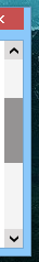 3)拖动中
3)拖动中 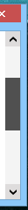
| 3.XAML代码 |
    <!--x:Key="ScrollBarThumb" TargetType="{x:Type Thumb}"-->

     <SolidColorBrush x:Key="ThumbBorderBackground" Color="#FFCDCDCD"/>

     <SolidColorBrush x:Key="ThumbMouseOverBackground" Color="#FF959393"/>

     <SolidColorBrush x:Key="ThumbDraggingBackground" Color="#FF505050"/>

    <!--x:Key="ScrollBarStyle1" TargetType="{x:Type ScrollBar}"-->

     <!--1,垂直与水平值相反-->

     <sys:Double x:Key="PepeatButtonPathWidth">8</sys:Double>

     <sys:Double x:Key="PepeatButtonPathHeight">6</sys:Double>

     <!--2,垂直与水平值一样-->

     <SolidColorBrush x:Key="PepeatButtonPathFill" Color="#FF444F4F"/>

     <SolidColorBrush x:Key="PepeatButtonPathMouseOverFill" Color="Black"/>

     <SolidColorBrush x:Key="PepeatButtonMouseOverBackground" Color="#FFDEDCDC"/>

     <SolidColorBrush x:Key="ScrollBarDisabledBackground" Color="#F4F4F4"/>

     <SolidColorBrush x:Key="ScrollBarBackground" Color="#F4F4F4"/>

     <Style x:Key="ScrollBarButton" TargetType="{x:Type RepeatButton}">

         <Setter Property="OverridesDefaultStyle" Value="true"/>

         <Setter Property="Focusable" Value="false"/>

         <Setter Property="IsTabStop" Value="false"/>

         <Setter Property="Template">

             <Setter.Value>

                 <ControlTemplate TargetType="{x:Type RepeatButton}">

                     <Themes:ScrollChrome x:Name="Chrome" RenderMouseOver="{TemplateBinding IsMouseOver}" RenderPressed="{TemplateBinding IsPressed}" SnapsToDevicePixels="true" Themes:ScrollChrome.ScrollGlyph="{TemplateBinding Themes:ScrollChrome.ScrollGlyph}"/>

                 </ControlTemplate>

             </Setter.Value>

         </Setter>

     </Style>

     <Style x:Key="VerticalScrollBarPageButton" TargetType="{x:Type RepeatButton}">

         <Setter Property="OverridesDefaultStyle" Value="true"/>

         <Setter Property="Background" Value="Transparent"/>

         <Setter Property="Focusable" Value="false"/>

         <Setter Property="IsTabStop" Value="false"/>

         <Setter Property="Template">

             <Setter.Value>

                 <ControlTemplate TargetType="{x:Type RepeatButton}">

                     <Rectangle Fill="{TemplateBinding Background}" Height="{TemplateBinding Height}" Width="{TemplateBinding Width}"/>

                 </ControlTemplate>

             </Setter.Value>

         </Setter>

     </Style>

     <Style x:Key="ScrollBarThumb" TargetType="{x:Type Thumb}">

         <Setter Property="OverridesDefaultStyle" Value="true"/>

         <Setter Property="IsTabStop" Value="false"/>

         <Setter Property="Template">

             <Setter.Value>

                 <ControlTemplate TargetType="{x:Type Thumb}">

                     <Border x:Name="border" Background="{StaticResource ThumbBorderBackground}" />

                     <ControlTemplate.Triggers>

                         <Trigger Property="IsMouseOver" Value="True">

                             <Setter Property="Background" TargetName="border" Value="{StaticResource ThumbMouseOverBackground}" />

                         </Trigger>

                         <Trigger Property="IsDragging" Value="True">

                             <Setter Property="Background" TargetName="border" Value="{StaticResource ThumbDraggingBackground}"/>

                         </Trigger>

                     </ControlTemplate.Triggers>

                 </ControlTemplate>

             </Setter.Value>

         </Setter>

     </Style>

     <Style x:Key="HorizontalScrollBarPageButton" TargetType="{x:Type RepeatButton}">

         <Setter Property="OverridesDefaultStyle" Value="true"/>

         <Setter Property="Background" Value="Transparent"/>

         <Setter Property="Focusable" Value="false"/>

         <Setter Property="IsTabStop" Value="false"/>

         <Setter Property="Template">

             <Setter.Value>

                 <ControlTemplate TargetType="{x:Type RepeatButton}">

                     <Rectangle Fill="{TemplateBinding Background}" Height="{TemplateBinding Height}" Width="{TemplateBinding Width}"/>

                 </ControlTemplate>

             </Setter.Value>

         </Setter>

     </Style>

     <Style x:Key="ScrollBarStyle1" TargetType="{x:Type ScrollBar}">

         <Setter Property="Background" Value="{StaticResource ScrollBarBackground}"/>

         <Setter Property="Stylus.IsPressAndHoldEnabled" Value="false"/>

         <Setter Property="Stylus.IsFlicksEnabled" Value="false"/>

         <Setter Property="Foreground" Value="{DynamicResource {x:Static SystemColors.ControlTextBrushKey}}"/>

         <Setter Property="Width" Value="{DynamicResource {x:Static SystemParameters.VerticalScrollBarWidthKey}}"/>

         <Setter Property="MinWidth" Value="{DynamicResource {x:Static SystemParameters.VerticalScrollBarWidthKey}}"/>

         <Setter Property="Template">

             <Setter.Value>

                 <ControlTemplate TargetType="{x:Type ScrollBar}">

                     <Grid x:Name="Bg" Background="{TemplateBinding Background}" SnapsToDevicePixels="true">

                         <Grid.RowDefinitions>

                             <RowDefinition MaxHeight="{DynamicResource {x:Static SystemParameters.VerticalScrollBarButtonHeightKey}}"/>

                             <RowDefinition Height="0.00001*"/>

                             <RowDefinition MaxHeight="{DynamicResource {x:Static SystemParameters.VerticalScrollBarButtonHeightKey}}"/>

                         </Grid.RowDefinitions>

                         <RepeatButton x:Name="upButton" Command="{x:Static ScrollBar.LineUpCommand}" IsEnabled="{TemplateBinding IsMouseOver}" BorderBrush="{x:Null}" Foreground="{x:Null}" BorderThickness="0">

                             <Path x:Name="upPath" Height="{StaticResource PepeatButtonPathHeight}" Width="{StaticResource PepeatButtonPathWidth}" Stretch="Fill" Fill="{StaticResource PepeatButtonPathFill}" Data="F1 M 37.8516,35.625L 34.6849,38.7917L 23.6016,50.2708L 23.6016,39.9792L 37.8516,24.9375L 52.1016,39.9792L 52.1016,50.2708L 41.0182,38.7917L 37.8516,35.625 Z "/>

                         </RepeatButton>

                         <Track x:Name="PART_Track" IsDirectionReversed="true" IsEnabled="{TemplateBinding IsMouseOver}" Grid.Row="1">

                             <Track.DecreaseRepeatButton>

                                 <RepeatButton Command="{x:Static ScrollBar.PageUpCommand}" Style="{StaticResource VerticalScrollBarPageButton}"/>

                             </Track.DecreaseRepeatButton>

                             <Track.IncreaseRepeatButton>

                                 <RepeatButton Command="{x:Static ScrollBar.PageDownCommand}" Style="{StaticResource VerticalScrollBarPageButton}"/>

                             </Track.IncreaseRepeatButton>

                             <Track.Thumb>

                                 <Thumb Style="{StaticResource ScrollBarThumb}" Themes:ScrollChrome.ScrollGlyph="VerticalGripper"/>

                             </Track.Thumb>

                         </Track>

                         <RepeatButton x:Name="downButton" Command="{x:Static ScrollBar.LineDownCommand}" IsEnabled="{TemplateBinding IsMouseOver}" Grid.Row="2" Foreground="{x:Null}" BorderBrush="{x:Null}" BorderThickness="0">

                             <Path x:Name="downPath" Height="{StaticResource PepeatButtonPathHeight}" Width="{StaticResource PepeatButtonPathWidth}" Stretch="Fill" Fill="{StaticResource PepeatButtonPathFill}" Data="F1 M 37.8516,39.5833L 52.1016,24.9375L 52.1016,35.2292L 37.8516,50.2708L 23.6016,35.2292L 23.6016,24.9375L 37.8516,39.5833 Z "/>

                         </RepeatButton>

                     </Grid>

                     <ControlTemplate.Triggers>

                         <Trigger Property="IsEnabled" Value="True" SourceName="upButton">

                             <Setter Property="Fill" TargetName="upPath" Value="{StaticResource PepeatButtonPathMouseOverFill}"/>

                             <Setter Property="Fill" TargetName="downPath" Value="{StaticResource PepeatButtonPathMouseOverFill}"/>

                             <Setter Property="Background" TargetName="upButton" Value="{StaticResource PepeatButtonMouseOverBackground}"/>

                             <Setter Property="Background" TargetName="downButton" Value="{StaticResource PepeatButtonMouseOverBackground}"/>

                         </Trigger>

                         <Trigger Property="IsEnabled" Value="false">

                             <Setter Property="Background" TargetName="Bg" Value="{StaticResource ScrollBarDisabledBackground}"/>

                         </Trigger>

                     </ControlTemplate.Triggers>

                 </ControlTemplate>

             </Setter.Value>

         </Setter>

         <Style.Triggers>

             <Trigger Property="Orientation" Value="Horizontal">

                 <Setter Property="Background" Value="{StaticResource ScrollBarBackground}"/>

                 <Setter Property="Width" Value="Auto"/>

                 <Setter Property="MinWidth" Value="0"/>

                 <Setter Property="Height" Value="{DynamicResource {x:Static SystemParameters.HorizontalScrollBarHeightKey}}"/>

                 <Setter Property="MinHeight" Value="{DynamicResource {x:Static SystemParameters.HorizontalScrollBarHeightKey}}"/>

                 <Setter Property="Template">

                     <Setter.Value>

                         <ControlTemplate TargetType="{x:Type ScrollBar}">

                             <Grid x:Name="Bg" Background="{TemplateBinding Background}" SnapsToDevicePixels="true">

                                 <Grid.ColumnDefinitions>

                                     <ColumnDefinition MaxWidth="{DynamicResource {x:Static SystemParameters.HorizontalScrollBarButtonWidthKey}}"/>

                                     <ColumnDefinition Width="0.00001*"/>

                                     <ColumnDefinition MaxWidth="{DynamicResource {x:Static SystemParameters.HorizontalScrollBarButtonWidthKey}}"/>

                                 </Grid.ColumnDefinitions>

                                 <RepeatButton x:Name="leftButton" Command="{x:Static ScrollBar.LineLeftCommand}" IsEnabled="{TemplateBinding IsMouseOver}" Foreground="{x:Null}" BorderBrush="{x:Null}" BorderThickness="0">

                                     <Path x:Name="leftPath" Height="{StaticResource PepeatButtonPathWidth}" Width="{StaticResource PepeatButtonPathHeight}" Stretch="Fill" Fill="DarkSlateGray" Data="F1 M 35.8724,37.6042L 39.0391,40.7708L 50.5182,51.8542L 40.2266,51.8542L 25.1849,37.6041L 40.2266,23.3542L 50.5182,23.3542L 39.0391,34.4375L 35.8724,37.6042 Z "/>

                                 </RepeatButton>

                                 <Track x:Name="PART_Track" Grid.Column="1" IsEnabled="{TemplateBinding IsMouseOver}">

                                     <Track.DecreaseRepeatButton>

                                         <RepeatButton Command="{x:Static ScrollBar.PageLeftCommand}" Style="{StaticResource HorizontalScrollBarPageButton}"/>

                                     </Track.DecreaseRepeatButton>

                                     <Track.IncreaseRepeatButton>

                                         <RepeatButton Command="{x:Static ScrollBar.PageRightCommand}" Style="{StaticResource HorizontalScrollBarPageButton}"/>

                                     </Track.IncreaseRepeatButton>

                                     <Track.Thumb>

                                         <Thumb Style="{StaticResource ScrollBarThumb}" Themes:ScrollChrome.ScrollGlyph="HorizontalGripper"/>

                                     </Track.Thumb>

                                 </Track>

                                 <RepeatButton x:Name="rightButton" Grid.Column="2" Command="{x:Static ScrollBar.LineRightCommand}" IsEnabled="{TemplateBinding IsMouseOver}" Foreground="{x:Null}" BorderBrush="{x:Null}" BorderThickness="0">

                                     <Path x:Name="rightPath" Height="{StaticResource PepeatButtonPathWidth}" Width="{StaticResource PepeatButtonPathHeight}" Stretch="Fill" Fill="{StaticResource PepeatButtonPathFill}" Data="F1 M 39.8307,37.6042L 36.6641,34.4375L 25.1849,23.3542L 35.4766,23.3542L 50.5182,37.6042L 35.4766,51.8542L 25.1849,51.8542L 36.6641,40.7708L 39.8307,37.6042 Z "/>

                                 </RepeatButton>

                             </Grid>

                             <ControlTemplate.Triggers>

                                 <Trigger Property="IsEnabled" Value="True" SourceName="leftButton">

                                     <Setter Property="Fill" TargetName="leftPath" Value="{StaticResource PepeatButtonPathMouseOverFill}"/>

                                     <Setter Property="Fill" TargetName="rightPath" Value="{StaticResource PepeatButtonPathMouseOverFill}"/>

                                     <Setter Property="Background" TargetName="leftButton" Value="{StaticResource PepeatButtonMouseOverBackground}"/>

                                     <Setter Property="Background" TargetName="rightButton" Value="{StaticResource PepeatButtonMouseOverBackground}"/>

                                 </Trigger>

                                 <Trigger Property="IsEnabled" Value="false">

                                     <Setter Property="Background" TargetName="Bg" Value="{StaticResource ScrollBarDisabledBackground}"/>

                                 </Trigger>

                             </ControlTemplate.Triggers>

                         </ControlTemplate>

                     </Setter.Value>

                 </Setter>

             </Trigger>

         </Style.Triggers>

     </Style>

    <!--总样式x:Key="ScrollViewerStyle",引用此处Key即可-->

     <ControlTemplate x:Key="ScrollViewerStyle" TargetType="{x:Type ScrollViewer}">

         <Grid x:Name="Grid" Background="{TemplateBinding Background}">

             <Grid.ColumnDefinitions>

                 <ColumnDefinition Width="*"/>

                 <ColumnDefinition Width="Auto"/>

             </Grid.ColumnDefinitions>

             <Grid.RowDefinitions>

                 <RowDefinition Height="*"/>

                 <RowDefinition Height="Auto"/>

             </Grid.RowDefinitions>

             <ScrollBar x:Name="PART_VerticalScrollBar" AutomationProperties.AutomationId="VerticalScrollBar" Cursor="Arrow" Grid.Column="1" Maximum="{TemplateBinding ScrollableHeight}" Minimum="0" Grid.Row="0" Visibility="{TemplateBinding ComputedVerticalScrollBarVisibility}" Value="{Binding VerticalOffset, Mode=OneWay, RelativeSource={RelativeSource TemplatedParent}}" ViewportSize="{TemplateBinding ViewportHeight}" Style="{DynamicResource ScrollBarStyle1}"/>

             <ScrollBar x:Name="PART_HorizontalScrollBar" AutomationProperties.AutomationId="HorizontalScrollBar" Cursor="Arrow" Grid.Column="0" Maximum="{TemplateBinding ScrollableWidth}" Minimum="0" Orientation="Horizontal" Grid.Row="1" Visibility="{TemplateBinding ComputedHorizontalScrollBarVisibility}" Value="{Binding HorizontalOffset, Mode=OneWay, RelativeSource={RelativeSource TemplatedParent}}" ViewportSize="{TemplateBinding ViewportWidth}" Style="{DynamicResource ScrollBarStyle1}"/>

             <ScrollContentPresenter x:Name="PART_ScrollContentPresenter" CanContentScroll="{TemplateBinding ScrollViewer.CanContentScroll}" CanHorizontallyScroll="False" CanVerticallyScroll="False" ContentTemplate="{TemplateBinding ContentTemplate}" Content="{TemplateBinding Content}" Grid.Column="0" Margin="{TemplateBinding Padding}" Grid.Row="0"/>

         </Grid>

     </ControlTemplate>
注:将以上代码放置资源字典或文档资源或App.xaml中都可,如果,您对该样式的颜色搭配有自己的想法,修改以下代码部分颜色值即可,更多修改,此处不再赘述
    <!--x:Key="ScrollBarThumb" TargetType="{x:Type Thumb}"-->

     <SolidColorBrush x:Key="ThumbBorderBackground" Color="#FFCDCDCD"/>

     <SolidColorBrush x:Key="ThumbMouseOverBackground" Color="#FF959393"/>

     <SolidColorBrush x:Key="ThumbDraggingBackground" Color="#FF505050"/>

    <!--x:Key="ScrollBarStyle1" TargetType="{x:Type ScrollBar}"-->

     <!--1,垂直与水平值相反-->

     <sys:Double x:Key="PepeatButtonPathWidth">8</sys:Double>

     <sys:Double x:Key="PepeatButtonPathHeight">6</sys:Double>

     <!--2,垂直与水平值一样-->

     <SolidColorBrush x:Key="PepeatButtonPathFill" Color="#FF444F4F"/>

     <SolidColorBrush x:Key="PepeatButtonPathMouseOverFill" Color="Black"/>

     <SolidColorBrush x:Key="PepeatButtonMouseOverBackground" Color="#FFDEDCDC"/>

     <SolidColorBrush x:Key="ScrollBarDisabledBackground" Color="#F4F4F4"/>

     <SolidColorBrush x:Key="ScrollBarBackground" Color="#F4F4F4"/>
| 4.应用 |
 <ScrollViewer Template="{DynamicResource ScrollViewerStyle}" HorizontalScrollBarVisibility="Auto"VerticalScrollBarVisibility="Auto">

      <!--包含的控件-->

 </ScrollViewer>
| 5.总结 |
可能对于大神而言这不算什么,但对于初学者还是有一定帮助的,但愿能给与一些还不是很懂的同僚一些启示,共同进步,有更多想法的还望多多批评,不吝赐教。
WPF自定义控件之仿Win8滚动条--ScrollViewer的更多相关文章
- WPF自定义控件与样式(6)-ScrollViewer与ListBox自定义样式
一.前言 申明:WPF自定义控件与样式是一个系列文章,前后是有些关联的,但大多是按照由简到繁的顺序逐步发布的等,若有不明白的地方可以参考本系列前面的文章,文末附有部分文章链接. 本文主要内容: Scr ...
- 【转】WPF自定义控件与样式(6)-ScrollViewer与ListBox自定义样式
一.前言 申明:WPF自定义控件与样式是一个系列文章,前后是有些关联的,但大多是按照由简到繁的顺序逐步发布的等. 本文主要内容: ScrollViewer的样式拆解及基本样式定义: ListBox集合 ...
- [WPF自定义控件库] 关于ScrollViewer和滚动轮劫持(scroll-wheel-hijack)
原文:[WPF自定义控件库] 关于ScrollViewer和滚动轮劫持(scroll-wheel-hijack) 1. 什么是滚动轮劫持# 这篇文章介绍一个很简单的继承自ScrollViewer的控件 ...
- VS编程,WPF中两个滚动条 ScrollViewer 同步滚动的一种方法
原文:VS编程,WPF中两个滚动条 ScrollViewer 同步滚动的一种方法 版权声明:我不生产代码,我只是代码的搬运工. https://blog.csdn.net/qq_43307934/ar ...
- wpf 添加滚动条 ScrollViewer
在WPF中有些控件没有滚动条,微软提供了控件ScrollViewer,这个控件是设置滚动条 <ScrollViewer Name="scrollViewer1" /> ...
- WPF自定义控件与样式(11)-等待/忙/正在加载状态-控件实现
一.前言 申明:WPF自定义控件与样式是一个系列文章,前后是有些关联的,但大多是按照由简到繁的顺序逐步发布的等,若有不明白的地方可以参考本系列前面的文章,文末附有部分文章链接. 本文主要有三种实现方式 ...
- WPF自定义控件与样式(13)-自定义窗体Window & 自适应内容大小消息框MessageBox
一.前言 申明:WPF自定义控件与样式是一个系列文章,前后是有些关联的,但大多是按照由简到繁的顺序逐步发布的等,若有不明白的地方可以参考本系列前面的文章,文末附有部分文章链接. 本文主要内容: 自定义 ...
- WPF自定义控件与样式(3)-TextBox & RichTextBox & PasswordBox样式、水印、Label标签、功能扩展
一.前言.预览 申明:WPF自定义控件与样式是一个系列文章,前后是有些关联的,但大多是按照由简到繁的顺序逐步发布的等,若有不明白的地方可以参考本系列前面的文章,文末附有部分文章链接. 本文主要是对文本 ...
- WPF自定义控件与样式(1)-矢量字体图标(iconfont)
一.图标字体 图标字体在网页开发上运用非常广泛,具体可以网络搜索了解,网页上的运用有很多例子,如Bootstrap.但在C/S程序中使用还不多,字体图标其实就是把矢量图形打包到字体文件里,就像使用一般 ...
随机推荐
- Database and models
Database and models The database Now that we have the Album module set up with controller action met ...
- windows下mysql初始密码设置
转载自:http://blog.csdn.net/ofreelander/article/details/50802780 1.my-default.ini 改名my.ini 在解压的目录下面复制my ...
- C语言结构体的强制类型转换
陈浩师兄03年的一篇博客<用C写有面向对象特点的程序>描述了用C语言来实现类似C++类继承的方法,这样方法的核心要点就是结构体的强制类型转换,让我来简单分析分析C语言中的结构体强制类型转换 ...
- 用Windows Server 2003搭建企业内部邮件服务器
公司要搭建一个邮件服务器,方便内部邮件的发送.而且要求每位员工都可以使用自己的账号和密码.领导将这份工作交给我,不过,这可难不倒我.只要借助Windows Server 2003就可以轻松建起内部邮件 ...
- [转]Oracle Stored Procedures Hello World Examples
本文转自:http://www.mkyong.com/oracle/oracle-stored-procedures-hello-world-examples/ List of quick examp ...
- Java内存分配全面浅析(转)
原文引自CSDN: 本文将由浅入深详细介绍Java内存分配的原理,以帮助新手更轻松的学习Java.这类文章网上有很多,但大多比较零碎.本文从认知过程角度出发,将带给读者一个 ...
- spark下测试akka的分布式通讯功能
采用的spark版本为1.1.0 scala版本为2.10.4 编写scala类文件myactors.scala: package bluejoe import akka.actor._ import ...
- 通过Workbook类 生成Excel导出数据
需求: 实现错误信息生成Excel保存到本地让用户查看. 刚开始使用了微软自带的Microsoft.Office.Interop.Excel类库. Microsoft.Office.Interop.E ...
- 【Oracle&SQLServer】并集、交际、补集
1.并集(UNION/UNION ALL) Oracle&SQLServer中用法一致 UNION 去重 UNION ALL 不去重 -- 去重 select * from tablea un ...
- linux 常见问题
无root权限install do chmod u+w /etc/sudoers sudo vi /etc/sudoers 找到root ALL=(ALL:ALL) ALL 在下面加一行: you ...