【动画消消乐|CSS】086.炫酷水波浪Loading过渡动画
前言
Hello!小伙伴!
非常感谢您阅读海轰的文章,倘若文中有错误的地方,欢迎您指出~
自我介绍 ଘ(੭ˊᵕˋ)੭
昵称:海轰
标签:程序猿|C++选手|学生
简介:因C语言结识编程,随后转入计算机专业,有幸拿过国奖、省奖等,已保研。目前正在学习C++/Linux(真的真的太难了~)
学习经验:扎实基础 + 多做笔记 + 多敲代码 + 多思考 + 学好英语!
【动画消消乐】 平时学习生活比较枯燥,无意之间对一些网页、应用程序的过渡/加载动画产生了浓厚的兴趣,想知道具体是如何实现的? 便在空闲的时候学习下如何使用css实现一些简单的动画效果,文章仅供作为自己的学习笔记,记录学习生活,争取理解动画的原理,多多“消灭”动画!
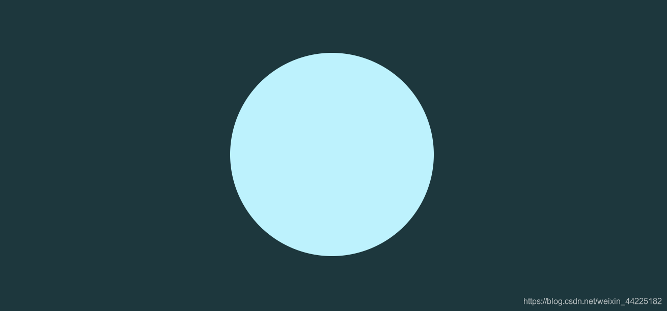
效果展示

Demo代码
HTML
<!DOCTYPE html>

<html lang="en">

    <head>

        <meta charset="UTF-8">

        <meta http-equiv="X-UA-Compatible" content="IE=edge">

        <meta name="viewport" content="width=device-width, initial-scale=1.0">

        <link rel="stylesheet" href="style.css">

        <title>Document</title>

    </head>

    <body>

        <section>

            <div class="circle">

                <div class="wave"></div>

            </div>

        </section>

    </body>

</html>
CSS
/*

模版css样式

仅供演示使用

*/

html, body {

	margin: 0;

	height: 100%;

}

body {

	display: flex;

	justify-content: center;

	align-items: center;

	background-color: #12383e;

}

section {

	width: 650px;

	height: 300px;

	padding: 10px;

	position: relative;

	display: flex;

	align-items: center;

	justify-content: center;

	border-radius: 20px;

	border: 18px solid white;

	overflow: hidden;

}

section::before {

	content: 'CSS';

	width: 150px;

	height: 150px;

	text-align: center;

	line-height: 250px;

	background-color: #00cec9;

	position: absolute;

	top: -76px;

	right: -76px;

	transform: translate(50%, -50%);

	font-size: 32px;

	font-weight: 500;

	font-family: sans-serif;

	color: white;

	transform: rotate(45deg);

}

section::after {

	content: '';

	position: absolute;

	width: 100%;

	height: 100%;

	border: 10px solid white;

	border-radius: 20px;

}

/* 实现代码 */

.circle {

	position: relative;

	width: 200px;

	height: 200px;

	background: #b0f4ff;

	border-radius: 50%;

	overflow: hidden;

	animation: loadingBreath 5s infinite linear;

}

.circle::before {

	content: 'Loading...';

	position: absolute;

	top: 50%;

	left: 50%;

	transform: translate(-50%, -50%);

	font-size: 18px;

	letter-spacing: 2px;

	color: #10a789;

	font-family: sans-serif;

	z-index: 2;

}

.circle::after {

	content: '';

	position: absolute;

	width: 100%;

	height: 25%;

	bottom: 0;

	background-image: linear-gradient(to top, #12c8e0, #36e9ff, #5ffbf1);

	animation: loadingRun 5s linear infinite;

}

.wave::before {

	content: '';

	position: absolute;

	left: -50%;

	width: 200%;

	height: 200%;

	z-index: 1;

	background-color: #85f7fb;

	border-radius: 52% 25% 62% 69%/25% 38%;

	animation: loadingWave 5s linear infinite;

}

.wave::after {

	content: '';

	position: absolute;

	left: -50%;

	width: 200%;

	height: 200%;

	z-index: 1;

	background-color: #d0f4ff;

	border-radius: 42% 38% 40% 62%/28% 35%;

	animation: loadingWave 5s ease-in-out infinite;

}

/* 呼吸灯动画 */

@keyframes loadingBreath {

	0% {

		box-shadow: 0 0 5px 0 #85f7fb;

	}

	25% {

		box-shadow: 0 0 20px 0 #85f7fb;

	}

	50% {

		box-shadow: 0 0 5px 0 #85f7fb;

	}

	75% {

		box-shadow: 0 0 20px 0 #85f7fb;

	}

	100% {

		box-shadow: 0 0 5px 0 #85f7fb;

	}

}

/* 底部液体上升动画 */

@keyframes loadingRun {

	0% {

		height: 25%;

	}

	100% {

		height: 100%;

	}

}

/* wave动画 */

@keyframes loadingWave {

	0% {

		top: -100%;

		transform: rotate(0);

	}

	100% {

		top: -200%;

		transform: rotate(360deg);

	}

}
原理详解
步骤1
从效果图上分析
可以将其分为两个部分
- 容器
- 波浪
这里使用两个div,一个为circle类,一个为wave类,分别代表容器和wave
            <div class="circle">

                <div class="wave"></div>

            </div>
步骤2
设置circle类
- 相对定位
- 宽度、高度均为200px
- 背景色:#b0f4ff
- 圆角:50%
.circle {

	position: relative;

	width: 200px;

	height: 200px;

	background: #b0f4ff;

	border-radius: 50%;

}
效果图如下:
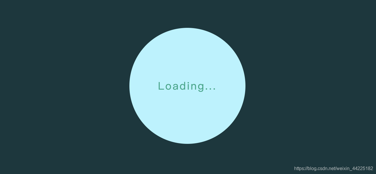
步骤3
利用.circle::befor伪元素
用于显示“Loading...”字样
设置为
- 绝对定位
- 使其位于正中间( top: 50%; left: 50%; transform: translate(-50%, -50%);)
- 字体大小:18px
- 颜色:#10a789;
- z-index:2(比1大就行 使其文字处于最上层)
.circle::before {

	content: 'Loading...';

	position: absolute;

	top: 50%;

	left: 50%;

	transform: translate(-50%, -50%);

	font-size: 18px;

	letter-spacing: 2px;

	color: #10a789;

	font-family: sans-serif;

	z-index: 2;

}
效果图如下:
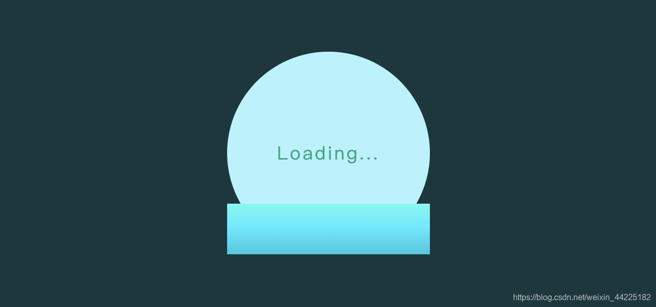
步骤4
利用.circle::after伪元素
设置为
- 绝对定位(bottom: 0; )
- 宽度:100%
- 高度:25%
- 背景颜色为渐变色 linear-gradient(to top, #12c8e0, #36e9ff, #5ffbf1);
.circle::after {

	content: '';

	position: absolute;

	width: 100%;

	height: 25%;

	bottom: 0;

	background-image: linear-gradient(to top, #12c8e0, #36e9ff, #5ffbf1);

}
效果图如下:
步骤5
为.circle::after伪元素添加动画
使其随时间其高度逐渐增大
只需要明确两个关键帧
- 初始位置:height: 25%
- 结束位置:height: 100%
.circle::after {

	animation: loadingRun 5s linear infinite;

}

@keyframes loadingRun {

	0% {

		height: 25%;

	}

	100% {

		height: 100%;

	}

}
效果图如下:

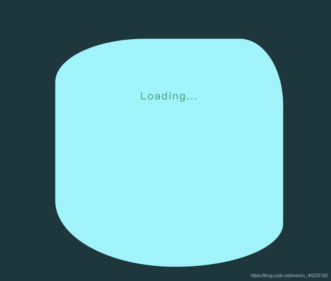
步骤6
对circle设置隐藏溢出
.circle {

	overflow: hidden;

}
效果图如下:

步骤7
这里先注释circle隐藏溢出 以及 circle::after动画 便于后面单独分析
.circle {

	/* overflow: hidden; */

}

.circle::after {

	/* animation: loadingRun 5s linear infinite; */

}
然后我们使用wave的两个伪元素.wave::before、.wave::afte与cirle::after产生波浪的效果
首先设置wave::before
- 绝对定位(left: -50%;)
- 宽度、高度均为200%
- z-index:1
- 背景色:#85f7fb
- border-radius: 52% 25% 62% 69%/25% 38%; 重点
.wave::before {

	content: '';

	position: absolute;

	left: -50%;

	width: 200%;

	height: 200%;

	z-index: 1;

	background-color: #85f7fb;

	border-radius: 52% 25% 62% 69%/25% 38%;/*重点*/

}
效果图如下:
注:.wave::before z-index为1 大于circile(0) 小于.circle::before(2)
为.wave::before 添加动画
效果描述
自身不断旋转的同时 也不断上升
.wave::before {

	animation: loadingWave 5s linear infinite;

}

@keyframes loadingWave {

	0% {

		top: -100%;

		transform: rotate(0);

	}

	100% {

		top: -200%;

		transform: rotate(360deg);

	}

}
效果图如下:

同理,对wave::after进行同样的设置
不同在于ç四边圆角率与before不同、颜色浅一点
border-radius: 42% 38% 40% 62%/28% 35%;

background-color: #d0f4ff;
其他都一样
当wave::after、before运用同样的动画时
效果图如下:

步骤8
取消circle隐藏溢出 以及 circle::after动画
.circle {

	overflow: hidden;

}

.circle::after {

	 animation: loadingRun 5s linear infinite;

}
效果图如下:

步骤9
最后为cirlce添加一个呼吸灯动画效果
.circle {

	animation: loadingBreath 5s infinite linear;

}

```css

@keyframes loadingBreath {

	0% {

		box-shadow: 0 0 5px 0 #85f7fb;

	}

	25% {

		box-shadow: 0 0 20px 0 #85f7fb;

	}

	50% {

		box-shadow: 0 0 5px 0 #85f7fb;

	}

	75% {

		box-shadow: 0 0 20px 0 #85f7fb;

	}

	100% {

		box-shadow: 0 0 5px 0 #85f7fb;

	}

}
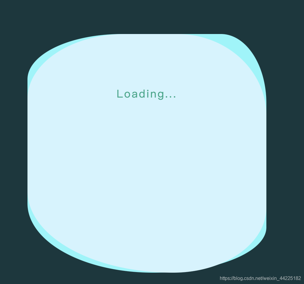
得到最终效果图
结语
文章仅作为学习笔记,记录从0到1的一个过程
希望对您有所帮助,如有错误欢迎小伙伴指正~
我是 海轰ଘ(੭ˊᵕˋ)੭
如果您觉得写得可以的话,请点个赞吧
谢谢支持️
学习参考:
https://www.bilibili.com/video/BV1Ai4y1t7od
https://developer.mozilla.org/zh-CN/docs/Web/CSS/::before

【动画消消乐|CSS】086.炫酷水波浪Loading过渡动画的更多相关文章
- 17.纯 CSS 创作炫酷的同心矩形旋转动画
原文地址:https://segmentfault.com/a/1190000014807564 感想: 这个特效不难,但是这想法可能想不到,哈哈,怎么又废了. HTML代码: <div cla ...
- 如何用纯 CSS 创作炫酷的同心矩形旋转动画
效果预览 在线演示 按下右侧的"点击预览"按钮可以在当前页面预览,点击链接可以全屏预览. https://codepen.io/comehope/pen/bMvbRp 可交互视频教 ...
- 前端每日实战:17# 视频演示如何用纯 CSS 创作炫酷的同心矩形旋转动画
效果预览 按下右侧的"点击预览"按钮可以在当前页面预览,点击链接可以全屏预览. https://codepen.io/comehope/pen/bMvbRp 可交互视频教程 此视频 ...
- jQuery.smoove — jQuery和CSS3炫酷滚动页面内容元素动画特效插件
插件介绍: jQuery-smoove是一款jQuery和CSS3炫酷滚动页面内容元素动画特效插件.该内容元素动画插件在页面滚动到指定位置时,该位置的HTML元素会执行指定的CSS3动画特效,如旋转. ...
- 6种炫酷的CSS3按钮边框动画特效
6种炫酷的CSS3按钮边框动画特效Button border animate 用鼠标滑过下面的按钮看看效果! Draw Draw Meet Center Spin Spin Circle Spin T ...
- 开源分享三(炫酷的Android Loading动画)
开源分享三(炫酷的Android Loading动画) 分享GitHub上的一些Loading,为了提升产品用户体验,一个好的Loading必然是不可缺少的,对于一些耗时需要用户等待的页面来说会转移用 ...
- 使用css实现炫酷的横屏滚动效果
炫酷的横屏滚动效果css实现 DEMO: https://codepen.io/kobako/pen/BxVLLm 我们对滚动条都不陌生.平时浏览的网页,进度条通常是垂直方向的,内容从上往下排列.但是 ...
- 教你用原生CSS写炫酷页面切换效果,跟第三方组件说拜拜
因为项目需要,别人想让我给他写一个个人博客,并且给了我一个其他人的网页,可以点此查看.有的同学可能说了,第三方博客框架这么多,为什么还要去手写的,你说这个有可能是没有看到打开这个博客. 样式介绍 给大 ...
- 17.1拓展之纯 CSS 创作炫酷的同心圆旋转动画
效果地址:https://codepen.io/flyingliao/pen/ebjEMm?editors=1100 HTML代码: <div class="loader"& ...
随机推荐
- SpringBoot集成logback后访问日志端点
问题描述 使用SpringBootAdmin(sba)监控Springboot服务时,配置了logback日志框架,按天滚动生成日志,此时在sba的日志监控页面出现404,如下图所示: 解决方案 查看 ...
- bson的类型
BSON是JSON的扩展数据类型
- SEO入门一篇就够-SEO教程
大家口中的SEO(Search Engine Optimization),中文翻译为"搜索引擎优化",从本质上来说,其实就是如何迎合搜索引擎的规则,使得网站在搜索结果中能有更好的排 ...
- IP地址与子网化分
IP地址与子网掩码 一.IP地址的组成 二.IP地址的分类 1)A.B.C三类地址的组成 2 ...
- NB-IoT物联网连接
一.NB-1oT的专有能力物联网(Internet of Things).简称IoTNB-IoT就是指窄带物联网(Narrow Band-Internet of Things)技术目前关于NB-IoT ...
- python 分析文本文件
def count_words(filename):#统计指定文件单词的数量 """Count the approximate number of words in a ...
- Spring总结之事务
Spring事务 1)定义 事务是指多个操作单元组成的集合,多个操作单元是整体不可分割的,要么都成功,要么都不成功.必须遵守四个原则(ACID) ●原子性(Atomicity):即事务是不可分割的最小 ...
- 【系统学习ES6】新专题发布
我要发免费专题了,向下看 公众号和博客都有一阵没更新了,丢了一些粉儿,但是也很庆幸,时时还会有人关注.我并不是什么专业讲师,文章都是利用业余时间手工原创.在这里非常感谢各位的支持和厚爱. 这个月开始, ...
- 从redis数据库取数据存放到本地mysql数据库
redis数据库属于非关系型数据库,数据存放在内存堆栈中,效率比较高. 其存储数据是以json格式字符串存储字典的,而类似的关系型数据库无法实现这种数据的存储. 在爬取数据时,将数据暂存到redis中 ...
- python errno库与socket.connect_ex()方法的结合使用
前言:一般socket链接会首选connect方法,该方法会一直尝试链接.那么今天展示下connect_ex()方法,该方法如果链接成功会返回0,失败会返回errno库中的errorcode中的key ...