基于uniapp自定义Navbar+Tabbar组件「兼容H5+小程序+App端Nvue」
uni-app跨端自定义navbar+tabbar组件|沉浸式导航条|仿咸鱼凸起标签栏
在跨端项目开发中,uniapp是个不错的框架。采用vue.js和小程序语法结构,使得入门开发更容易。拥有非常丰富的插件生态。支持编译到h5、小程序及App等多个终端平台。
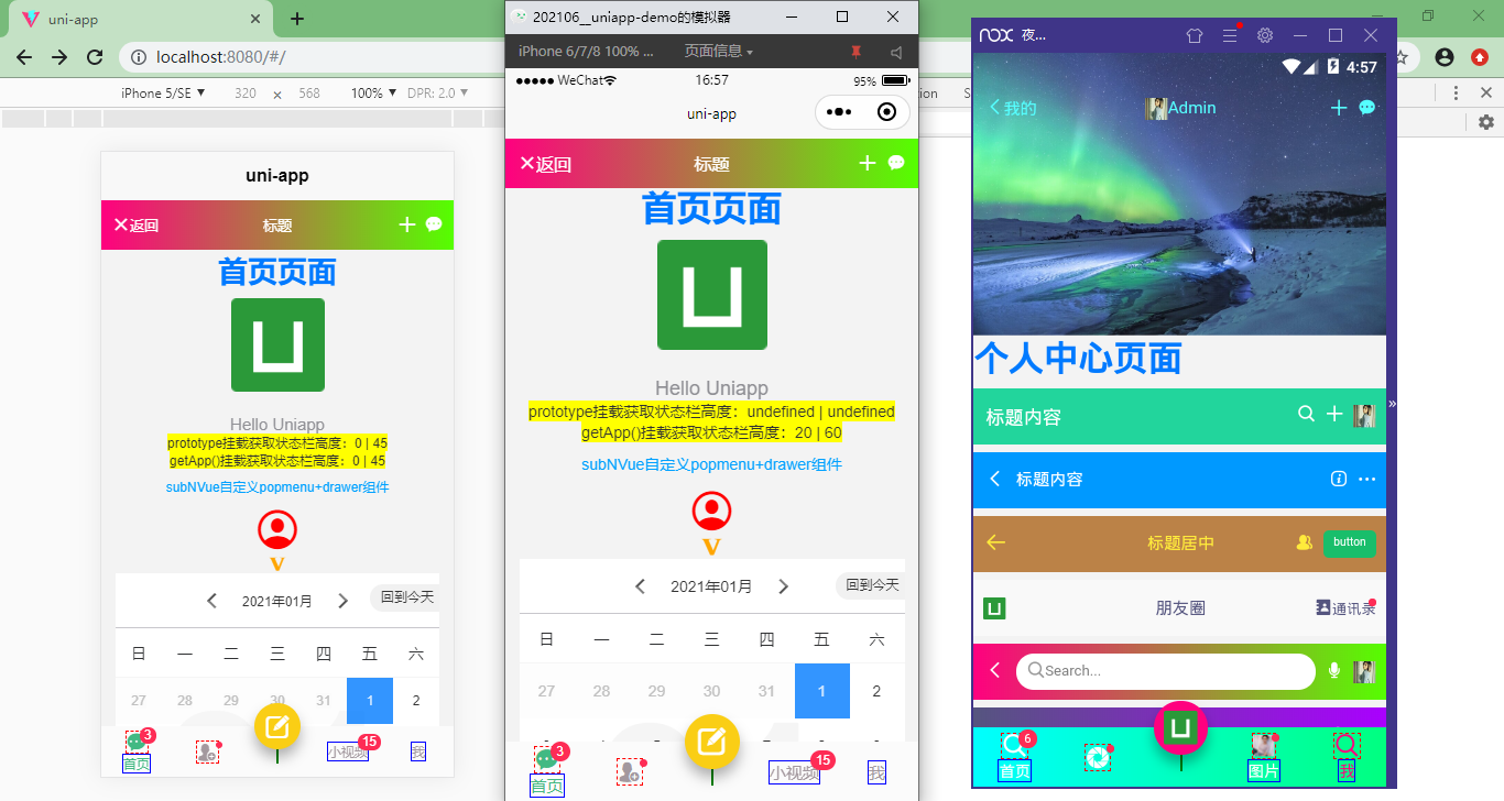
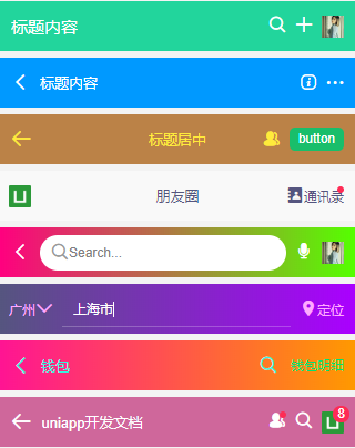
如上图:编译到h5+小程序+App端效果
◆ 准备
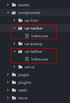
在项目根目录components下新建ua-navbar和ua-tabbar组件。
在main.js中全局引入组件。
// 引入自定义组件

import NavBar from './components/ua-navbar/index.vue'

import TabBar from './components/ua-tabbar/index.vue'

Vue.component('navbar', NavBar)

Vue.component('tabbar', TabBar)
HBuilderX 2.5.5起支持easycom组件模式。大家也可以根据需要改为此种引入模式,会更加方便。
传统vue组件,需要安装、引用、注册,三个步骤后才能使用组件。easycom将其精简为一步。 只要组件安装在项目的components目录下,并符合components/组件名称/组件名称.vue目录结构。就可以不用引用、注册,直接在页面中使用。
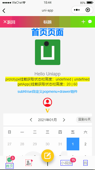
◆ uniapp获取手机状态条
如果项目中导航栏采用自定义模式 "globalStyle": { "navigationStyle": "custom" } 那么状态栏就需要重新计算了。
在App.vue中全局设置
/**

 * @Desc     uniapp获取状态栏信息

 * @Time     andy by 2021/7/6

 * @About    Q:282310962  wx:xy190310

 */

<script>

    import Vue from 'vue'

    export default {

        globalData: {

            // 全局设置状态栏和导航栏高度

            statusBarH: 0,

            customBarH: 0,

        },

        onLaunch: function() {

            uni.getSystemInfo({

                success: (e) => {

                    // 获取手机状态栏高度

                    let statusBar = e.statusBarHeight

                    let customBar

                    // #ifndef MP

                    customBar = statusBar + (e.platform == 'android' ? 50 : 45)

                    // #endif

                    // #ifdef MP-WEIXIN

                    // 获取胶囊按钮的布局位置信息

                    let menu = wx.getMenuButtonBoundingClientRect()

                    // 导航栏高度 = 胶囊下距离 + 胶囊上距离 - 状态栏高度

                    customBar = menu.bottom + menu.top - statusBar

                    // #endif

                    // #ifdef MP-ALIPAY

                    customBar = statusBar + e.titleBarHeight

                    // #endif

                    // 注意:此方法不支持原生Nvue页面

                    Vue.prototype.statusBarH = statusBar

                    Vue.prototype.customBarH = customBar

                    // 支持nvue页面写法(兼容H5/小程序/APP/APP-Nvue)

                    this.globalData.statusBarH = statusBar

                    this.globalData.customBarH = customBar

                }

            })

        },

        // ...

    }

</script>

◆ uniapp自定义沉浸式导航条
<!-- 导航条模板 -->

<template>

    <view class="ua__navbar">

        <view class="ua__navbar-wrap" :class="{'custom': custom, 'fixed': fixed || transparent}"

            :style="{'height': customBarH + 'px', 'padding-top': (custom ? statusBarH : 0) + 'px', 'background': bgcolor, 'color': color, 'z-index': zIndex}">

            <!-- //左侧 (返回) -->

            <view class="action navbar-action__left" v-if="back && back!='false'" @click="onBack">

                <template v-if="$slots.back">

                    <slot name="back" />

                </template>

                <template v-else><text class="iconfont nvuefont"

                        :style="{'color': color}">{{'\ue84c'}}</text></template>

                <slot name="backText" />

            </view>

            <slot name="left" />

            <!-- //标题 -->

            <view v-if="!search" class="navbar-title" :class="{'center': center}">

                <template v-if="$slots.title">

                    <slot name="title" />

                </template>

                <template v-else><text :style="{'color': color}">{{title}}</text></template>

            </view>

            <!-- //搜索框 -->

            <view v-if="search" class="action navbar-action__search">

                <slot name="search" />

            </view>

            <!-- //右侧 -->

            <view class="action navbar-action__right">

                <slot name="right" />

            </view>

        </view>

    </view>

</template>
<script>

    export default {

        props: {

            // 是否采用自定义导航模式

            custom: { type: [Boolean, String], default: false },

            // 是否返回

            back: { type: [Boolean, String], default: true },

            // 标题

            title: { type: String, default: '' },

            // 标题颜色

            color: { type: String, default: '#353535' },

            // 背景色

            bgcolor: { type: String, default: '#fff' },

            // 标题是否居中

            center: { type: [Boolean, String], default: false },

            // 搜索框

            search: { type: [Boolean, String], default: false },

            // 是否固定导航

            fixed: { type: [Boolean, String], default: false },

            // 是否背景透明

            transparent: { type: [Boolean, String], default: false },

            // 设置层叠

            zIndex: { type: [Number, String], default: '2022' },

        },

        data() {

            return {

                statusBarH: 0,

                customBarH: 0,

            }

        },

        beforeCreate() {

            // #ifdef APP-NVUE

            var domModule = weex.requireModule('dom');

            domModule.addRule('fontFace', {

                'fontFamily': "nvueIcon",

                'src': "url('/static/fonts/iconfont.ttf')"

            });

            // #endif

        },

        created() {

            const app = getApp()

            // 获取状态栏和导航条高度

            this.statusBarH = app.globalData.statusBarH

            this.customBarH = this.custom ? app.globalData.customBarH : app.globalData.customBarH - this.statusBarH

        },

        methods: {

            onBack() {

                uni.navigateBack({

                    delta: 1

                })

            }

        }

    }

</script>
支持自定义背景色(渐变)、文字颜色、标题居中、搜索框、透明沉浸式、是否固定及层级等功能。
也可以根据自定义插槽来实现一些城市选择、按钮、圆点提示、图片等功能。
<navbar :back="true" title="标题内容" bgcolor="#09f" color="#fff" fixed zIndex="1010" />
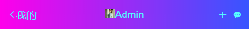
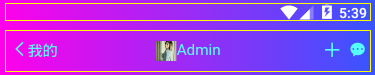
<navbar custom bgcolor="linear-gradient(to right, #ff007f, #0000ff)" color="#55ffff" center transparent zIndex="3003">

    <template slot="back"><text class="iconfont icon-arrL"></text></template>

    <template slot="backText"><text>我的</text></template>

    <template slot="title"><image src="/static/img2.jpg" style="height:20px;width:20px;" /> Admin</template>

    <template slot="right">

            <view class="ml-20" @click="handleAdd"><text class="iconfont icon-tianjia"></text></view>

            <view class="ml-20"><text class="iconfont icon-msg"></text></view>

    </template>

</navbar>
◆ uniapp自定义底部标签栏导航
<!-- 标签栏模板 -->

<template>

    <view class="ua__tabbar" :class="{'fixed': fixed}">

        <view class="ua__tabbar-wrap flexbox flex-alignc" :style="{'background': bgcolor}">

            <view v-for="(item, index) in tabs" :key="index" class="ua__tabbar-item flexbox flex-col" :class="currentTabIndex == index ? 'on' : ''" @click="switchTabs(index, item)">

                <view v-if="item.icon||item.img" class="ua__tabbar-icon" :class="{'dock': item.dock}">

                    <template v-if="item.dock">

                        <view class="dock-bg flexbox" :style="{'background': item.dockBg ? item.dockBg : activeColor}">

                            <text v-if="item.icon" class="iconfont nvuefont" :class="item.icon" :style="{'color': (currentTabIndex == index && !item.dock ? activeColor : color), 'font-size': item.iconSize}">{{item.icon.charAt(1) == '' ? item.icon : ''}}</text>

                            <image v-if="item.img" class="iconimg" :src="currentTabIndex == index && item.activeImg ? item.activeImg : item.img" :style="{'font-size': item.iconSize}" />

                        </view>

                    </template>

                    <template v-else>

                        <text v-if="item.icon" class="iconfont nvuefont" :class="item.icon" :style="{'color': (currentTabIndex == index && !item.dock ? activeColor : color), 'font-size': item.iconSize}">{{item.icon.charAt(1) == '' ? item.icon : ''}}</text>

                        <image v-if="item.img" class="iconimg" :src="currentTabIndex == index && item.activeImg ? item.activeImg : item.img" :style="{'font-size': item.iconSize}" />

                    </template>

                    <text v-if="item.badge" class="vui__badge ua__tabbar-icon__badge">{{item.badge}}</text>

                    <text v-if="item.dot" class="vui__badge-dot ua__tabbar-icon__badgeDot"></text>

                </view>

                <view v-if="item.title&&!item.dock" class="ua__tabbar-title">

                    <text class="ua__tabbar-title__text" :style="{'color': (currentTabIndex == index ? activeColor: color)}">{{item.title}}</text>

                    <template v-if="!item.icon&&!item.img">

                        <text v-if="item.badge" class="vui__badge ua__tabbar-title__badge">{{item.badge}}</text>

                        <text v-if="item.dot" class="vui__badge-dot ua__tabbar-title__badgeDot"></text>

                    </template>

                </view>

            </view>

        </view>

    </view>

</template>
<script>

    export default {

        props: {

            current: { type: [Number, String], default: 0 },

            // 背景色

            bgcolor: { type: String, default: '#fff' },

            // 颜色

            color: { type: String, default: '#9d9ea5' },

            // 激活颜色

            activeColor: { type: String, default: '#ff007f' },

            // 是否固定

            fixed: { type: [Boolean, String], default: false },

            // tab选项

            tabs: {

                type: Array,

                default: () => []

            },

        },

        data() {

            return {

                currentTabIndex: this.current

            }

        },

        beforeCreate() {

            // #ifdef APP-NVUE

            var domModule = weex.requireModule('dom');

            domModule.addRule('fontFace', {

                'fontFamily': "nvueIcon",

                'src': "url('/static/fonts/iconfont.ttf')"

            });

            // #endif

        },

        created() {

            /* uniapp获取当前页面路径 (App、小程序、H5通用) */

            let pages = getCurrentPages() //获取页面栈数组

            let page = pages[pages.length - 1] //获取当前页面对象

            let route = page.route //获取当前页面路由

            this.selectRoute(route)

        },

        methods: {

            // 匹配当前路由页面

            selectRoute(curPath) {

                curPath = curPath.substr(0, 1) == '/' ? curPath : '/' + curPath

                this.tabs.map((item, index) => {

                    if(item.path == curPath) {

                        this.currentTabIndex = index

                    }

                })

            },

            switchTabs(index, item) {

                if(item.path) {

                    // this.$router.push(item.path)

                    uni.navigateTo({

                        url: item.path

                    })

                }else {

                    this.currentTabIndex = index

                    this.$emit('click', index)

                }

            }

        }

    }

</script>
<style scoped>

    .nvuefont {font-family: nvueIcon;}

    .ua__tabbar {

        /* #ifndef APP-NVUE */

        display:-webkit-box; display:-webkit-flex; display:flex; display:-ms-flexbox;

        /* #endif */

        flex-direction: row;

    }

    .ua__tabbar-wrap {flex: 1; flex-direction: row; background-color: #fff; color: #333; height: 110rpx; position: relative; z-index: 2021;}

    .ua__tabbar.fixed{padding-top: 110rpx;}

    .ua__tabbar.fixed .ua__tabbar-wrap{

        /* #ifdef APP-NVUE */

        left: 0; right: 0;

        /* #endif */

        /* #ifndef APP-NVUE */

        width: 100%;

        /* #endif */

        max-width: 750px; position: fixed; bottom: 0;

    }

    .ua__tabbar-item{flex: 1; align-items: center; justify-content: center; height: 110rpx; position: relative;}

    /* 图标 */

    .ua__tabbar-icon{

        /* #ifdef APP-NVUE */

        padding: 0 20rpx;

        /* #endif */

        display: flex; align-items: center; justify-content: center; margin: 0 auto; height: 50rpx; position: relative; border:1px dashed red;

    }

    /* dock菜单 */

    .ua__tabbar-item .dock {

        /* #ifdef APP-NVUE */

        height: 200rpx;

        /* #endif */

        /* #ifndef APP-NVUE */

        position: static;

        /* #endif */

        border: 1px solid green;

    }

    .ua__tabbar-item .dock .dock-bg {

        background-color: #f57b15; border-radius: 1000rpx;

        align-items: center; justify-content: center; height: 100rpx; width: 100rpx;

        /* #ifdef APP-NVUE */

        box-shadow: 0 0 6px rgba(0,0,0,.3);

        /* #endif */

        /* #ifndef APP-NVUE */

        box-shadow: 0 8px 12px rgba(0,0,0,.3);

        position: absolute; top: -50rpx; left: 50%; transform: translateX(-50%);

        /* #endif */

    }

    .ua__tabbar-item .dock .iconfont {color: #fff!important;}

    /* 字体图标/图片 */

    .ua__tabbar-item .iconfont{color:#9d9ea5; font-size: 45rpx; transition: color .3s;}

    .ua__tabbar-item .iconimg{display: block; font-size: 40rpx; height: 1em; width: 1em;}

    .ua__tabbar-item.on .iconfont{color:#f57b15;}

    /* 标题 */

    .ua__tabbar-title{

        /* #ifdef APP-NVUE */

        padding: 0 20rpx;

        /* #endif */

        position: relative; transition: color .3s; border: 1px solid blue;

    }

    .ua__tabbar-title__text {color: #9d9ea5; font-size: 30rpx; }

    .ua__tabbar-item.on .ua__tabbar-title__text{color: #f57b15;}

</style>

支持自定义背景色(渐变)、文字颜色|选中颜色、是否固定、是否dock凸起按钮等功能。
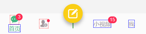
<tabbar bgcolor="linear-gradient(to top, rgba(0, 255, 127, 0.9), transparent)" color="#eee" activeColor="#ff0" fixed @click="handleTabClicked"

    :tabs="[

        {

            path: `/pages/index/index`,

            icon: `icon-home`,

            title: `首页`,

            badge: 38,

        },

        {

            icon: `icon-tianjia`,

            dock: true,

            dockBg: `#ff007f`,

            iconSize: `30px`,

        },

        {

            icon: `\ue606`,

            dot: true,

            title: `钱包`,

        },

    ]"

 />
tabs选项里面的参数
path: '/pages/index/index'   自定义跳转页面

icon: 'icon-home'            iconfont图标 支持icon-xxx和`\ue642`写法,在nvue页面必须写成`\ue642`格式

title: '首页'                 标题

img: 'http://...'            自定义图片地址

activeImg: ''                自定义选中图片

dock: true                   底部中间凸起按钮

dockBg: '#f90'               凸起按钮背景色(不设置则为activeColor)

iconSize: '30px'             图标/图片大小

badge: 18                    小红点数字

dot: true                    小圆点
根据项目需要,可以设置多个子标签栏菜单。
注意:在nvue页面,icon图标则需要使用 '\ue642' 这种unicode写法。
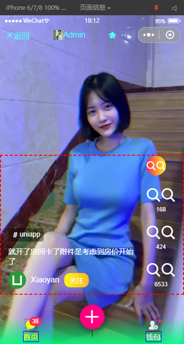
<tabbar bgcolor="linear-gradient(to right, #00ffff, #00ff7f)" color="#fff" active-color="#ff007f" fixed="true" @click="tabbarClicked"

    :tabs="[

        { path: `/pages/index/index`, icon: `icon-search`, title: `首页`, badge: 6 },

        { icon: `\ue644`, dot: true },

        { img: `/static/logo.png`, title: `发布`, dock: true, dockBg: `#ff007f`, iconSize: `30px` },

        { img: `/static/img1.jpg`, activeImg: `/static/img2.jpg`, title: `图片`, dot: true },

        { path: `/pages/ucenter/index`, icon: `icon-search`, title: `我` },

    ]"

/>

ending,基于uniapp模拟导航条/底部tabbar组件就介绍到这里。希望以上分享对大家有所帮助!
基于uniapp自定义Navbar+Tabbar组件「兼容H5+小程序+App端Nvue」的更多相关文章
- 基于uni-app全端弹框组件uaPopup「兼容h5+小程序+app端|nvue」
uniapp兼容多端自定义模态弹框组件UAPopup ua-popup 一款轻量级的uniapp自定义弹窗组件.汇集了android.ios和微信弹窗效果(msg消息.alert提示框.dialog对 ...
- uni-app自定义Modal弹窗组件|仿ios、微信弹窗效果
介绍 uniapp自定义弹窗组件uniPop,基于uni-app开发的自定义模态弹窗|msg信息框|alert对话框|confirm确认框|toast弱提示框 支持多种动画效果.多弹窗类型ios/an ...
- uniapp自定义顶部搜索框兼容微信小程序
zhuanzai: uniapp自定义顶部搜索框兼容微信小程序 自定义组件 navbarvue (胶囊底部高度 - 状态栏的高度) + (胶囊顶部高度 - 状态栏内的高度) = 导航栏的高度 < ...
- svelte组件:Svelte3自定义Navbar+Tabbr组件|svelte自定义插件
基于Svelte3自定义组件Navbar+Tabbar沉浸式导航条|底部凸起菜单栏 Svelte 一种全新的构建用户界面的框架.当下热门的 Vue 和 React 在浏览器中需要做大量的工作,而 Sv ...
- rtvue-lowcode:一款基于uniapp框架和uview组件库的开源低代码开发平台
rtvue-lowcode低代码开发平台 rtvue-lowcode一款基于uniapp框架和uview组件库的低代码开发平台,项目提供可视化拖拽编辑器,采用MIT开源协议,适用于app.小程序等项目 ...
- uniapp之uni-starter小程序多端研发框架搭建与项目实践
随着移动互联网的飞速发展,无数移动APP琳琅满目:在移动App的发展的基础上,衍生了小程序.轻应用技术,它随时可用,但又无需安装卸载.小程序是一种不需要下载安装即可使用的应用,它实现了应用" ...
- 微信小程序框架 同时兼容QQ小程序
最近一直在开发微信小程序,经过几个版本的迭代开发,代码终于能够达到框架级别,动态配置.除了界面有些寒酸以外,功能上还是挺完备的. 主要有以下特点 1.整个程序所需url地址均在api.js中定义,环境 ...
- uni-app开发的应用(小程序,app,web等),使用Node+Koa2开发的后端程序接收上传文件的方法
uni-app使用使用Node+Koa2开发的后端程序接收上传的文件 通过gitbook浏览此随笔 通过其它客户端上传(h5,小程序等),接收方法一致 使用koa接收时,我们需安装一个中间件koa-b ...
- 基于wepy和云开发的动漫资讯小程序----233次元
233次元小程序 # 233次元小程序 项目描述- 基于微信小程序的动漫咨询小程序,采用`wepy`框架开发:- 后台数据采用小程序的云开发存储: 线上体验 部分截图 ...
随机推荐
- [Linux] Linux命令行与Shell脚本编程大全 Part.2
进程 Linux是多用户系统,多个用户可以在不同地方通过网络连接到一个Linux系统上进行操作 w:显示登录人员信息 date:显示当前日期.时间和时区 up:从开机登录到现在经过的时间 load a ...
- 小米华为vivooppo手机记录隐私证据查询
1.在拨号界面输入:*#*#4636#*#* 2.在输入代码之后 手机会自动跳转到下面这个页面 就可以查看她到底拿着手机在干嘛 2 输入下面代码可以检测小米手机的各种信息 *#*#64663#*#*
- Ubuntu20 修改网卡名称
Ubuntu 修改网卡名称 Ubuntu修改网卡名称 Ubuntu 版本: Ubuntu 20.04 查看当前网卡名称 root@it:~# ip add 1: lo: <LOOPBACK,UP ...
- Java 程序流程控制语句
顺序语句 语句:使用分号分隔的代码称作为一个语句 注意:没有写任何代码只是一个分号的时候,也是一条语句,称作空语句 顺序语句就是按照从上往下的顺序执行的语句 Scanner scanner = new ...
- Centos7 Samba共享服务搭建
Centos7 Samba共享服务搭建 1.安装启动和端口 ---------------------------------------------------------------------- ...
- 三大主流开源硬件对比:Arduino vs Raspberry Pi vs BeagleBone
http://www.elecfans.com/emb/361236_3.html 下文摘自上面的链接 软硬件整合是今年一再被提及的话题,如今我们也可以看到不少硬件创业的成功案例,比如Jawbone ...
- nginx 的基础知识(二)
Nginx 多进程网络模型 进程模型 nginx启动后以daemon的方式在后台运行,后台进程包括一个master进程和多个worker进程 master进程主要作用,接收来自外界的信号:向各work ...
- ThinkPHP无限级分类(递归)
代码演示 没什么可说的直接看代码 <?php namespace app\controller; class Category { //模拟假数据 protected static functi ...
- GO学习-(28) Go语言操作influxDB
Go语言操作influxDB 本文介绍了influxDB时序数据库及Go语言操作influxDB. InfluxDB是一个开源分布式时序.事件和指标数据库.使用Go语言编写,无需外部依赖.其设计目标是 ...
- NBU Rman异机恢复Oracle
前段时间一个亿级分区表,被分割成历史表和业务表,历史表中保留15天以外的数据,每天都会从业务表中的15天外的数据copy到历史表,并删除业务表15天外的数据,逻辑也很简单,但插入历史表的where 条 ...