
CSS绘制简单图形
究竟该用字体图标、图片图标、还是CSS画一个图标?我也不知道。各有千秋吧。本文将介绍如何用css绘制简单的图形,所有测试在chrome58.0完成,如果你不能得到正确结果请到caniuse查一查看看是不是需要什么前缀。
一、基础
<!DOCTYPE html>

<html>

<head>

    <title>basic shapes</title>

    <style type="text/css">

        div{

            box-sizing: border-box;

        }

        .div1{

            width: 100px;

            height: 100px;

            border-top: 50px solid red;

            border-right: 50px solid blue;

            border-bottom: 50px solid yellow;

            border-left: 50px solid green;

        }

        .div2{

            width: 100px;

            height: 100px;

            border-right: 50px solid blue;

            border-bottom: 100px solid yellow;

            border-left: 50px solid green;

        }

        .div3{

            width: 100px;

            height: 100px;

            border-right: 25px solid blue;

            border-bottom: 100px solid yellow;

            border-left: 25px solid green;

        }

    </style>

</head>

<body>

    <div class="div1">div1</div>

    <span>border的神奇之处</span>

    <hr>

    <div class="div2">div2</div>

    <span>黄色三角形,底边100px高100px</span>

    <hr>

    <div class="div3">div3</div>

    <span>黄色的等腰梯形,上底50,下底100,高100</span>

</body>

</html>
上面代码的效果是这样的
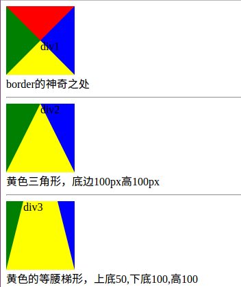
border是如何工作的,你可以从上面的结果自行体会。
二、特殊三角形
<!DOCTYPE html>

<html>

<head>

    <title>三角形</title>

    <style type="text/css">

        div{

            box-sizing: border-box;

            margin:20px;

        }

        .container::after{

            content: "";

            display: block;

            clear: both;

        }

        .div1{

            width: 100px;

            height: 0;

            border-bottom: 100px solid red;

            border-left: 50px solid transparent;

            border-right: 50px solid transparent;

            float: left;

        }

        .div2{

            width: 0;

            height: 100px;

            border-bottom: 50px solid transparent;

            border-left: 100px solid blue;

            border-top: 50px solid transparent;

            float: left;

        }

        .div3{

            width: 100px;

            height: 0;

            border-top: 100px solid yellow;

            border-left: 50px solid transparent;

            border-right: 50px solid transparent;

            float: left;

        }

        .div4{

            width: 0;

            height: 100px;

            border-bottom: 50px solid transparent;

            border-right: 100px solid green;

            border-top: 50px solid transparent;

            float: left;

        }

        .div5{

            width: 100px;

            height: 0;

            border-bottom: 86.6px solid red;

            border-left: 50px solid transparent;

            border-right: 50px solid transparent;

            float: left;

        }

        .div6{

            width: 100px;

            height: 0;

            border-bottom: 100px solid blue;

            /*border-left: 50px solid transparent;*/

            border-right: 100px solid transparent;

            float: left;

        }

        .div7{

            width: 100px;

            height: 0;

            border-bottom: 100px solid blue;

            /*border-left: 50px solid transparent;*/

            border-right: 100px solid transparent;

            float: left;

            transform: rotate(135deg);

            transform-origin: 50% 50%;

        }

    </style>

</head>

<body>

    <div class="container">

        <h4>等腰三角形</h4>

        <div class="div1"></div>

        <div class="div2"></div>

        <div class="div3"></div>

        <div class="div4"></div>

    </div>

    <div class="container">

        <h4>其他特殊三角形</h4>

        <div class="div5">等边</div>

        <div class="div6">直角</div>

        <div class="div7">直角</div>

    </div>

</body>

</html>
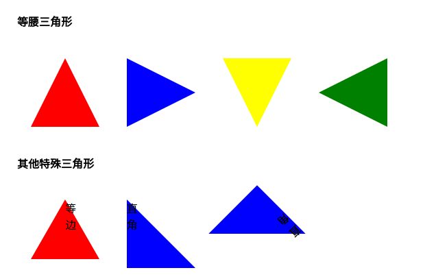
等腰三角形我做了4个方向的,当然你也可以用旋转来做,就像div7那样。制作三角形比较简单,只要对我前面将的基础加以改造就可以了。
三、特殊四边形
<!DOCTYPE html>

<html>

<head>

    <title>四边形</title>

    <style type="text/css">

        div{

            box-sizing: border-box;

            margin:20px;

        }

        .container::after{

            content: "";

            display: block;

            clear: both;

        }

        .div1{

            background: transparent;

            width: 0;

            height: 100px;

            border-bottom: 50px solid transparent;

            border-right: 100px solid green;

            border-top: 50px solid transparent;

            float: left;

            position: relative;

            box-sizing: border-box;

        }

        .div1::after{

            content: "";

            position: absolute;

            top: -50px;

            left: 100px;

            background: transparent;

            width: 0;

            height: 100px;

            border-bottom: 50px solid transparent;

            border-left: 100px solid green;

            border-top: 50px solid transparent;

            float: left;

            position: relative;

            box-sizing: border-box;

        }

        .div2{

            background: transparent;

            width: 80px;

            height: 0;

            border-bottom: 50px solid green;

            border-right: 40px solid transparent;

            border-left: 40px solid transparent;

            float: left;

            position: relative;

            box-sizing: border-box;

            margin-left: 100px;

        }

        .div2::after{

            content: "";

            position: absolute;

            top: 50px;

            left: -40px;

            width: 80px;

            height: 0;

            border-top: 50px solid green;

            border-right: 40px solid transparent;

            border-left: 40px solid transparent;

            box-sizing: border-box;

        }

        .div5{

            width: 100px;

            height: 0;

            border-bottom: 100px solid green;

            border-left: 25px solid transparent;

            border-right: 25px solid transparent;

            float: left;

        }

        .div6{

            width: 100px;

            height: 0;

            border-bottom: 100px solid green;

            border-right: 40px solid transparent;

            float: left;

        }

        .div7{

            width: 100px;

            height: 100px;

            background: green;

            transform: skew(30deg,0);

            float: left;

        }

    </style>

</head>

<body>

    <div class="container">

        <h4>菱形</h4>

        <div class="div1"></div>

        <div class="div2"></div>

    </div>

    <div class="container">

        <h4>梯形和平行四边形</h4>

        <div class="div5">等腰</div>

        <div class="div6">直角</div>

        <div class="div7">平行四边形</div>

    </div>

</body>

</html>

四、圆和椭圆
<!DOCTYPE html>

<html>

<head>

    <title>圆和椭圆</title>

    <style type="text/css">

        .div1{

            width: 50px;

            height: 50px;

            border-radius: 25px;

            box-sizing: border-box;

            background: red;

            float: left;

        }

        .div2 {

            width: 100px;

            height: 80px;

            background: green;

            border-radius: 50px / 40px;

            float: left;

        }

    </style>

</head>

<body>

    <div class="div1"></div>

    <div class="div2"></div>

</body>

</html>
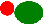
科普一下:http://www.css88.com/book/css/properties/border/border-radius.htm

以前都只用一个参参数的,所以写博客可以帮助查漏补缺。
五、复杂一点的图形
1、正多边形
<!DOCTYPE html>

<html>

<head>

    <title>正多边形</title>

    <style type="text/css">

        .five {

            top: 50px;

            position: relative;

            width: 54px;

            border-width: 50px 18px 0;

            border-style: solid;

            border-color: red transparent;

        }

        .five::before {

            content: "";

            position: absolute;

            height: 0;

            width: 0;

            top: -85px;

            left: -18px;

            border-width: 0 45px 35px;

            border-style: solid;

            border-color: transparent transparent green;

        }

        .six{

            width: 100px;

            height: 0px;

            border-width:0px 18.59px 60px;

            border-style: solid;

            border-color: transparent transparent red;

            margin-top: 60px;

            position: relative;

        }

        .six::after{

            content: "";

            width: 100px;

            height: 0px;

            border-width:60px 18.59px 0px;

            border-style: solid;

            border-color: green transparent transparent;

            position: absolute;

            top: 60px;

            left: -18.59px;

        }

    </style>

</head>

<body>

    <div class="five"></div>

    <div class="six"></div>

</body>

</html>

正五边形是借鉴的大神的(不知道是不是正的,我没算),思路是做一个梯形,然后拼接一个三角形,正六边形是我根据他的思路用两个梯形拼接的,如果我没有计算错误这应该是一个正六边形(怎么有点不像呢),计算目的是保证,腰和短底长相等。我刻意用不同颜色表示了拆分情况,便于理解。正 八变形怎么做?只需要拆解成两个梯形和一个矩形就好做了。正n边形怎么做,也是把它看作基本图形的组合,只不过可能单靠两个伪元素已经不够用了。
2、大大的爱心送给你
.aixin{

            border-width: 200px 150px 0;

            border-style: solid;;

            border-color: red transparent;

            width: 0px;

            position: relative;

            top: 200px;

            left: 100px;

        }

        .aixin::before{

            content: "";

            width: 180px;

            height: 180px;

            display: block;

            border-radius: 90px;

            background: red;

            position: absolute;

            top: -357px;

            left: -180px;

        }

        .aixin:after{

            content: "";

            width: 180px;

            height: 180px;

            display: block;

            border-radius: 90px;

            background: red;

            position: absolute;

            top: -357px;

            left:;

        }

数据没算,调整出来的。人要实心啊,搞个空心太不像话了,你自己去弄吧。两个圈圈加个三角形就可以了,原来爱这么简单。
3、对话框
<!DOCTYPE html>

<html>

<head>

    <title>对话框</title>

    <style type="text/css">

        .div1{

            width: 300px;

            height: 100px;

            border: 1px solid #97FFFF;

            position: relative;

            left: 100px;

            border-radius: 10px;

        }

        .div1::after,.div1::before{

            content: "";

            display: block;

            width: 0;

            height: 0;

            border-style: solid;

            border-color:transparent #97FFFF transparent transparent;

            position: absolute;

            top: 30px;

            left: -50px;

        }

        .div1::after{

            border-width: 21px 50px 21px 0;

        }

        .div1::before{

            top: 31px;

            border-width: 20px 50px 20px 0;

            border-color: transparent white transparent transparent;

            z-index: 1000;

            left: -49px;

        }

        .div2{

            width: 300px;

            height: 100px;

            border: 1px solid #97FFFF;

            position: relative;

            left: 100px;

            border-radius: 10px;

            margin-top: 20px;

        }

        .div2::after,.div2::before{

            content: "";

            display: block;

            width: 0;

            height: 0;

            border-style: solid;

            border-color:transparent transparent transparent #97FFFF;

            position: absolute;

            top: 30px;

            left: 300px;

        }

        .div2::after{

            border-width: 21px 0px 21px 50px;

        }

        .div2::before{

            top: 31px;

            border-width: 20px 0px 20px 50px;

            border-color: transparent transparent transparent white;

            z-index: 1000;

            left: 299px;

        }

    </style>

</head>

<body>

    <div class="div1">

    </div>

    <div class="div2"></div>

</body>

</html>
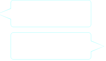
六、小结一下
用CSS还是画出来很多东西的,对于稍微复杂点的图形用拼接或者裁剪的方法实现,有时可能会需要一些简单计算。本文所提到的只是九牛一毛,早有一些朋友做出了许多非常炫酷的图形,你可以去搜搜看。就写到这里,留几个大神的作品,以备不时只需。
参考:
- http://blog.csdn.net/sinolzeng/article/details/41593651
- http://blog.csdn.net/pigsuper/article/details/43053679
- http://www.cnblogs.com/pigtail/archive/2013/02/17/2914119.html
CSS绘制简单图形的更多相关文章
- 学习笔记:HTML5 Canvas绘制简单图形
HTML5 Canvas绘制简单图形 1.添加Canvas标签,添加id供js操作. <canvas id="mycanvas" height="700" ...
- 摘记 史上最强大的40多个纯CSS绘制的图形(一)
今天在国外的网站上看到了很多看似简单却又非常强大的纯CSS绘制的图形,里面有最简单的矩形.圆形和三角形,也有各种常见的多边形,甚至是阴阳太极和网站小图标,真的非常强大,分享给大家. Square(正方 ...
- 40多个纯CSS绘制的图形
本文由码农网 – 陈少华原创,转载请看清文末的转载要求. 今天在国外的网站上看到了很多看似简单却又非常强大的纯CSS绘制的图形,里面有最简单的矩形.圆形和三角形,也有各种常见的多边形,甚至是阴阳太极和 ...
- CSS 魔法系列:纯 CSS 绘制各种图形《系列六》
我们的网页因为 CSS 而呈现千变万化的风格.这一看似简单的样式语言在使用中非常灵活,只要你发挥创意就能实现很多比人想象不到的效果.特别是随着 CSS3 的广泛使用,更多新奇的 CSS 作品涌现出来. ...
- CSS 魔法系列:纯 CSS 绘制各种图形《系列五》
我们的网页因为 CSS 而呈现千变万化的风格.这一看似简单的样式语言在使用中非常灵活,只要你发挥创意就能实现很多比人想象不到的效果.特别是随着 CSS3 的广泛使用,更多新奇的 CSS 作品涌现出来. ...
- CSS 魔法系列:纯 CSS 绘制基本图形(圆、椭圆等)
我们的网页因为 CSS 而呈现千变万化的风格.这一看似简单的样式语言在使用中非常灵活,只要你发挥创意就能实现很多比人想象不到的效果.特别是随着 CSS3 的广泛使用,更多新奇的 CSS 作品涌现出来. ...
- 史上最强大的40多个纯CSS绘制的图形[转]
今天在国外的网站上看到了很多看似简单却又非常强大的纯CSS绘制的图形,里面有最简单的矩形.圆形和三角形,也有各种常见的多边形,甚至是阴阳太极和网站小图标,真的非常强大,分享给大家. Square(正方 ...
- Java入门:绘制简单图形
在上一节,我们学习了如何使用swing和awt工具创建一个空的窗口,本节学习如何绘制简单图形. 基本绘图介绍 Java中绘制基本图形,可以使用Java类库中的Graphics类,此类位于java.aw ...
- 纯CSS绘制的图形一览
整理网上一些使用纯CSS绘制的图形示例~~纯属抄袭,哈哈...仅仅是为了自己以后查看! Square(正方形) #square { width: 100px; height: 100px; backg ...
随机推荐
- linux 私房菜 CH5 笔记
知识点 linux 大小写敏感 接口的切换 [Ctrl] + [Alt] + [F1] ~ [F6] :文字接口登入 tty1 ~ tty6 终端机: [Ctrl] + [Alt] + [F7] :图 ...
- jQuery遮罩插件 jquery.blockUI.js
Overview jQuery BlockUI 插件可以在不同锁定浏览器的同时,模拟同步模式下发起Ajax请求的行为.该插件激活时,会组织用户在页面进行的操作,直到插件被关闭.BlockUI通过向DO ...
- angularjs fileUpload
文件上传一直是我不熟悉的地方,<a href='https://github.com/nervgh/angular-file-upload/wiki/Module-API'>官网解释的例子 ...
- PHP的错误处理
PHP的错误处理机制 php的错误处理是比较复杂的, 本文讲解php中所有错误相关的重要知识点做一次梳理, 便于理解php的错误机制. 基础知识 在此之前, 先熟悉一下php error的基础知识 预 ...
- fastlane安装流程和fastlane match同步证书和PP文件方法
分步指南 安装fastlane: ① Make sure you have the latest version of the Xcode command line tools installed: ...
- jQuery选择器对应的DOM API ——选择元素
英文原文:http://blog.garstasio.com/you-dont-need-jquery/selectors/愚人码头注: 原作者的写这文章的意图是让我们抛弃jQuery,You Don ...
- iOS面试必看经典试题分析
> **不用临时变量怎么实现两个数据的交换?** 方式一:加减法的运算方式求解new_b = a - b + b = a;new_a = a + b - a = b;一个简单的运算方式,最重要的 ...
- iOS 按钮连续提交执行一次(如留言提交,多次拍照问题)
在很多项目中暴力测试时会出现多次点击执行一个方法 可以用下面的语句进行解决 //先将未到时间执行前的任务取消. [[self class] cancelPreviousPerformRequests ...
- golang的http分析
首先,要认识一个贯穿始终的接口http.Handler type Handler interface { ServeHTTP(ResponseWriter, *Request) } 其中,两个参数 ...
- shiro使用教程
一.shiro是什么 Apache Shiro是一个强大且易用的Java安全框架,执行身份验证.授权.密码学和会话管理.不仅可以在Web项目中使用,在普通的项目中也是可以使用的 二.shiro可以做什 ...