CSS3 Loading(加载)动画效果

1.html 部分
<div class="spinner">

  <div class="rect1"></div>

  <div class="rect2"></div>

  <div class="rect3"></div>

  <div class="rect4"></div>

  <div class="rect5"></div>

</div>
2.css 部分
.spinner {

  margin: 100px auto;

  width: 50px;

  height: 60px;

  text-align: center;

  font-size: 10px;

}

.spinner > div {

  background-color: #67CF22;

  height: 100%;

  width: 6px;

  display: inline-block;

  -webkit-animation: stretchdelay 1.2s infinite ease-in-out;

  animation: stretchdelay 1.2s infinite ease-in-out;

}

.spinner .rect2 {

  -webkit-animation-delay: -1.1s;

  animation-delay: -1.1s;

}

.spinner .rect3 {

  -webkit-animation-delay: -1.0s;

  animation-delay: -1.0s;

}

.spinner .rect4 {

  -webkit-animation-delay: -0.9s;

  animation-delay: -0.9s;

}

.spinner .rect5 {

  -webkit-animation-delay: -0.8s;

  animation-delay: -0.8s;

}

@-webkit-keyframes stretchdelay {

  0%, 40%, 100% { -webkit-transform: scaleY(0.4) }

  20% { -webkit-transform: scaleY(1.0) }

}

@keyframes stretchdelay {

  0%, 40%, 100% {

    transform: scaleY(0.4);

    -webkit-transform: scaleY(0.4);

  }  20% {

    transform: scaleY(1.0);

    -webkit-transform: scaleY(1.0);

  }

}

1.html 部分
<div class="spinner"></div>
2.css 部分
.spinner {

  width: 60px;

  height: 60px;

  background-color: #67CF22;

  margin: 100px auto;

  -webkit-animation: rotateplane 1.2s infinite ease-in-out;

  animation: rotateplane 1.2s infinite ease-in-out;

}

@-webkit-keyframes rotateplane {

  0% { -webkit-transform: perspective(120px) }

  50% { -webkit-transform: perspective(120px) rotateY(180deg) }

  100% { -webkit-transform: perspective(120px) rotateY(180deg)  rotateX(180deg) }

}

@keyframes rotateplane {

  0% {

    transform: perspective(120px) rotateX(0deg) rotateY(0deg);

    -webkit-transform: perspective(120px) rotateX(0deg) rotateY(0deg)

  } 50% {

    transform: perspective(120px) rotateX(-180.1deg) rotateY(0deg);

    -webkit-transform: perspective(120px) rotateX(-180.1deg) rotateY(0deg)

  } 100% {

    transform: perspective(120px) rotateX(-180deg) rotateY(-179.9deg);

    -webkit-transform: perspective(120px) rotateX(-180deg) rotateY(-179.9deg);

  }

}
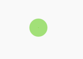
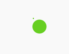
1.html 部分
<div class="spinner">

  <div class="double-bounce1"></div>

  <div class="double-bounce2"></div>

</div>
2.css 部分
.spinner {

  width: 60px;

  height: 60px;

  position: relative;

  margin: 100px auto;

}

.double-bounce1, .double-bounce2 {

  width: 100%;

  height: 100%;

  border-radius: 50%;

  background-color: #67CF22;

  opacity: 0.6;

  position: absolute;

  top: 0;

  left: 0;

  -webkit-animation: bounce 2.0s infinite ease-in-out;

  animation: bounce 2.0s infinite ease-in-out;

}

.double-bounce2 {

  -webkit-animation-delay: -1.0s;

  animation-delay: -1.0s;

}

@-webkit-keyframes bounce {

  0%, 100% { -webkit-transform: scale(0.0) }

  50% { -webkit-transform: scale(1.0) }

}

@keyframes bounce {

  0%, 100% {

    transform: scale(0.0);

    -webkit-transform: scale(0.0);

  } 50% {

    transform: scale(1.0);

    -webkit-transform: scale(1.0);

  }

}
1.html 部分
<div class="spinner">

  <div class="bounce1"></div>

  <div class="bounce2"></div>

  <div class="bounce3"></div>

</div>
2.css 部分
.spinner {

  margin: 100px auto 0;

  width: 150px;

  text-align: center;

}

.spinner > div {

  width: 30px;

  height: 30px;

  background-color: #67CF22;

  border-radius: 100%;

  display: inline-block;

  -webkit-animation: bouncedelay 1.4s infinite ease-in-out;

  animation: bouncedelay 1.4s infinite ease-in-out;

  /* Prevent first frame from flickering when animation starts */

  -webkit-animation-fill-mode: both;

  animation-fill-mode: both;

}

.spinner .bounce1 {

  -webkit-animation-delay: -0.32s;

  animation-delay: -0.32s;

}

.spinner .bounce2 {

  -webkit-animation-delay: -0.16s;

  animation-delay: -0.16s;

}

@-webkit-keyframes bouncedelay {

  0%, 80%, 100% { -webkit-transform: scale(0.0) }

  40% { -webkit-transform: scale(1.0) }

}

@keyframes bouncedelay {

  0%, 80%, 100% {

    transform: scale(0.0);

    -webkit-transform: scale(0.0);

  } 40% {

    transform: scale(1.0);

    -webkit-transform: scale(1.0);

  }

}

1.html 部分
<div class="spinner">

  <div class="spinner-container container1">

    <div class="circle1"></div>

    <div class="circle2"></div>

    <div class="circle3"></div>

    <div class="circle4"></div>

  </div>

  <div class="spinner-container container2">

    <div class="circle1"></div>

    <div class="circle2"></div>

    <div class="circle3"></div>

    <div class="circle4"></div>

  </div>

  <div class="spinner-container container3">

    <div class="circle1"></div>

    <div class="circle2"></div>

    <div class="circle3"></div>

    <div class="circle4"></div>

  </div>

</div>
2.css部分
.spinner {

  margin: 100px auto;

  width: 20px;

  height: 20px;

  position: relative;

}

.container1 > div, .container2 > div, .container3 > div {

  width: 6px;

  height: 6px;

  background-color: #333;

  border-radius: 100%;

  position: absolute;

  -webkit-animation: bouncedelay 1.2s infinite ease-in-out;

  animation: bouncedelay 1.2s infinite ease-in-out;

  -webkit-animation-fill-mode: both;

  animation-fill-mode: both;

}

.spinner .spinner-container {

  position: absolute;

  width: 100%;

  height: 100%;

}

.container2 {

  -webkit-transform: rotateZ(45deg);

  transform: rotateZ(45deg);

}

.container3 {

  -webkit-transform: rotateZ(90deg);

  transform: rotateZ(90deg);

}

.circle1 { top: 0; left: 0; }

.circle2 { top: 0; right: 0; }

.circle3 { right: 0; bottom: 0; }

.circle4 { left: 0; bottom: 0; }

.container2 .circle1 {

  -webkit-animation-delay: -1.1s;

  animation-delay: -1.1s;

}

.container3 .circle1 {

  -webkit-animation-delay: -1.0s;

  animation-delay: -1.0s;

}

.container1 .circle2 {

  -webkit-animation-delay: -0.9s;

  animation-delay: -0.9s;

}

.container2 .circle2 {

  -webkit-animation-delay: -0.8s;

  animation-delay: -0.8s;

}

.container3 .circle2 {

  -webkit-animation-delay: -0.7s;

  animation-delay: -0.7s;

}

.container1 .circle3 {

  -webkit-animation-delay: -0.6s;

  animation-delay: -0.6s;

}

.container2 .circle3 {

  -webkit-animation-delay: -0.5s;

  animation-delay: -0.5s;

}

.container3 .circle3 {

  -webkit-animation-delay: -0.4s;

  animation-delay: -0.4s;

}

.container1 .circle4 {

  -webkit-animation-delay: -0.3s;

  animation-delay: -0.3s;

}

.container2 .circle4 {

  -webkit-animation-delay: -0.2s;

  animation-delay: -0.2s;

}

.container3 .circle4 {

  -webkit-animation-delay: -0.1s;

  animation-delay: -0.1s;

}

@-webkit-keyframes bouncedelay {

  0%, 80%, 100% { -webkit-transform: scale(0.0) }

  40% { -webkit-transform: scale(1.0) }

}

@keyframes bouncedelay {

  0%, 80%, 100% {

    transform: scale(0.0);

    -webkit-transform: scale(0.0);

  } 40% {

    transform: scale(1.0);

    -webkit-transform: scale(1.0);

  }

}
CSS3 Loading(加载)动画效果的更多相关文章
- 2款不同样式的CSS3 Loading加载动画 附源码
原文:2款不同样式的CSS3 Loading加载动画 附源码 我们经常看到的Loading加载很多都是转圈圈的那种,今天我们来换一种有创意的CSS3 Loading加载动画,一种是声波形状的动画,另一 ...
- 10个样式各异的CSS3 Loading加载动画
前几天我在园子里分享过2款很酷的CSS3 Loading加载动画,今天又有10个最新的Loading动画分享给大家,这些动画的样式都不一样,实现起来也并不难,你很容易把它们应用在项目中,先来看看效果图 ...
- CSS动画实例:Loading加载动画效果(一)
一些网站或者APP在加载新东西的时候,往往会给出一个好看有趣的Loading图,大部分的Loading样式都可以使用CSS3制作出来,它不仅比直接使用gif图简单方便,还能节省加载时间和空间.下面介绍 ...
- CSS动画实例:Loading加载动画效果(三)
3.小圆型Loading 这类Loading动画的基本思想是:在呈现容器中定义1个或多个子层,再对每个子层进行样式定义,使得其均显示为一个实心圆形,最后编写关键帧动画控制,使得各个实心圆或者大小发生改 ...
- css制作简单loading动画效果【css3 loading加载动画】
曾经以为,loading的制作需要一些比较高深的web动画技术,后来发现大多数loading都可以用“障眼法”做出来.比如一个旋转的圆圈,并不都是将gif图放进去,有些就是画个静止图像,然后让它旋转就 ...
- loading加载动画效果js实现
<style>.box { width: 400px; padding: 20px; border: 40px solid #a0b3d6; background-color: #eee; ...
- 16款纯CSS3实现的loading加载动画
分享16款纯CSS3实现的loading加载动画.这是一款实用的可替代GIF格式图片的CSS3加载动画代码.效果图如下: 在线预览 源码下载 实现的代码. html代码: <div clas ...
- CSS3实现的图片加载动画效果
来源:GBin1.com 使用CSS3实现的不同图片加载动画效果,支持响应式,非常适合针对瀑布流布局图片动态加载特效进行增强! HTML <ul class="grid effect- ...
- 原生JS+ CSS3创建loading加载动画;
效果图: js创建loading show = function(){ //loading dom元素 var Div = document.createElement("div" ...
- HTML5 五彩圆环Loading加载动画实现教程
原文:HTML5 五彩圆环Loading加载动画实现教程 今天我们要来介绍一款效果很特别的HTML5 Loading加载动画,不像其他的Loading动画,这款Loading动画颜色很丰富,并且在转圈 ...
随机推荐
- JavaScript If...Else 语句
JavaScript If...Else 语句 JavaScript的开头和结束标签: <script type="text/javascript"></scri ...
- Tomcat 利用server.xml进行其他盘符的其他项目映射的部署以及JSP引用其他盘符的图片(虚拟目录及虚拟路径)
Tomcat 利用server.xml进行项目映射的部署 2013-07-17 15:14 12843人阅读 评论(4) 收藏 举报 分类: web 开发(5) 版权声明:本文为博主原创文章,欢迎 ...
- github免密码设置
在创建好了github账号之后,我们可以新建自己的github项目.然而,我们在本地代码升级维护的过程中,涉及到git操作的时候并不是想每次都重新输入密码.这个时候我们需要使用ssh和私钥(公钥)来方 ...
- Eclispe远程调试tomcat设置
首先在catelina.sh中添加 JAVA_OPTS="$JAVA_OPTS -Xrunjdwp:transport=dt_socket,address=23787,server=y,su ...
- 【转】MySQL性能优化的最佳21条经验
文章转自: http://blog.csdn.net/waferleo/article/details/7179009 今天,数据库的操作越来越成为整个应用的性能瓶颈了,这点对于Web应用尤其明显.关 ...
- 【JSP错误总结】无法访问jsp页面
运行环境:window 7 64位 JSP服务器 tomcat 7 现象:无法访问JSP页面,如下图所示:
- MVC中渲染页面
mvc中当返回的字符带有html代码的时候,可以直接使用@Html.Raw(Model.description)这句代码的意思就是返回不是html编码,因此用了这句代码就不需要单独再转换一次
- Spring4读书笔记(1)-模块
Srping主要模块 Core Container spring-core,spring-beans: 提供基础功能,包括IoC和DI等特性.对依赖起到解耦作用(BeanFactory). sprin ...
- JS学习:第二周——NO.2正则
1.[正则] 就是用来操作(匹配和捕获)的一系列规则: 匹配:校验字符串是否符合我们的规则:返回值--布尔值 匹配这里用的是正则的方法:test(),reg.text( ); 捕获 ...
- Dotnet文件格式解析
0x0.序 解析过程并没有介绍对pe结构的相关解析过程,网上此类相关资料很多可自行查阅,本文只介绍了网上资料较少的从pe结构的可选头中的数据目录表中获取dotnet目录的rva和size,到完全解析d ...