
CSS 弹性盒子模型
CSS 弹性盒子模型
https://www.w3.org/TR/2016/CR-css-flexbox-1-20160526/
CSS Flexible Box Layout Module Level 1
W3C Candidate Recommendation, 26 May 2016
1
1
深入了解 Flexbox 伸缩盒模型
1
w3schools
http://www.w3schools.com/html/tryit.asp?filename=tryhtml_layout_semantic
http://www.w3schools.com/css/css3_flexbox.asp
http://www.w3cplus.com/
1
1
Website Layout Using HTML5
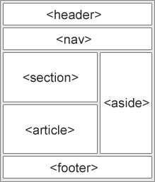
HTML5 offers new semantic elements that define different parts of a web page:
- <header> - Defines a header for a document or a section
- <nav> - Defines a container for navigation links
- <section> - Defines a section in a document
- <article> - Defines an independent self-contained article
- <aside> - Defines content aside from the content (like a sidebar)
- <footer> - Defines a footer for a document or a section
- <details> - Defines additional details
- <summary> - Defines a heading for the <details> element
This example uses <header>, <nav>, <section>, and <footer> to create a multiple column layout:
HTML Layout Using <div> Elements
The <div> element is often used as a layout tool, because it can easily be positioned with CSS. This example uses four <div> elements to create a multiple column layout:
HTML Layout Using Tables
The <table> element was not designed to be a layout tool.
The purpose of the <table> element is to display tabular data.Layout can be achieved using the <table> element, because table elements can be styled with CSS:

1
1
4 Different HTML/CSS Layout Techniques to Create a Site
- Tables. What’s good about them? Using tables for layout creation is intuitive. You can see them almost everywhere! You don’t even need to use a separate CSS stylesheet when using tables. And, what is more important, they don’t break. Have you ever seen a broken table? No? Me neither. Sounds great. We’ll use one of them for our site later.
- Float. We’re talking about the CSS property here. It’s common practice to use
floatwithin your web page to create a layout. And, in this case, you will need to use a separate stylesheet. Two files, huh? Sounds not so convenient comparing to using tables. However, usingfloatis kind of a standard. The only way you’ll use your HTML file is to determine the content of your web page. If you want to align your content in some freaky way, you must use the CSS file. Only!- CSS Frameworks. These work the same way as JavaScript frameworks. Just add the source file to your header (using
<link rel="stylesheet" type="text/css" href="stylesheets/framework_file.css">, for example) and it’s ready to go! There is no need to write your own properties. Just use the classes that framework developers prepared for you. Sounds great. But how does it work? We’ll see.- Flexbox. Flexbox is a short name for the CSS Flexible Box Layout Module. And this is something new comparing to the
floatproperty, for example. The main idea behind the flexbox is to give a container the ability to alter its items’ width, height and order. You should use it if you want to fill the available space in the best possible way. For example, to accommodate to all kind of display devices and screen sizes. A flex container will expand its items to fill the screen.
https://www.w3.org/TR/2016/CR-css-flexbox-1-20160526/
## refs
***
<div>
<a href="https://info.flagcounter.com/QIXi">
<img src="https://s11.flagcounter.com/count2/QIXi/bg_000000/txt_00FF00/border_FF00FF/columns_3/maxflags_12/viewers_0/labels_1/pageviews_1/flags_0/percent_1/" alt="Flag Counter" border="0">
</a>
</div>
***
<blockquote style="display: flex; flex-flow: column; align-items: center; justify-content: center; text-align: center; border: none;">
<h3><strong><span style="font-size: 16pt; color: #00ff00;">©xgqfrms 2012-<span data-uid="copyright-aside">2020</span></strong></span</h3>
<p><span style="font-size: 18pt; color: #00ff00;"><strong>www.cnblogs.com 发布文章使用:只允许注册用户才可以访问!</strong></span></p>
</blockquote>
***
CSS 弹性盒子模型的更多相关文章
- 使用css弹性盒子模型
提示: 当期内容不充实, 修改后再来看吧 以下称:弹性子元素: 子元素, 弹性容器: 容器 弹性盒子的属性 1. css弹性盒子模型规定了弹性元素如何在弹性容器内展示 2. 弹性元素默认显示在弹性容器 ...
- css中的f弹性盒子模型的应用案例
案例1: <!doctype html> <html> <head> <meta charset="utf-8"> <meta ...
- CSS box-flex属性,然后弹性盒子模型简介
今天做项目的时候发现一个css3的新属性flex 一.什么是flex 它的作用是能够按照设置好的规则来排列容器内的项目,而不必去计算每一个项目的宽度和边距.甚至是在容器的大小发生改变的时候,都可以重新 ...
- CSS box-flex属性,然后弹性盒子模型简介(转)
一.淡淡的开头语 昨天趁着不想工作的时间间隙闲逛24ways,在My CSS Wish List一文中,见到了个新鲜的CSS属性,就是题目中的box-flex,以前没有见过,顿生疑惑,不知是骡子还是马 ...
- CSS Flexbox 弹性盒子模型
CSS Flexbox 弹性盒子模型 设置元素样式为 display: flex 或 display: inline-flex, 让元素变成flex容器, 从而可以通过flex模式布局它的子元素. f ...
- css3弹性盒子模型
当下各种手机,平板尺寸不一,如果盒模型只能固定尺寸,不能随意压缩,将不能很好的迎合这个时代.所以css3推出了新的盒模型——弹性盒子模型(Flexible Box Model). 弹性盒模型可以水平布 ...
- flexbox弹性盒子模型
这几天在做移动端的web开发,遇到了一些问题,之前没有折腾过这方面的东西,这次好好吸收下 css3的flexbox--弹性盒子模型,这个盒模型决定了一个盒子在其他盒子中的分布方式及如何处理可用的空间. ...
- 弹性盒子模型display:flex
1.div上下左右居中 <!DOCTYPE html> <html lang="en"> <head> <meta charset=&qu ...
- css3弹性盒子模型之box-flex
css3弹性盒子模型之box-flex 浏览器支持 目前没有浏览器支持 box-flex 属性. Firefox 支持替代的 -moz-box-flex 属性. Safari.Opera 以及 Chr ...
随机推荐
- 数字化转型中企业真正困惑-传统IT架构如何改造和全面上云
对数字化转型,整体来看大部分人相对关心问题主要还是集中在以下两个方面. 企业传统的IT架构如何如何微服务改造,演进发展 企业传统IT如何全面上云和实施云原生 以上两点实际都包括一个关键点,即企业当前内 ...
- 在Golang中如何正确地使用database/sql包访问数据库
本文记录了我在实际工作中关于数据库操作上一些小经验,也是新手入门golang时我认为一定会碰到问题,没有什么高大上的东西,所以希望能抛砖引玉,也算是对这个问题的一次总结. 其实我也是一个新手,机缘巧合 ...
- 内存空间有限情况下的词频统计 Trie树 前缀树
数据结构与算法专题--第十二题 Trie树 https://mp.weixin.qq.com/s/nndr2AcECuUatXrxd3MgCg
- 【LinuxShell】命令行常用快捷键
Ctrl + A :光标跳到一行命令的开头.一般来说,Home 键有相同的效果: Ctrl + E :光标跳到一行命令的结尾.一般来说,End 键有相同的效果:. Ctrl + U :删除所有在光标左 ...
- 004_C++常见错误类型总结(一)之最后几行错误
1.介绍 经常进行代码测试和静态代码分析的同学,应该会遇到这样的一个问题,就是一个程序段的最后几行,或者一个源文件末尾会出现错误.本文,结合专业的静态代码分析软件PSV-Studio提供错误类型代码库 ...
- 利用Javascript制作网页特效(其他常见特效)
设置为首页和加入收藏夹 ①:在body标签内输入以下代码: <a onclick="this.style.behavior='url(#default#homepage)'; this ...
- Office系列---将Office文件(Word、PPT、Excel)转换为PDF文件,提取Office文件(Word、PPT)中的所有图片
将Office文件转换为PDF文件,提取Office文件中的所有图片 1.Office系列---将Office文件(Word.PPT.Excel)转换为PDF文件 1.1 基于Office实现的解决方 ...
- OSPF总结
参考文档:OSPF知识点总结(华为)https://wenku.baidu.com/view/8cc8ab52a36925c52cc58bd63186bceb19e8edf6.html OSPF概念 ...
- nginx教程<一>
2020最新Nginx教程全面讲解教程,感觉讲的很不错但是需要有docker基础,因为是基于docker快速搭建的nginx. 1.为什么要学习Nginx 肯定是工作和业务需求催生的学习需要哈哈,不过 ...
- Elastic Stack简介和Elasticsearch--先搞清楚概念第二篇
ELK 是三款软件的简称:分别是Elasticsearch. Logstash.Kibana组成 .在发展的过程中,又有新成员Beats等的加入,所以就形成了Elastic Stack.ELK 是旧的 ...