CSS3 Transitions属性打造动画的下载按钮特效
一个网站的下载按钮应尽量吸引读者的注意。 这意味着网页设计师应该非常重视文件的下载界面。一个页面这么多的文件,如图片,视频和插件可以通过直接HTTP下载共享。许多免费网站甚至发布图标集和PSD文件供用户免费下载。在这些元素很多的网页下载按钮非常重要。下面就给大家带来一款动画的下载按钮,效果图如下: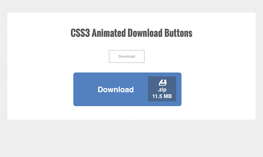
这里不需要任何JavaScript。我们需要的是引用一个外部的样式文件styles.css。这里所有的CSS文件和index.html文件在同一目录下面。
html代码:
<div id="wrapper">
<h1>
CSS3 Animated Download Buttons</h1>
<div class="center">
<a target=_blank href="http://www.w2bc.com/shili" class="dlbtn">Download<span class="details">.zip<span
class="size">11.5 MB</span></span></a></div>
<br>
<br>
<div class="centerbig">
<a target=_blank href="http://www.w2bc.com/shili" class="dlbtn big">Download<span class="details"><span
class="dlicon"><i class="entypo"></i></span>.zip<span class="size">11.5 MB</span></span></a></div>
</div>
css代码:
@font-face {

  font-family: 'entypo';

  src: url('entypo/entypo.eot');

  src: url('entypo/entypo.eot?#iefix') format('embedded-opentype'),

       url('entypo/entypo.woff') format('woff'),

       url('entypo/entypo.ttf')  format('truetype'),

       url('entypo/entypo.svg#svgFontName') format('svg');

}

html, body, div, span, applet, object, iframe, h1, h2, h3, h4, h5, h6, p, blockquote, pre, a, abbr, acronym, address, big, cite, code, del, dfn, em, img, ins, kbd, q, s, samp, small, strike, strong, sub, sup, tt, var, b, u, i, center, dl, dt, dd, ol, ul, li, fieldset, form, label, legend, table, caption, tbody, tfoot, thead, tr, th, td, article, aside, canvas, details, embed, figure, figcaption, footer, header, hgroup, menu, nav, output, ruby, section, summary, time, mark, audio, video {

  margin:;

  padding:;

  border:;

  font-size: 100%;

  font: inherit;

  vertical-align: baseline;

  outline: none;

  -webkit-font-smoothing: antialiased;

  -webkit-text-size-adjust: 100%;

  -ms-text-size-adjust: 100%;

  -webkit-box-sizing: border-box;

  -moz-box-sizing: border-box;

  box-sizing: border-box;

}

html { overflow-y: scroll; }

body {

  font-family: 'Helvetica', Arial, sans-serif;

  font-size: 62.5%;

  line-height:;

  color: #414141;

  margin: 45px 15px;

  background: #ececec url('bg.png');

}

br { display: block; margin: 10px 0;}

article, aside, details, figcaption, figure, footer, header, hgroup, menu, nav, section { display: block; }

ol, ul { list-style: none; }

input, textarea {

  -webkit-font-smoothing: antialiased;

  -webkit-text-size-adjust: 100%;

  -ms-text-size-adjust: 100%;

  -webkit-box-sizing: border-box;

  -moz-box-sizing: border-box;

  box-sizing: border-box;

  outline: none;

}

blockquote, q { quotes: none; }

blockquote:before, blockquote:after, q:before, q:after { content: ''; content: none; }

strong, b { font-weight: bold; }

em, i { font-style: italic; }

table { border-collapse: collapse; border-spacing:; }

img { border:; max-width: 100%; height: auto; width: 100%; }

h1 {

  font-size: 3.1em;

  line-height: 1.55em;

  text-align: center;

  font-weight: bold;

  font-family: 'Oswald', 'Helvetica', Arial, sans-serif;

  margin-bottom: 35px;

  color: #595959;

}

.entypo {

  font-family: 'entypo', sans-serif;

}

/** page structure **/

#wrapper {

  display: block;

  max-width: 850px;

  padding: 45px 35px;

  margin: 0 auto;

  background: #fff;

  -webkit-border-radius: 7px;

  -moz-border-radius: 7px;

  border-radius: 7px;

}

.center {

  width: 20%;

  margin: 0 auto;

}

.centerbig {

  width: 40%;

  margin: 0 auto;

}

/** download button effect **/

a.dlbtn {

  display: inline-block;

  position: relative;

  height: 45px;

  line-height: 40px;

  overflow: hidden;

  padding: 0 30px;

  font-size: 12px;

  font-weight: bold;

  color: #c0c0c0;

  background-color: #fff;

  text-decoration: none;

  cursor: pointer;

  border: 3px solid #ddd;

  -webkit-border-radius: 2px;

  -moz-border-radius: 2px;

  border-radius: 2px;

  -webkit-transition: all 0.4s;

  -moz-transition: all 0.4s;

  transition: all 0.4s;

}

a.dlbtn:hover, a.dlbtn:focus {

  color: #fff;

  padding-right: 90px;

  background-color: #5381bf;

  border-color: #5381bf;

}

a.dlbtn .details {

  position: absolute;

  line-height: 11px;

  top: 4px;

  right: -15px;

  opacity:;

  background: #49668c;

  color: #fff;

  text-align: center;

  padding: 3px 4px;

  -webkit-border-radius: 3px;

  -moz-border-radius: 3px;

  border-radius: 3px;

  -webkit-transition: right 0.4s linear, opacity 0.25s;

  -moz-transition: right 0.4s linear, opacity 0.25s;

  transition: right 0.4s linear, opacity 0.25s;

}

a.dlbtn .details .size {

  display: block;

  padding-top: 3px;

}

a.dlbtn:hover .details, a.dlbtn:focus .details {

  right: 8px;

  opacity:;

}

/** large download button **/

a.dlbtn.big {

  height: 115px;

  line-height: 115px;

  padding: 0 80px;

  font-size: 26px;

  -webkit-border-radius: 8px;

  -moz-border-radius: 8px;

  border-radius: 8px;

}

a.dlbtn.big:hover, a.dlbtn.big:focus {

  padding-right: 160px;

}

a.dlbtn.big .details {

  top: 10px;

  font-size: 18px;

  line-height: 20px;

  padding: 6px 15px;

}

a.dlbtn.big:hover .details, a.dlbtn.big:focus .details {

  right: 15px;

}

a.dlbtn .dlicon {

  display: block;

  font-size: 55px;

  line-height: 30px;

}

/** responsive styles **/

@media screen and (max-width: 620px) {

  h1 { font-size: 2.7em; }

  .center { width: 30%; }

  .centerbig { width: 70%; }

}

@media screen and (max-width: 480px) {

  h1 { font-size: 2.2em; }

  .center { margin-left:; }

  .centerbig { margin-left: -20px; }

  a.dlbtn.big { padding: 0 70px; }

  a.dlbtn.big:hover, a.dlbtn.big:focus { padding-right: 150px; }

}
注:本文爱编程原创文章,转载请注明原文地址:http://www.w2bc.com/Article/6364
CSS3 Transitions属性打造动画的下载按钮特效的更多相关文章
- 9款基于CSS3 Transitions实现的鼠标经过图标悬停特效
之前给大家分享了很多css3实现的按钮特效.今天给大家分享9款基于CSS3 Transitions实现的鼠标经过图标悬停特效.这款特效适用浏览器:360.FireFox.Chrome.Safari.O ...
- css3 data-attribute属性打造漂亮的按钮
之前介绍了几款css3实现的按钮,今天为网友来款比较新鲜的,用css3的data-attribute属性开发按钮,当鼠标经过显示按钮的详细信息.而且实现过程很简单,几行代码就搞定.大家试一试吧.如下图 ...
- 原生html,css+js写下载按钮有提示动画效果的落地页
<!DOCTYPE html> <html lang="en"> <head> <meta charset="UTF-8&q ...
- 使用CSS3 BACKFACE-VISIBILITY属性制作翻转动画效果
摘要: 通过backface-visibility:hidden;属性,我们可以使一个元素在翻转之后消失,这是可以使用另一个元素放在它的背面,从而制作出一种元素翻转之后出现另一个元素的效果. ... ...
- web前端学习(三)css学习笔记部分(8)-- SVN的介绍和应用、CSS动画效果、CSS3布局属性全接触
15.SVN的介绍和应用 15.1.SVN的介绍和应用课程概要 将代码进行集中管理,有版本号的进行迭代,方便集体工作的build流程 15.2.SVN的介绍 SVN是Subversion的简称,是一个 ...
- 类似 Dribbble 下载按钮的 SVG 弹性动画进度条
Codrops 发布了一个如何创建一个基于弹性效果的 SVG 加载进度条教程,基于 SVG 和 TweenMax 实现.按钮开始的时候是一个带有箭头的图标,一旦它被点击,动画成一个有趣的小金属丝和一个 ...
- CSS3和js炫酷点击按钮3D翻转动画特效
简要教程 flipside是一款使用CSS3和js制作的炫酷点击按钮无缝过渡到确认面板的过渡动画特效.该点击按钮特效在按钮不同方向的边部点击时,产生的过渡动画特效是不一样的. 在线预览 源码下载 ...
- 使用CSS3各个属性实现小人的动画
使用CSS3各个属性实现带有音乐小人的动画,完全不使用JS代码: 注:chrome浏览器效果最佳,最终效果静态图: HTML代码如下: <!DOCTYPE html> <html&g ...
- 使用 CSS3 动感的图片标题动画效果【附源码下载】
在网站中,有很多地方会需要在图片上显示图片标题.使用 CSS3 过渡和变换可以实现动感的鼠标悬停显示效果.没有使用 JavaScript,所以只能在支持 CSS3 动画的现代浏览器中才能正常工作.您可 ...
随机推荐
- iOS自定义从底部弹上来的View
概述 自定义蒙层弹起View,点击一下遮罩或界面上关闭按钮,页面会自动下去(从上向下) 详细 代码下载:http://www.demodashi.com/demo/10724.html 在一些少数据没 ...
- opencv在手机上实现照片背景虚化
概述 使用androidstudio开发,在手机上实现照片背景虚化 详细 代码下载:http://www.demodashi.com/demo/10599.html 一.准备工作 1.需要下载安装an ...
- poj1611---The Suspects
The Suspects Time Limit: 1000MS Memory Limit: 20000K Total Submissions: 19754 Accepted: 9576 Des ...
- SpringMVC中的Controller默认单例
众所周知,Servlet是单例的. 在struts中,Action是多例的,每一个请求都会new出来一个action来处理. 在Spring中,Controller默认是单例的,多个请求都会访问同一个 ...
- Python实现 K_Means聚类算法
使用 Python实现 K_Means聚类算法: 问题定义 聚类问题是数据挖掘的基本问题,它的本质是将n个数据对象划分为 k个聚类,以便使得所获得的聚类满足以下条件: 同一聚类中的数据对象相似度较高 ...
- 直线的中点Bresenham算法的实现
一.实验目的 1.掌握在MFC中搭建图形绘制的基本框架的方法: 2.将直线的中点Bresenham算法转化成可执行代码. 二.实验内容 1. 通过分析具体数据在中点Bresenham算法上的执行过程, ...
- Oracle用同义词可以不使用用户名.表名查询表 Oracle 创建synonym
一般在PL/SQL下,Oracle 用户查询其他用户的表一定要使用user.table格式才能查询,每次用户名.表名嫌麻烦的话.可以使用同义词,意思将user.table访问格式改成table格式即可 ...
- JSP开发中对jstl的引用方式(标签库引用)
创建标签库引用文件taglibs.inc 一 采用本地标签库的taglibs.inc文件 <%--struts库标签 --%> <%@ taglib uri="/WEB-I ...
- Chrome英文版离线安装包下载
在原来在线安装地址后面加上 ?standalone=1 即可 https://www.google.com/intl/en/chrome/browser/desktop/index.html?st ...
- docker 概念初识
1 docker 优势,一次创建或配置可以在任意时间.任意环境让应用正常的运行. 快速交付和部署,开发人员可以使用镜像快速构建一套标准的开发环境:开发完后测试和运维人员可以直接使用相同的环境来部署代码 ...