使用Flex布局的几个小技巧
前情
Flex 是 Flexible Box 的缩写,意为"弹性布局",用来为盒状模型提供最大的灵活性,任何一个容器都可以指定为 Flex 布局,如果说目前我开发中离不开的布局方式那就非Flex莫属了,而且小程序就是推荐使用Flex布局的,对 Grid布局的支持不太理想。
在一次次使用flex布局的时候遇到了一些小困扰,而解决这些小困扰的过程中发现了一些小技巧,特记录并分享出来。
技巧内容
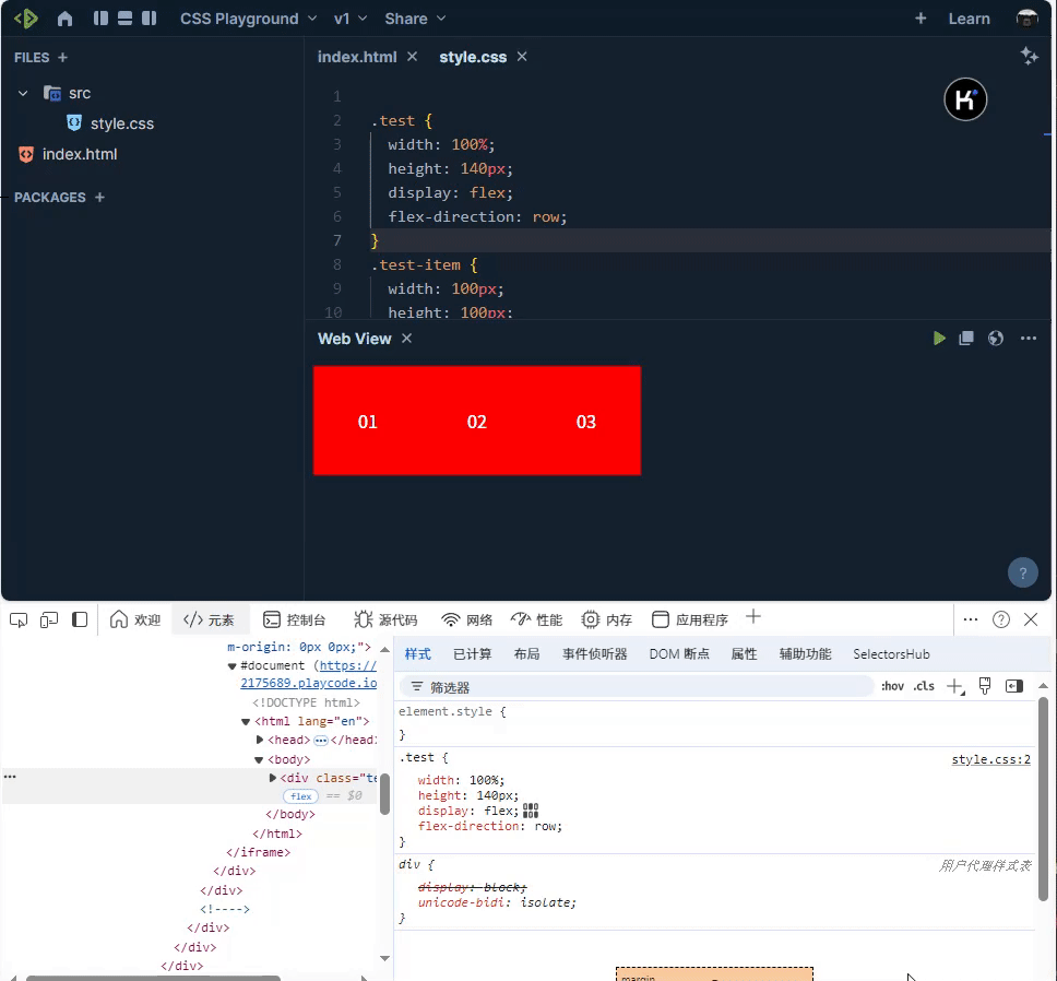
技巧 1:flex-direction为column的子元素自适应内容宽
<!DOCTYPE html>

<html lang="en">

  <head>

    <meta charset="UTF-8" />

    <meta name="viewport" content="width=device-width, initial-scale=1.0" />

    <style>

	    .test {

			  width: 100%;

			  display: flex;

			  flex-direction: column;

			}

			.test-item {

			  height: 100px;

			  display: flex;

			  flex-direction: row;

			  justify-content: center;

			  align-items: center;

			  background-color: red;

			  color: white;

			}

			.test-item:nth-of-type(3){

			  align-self: flex-start;

			}

    </style>

  </head>

  <body>

      <div class="test">

        <div class="test-item">010101</div>

        <div class="test-item">020202</div>

        <div class="test-item">030303</div>

      </div>

  </body>

</html>
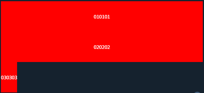
当设置为flex-direction: column后,项目元素align-self样式值默认为stretch,导致项目元素会充满整行,如果你想做到项目元素自适应内容宽你设置为align-self:baseline或者flex-start即可
上述示例可以实现如下图布局效果:
体验链接:CSS Playground
技巧 2:利用margin:auto实现一些特殊布局
对于如下需求你第一想到的flex布局方式是怎么实现:
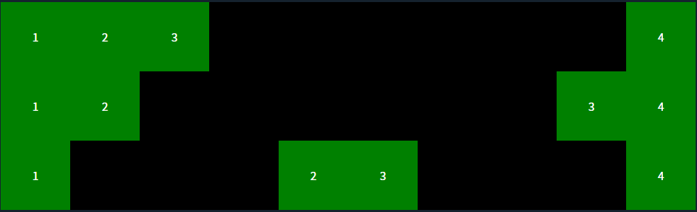
按正常的实现思路是左边一个div包住左边内容,右边再一个div,再使用justify-content:between可以实现或者让左边的div为 flex:1,那有什么方式可以让结构打平一层,左边的包裹div免去了,那就是margin:auto,利用好margin:auto可以实现一些特殊布局,演示代码如下:
<!DOCTYPE html>

<html lang="en">

  <head>

    <meta charset="UTF-8" />

    <meta name="viewport" content="width=device-width, initial-scale=1.0" />

	  <style>

	  .test,.test0,.test1 {

			  width: 100%;

			  display: flex;

			  flex-direction: row;

			  background-color: black;

			}

			.test-item,.test-item0,.test-item1 {

			  width: 100px;

			  height: 100px;

			  display: flex;

			  justify-content: center;

			  align-items: center;

			  color: white;

			  background-color: green;

			}

			.test-item:nth-last-of-type(1){

			  margin-left: auto;

			}

			.test-item0:nth-last-of-type(2){

			  margin-left: auto;

			}

			.test-item1:nth-of-type(2){

			  margin-left: auto;

			}

			.test-item1:nth-of-type(3){

			  margin-right: auto;

			}

	  </style>

  </head>

  <body>

    <div class="test">

      <div class="test-item">1</div>

      <div class="test-item">2</div>

      <div class="test-item">3</div>

      <div class="test-item">4</div>

    </div>

    <div class="test0">

      <div class="test-item0">1</div>

      <div class="test-item0">2</div>

      <div class="test-item0">3</div>

      <div class="test-item0">4</div>

    </div>

    <div class="test1">

      <div class="test-item1">1</div>

      <div class="test-item1">2</div>

      <div class="test-item1">3</div>

      <div class="test-item1">4</div>

    </div>

  </body>

</html>
上述示例可以实现如下图布局效果:
体验链接:CSS Playground
技巧 3:利用align-self实现交叉轴(Cross Axis)上单个元素位置控制
<!DOCTYPE html>

<html lang="en">

  <head>

    <meta charset="UTF-8">

    <meta name="viewport" content="width=device-width, initial-scale=1.0">

    <style>

	    .test {

			  display: flex;

			  flex-direction: column;

			  align-items: center;

			}

			.test-item {

			  width: 100px;

			  height: 100px;

			  display: flex;

			  flex-direction: row;

			  justify-content: center;

			  align-items: center;

			  color: white;

			  background-color: red;

			}

			.test-item:nth-of-type(1){

			  align-self: flex-start;

			}

			.test-item:nth-of-type(3){

			  align-self: flex-end;

			}

    </style>

  </head>

  <body>

    <div class="test">

      <div class="test-item">1</div>

      <div class="test-item">2</div>

      <div class="test-item">3</div>

    </div>

  </body>

</html>
通过align-items可以整体控制交项目元素在叉轴上的对齐方式,但如果想单个控制它的对齐方式,那就用好align-self吧,上述示例可以实现如下图布局效果:
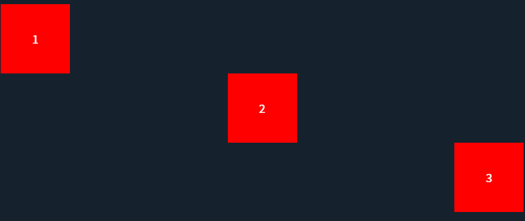
体验链接:CSS Playground
技巧 4:使用gap设置容器内项目之间的间距
<!DOCTYPE html>

<html lang="en">

  <head>

    <meta charset="UTF-8" />

    <meta name="viewport" content="width=device-width, initial-scale=1.0" />

	  <style>

		  .wrap {

			  display: flex;

			  flex-direction: row;

			}

			.test {

			  width: 320px;

			  display: flex;

			  flex-direction: row;

			  align-items: center;

			  justify-content: space-between;

			  flex-wrap: wrap;

			  margin-right: 20px;

			}

			.test-item {

			  width: 100px;

			  height: 100px;

			  margin-bottom: 10px;

			  flex: none;

			  display: flex;

			  flex-direction: row;

			  justify-content: center;

			  align-items: center;

			  color: white;

			  background-color: red;

			}

			.test0 {

			  width: 320px;

			  display: flex;

			  flex-direction: row;

			  align-items: center;

			  flex-wrap: wrap;

			  margin-right: 20px;

			  gap: 10px 10px;

			}

			.test-item0 {

			  width: 100px;

			  height: 100px;

			  flex: none;

			  display: flex;

			  flex-direction: row;

			  justify-content: center;

			  align-items: center;

			  color: white;

			  background-color: red;

			}

	  </style>

  </head>

  <body>

    <div class="wrap">

      <div class="test">

        <div class="test-item">01</div>

        <div class="test-item">02</div>

        <div class="test-item">03</div>

        <div class="test-item">04</div>

        <div class="test-item">05</div>

        <div class="test-item">06</div>

        <div class="test-item">07</div>

        <div class="test-item">08</div>

      </div>

      <div class="test0">

        <div class="test-item0">11</div>

        <div class="test-item0">12</div>

        <div class="test-item0">13</div>

        <div class="test-item0">14</div>

        <div class="test-item0">15</div>

        <div class="test-item0">16</div>

        <div class="test-item0">17</div>

        <div class="test-item0">18</div>

      </div>

    </div>

  </body>

</html>
Flex布局如果不依赖gap想实现如下右图的布局是比较麻烦的,通过justify-content: space-between可以做到平分余下空间让元素间有间距,但是如果遇到未行元素不够的时候就会出现如下左图的问题,解决办法是手动生成一个空的元素让它补齐一行内容也是可以做到的;另一种实现方式是通过margin来实现元素间距,再通过:nth-child()方式来去除每行最边缘元素的margin。上述二种方式都相对比较麻烦,如果你使用gap就可以轻松实现右图效果
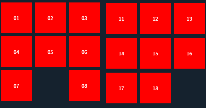
体验地址:CSS Playground
技巧 5:比较常用的几个缩写
flex: 1/flex: 0%; 等效于flex:1 1 0%; 子元素平分父元素空间,各子元素尺寸一样
flex: none; 等效于flex:0 0 auto; 元素保持自身原始大小不变

flex:auto; 等效于flex:1 1 auto; 元素尺寸可以弹性增大,也可以弹性变小,具有十足的弹性,项目会根据自身大小和剩余空间进行伸缩
注:flex:1和flex:auto区别:
- flex-basis属性定义了项目在分配多余空间之前,占据的主轴空间(main size)
- flex:1相当于flex: 1 1 0%,表示项目的基准大小为0%,不考虑项目本身的大小,只根据剩余空间进行伸缩
- flex:auto相当于flex: 1 1 auto,表示项目的基准大小为auto,即项目本身的大小,同时也会根据剩余空间进行伸缩
- 如果容器有足够的空间,flex:1和flex:auto都会平分剩余空间,但是flex:auto会保持项目本身的最小宽度,而flex:1不会
- 如果容器没有足够的空间,flex:1会优先压缩内容,使得所有项目都能等分空间,而flex:auto会优先保持内容的完整性,挤压其他项目的空间
在线测试地址:JS Bin - Collaborative JavaScript Debugging
技巧 6:浏览器开发者工具辅助使用
对于新手刚刚学习使用flex布局,经常容易忘记一些属性,其实可以通过浏览器开发者工具辅助来学习flex布局,vs code也有对应的插件可以辅助
期望
上述只是个人在开发中发现的一些Flex布局小技巧,如果你有好的技巧欢迎也分享出来,共同学习进步。期待你的留言。
使用Flex布局的几个小技巧的更多相关文章
- Android开发——布局性能优化的一些技巧(二)
, 0, drawable.getMinimumWidth(),dra.getMinimumHeight()); tv.setCompoundDrawables(null, null, drawabl ...
- css的flex布局调试
学习经验-css的flex布局 今天遇到一个小问题 在给三个div布局时,设置父元素display:flex 此时三个div的宽度均为50%,他们并没有超出屏幕的宽度,还是撑满了父元素. 为什么呢? ...
- 原创:新手布局福音!微信小程序使用flex的一些基础样式属性
来源:新手布局福音!微信小程序使用flex的一些基础样式属性 作者:Nazi Flex布局相对于以前我们经常所用到的布局方式要好的很多,在做微信小程序的时候要既能符合微信小程序的文档开发要求,又能 ...
- 写给 Android 开发的小程序布局指南,Flex 布局!
一.序 Hi,大家好,我是承香墨影! 最近在做小程序,验证一些方向,开发效率确实很快,就是各种微信的审核有点费劲,但是总归是有办法解决的. 想要开发一款小程序,其实和我们正常写一款 App 类似,你需 ...
- 微信小程序开发:Flex布局
微信小程序页面布局方式采用的是Flex布局.Flex布局,是W3c在2009年提出的一种新的方案,可以简便,完整,响应式的实现各种页面布局.Flex布局提供了元素在容器中的对齐,方向以及顺序,甚至他们 ...
- flex开发小技巧集锦
关于flex开发网上有非常多的相关信息介绍,因此我们要想学习关于flex开发的知识信息技能是一件非常简单和方便的事情.而针对于flex开发小编要告诉大家的是一些flex开发小技巧.利用这些小技巧能够有 ...
- 微信小程序前置课程:flex布局(二)
原文:http://www.ruanyifeng.com/blog/2015/07/flex-examples.html 上一篇文章介绍了Flex布局的语法,今天介绍常见布局的Flex写法. 你会看到 ...
- 微信小程序前置课程:Flex 布局教程(一):语法篇
原文:http://www.ruanyifeng.com/blog/2015/07/flex-grammar.html?utm_source=tuicool 网页布局(layout)是CSS的一个重点 ...
- 第八十四节,css布局小技巧及font-awesome图标使用
css布局小技巧及font-awesome图标使用 图片鼠标放上去遮罩效果,显示文字 当鼠标放上去时 /*最外层div*/ .a{ width: 384px; height: 240px; backg ...
- 在微信小程序中学习flex布局
网页布局(layout)是CSS的一个重点应用. 布局的传统解决方案,基于盒状模型,依赖display属性 + position属性 + float属性.它对于那些特殊布局非常不方便,比如,垂直居中就 ...
随机推荐
- Nuxt Kit 组件管理:注册与自动导入
title: Nuxt Kit 组件管理:注册与自动导入 date: 2024/9/15 updated: 2024/9/15 author: cmdragon excerpt: Nuxt Kit 为 ...
- 线段树 transformation——hdu 4578
问题描述: 给定一个数列,数列中所有元素都初始化为0,对其执行多种区间操作 操作1:add修改:对区间[L,R]内的所有数加c 操作2:multi修改:对区间[L,R]内所有数乘以c 操作3:chan ...
- P9118 [春季测试 2023] 幂次
二诊前愉快的一次测试,关键是还有奶茶喝 第二题,本来直接暴力去重枚举可以的六十分的,但是.......花了30分钟优化剪纸,优化空间后,惨变35分. [春季测试 2023] 幂次 题目描述 小 Ω 在 ...
- /sys/kernel/debug/binder/目录下主要节点含义
/sys/kernel/debug/binder/目录下主要节点含义 state 显示binder设备的整体状态信息 包括进程数量.线程数量.待处理事务数量等 stats 展示binder操作的统计信 ...
- js递归遍历树形结构数据,获取所有数组id集合
function getAllIds(tree, result) { //遍历树 获取id数组 for (const i in tree) { result.push(tree[i].id); // ...
- kotlin集合——>集合概述、构造集合
1.kotlin集合概述 在kotli.collections包中包含List(有序集合).Set(无序集合).Map(健值对)三种集合 2.val定义的集合,调用集合方法可以添加删除,但是如果重新创 ...
- Android复习(三)清单文件中的元素——>grant-uri-permission、instrumentation、intent-filter、manifest、meta-data
<grant-uri-permission> 语法: <grant-uri-permission android:path="string" android:pa ...
- python实战-编写请求方法重试(用途:请求重试、也可用于其他场景)、日志、执行耗时、手机号与邮箱校验装饰器
更新日志 2023.2.9 增加重试装饰器 防止函数原信息被改变使用:@functools.wraps(func)装饰执行函数 # _*_ coding: UTF-8 _*_ "" ...
- c++11大括号初始化
C++11可以将{}初始化器用于任何类型(可以用等号,也可以不用) 数组.集合初始化 在C++11中,集合(列表)的初始化已经成为C++的一个基本功能,被称为"初始化列表": // ...
- ClickHouse-查询优化
单表查询[使用的频率高] 1.prewhere代表where Prewhere 和 where 语句的作用相同,用来过滤数据.不同之处在于 prewhere 只支持*MergeTree 族系列引擎的表 ...