
python中matplotlib画折线图实例(坐标轴数字、字符串混搭及标题中文显示)
最近在用python中的matplotlib画折线图,遇到了坐标轴 “数字+刻度” 混合显示、标题中文显示、批量处理等诸多问题。通过学习解决了,来记录下。如有错误或不足之处,望请指正。
一、最简单的基本框架如下:已知x,y,画出折线图并保存。此时x和y均为数字。
 # -*- coding: utf-8 -*-

 import matplotlib.pyplot as plt #引入matplotlib的pyplot子库,用于画简单的2D图

 import random

 x= range(0,20)

 y= [random.randint(0,20) for _ in range(20)]

 #建立对象

 fig = plt.figure(figsize=(8,6))

 ax = fig.add_subplot()

 #画图

 plt.plot(x,y,'o-',label=u"线条")    #画图

 plt.show()

 plt.savefig("temp.png")
二、坐标轴增加字母元素:
用到了如下语句和函数【参考:http://matplotlib.org/examples/ticks_and_spines/tick_labels_from_values.html】:
from matplotlib.ticker import FuncFormatter, MaxNLocator
labels = list('abcdefghijklmnopqrstuvwxyz')
def format_fn(tick_val, tick_pos):
if int(tick_val) in xs:
return labels[int(tick_val)]
else:
return ''
ax.xaxis.set_major_formatter(FuncFormatter(format_fn))
ax.xaxis.set_major_locator(MaxNLocator(integer=True))
稍微改动,用到了之前的程序里:
 # -*- coding: utf-8 -*-

 import matplotlib.pyplot as plt    #引入matplotlib的pyplot子库,用于画简单的2D图

 from matplotlib.ticker import FuncFormatter, MaxNLocator

 import random

 x= range(20)

 y= [random.randint(0,20) for _ in range(20)]

 fig = plt.figure(figsize=(8,6))

 ax = fig.add_subplot(111)              #建立对象

 labels = [1,2,3,4,5,6,7,8,9,10,'a','b','cc','d','e','f','g','h','*%$','']

 def format_fn(tick_val, tick_pos):

     if int(tick_val) in x:

         return labels[int(tick_val)]

     else:

         return ''

 ax.xaxis.set_major_formatter(FuncFormatter(format_fn))

 ax.xaxis.set_major_locator(MaxNLocator(integer=True))

 plt.plot(x,y,'o-',label=u"线条")    #画图

 plt.show()

 plt.savefig("temp.png")
这样坐标轴既可以含有字符串,同时也可以含有数字。
三、标题等的中文显示:
用到了如下库和语句:
from matplotlib.font_manager import FontProperties
font1 = FontProperties(fname=r"c:\windows\fonts\simsun.ttc",size=8) #可指定计算机内的任意字体,size为字体大小
plt.title(u"标题",fontproperties=font1)
plt.xlabel(u"x轴)",fontproperties=font1)
plt.ylabel(u"Y轴",fontproperties=font1)
ax.legend(prop=font1, loc="upper right")
这样用到上面程序里,则可以显示中文:
# -*- coding: utf-8 -*-

import matplotlib.pyplot as plt    #引入matplotlib的pyplot子库,用于画简单的2D图

from matplotlib.ticker import FuncFormatter, MaxNLocator

import random

from matplotlib.font_manager import FontProperties

x= range(20)

y= [random.randint(0,20) for _ in range(20)]

fig = plt.figure(figsize=(8,6))

ax = fig.add_subplot(111)              #建立对象

labels = [1,2,3,4,5,6,7,8,9,10,'a','b','cc','d','e','f','g','h','*%$','']

def format_fn(tick_val, tick_pos):

    if int(tick_val) in x:

        return labels[int(tick_val)]

    else:

        return ''

ax.xaxis.set_major_formatter(FuncFormatter(format_fn))

ax.xaxis.set_major_locator(MaxNLocator(integer=True))

#可指定计算机内的任意字体,size为字体大小

font1 = FontProperties(fname=r"c:\windows\fonts\simsun.ttc",size=20)

plt.title(u"标题",fontproperties=font1)

plt.xlabel(u"x轴",fontproperties=font1)

plt.ylabel(u"Y轴",fontproperties=font1)

plt.plot(x,y,'o-',label=u"线条")    #画图

ax.legend(prop=font1, loc="upper right")

plt.show()

plt.savefig("temp.png")
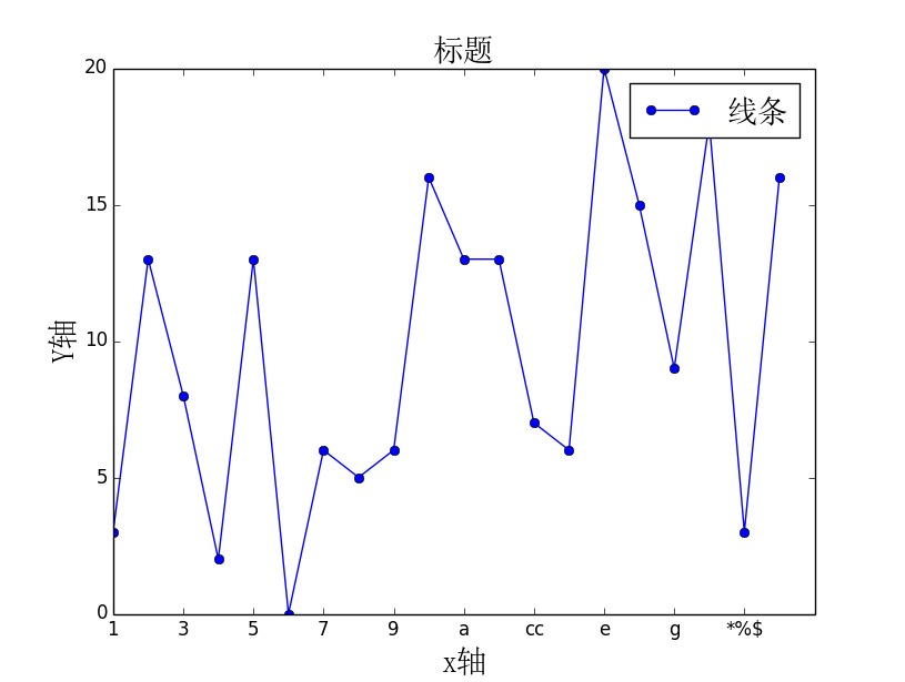
画出的图如下:
四、不显示图片,以便进行批处理:
import matplotlib
matplotlib.use('Agg')
需加在 import matplotlib.pyplot as plt 之前,然后删掉plt.show()即可。
python中matplotlib画折线图实例(坐标轴数字、字符串混搭及标题中文显示)的更多相关文章
- python用matplotlib画折线图
折线图: import matplotlib.pyplot as plt y1=[10,13,5,40,30,60,70,12,55,25] x1=range(0,10) x2=range(0,10) ...
- Matplotlib学习---用matplotlib画折线图(line chart)
这里利用Jake Vanderplas所著的<Python数据科学手册>一书中的数据,学习画图. 数据地址:https://raw.githubusercontent.com/jakevd ...
- python使用matplotlib绘制折线图教程
Matplotlib是一个Python工具箱,用于科学计算的数据可视化.借助它,Python可以绘制如Matlab和Octave多种多样的数据图形.下面这篇文章主要介绍了python使用matplot ...
- 【Python】matplotlib绘制折线图
一.绘制简单的折线图 import matplotlib.pyplot as plt squares=[1,4,9,16,25] plt.plot(squares) plt.show() 我们首先导入 ...
- Python3 使用 matplotlib 画折线图
ChartUtil.py import matplotlib.pyplot as plt from pylab import mpl def plotLine(xData,yData,xLabel,c ...
- SAS 画折线图PROC GPLOT
虽然最后做成PPT里的图表会被要求用EXCEL画,但当我们只是在分析的过程中,想看看数据的走势,直接在SAS里画会比EXCEL画便捷的多. 修改起来也会更加的简单,,不用不断的修改程序然后刷新EXCE ...
- python 中matplotlib 绘图
python 中matplotlib 绘图 数学建模需要,对于绘图进行简单学习 matpoltlib之类的包安装建议之间用anaconda 绘制一条y=x^2的曲线 #比如我们要绘制一条y=x^2的曲 ...
- Matplotlib学习---用matplotlib画雷达图(radar chart)
雷达图常用于对多项指标的全面分析.例如:HR想要比较两个应聘者的综合素质,用雷达图分别画出来,就可以进行直观的比较. 用Matplotlib画雷达图需要使用极坐标体系,可点击此链接,查看对极坐标体系的 ...
- echars画折线图的一种数据处理方式
echars画折线图的一种数据处理方式 <!DOCTYPE html> <html> <head> <meta charset="utf-8&quo ...
随机推荐
- WEB API异常处理
当一个web api抛出一个异常后 此异常会被转化成一个HTTP响应 错误代码为500的服务错误 但是如果你不想让客户端看到500的错误码 你也可以自定义错误码 如下代码当用户输入的ID没有与之相关的 ...
- 《sqoop实现hdfs中的数据导出至mysql数据库》
报错Access denied for user 'root'@'localhost' (using password: YES) 参考一 参考二 登陆mysql时,root密码的修改 参考帖子h ...
- Find All Duplicates in an Array
Given an array of integers, 1 ≤ a[i] ≤ n (n = size of array), some elements appear twice and others ...
- poj1988_Cube Stacking
Cube Stacking Time Limit: 2000MS Memory Limit: 30000K Total Submissions: 24130 Accepted: 8468 Ca ...
- gulp基本介绍
一.gulp是什么 gulp就是用来机械化的完成重复性质(如less->css:js.css压缩:js混淆)的工作:gulp的机制就是将重复工作抽象成一个个的任务. 二.gulp使用 a.首先确 ...
- 异或之(bzoj 3689)
Description 给定n个非负整数A[1], A[2], --, A[n].对于每对(i, j)满足1 <= i < j <= n,得到一个新的数A[i] xor A[j],这 ...
- oracle11g RAC1执行脚本结果
[root@testdb11a ~]# /u01/app/oraInventory/orainstRoot.sh Changing permissions of /u01/app/oraInvento ...
- 在编译命令行中添加 /D_SCL_SECURE_NO_DEPRECATE
问题:Add the option /D_SCL_SECURE_NO_DEPRECATE to the compilation command 解决方案:项目属性 –> 配置属性 –> C ...
- 【转】一台电脑同时运行多个tomcat配置方法
参考:http://blog.csdn.net/zyk906705975/article/details/8471475
- [leetcode] 题型整理之动态规划
动态规划属于技巧性比较强的题目,如果看到过原题的话,对解题很有帮助 55. Jump Game Given an array of non-negative integers, you are ini ...