在移动端中的flex布局
flex布局介绍:
flex布局很灵活, 这种布局我们也可以称之为弹性布局, 弹性布局的主要优势就是元素的宽或者高会自动补全;
flex布局实例:
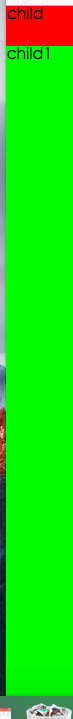
比如有两个div,一个div的宽度为100px, 想让另外一个div的占据剩下的宽度:

<!DOCTYPE html>

<html lang="en">

<head>

    <meta charset="UTF-8">

    <title>Document</title>

    <style>

        body{

            margin:;

        }

        .box{

            display:flex;

            flex-direction:row;

        }

        .box .child{

            width:40px;

            background:#f00;

        }

        .box .child1{

            flex:;

            background:#0f0

        }

    </style>

</head>

<body>

    <div class="box">

        <div class="child">child</div>

        <div class="child1">child1</div>

    </div>

</body>

</html>
或者有两个div,一个高度为100px, 另外一个高度自动补全当前界面下剩余的高度:
<!DOCTYPE html>

<html lang="en">

<head>

    <meta charset="UTF-8">

    <title>Document</title>

    <style>

        html,body,.box{

            height:%;

        }

        body{

            margin:;

        }

        .box{

            display:flex;

            flex-direction:column;

        }

        .box .child{

            height:40px;

            background:#f00;

        }

        .box .child1{

            flex:;

            background:#0f0

        }

    </style>

</head>

<body>

    <div class="box">

        <div class="child">child</div>

        <div class="child1">child1</div>

    </div>

</body>

</html>
所以说flex布局是很灵活, flex布局没出现之前,这种布局不好实现, 只能通过-webkit-calc的方式, 或者使用javascript的方式动态修改元素的样式,还有水平方向元素自动适应布局等, 用了flex,css的布局方式更加多样化了;
flex布局也可以实现未知宽高的元素自动居中, 以前用的比较多的居中布局方式主要为固定宽高的负margin居中:
<!DOCTYPE html>

<html lang="en">

<head>

    <meta charset="UTF-8">

    <title>Document</title>

    <style>

        html,body,.parent{

            height:%;

        }

        .parent{

            justify-content:center;/*水平居中*/

            align-items: center; /*垂直居中*/

            display:-webkit-flex;

/*

            flex-direction:排版方向

            flex-wrap:如果宽度超出父级宽度, 是否折行

            flex-flow:flex-direction和flex-wrap的缩写

*/        }

        .child{

        }

    </style>

</head>

<body>

    <div class="parent">

        <div class="child">

            hehe

        </div>

    </div>

</body>

</html>
子元素css的样式flex:auto或者flex:1的时候, 该子元素会自动适应当前宽高:
如果一个父元素为flex布局, 内部元素的宽度会根据各自的flex属性值进行等比切分:
<!DOCTYPE html>

<html lang="en">

<head>

    <meta charset="UTF-8">

    <title>Document</title>

    <style>

        *{

            margin:;

            padding:;

        }

    </style>

</head>

<body>

    <style>

        .box{

            display:flex;

            flex-direction:row

        }

        .box .child{

            flex:;

        }

        .box .chi{

            flex:;

        }

    </style>

    <div class="box">

        <div class="child">

            child

        </div>

        <div class="chi">

            chi, child占用1/4的百分比, chi占用3/4的百分比

        </div>

    </div>

    <br>

    <br>

    <style>

        .box1{

            display:flex;

            flex-direction:row;

        }

        .box1 .child{

            width:40px;

        }

        .box1 .chi{

            flex:;

        }

    </style>

    <div class="box1">

        <div class="child">

            child

        </div>

        <div class="chi">

            chi, child固定长度, chi自动适应

        </div>

    </div>

    <br>

    <br>

    <style>

        .box2 {

            display:flex;

            flex-direction:row;

        }

        .box2 .child1{

            width:40px;

        }

        .box2 .child2{

            flex:auto;

        }

        .box2 .child3{

            width:40px;

        }

    </style>

    <div class="box2">

        <div class="child1">child1</div>

        <div class="child2">child2, 两边固定宽度, 中间自动适应</div>

        <div class="child3">child3</div>

    </div>

</body>

</html>
高度自动适应的demo:
<!DOCTYPE html>

<html lang="en">

<head>

    <meta charset="UTF-8">

    <title>Document</title>

    <style>

        *{

            margin:;

            padding:;

        }

        html,body,.box{

            height:%;

        }

        .box{

            display:flex;

            flex-direction:column;

        }

        .box .header{

            height:40px;

            background:#f00;

        }

        .box .bodyer{

            flex:;

            background:#0f0;

        }

        .box .footer{

            height:40px;

            background:#00f;

        }

    </style>

</head>

<body>

    <div class="box">

        <div class="header">header</div>

        <div class="bodyer">bodyer</div>

        <div class="footer">footer</div>

    </div>

</body>

</html>
通过flex布局可以模拟一个微信的聊天窗口:

<!DOCTYPE html>

<html lang="en">

<head>

    <meta charset="UTF-8">

    <title>Document</title>

    <meta name="viewport" content="width=device-width, initial-scale=1, maximum-scale=1, user-scalable=no">

    <style>

        *{

            margin:;

            padding:;

        }

        html,body,.box{

            height:%;

        }

        .box{

            display:-webkit-flex;

            display:flex;

            flex-direction:column;

            font-family:"microsoft yahei";

            font-size:18px;

        }

        .box .header{

            height:40px;

            line-height:40px;

            text-align:center;

            background:#3498DB;

            color:#fff;

        }

        .box .body{

            display: block;

            border-bottom:1px solid #eee;

            overflow:auto;

            flex:;

        }

        .box .send-left {

            align-self:flex-end;

            margin-top:10px;

            position:relative;

            height:35px;

            background:#F8C301;

            border-radius:5px; /* 圆角 */

            line-height:35px;

            margin-left:10px;

            padding: 10px;

            float:left;

        }

        .box .send-left .arrow {

            position:absolute;

            top:5px;

            left:-15px;

            width:;

            height:;

            font-size:;

            border:solid 8px;

            border-color:#fff #F8C301 #fff #fff;

        }

        .box .send {

            align-self:flex-end;

            margin-top:10px;

            position:relative;

            height:35px;

            background:#2ECC71;

            border-radius:5px; /* 圆角 */

            line-height:35px;

            margin-right:10px;

            padding: 10px;

            float:right;

        }

        .box .send .arrow {

            position:absolute;

            top:5px;

            right:-15px;

            width:;

            height:;

            font-size:;

            border:solid 8px;

            border-color:#fff #fff #fff #2ECC71;

        }

        .box  .clear{

            clear:both;

        }

        .box .footer{

            height:40px;

            line-height:40px;

            display:-webkit-flex;

            display:flex;

        }

        .box .footer input{

            flex:auto;

            border:none;

            border-right:1px solid #eee;

            font-size:18px;

            padding-left:4px;

        }

        .box .footer button{

            width:50px;

            font-size:18px;

        }

    </style>

</head>

<body>

    <!--

    容器属性

        flex-direction

        flex-wrap

        flex-flow

        justify-content

        align-items

        align-content

    项目属性:

        order

        flex-grow

        flex-shrink

        flex-basis

        flex

        align-self

    -->

    <div class="box">

        <div class="header">

            消息

        </div>

        <div class="body">

            <div class="send-left">

                hehe我哟我去

                <div class="arrow"></div>

            </div>

            <div class="clear"></div>

            <div class="send">

                hehe

                <div class="arrow"></div>

            </div>

            <div class="clear"></div>

            <div class="send">

                hehe我哟我去

                <div class="arrow"></div>

            </div>

            <div class="clear"></div>

            <div class="send">

                来啊, 哈哈

                <div class="arrow"></div>

            </div>

            <div class="clear"></div>

            <div class="send">

                来啊, 哈哈

                <div class="arrow"></div>

            </div>

            <div class="clear"></div>

            <div class="send">

                来啊, 哈哈

                <div class="arrow"></div>

            </div>

            <div class="clear"></div>

            <div class="send">

                来啊, 哈哈

                <div class="arrow"></div>

            </div>

            <div class="clear"></div>

            <div class="send">

                来啊, 哈哈

                <div class="arrow"></div>

            </div>

            <div class="clear"></div>

            <div class="send">

                来啊, 哈哈

                <div class="arrow"></div>

            </div>

            <div class="clear"></div>

            <div class="send">

                来啊, 哈哈

                <div class="arrow"></div>

            </div>

            <div class="clear"></div>

            <div class="send">

                来啊, 哈哈

                <div class="arrow"></div>

            </div>

            <div class="clear"></div>

            <div class="send">

                来啊, 哈哈

                <div class="arrow"></div>

            </div>

            <div class="clear"></div>

            <div class="send">

                来啊, 哈哈

                <div class="arrow"></div>

            </div>

        </div>

        <div class="footer">

            <input type="text">

            <button>发送</button>

        </div>

    </div>

</body>

<script>

</script>

</html>
flex布局的其它css属性:
Flex 容器属性:
Flex 条目属性:
兼容:
android 4.4以上版本支持display:flex。低版本不支持。
安卓4.1,以及4.1以下不支持flex布局, 必须考虑别的方案;
android的低版本无法使用display:flex, 但是可以使用display:box替代;
要记得加浏览器前缀, 兼容写法如下:
  display: -webkit-box;

  display: -moz-box;

  display: -webkit-flex;

  display: -ms-flexbox;

  display: flex;
参考:
caniuse:http://caniuse.com/#feat=flexbox
MDN:https://developer.mozilla.org/zh-CN/docs/Web/CSS/CSS_Flexible_Box_Layout/Using_CSS_flexible_boxes
ruanyifeng:http://www.ruanyifeng.com/blog/2015/07/flex-examples.html
在移动端中的flex布局的更多相关文章
- vue项目中h5移动端中通过flex布局实现首尾固定,中间滚动(借鉴)
html中 <div class="flexLayoutr"> <div class="div_head"></div> & ...
- 在微信小程序中学习flex布局
网页布局(layout)是CSS的一个重点应用. 布局的传统解决方案,基于盒状模型,依赖display属性 + position属性 + float属性.它对于那些特殊布局非常不方便,比如,垂直居中就 ...
- CSS中的flex布局
1.flex 布局的概念 Flex是Flexible Box的缩写,意为"弹性布局",用来为盒状模型提供最大的灵活性.任何一个容器都可以指定为 Flex 布局,行内元素也可以通过 ...
- 使用css中的flex布局弹性手风琴效果
不多说,直接上代码. <!DOCTYPE html> <html lang="en"> <head> <meta charset=&quo ...
- 使用Sass优雅并高效的实现CSS中的垂直水平居中(附带Flex布局,CSS3+SASS完美版)
实现css水平垂直居中的方法有很多,在这里我简单的说下四种比较常用的方法: 1.使用CSS3中的Flex布局 对于flex,我们要了解的是它是一个display的属性,而且必须要给他的父元素设置fle ...
- [续更]一起来撸一下Flex布局里面的那些属性
Flex的全称是Flexible Box,意为弹性布局,用来为盒模型提供最大的灵活性. Flex包含的属性有很多,每个属性又包含了许多不同意义的属性值···然而在实际开发中,能被我们临幸的可能也只是那 ...
- ReactNative之参照具体示例来看RN中的FlexBox布局
今天是重阳节,祝大家节日快乐,今天继续更新RN相关的博客.上篇博客<ReactNative之从HelloWorld中看环境搭建.组件封装.Props及State>中我们通过一个HelloW ...
- 【分享】谈CSS3中display属性的flex布局
最近在学习微信小程序(重新学习微信小程序),在设计首页布局的时候,新认识了一种布局方式display:flex .guide-top{ height: 36%; display: flex; /*fl ...
- es6 Object.assign ECMAScript 6 笔记(六) ECMAScript 6 笔记(一) react入门——慕课网笔记 jquery中动态新增的元素节点无法触发事件解决办法 响应式图像 弹窗细节 微信浏览器——返回操作 Float 的那些事 Flex布局 HTML5 data-* 自定义属性 参数传递的四种形式
es6 Object.assign 目录 一.基本用法 二.用途 1. 为对象添加属性 2. 为对象添加方法 3. 克隆对象 4. 合并多个对象 5. 为属性指定默认值 三.浏览器支持 ES6 O ...
随机推荐
- WPF's Style BasedOn
<Style x:Key="BasedStyle" BasedOn="{x:Null}" TargetType="{x:Type Control ...
- spring mvc 和spring security配置 web.xml设置
<?xml version="1.0" encoding="UTF-8"?> <web-app xmlns="http://xmln ...
- dbutils基本使用
dbutils的查询,主要用到的是query方法,增加,修改和删除都是update方法,update方法就不讲了 只要创建ResultSetHandler接口不同的实现类对象就可以得到想要的查询结果, ...
- 在docker容器中vi指令找不到
在使用docker容器时,有时候里边没有安装vi,敲vi命令时提示说:vi: command not found,这个时候就需要安装vi,可是当你敲apt-get install vi命令时,提示: ...
- jstack+top定位性能问题
定位性能问题,尤其是cpu使用率过高时,经常需要查找cpu消耗较高的线程,然后查看其堆栈,从而进入代码定位问题. 该场景下, jstack+top是一种非常经典的方式. jstack+top: 1 ...
- GJM : Unity3D HIAR -【 快速入门 】 二、搭建开发环境
感谢您的阅读.喜欢的.有用的就请大哥大嫂们高抬贵手"推荐一下"吧!你的精神支持是博主强大的写作动力以及转载收藏动力.欢迎转载! 版权声明:本文原创发表于 [请点击连接前往] ,未经 ...
- SpringMVC的执行流程(二)
文字解析: 1.客户端发出一个http请求给web服务器,web服务器对http请求进行解析,如果匹配 DispatcherServlet的请求映射路径(在web.xml中指定),web容器将请求转交 ...
- .Container与.container_fluid区别
.Container与.container_fluid是bootstrap中的两种不同类型的外层容器,两者的区别是:.container 类用于固定宽度并支持响应式布局的容器..container-f ...
- 《C#微信开发系列(Top)-微信开发完整学习路线》
年前就答应要将微信开发的学习路线整理给到大家,但是因为年后回来这段时间学校还有公司那边有很多事情需要兼顾,所以没能及时更新文章.今天特地花时间整理了下,话不多说,上图,希望对大家的学习有所帮助哈. 如 ...
- <![CDATA[的web使用简单说明
html.javascript会涉及到三个解析器,html解析器.xml解析器.javascript解析器.那么好了,问题来了,以上代码经常混编在一起,各自有各自的规则,终究会有冲突的,如下就是冲突. ...