
css多种方式实现双飞翼布局
圣杯布局、双飞翼布局效果图
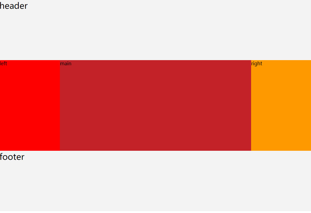
从效果图来看圣杯布局、双飞翼布局效果是一样一样的。
圣杯布局、双飞翼布局就是左右两侧宽度固定,中间内容宽度自适应,即100%
圣杯布局
<style>

    *{

        margin: 0;

        padding: 0;

        box-sizing: border-box;

    }

    .clearfix:before,

    .clearfix:after{

        display: table;

        content: " ";

        clear: both;

    }

    .container{

        padding: 0 200px;

    }

    .header,

    .footer{

        height: 200px;

        font-size: 28px;

        background-color: #f3f3f3;

    }

    .left{

        position: relative;

        /* 2、将.left再次拉到最左边,否则.main的左侧会有200px的空白 */

        left: -200px;

        float: left;

        width: 200px;

        min-height: 300px;

        /* 1、将.left拉到最左边,原来.left是掉下去的 */

        margin-left: -100%;

        background-color: #f00;

    }

    .main{

        float: left;

        width: 100%;

        min-height: 300px;

        background-color: #c32228;

    }

    .right{

        position: relative;

        /* 2、将.right再次拉到最右边,否则.main的右侧会有200px的空白 */

        right: -200px;

        float: left;

        width: 200px;

        /*/1、将.right拉到最右边,原来.right是掉下去的 */

        margin-left: -200px;

        min-height: 300px;

        background-color: #f90;

    }

</style>
<div class="header">header</div>
<div class="container clearfix">
<div class="main">main</div>
<div class="left">left</div>
<div class="right">right</div>
</div>
<div class="footer">footer</div> 浮动实现双飞翼布局
<style>

    *{

        margin: 0;

        padding: 0;

        box-sizing: border-box;

    }

    .clearfix:before,

    .clearfix:after{

        display: table;

        content: " ";

        clear: both;

    }

    .header,

    .footer{

        height: 200px;

        font-size: 28px;

        background-color: #f3f3f3;

    }

    .left{

        float: left;

        width: 200px;

        min-height: 300px;

        /* 将.left拉到最左边,原来.left是掉下去的 */

        margin-left: -100%;

        background-color: #f00;

    }

    .main{

        float: left;

        width: 100%;

        min-height: 300px;

        /* .left、.right各占了200px,因此需要将其抵消掉 */

        padding: 0 200px;

        background-color: #c32228;

    }

    .right{

        float: left;

        width: 200px;

        /* 将.right拉到最右边,原来.right是掉下去的 */

        margin-left: -200px;

        min-height: 300px;

        background-color: #f90;

    }

</style>
<div class="header">header</div>
<div class="container clearfix">
<div class="main">
<div class="main-inner">main</div>
</div>
<div class="left">left</div>
<div class="right">right</div>
</div>
<div class="footer">footer</div>table-cell实现双飞翼布局(IE8也兼容哦~)
<style>

    *{

        margin: 0;

        padding: 0;

        box-sizing: border-box;

    }

    .container{

        display: table;

    }

    .header,

    .footer{

        height: 200px;

        font-size: 28px;

        background-color: #f3f3f3;

    }

    .left,

    .right,

    .main{

        /* 外层容器使用table-cell布局,设置元素为table-cell布局后它们就能在一行显示了,display: table-cell;设置宽度无效,

因此他们的宽度由内容撑开。 */

        display: table-cell;

    }

    .left-inner{

        width: 200px;

        min-height: 300px;

        background-color: #f00;

    }

    .main{

        width: 100%;

    }

    .main-inner{

        min-height: 300px;

        background-color: #c32228;

    }

    .right-inner{

        width: 200px;

        min-height: 300px;

        background-color: #f90;

    }

</style>
<div class="header">header</div>
<div class="container clearfix">
<div class="left">
<div class="left-inner">left</div>
</div>
<div class="main">
<div class="main-inner">main</div>
</div>
<div class="right">
<div class="right-inner">right</div>
</div>
</div>
<div class="footer">footer</div> 绝对定位实现双飞翼布局
使用绝对定位实现有个小问题:父容器的高度只能由.main的高度来决定
<style>

    *{

        margin: 0;

        padding: 0;

        box-sizing: border-box;

    }

    .container{

        position: relative;

        padding: 0 200px;

    }

    .header,

    .footer{

        height: 200px;

        font-size: 28px;

        background-color: #f3f3f3;

    }

    .left{

        position: absolute;

        top: 0;

        left: 0;

        width: 200px;

        min-height: 300px;

        background-color: #f00;

    }

    .main{

        min-height: 300px;

        background-color: #c32228;

    }

    .right{

        position: absolute;

        top: 0;

        right: 0;

        width: 200px;

        min-height: 300px;

        background-color: #f90;

    }

</style>
<div class="header">header</div>
<div class="container clearfix">
<div class="left">left</div>
<div class="main">mian</div>
<div class="right">right</div>
</div>
<div class="footer">footer</div>使用flex实现双飞翼布局(有兼容性问题)
<style>

    *{

        margin: 0;

        padding: 0;

        box-sizing: border-box;

    }

    .clearfix:before,

    .clearfix:after{

        display: table;

        content: " ";

        clear: both;

    }

    .container{

        display: flex;

    }

    .header,

    .footer{

        height: 200px;

        font-size: 28px;

        background-color: #f3f3f3;

    }

    .left{

        flex: 0 0 200px;

        width: 200px;

        min-height: 300px;

        background-color: #f00;

    }

    .main{

        flex: 1;

        width: 100%;

        min-height: 300px;

        background-color: #c32228;

    }

    .right{

        flex: 0 0 200px;

        width: 200px;

        min-height: 300px;

        background-color: #f90;

    }

</style>
<div class="header">header</div>
<div class="container clearfix">
<div class="left">left</div>
<div class="main">main</div>
<div class="right">right</div>
</div>
<div class="footer">footer</div>css多种方式实现双飞翼布局的更多相关文章
- CSS多种方式实现底部对齐
CSS实现底部对齐效果 因公司业务要求需要实现如下图中红色区域的效果: 效果说明: 1.红色区域数据需要倒排(即从底部开始数,数字为1.2.3.4.5),并且显示在最底部 2.当数据过多时需要显示滚动 ...
- CSS盒子模型与双飞翼布局
盒子模型&双飞翼实现 CSS盒模型本质上是一个盒子,封装周围的HTML元素,它包括:外边距(margin).边框(border).内边距(padding).实际内容(content)四个属性. ...
- css居中方法与双飞翼布局
居中 类型 方法 对应属性 水平 垂直 水平&垂直 1.父元素使用外边距自动 2.子元素显示行内块级元素,写入内容,父元素设置文本居中 3.给父元素开启非绝对和固定定位作为子元素开启绝对定位的 ...
- css多种方式实现等宽布局
本文讲的等宽布局是在不手动设置元素宽度的情况下,使用纯css实现各个元素宽度都相当的效果. 1.使用table-cell实现(兼容ie8) <style> body,div{ margin ...
- HTML系列:js和css多种方式实现隔行变色
<!DOCTYPE html> <html lang="en"> <head> <meta charset="UTF-8&quo ...
- CSS多种方式实现元素水平垂直居中
html结构: <div class="center">确定宽高水平垂直居中</div> <div class="center2" ...
- CSS系列,三栏布局的四种方法
三栏布局.两栏布局都是我们在平时项目里经常使用的,今天我们来玩一下三栏布局的四种写法,以及它的使用场景. 所谓三栏布局就是指页面分为左中右三部分然后对中间一部分做自适应的一种布局方式. 1.绝对定位法 ...
- css布局记录之双飞翼布局、圣杯布局
双飞翼布局和圣杯布局是比较常用的布局方式,都是为了实现一行三列,并且两侧列固定宽度,中间列宽度自适应的效果:直接上代码记录下: <!DOCTYPE html> <html lang= ...
- CSS | 圣杯布局、双飞翼布局 | 自适应三栏布局
圣杯布局和双飞翼布局是前端工程师需要日常掌握的重要布局方式.两者的功能相同,都是为了实现一个两侧宽度固定,中间宽度自适应的三栏布局 虽然两者的实现方法略有差异,不过都遵循了以下要点: 1.两侧宽度固定 ...
随机推荐
- Mysql 创建函数出现This function has none of DETERMINISTIC, NO SQL, or READS SQL DATA
This function has none of DETERMINISTIC, NO SQL, or READS SQL DATA in its declaration and binary mys ...
- org.hibernate.AssertionFailure: null id don't flus
我的是字段编码和数据库不匹配,是爬的微博数据
- spir 合并单元格
TableRow row = table2.AddRow(); var cell = row.AddCell(); var par = cell.AddParagraph(); par.Text = ...
- svn访问版本库时一直提示: please wait while the repository browser is initializing
最近不知道做了什么操作,原来正常的SVN Check In/Out都无法正常操作. 正常Check In的动作,几秒钟就会操作完成,但是我却等了好久好久,然后提示Connection timed ou ...
- 13 oracle数据库坏块-逻辑坏块(模拟/修复)
13 oracle数据库坏块-逻辑坏块 逻辑数据坏块的场景1)oracle bug也可能导致逻辑坏块的产生. 特别是parallel dml. 例如:Bug 5621677 Logical corru ...
- cobbler批量安装系统
cobbler是一个可以实现批量安装系统的Linux应用程序.它有别于pxe+kickstart,cobbler可以实现同个服务器批量安装不同操作系统版本. 1.系统环境准备及其下载cobbler 1 ...
- SpringCloud:(一)服务注册与发现
最近跟着方志明老师学习SpringCloud,博客地址如下: https://blog.csdn.net/forezp/article/details/81040925 自己也跟着撸了一遍,纸上得来终 ...
- 【Python】我的第一个完整的小说爬虫
写在开头 纪念我的第一个爬虫程序,一共写了三个白天,其中有两个上午没有看,中途遇到了各种奇怪的问题,伴随着他们的解决,对于一些基本的操作也弄清楚了.果然,对于这些东西的最号的学习方式,就是在使用中学习 ...
- redis学习(二)
深入了解redis字符串,列表,散列和有序集合命令,了解发布,订阅命令和其他命令. 一,字符串 1.字符串可以存储3种类型的值 字符串,整数,浮点数 2.运算命令列表 incr : incr ...
- Linux 系统多台主机之间做SSH免密码登陆
SSH 免密登录 环境说明 CentOS 7.3 关键点 免密登录的关键点在于理解谁登录谁. A 生成的公钥给 B,也给 C.D,则 A 可以直接免密 SSH 登录 B.C.D A 生成密钥 在 A ...