
css3神奇的背景控制属性+使用颜色过渡实现漂亮的渐变效果
css3背景图像相关
兼容性:IE9+
background-clip 背景图片绘制区域
background-clip:border-box; 内容区
<!DOCTYPE html>

<html lang="en" manifest="index.manifest">

<head>

<meta charset="UTF-8">

<title>Document</title>

<style>

    div{

        width: 500px;

        height: 500px;

        background:url(source/p3.jpg) center;

        padding:50px;

        border:50px solid transparent;

        background-clip:content-box;

        /*background-clip:padding-box;*/

        /*background-clip:border-box;*/

    }

</style>

</head>

<body>

    <div></div>

</body>

</html>
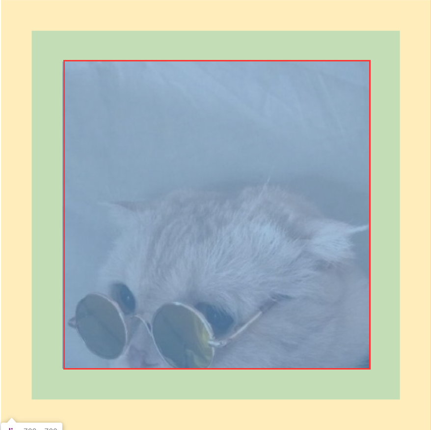
background-clip:padding-box; padding区域
<!DOCTYPE html>

<html lang="en" manifest="index.manifest">

<head>

<meta charset="UTF-8">

<title>Document</title>

<style>

    div{

        width: 500px;

        height: 500px;

        background:url(source/p3.jpg) center;

        padding:50px;

        border:50px solid transparent;

        background-clip:padding-box;

        /*background-clip:border-box;*/

    }

</style>

</head>

<body>

    <div></div>

</body>

</html>

background-clip:border-box; border区域
<!DOCTYPE html>

<html lang="en" manifest="index.manifest">

<head>

<meta charset="UTF-8">

<title>Document</title>

<style>

    div{

        width: 500px;

        height: 500px;

        background:url(source/p3.jpg) center;

        padding:50px;

        border:50px solid transparent;

        background-clip:border-box;

    }

</style>

</head>

<body>

    <div></div>

</body>

</html>
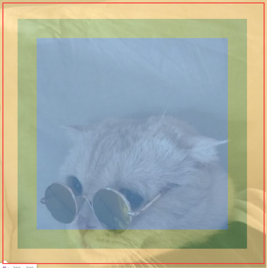
background-origin: content-box | padding-box | border-box; 背景图片起始位置
背景图片从border-box开始水平垂直向下偏移50px
<!DOCTYPE html>

<html lang="en" manifest="index.manifest">

<head>

<meta charset="UTF-8">

<title>Document</title>

<style>

    div{

        width: 500px;

        height: 500px;

        background:url(source/p3.jpg) 50px 50px no-repeat;

        padding:50px;

        border:50px solid transparent;

        background-origin:border-box;

    }

</style>

</head>

<body>

    <div></div>

</body>

</html>
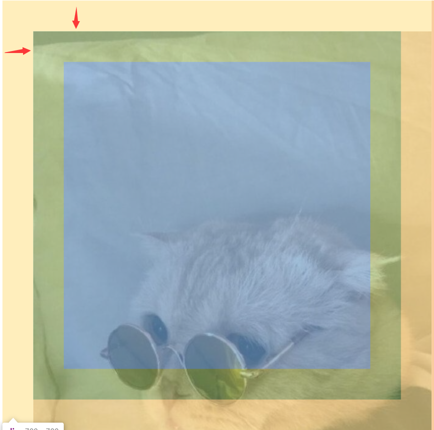
背景图片从padding-box开始水平垂直向下偏移50px
<!DOCTYPE html>

<html lang="en" manifest="index.manifest">

<head>

<meta charset="UTF-8">

<title>Document</title>

<style>

    div{

        width: 500px;

        height: 500px;

        background:url(source/p3.jpg) 50px 50px no-repeat;

        padding:50px;

        border:50px solid transparent;

        background-origin:padding-box;

    }

</style>

</head>

<body>

    <div></div>

</body>

</html>
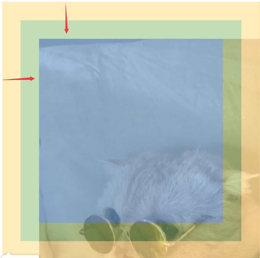
背景图片从content-box开始水平垂直向下偏移50px
<!DOCTYPE html>

<html lang="en" manifest="index.manifest">

<head>

<meta charset="UTF-8">

<title>Document</title>

<style>

    div{

        width: 500px;

        height: 500px;

        background:url(source/p3.jpg) 50px 50px no-repeat;

        padding:50px;

        border:50px solid transparent;

        background-origin:content-box;

    }

</style>

</head>

<body>

    <div></div>

</body>

</html>
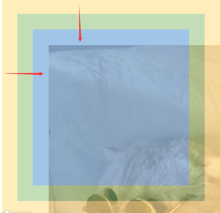
background-size: 填写数值或者百分比时,如果只填写一个值,另一个值默认为auto
cover 等比缩放填满容器
contain 等比缩放至一边碰到容器边
<!DOCTYPE html>

<html lang="en" manifest="index.manifest">

<head>

<meta charset="UTF-8">

<title>Document</title>

<style>

    div{

        width: 500px;

        height: 500px;

        background:url(source/p2.jpg) 50px 50px no-repeat;

        background-size:100%;/*宽度为容器宽度的100%,高度按图片比例来*/

        background-size:100% 100%;/*宽度为容器宽度的100%,高度为容器高度的100%*/

        background-size:cover;

        background-size:contain;

    }

</style>

</head>

<body>

    <div></div>

</body>

</html>
多重背景图片
background-image:url(),url();
前面的图片会覆盖后面的图片
<!DOCTYPE html>

<html lang="en" manifest="index.manifest">

<head>

<meta charset="UTF-8">

<title>Document</title>

<style>

    div{

        width: 500px;

        height: 500px;

        background-image:url(source/shuiyin.png), url(source/cat.jpg);

    }

</style>

</head>

<body>

    <div></div>

</body>

</html>
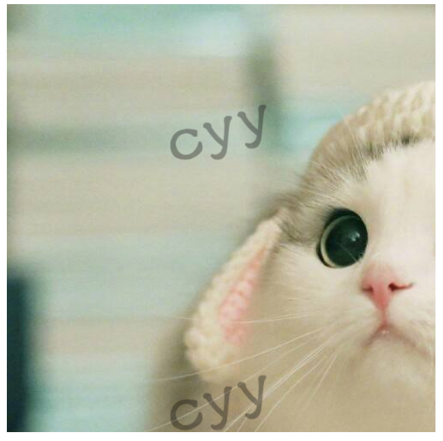
颜色设置为透明:transparent
css3渐变
兼容性:IE10
<!DOCTYPE html>

<html lang="en" manifest="index.manifest">

<head>

<meta charset="UTF-8">

<title>Document</title>

<style>

    div{

        width: 500px;

        height: 500px;

        background:-webkit-linear-gradient(pink, orange, #abcdef);/*默认是垂直方向*/

        background:   -moz-linear-gradient(pink, orange, #abcdef);/*默认是垂直方向*/

        background:     -o-linear-gradient(pink, orange, #abcdef);/*默认是垂直方向*/

        background:        linear-gradient(pink, orange, #abcdef);/*默认是垂直方向*/

        background:-webkit-linear-gradient(left, pink, orange, #abcdef);/*从左到右*/

        background:   -moz-linear-gradient(right, pink, orange, #abcdef);

        background:     -o-linear-gradient(right, pink, orange, #abcdef);

        background:        linear-gradient(to right, pink, orange, #abcdef);

        background:-webkit-linear-gradient(left top, pink, orange, #abcdef);/*从左上到右下*/

        background:   -moz-linear-gradient(right bottom, pink, orange, #abcdef);

        background:     -o-linear-gradient(right bottom, pink, orange, #abcdef);

        background:        linear-gradient(to right bottom, pink, orange, #abcdef);

    }

</style>

</head>

<body>

    <div></div>

</body>

</html>
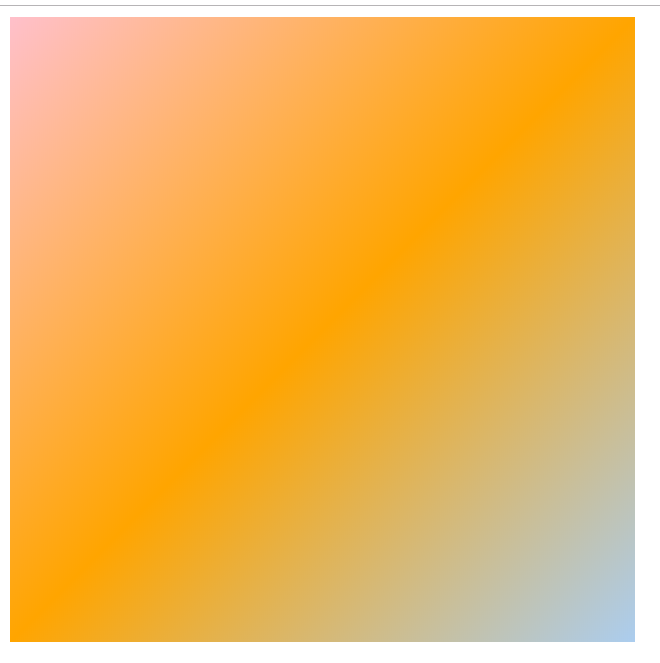
正常情况下线性渐变的角度
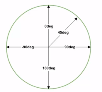
webkit内核下线性渐变的角度
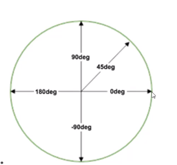
解决方法:兼容浏览器的前缀按顺序书写,正常情况下无前缀的放在最后
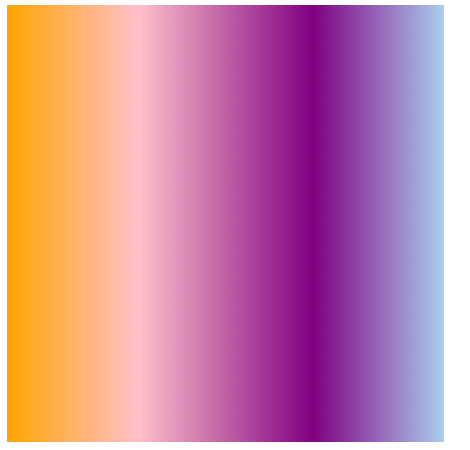
颜色可以具体分配位置
第一个颜色不写默认是0%的位置;最后一个颜色默认是100%的位置
<!DOCTYPE html>

<html lang="en" manifest="index.manifest">

<head>

<meta charset="UTF-8">

<title>Document</title>

<style>

    div{

        width: 500px;

        height: 500px;

        background:-webkit-linear-gradient(45deg, pink, orange, #abcdef);/*具体角度表示*/

        background:   -moz-linear-gradient(45deg, pink, orange, #abcdef);

        background:     -o-linear-gradient(45deg, pink, orange, #abcdef);

        background:        linear-gradient(45deg, pink, orange, #abcdef);

        background:-webkit-linear-gradient(90deg, orange, pink 30%, purple 70%, #abcdef);

        background:   -moz-linear-gradient(90deg, orange, pink 30%, purple 70%, #abcdef);

        background:     -o-linear-gradient(90deg, orange, pink 30%, purple 70%, #abcdef);

        background:        linear-gradient(90deg, orange, pink 30%, purple 70%, #abcdef);

    }

</style>

</head>

<body>

    <div></div>

</body>

</html>
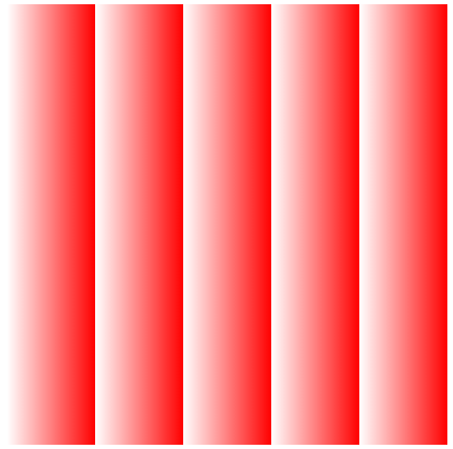
rgba() 可以设置带透明色的渐变
<!DOCTYPE html>

<html lang="en" manifest="index.manifest">

<head>

<meta charset="UTF-8">

<title>Document</title>

<style>

    div{

        width: 500px;

        height: 500px;

        background:-webkit-linear-gradient(90deg, rgba(255,0,0,0), rgba(255,0,0,1));/*具体角度表示*/

        background:   -moz-linear-gradient(90deg, rgba(255,0,0,0), rgba(255,0,0,1));

        background:     -o-linear-gradient(90deg, rgba(255,0,0,0), rgba(255,0,0,1));

        background:        linear-gradient(90deg, rgba(255,0,0,0), rgba(255,0,0,1));

    }

</style>

</head>

<body>

    <div></div>

</body>

</html>

重复渐变
repeating-linear-gradient
<!DOCTYPE html>

<html lang="en" manifest="index.manifest">

<head>

<meta charset="UTF-8">

<title>Document</title>

<style>

    div{

        width: 500px;

        height: 500px;

        background:-webkit-repeating-linear-gradient(90deg, rgba(255,0,0,0), rgba(255,0,0,1) 20%);

        background:   -moz-repeating-linear-gradient(90deg, rgba(255,0,0,0), rgba(255,0,0,1) 20%);

        background:     -o-repeating-linear-gradient(90deg, rgba(255,0,0,0), rgba(255,0,0,1) 20%);

        background:        repeating-linear-gradient(90deg, rgba(255,0,0,0), rgba(255,0,0,1) 20%);

    }

</style>

</head>

<body>

    <div></div>

</body>

</html>
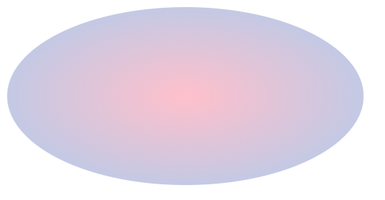
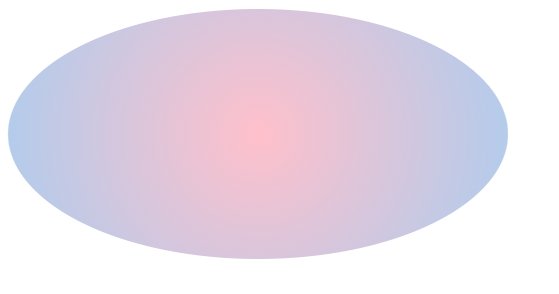
径向渐变 radial-gradient
<!DOCTYPE html>

<html lang="en" manifest="index.manifest">

<head>

<meta charset="UTF-8">

<title>Document</title>

<style>

    div{

        width: 400px;

        height: 200px;

        border-radius:50%;

        background:-webkit-radial-gradient(pink, #abcdef);

        background:   -moz-radial-gradient(pink, #abcdef);

        background:     -o-radial-gradient(pink, #abcdef);

        background:        radial-gradient(pink, #abcdef);

    }

</style>

</head>

<body>

    <div></div>

</body>

</html>
保持圆形渐变
<!DOCTYPE html>

<html lang="en" manifest="index.manifest">

<head>

<meta charset="UTF-8">

<title>Document</title>

<style>

    div{

        width: 400px;

        height: 200px;

        border-radius:50%;

        background:-webkit-radial-gradient(circle, pink, #abcdef);

        background:   -moz-radial-gradient(circle, pink, #abcdef);

        background:     -o-radial-gradient(circle, pink, #abcdef);

        background:        radial-gradient(circle, pink, #abcdef);

    }

</style>

</head>

<body>

    <div></div>

</body>

</html>
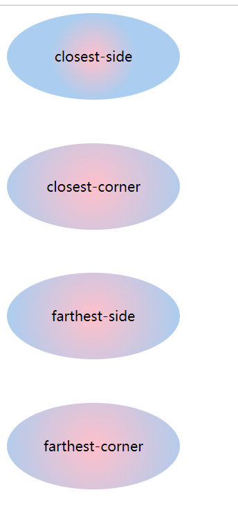
尺寸大小 closest-side closest-corner farthest-side farthest-corner
<!DOCTYPE html>

<html lang="en" manifest="index.manifest">

<head>

<meta charset="UTF-8">

<title>Document</title>

<style>

    div{

        width: 200px;

        height: 100px;

        border-radius:50%;

        margin-bottom:50px;

        line-height: 100px;

        text-align: center;

/*        background:-webkit-radial-gradient(circle, pink, #abcdef);

        background:   -moz-radial-gradient(circle, pink, #abcdef);

        background:     -o-radial-gradient(circle, pink, #abcdef);

        background:        radial-gradient(circle, pink, #abcdef);*/

    }

    div:nth-child(1){

        background:-webkit-radial-gradient(closest-side circle, pink, #abcdef);

        background:   -moz-radial-gradient(closest-side circle, pink, #abcdef);

        background:     -o-radial-gradient(closest-side circle, pink, #abcdef);

        background:        radial-gradient(closest-side circle, pink, #abcdef);

    }

    div:nth-child(2){

        background:-webkit-radial-gradient(closest-corner circle, pink, #abcdef);

        background:   -moz-radial-gradient(closest-corner circle, pink, #abcdef);

        background:     -o-radial-gradient(closest-corner circle, pink, #abcdef);

        background:        radial-gradient(closest-corner circle, pink, #abcdef);

    }

    div:nth-child(3){

        background:-webkit-radial-gradient(farthest-side circle, pink, #abcdef);

        background:   -moz-radial-gradient(farthest-side circle, pink, #abcdef);

        background:     -o-radial-gradient(farthest-side circle, pink, #abcdef);

        background:        radial-gradient(farthest-side circle, pink, #abcdef);

    }

    div:nth-child(4){

        background:-webkit-radial-gradient(farthest-corner circle, pink, #abcdef);

        background:   -moz-radial-gradient(farthest-corner circle, pink, #abcdef);

        background:     -o-radial-gradient(farthest-corner circle, pink, #abcdef);

        background:        radial-gradient(farthest-corner circle, pink, #abcdef);

    }

</style>

</head>

<body>

    <div>closest-side</div>

    <div>closest-corner</div>

    <div>farthest-side</div>

    <div>farthest-corner</div>

</body>

</html>
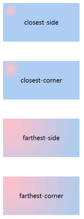
设置渐变的圆心位置
水平方向为宽度的10%,垂直方向为高度的20%
<!DOCTYPE html>

<html lang="en" manifest="index.manifest">

<head>

<meta charset="UTF-8">

<title>Document</title>

<style>

    div{

        width: 200px;

        height: 100px;

        margin-bottom:50px;

        line-height: 100px;

        text-align: center;

/*        background:-webkit-radial-gradient(circle, pink, #abcdef);

        background:   -moz-radial-gradient(circle, pink, #abcdef);

        background:     -o-radial-gradient(circle, pink, #abcdef);

        background:        radial-gradient(circle, pink, #abcdef);*/

    }

    div:nth-child(1){

        background:-webkit-radial-gradient(10% 20%, closest-side circle, pink, #abcdef);

        background:   -moz-radial-gradient(10% 20%, closest-side circle, pink, #abcdef);

        background:     -o-radial-gradient(10% 20%, closest-side circle, pink, #abcdef);

        background:        radial-gradient(10% 20%, closest-side circle, pink, #abcdef);

    }

    div:nth-child(2){

        background:-webkit-radial-gradient(10% 20%, closest-corner circle, pink, #abcdef);

        background:   -moz-radial-gradient(10% 20%, closest-corner circle, pink, #abcdef);

        background:     -o-radial-gradient(10% 20%, closest-corner circle, pink, #abcdef);

        background:        radial-gradient(10% 20%, closest-corner circle, pink, #abcdef);

    }

    div:nth-child(3){

        background:-webkit-radial-gradient(10% 20%, farthest-side circle, pink, #abcdef);

        background:   -moz-radial-gradient(10% 20%, farthest-side circle, pink, #abcdef);

        background:     -o-radial-gradient(10% 20%, farthest-side circle, pink, #abcdef);

        background:        radial-gradient(10% 20%, farthest-side circle, pink, #abcdef);

    }

    div:nth-child(4){

        background:-webkit-radial-gradient(10% 20%, farthest-corner circle, pink, #abcdef);

        background:   -moz-radial-gradient(10% 20%, farthest-corner circle, pink, #abcdef);

        background:     -o-radial-gradient(10% 20%, farthest-corner circle, pink, #abcdef);

        background:        radial-gradient(10% 20%, farthest-corner circle, pink, #abcdef);

    }

</style>

</head>

<body>

    <div>closest-side</div>

    <div>closest-corner</div>

    <div>farthest-side</div>

    <div>farthest-corner</div>

</body>

</html>
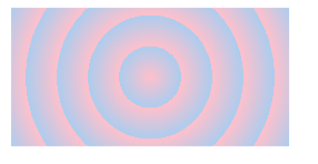
repeating-radial-gradient 重复径向渐变
<!DOCTYPE html>

<html lang="en" manifest="index.manifest">

<head>

<meta charset="UTF-8">

<title>Document</title>

<style>

    div{

        width: 200px;

        height: 100px;

        margin-bottom:50px;

        line-height: 100px;

        text-align: center;

        background:-webkit-repeating-radial-gradient(circle, pink, #abcdef 20%);

        background:   -moz-repeating-radial-gradient(circle, pink, #abcdef 20%);

        background:     -o-repeating-radial-gradient(circle, pink, #abcdef 20%);

        background:        repeating-radial-gradient(circle, pink, #abcdef 20%);

    }

</style>

</head>

<body>

    <div></div>

</body>

</html>
IE浏览器渐变
IE10+ 支持gradient 渐变
IE6-8 使用filter
<!DOCTYPE html>

<html lang="en" manifest="index.manifest">

<head>

<meta charset="UTF-8">

<title>Document</title>

<style>

    div{

        width: 200px;

        height: 100px;

        margin-bottom:50px;

        line-height: 100px;

        text-align: center;

        background:-webkit-repeating-radial-gradient(circle, pink, #abcdef 20%);

        background:   -moz-repeating-radial-gradient(circle, pink, #abcdef 20%);

        background:     -o-repeating-radial-gradient(circle, pink, #abcdef 20%);

        background:        repeating-radial-gradient(circle, pink, #abcdef 20%);

        filter: progid:DXImageTransform.Microsoft.gradient(startcolorstr=pink,endcolorstr=#abcdef,gradientType=1);

    }

</style>

</head>

<body>

    <div></div>

</body>

</html>
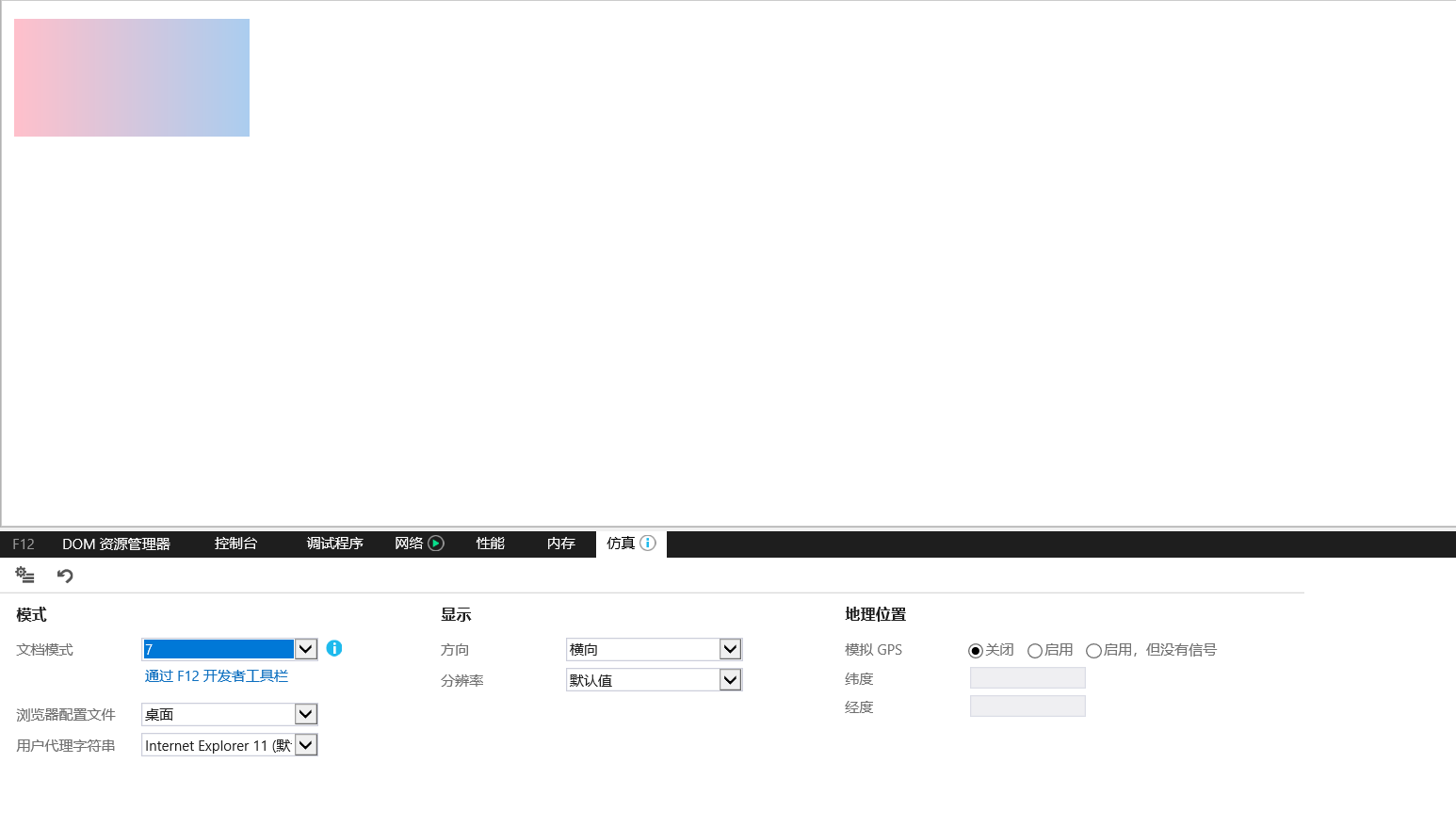
使用IE控制台可切换IE浏览器版本
IE filter
0 从左到右线性渐变
1 从上到下线性渐变
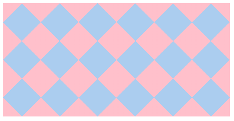
实际案例:
<!DOCTYPE html>

<html lang="en" manifest="index.manifest">

<head>

<meta charset="UTF-8">

<title>Document</title>

<style>

    div{

        width: 600px;

        height: 300px;

        background-color:#abcdef;

        background-size:100px 100px;

        background-image:-webkit-linear-gradient(45deg, pink 25%, transparent 25%),

                         -webkit-linear-gradient(-45deg, pink 25%, transparent 25%),

                         -webkit-linear-gradient(45deg, transparent 75%, pink 75%),

                         -webkit-linear-gradient(-45deg, transparent 75%, pink 75%);

        background-image:-moz-linear-gradient(45deg, pink 25%, transparent 25%),

                         -moz-linear-gradient(-45deg, pink 25%, transparent 25%),

                         -moz-linear-gradient(45deg, transparent 75%, pink 75%),

                         -moz-linear-gradient(-45deg, transparent 75%, pink 75%);

        background-image:-o-linear-gradient(45deg, pink 25%, transparent 25%),

                         -o-linear-gradient(-45deg, pink 25%, transparent 25%),

                         -o-linear-gradient(45deg, transparent 75%, pink 75%),

                         -o-linear-gradient(-45deg, transparent 75%, pink 75%);

        background-image:linear-gradient(45deg, pink 25%, transparent 25%),

                         linear-gradient(-45deg, pink 25%, transparent 25%),

                         linear-gradient(45deg, transparent 75%, pink 75%),

                         linear-gradient(-45deg, transparent 75%, pink 75%);

    }

</style>

</head>

<body>

    <div></div>

</body>

</html>
css3神奇的背景控制属性+使用颜色过渡实现漂亮的渐变效果的更多相关文章
- 利用css3的多背景图属性实现幻灯片切换效果
css3里关于背景的属性增加了可以添加多背景图的特性,例如: .box{background: url(img/1.png),url(img/2.png),url(img/3.png);} 这段css ...
- CSS3 边框 圆角 背景
CSS3用于控制网页的样式布局. CSS3是最新的CSS标准. 关于transform: transform:rotate(10deg);//顺时针方向旋转10° 浏览器支持情况:低版本的IE浏览 ...
- css3新增的背景属性
有时候我们需要往边框文字上添加背景与背景图片的时候就有用处了 background的css3有两个新增属性分别是background-clip与background-origin;背景-修剪与背景起点 ...
- HTML连载15-文本属性&颜色控制属性
一.文本装饰的属性 1.格式:text-decoration:underline; 2.取值: (1)underline代表下划线 (2)line-through代表删除线 (3)overline代表 ...
- CSS3文字、背景与列表
一.文本相关属性 1.字体 (1)字体设置 在HTML中,字体通过<font face="字体名称">来设置.在CSS中字体通过font-family属性来控制,里面可 ...
- Web前端篇:CSS常用格式化排版、盒模型、浮动、定位、背景边框属性
目录 Web前端篇:CSS常用格式化排版.盒模型.浮动.定位.背景边框属性 1.常用格式化排版 2.CSS盒模型 3.浮动 4.定位 5.背景属性和边框属性 6.网页中规范和错误问题 7.显示方式 W ...
- css3新增属性有哪些?css3中常用的新增属性总结
css3新增属性有哪些?来提问这个问题的人都应该知道css3是css的升级版本,那么,css3既然是升级版本,自然是会新增一些属性,接下来本篇文章将给大家介绍关于css3中常用的新增属性. 一.css ...
- 前端笔记之HTML5&CSS3(中)选择器&伪类伪元素&CSS3效果&渐变背景&过渡
一.CSS3选择器 CSS3是CSS的第三代版本,新增了很多功能,例如:强大的选择器.盒模型.圆角.渐变.动画.2D/3D转换.文字特效等. CSS3和HTML5没有任何关系!HTML5骨架中,可以用 ...
- css3种引入方式,样式与长度颜色,常用样式,css选择器
# CSS三种引入方式 ## 一.三种方式的书写规范 #### 1.行间式 ```html<div style="width: 100px; height: 100px; backgr ...
随机推荐
- WeChall_ Training: Stegano I (Training, Stegano)
This is the most basic image stegano I can think of. 解题: 一张小图片,文本方式打开.
- 《Python学习手册 第五版》 -第11章 赋值、表达式和打印
上一章对Python的语句和语法已经进行了基本的说明,接下来就是每个章节的详细说明,本章的主要内容就是标题中涵盖的三点:赋值语句.表达式语句.打印语句 本章重点内容如下: 1.赋值语句 1)赋值语句的 ...
- Java1变量数据类型和运算符
day02_变量数据类型和运算符 1 2 3 4 5 6 7 8 9 10 11 12 13 14 15 16 17 public class jh_01_数据类型说明 { public ...
- 1.3.4分析你的第一个Android程序——Android第一行代码(第二版)笔记
切换项目结构模式 Project模式的项目结构 我们将项目切换成Project模式,这就是真实的目录结构. .gradle和.idea 这两个目下放置的都是Android Studio自动生成的一些文 ...
- vs 中明明包含了头文件所在路径,但是却找不到头文件
vs基本不会出错,那么出错的只能是自己了. 哎,又被自己给蠢死了. 你可能在上面两个地方添加好了include 目录,但是却依然编译失败,失败的提示是找不到头文件所在路径,这是为什么呢. 很简单,因为 ...
- O准备如何苟进复赛圈?华为软挑开挂指南(附赛题预测)
事先声明,这不是华为软挑的软广,我也不是海军. 这篇文章纯粹是心血来潮,原因是去年上传到github的参赛代码,前几天又有两个人star和fork了. 记得star热潮还是去年4月复赛刚结束的那几天, ...
- SpringBoot、Spring MVC报错:Unable to create requested service [org.hibernate.engine.jdbc.env.spi.JdbcEnvironment]
出现问题的原因: jdbc配置不正确 解决方案: 1.检查是否已添加数据库驱动jar包 2.检查数据库服务是否启动 3.检查数据库配置文件 主要为:dialect,driver_class,url,u ...
- github三步走(init;add . ;commit -m "提交说明")
掌握以下几点就基本能满足你平时使用了.按这个顺序来1.git安装,已经好了,略 -到这里本地代码推送到远程已经结束了 2.git本地命令操作-shift+右键-git init:初始化git环境-新建 ...
- Keepalived 工作原理和配置说明
keepalived是什么: 简单来说 Keepalived 的功能功能1.使用VRRP协议 来控制一组高可用(HA) 主备系统,一台master工作,一台slave热备:master失效后slave ...
- android wifi断开原因分析
最近在解bug的过程中经常遇到密码正确但处于saved的状态,总结原因有已下几种: 1 在ASSOCIATING阶段由于丢包导致ASSOC REJECT 03-16 09:22:12.440 D/Wi ...