WPF中ComboBox用法
The ComboBox control is in many ways like the ListBox control, but takes up a lot less space, because the list of items is hidden when not needed. The ComboBox control is used many places in Windows, but to make sure that everyone knows how it looks and works, we'll jump straight into a simple example:
<Window x:Class="WpfTutorialSamples.ComboBox_control.ComboBoxSample"
        xmlns="http://schemas.microsoft.com/winfx/2006/xaml/presentation"
        xmlns:x="http://schemas.microsoft.com/winfx/2006/xaml"
        Title="ComboBoxSample" Height="150" Width="200">
    <StackPanel Margin="10">
        <ComboBox>
            <ComboBoxItem>ComboBox Item #1</ComboBoxItem>
            <ComboBoxItem IsSelected="True">ComboBox Item #2</ComboBoxItem>
            <ComboBoxItem>ComboBox Item #3</ComboBoxItem>
        </ComboBox>
    </StackPanel>
</Window>
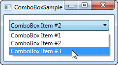
In the screenshot, I have activated the control by clicking it, causing the list of items to be displayed. As you can see from the code, the ComboBox, in its simple form, is very easy to use. All I've done here is manually add some items, making one of them the default selected item by setting the IsSelected property on it.
Custom content
In the first example we only showed text in the items, which is pretty common for the ComboBox control, but since the ComboBoxItem is a ContentControl, we can actually use pretty much anything as content. Let's try making a slightly more sophisticated list of items:
<Window x:Class="WpfTutorialSamples.ComboBox_control.ComboBoxCustomContentSample"
        xmlns="http://schemas.microsoft.com/winfx/2006/xaml/presentation"
        xmlns:x="http://schemas.microsoft.com/winfx/2006/xaml"
        Title="ComboBoxCustomContentSample" Height="150" Width="200">
    <StackPanel Margin="10">
        <ComboBox>
            <ComboBoxItem>
                <StackPanel Orientation="Horizontal">
                    <Image Source="/WpfTutorialSamples;component/Images/bullet_red.png" />
                    <TextBlock Foreground="Red">Red</TextBlock>
                </StackPanel>
            </ComboBoxItem>
            <ComboBoxItem>
                <StackPanel Orientation="Horizontal">
                    <Image Source="/WpfTutorialSamples;component/Images/bullet_green.png" />
                    <TextBlock Foreground="Green">Green</TextBlock>
                </StackPanel>
            </ComboBoxItem>
            <ComboBoxItem>
                <StackPanel Orientation="Horizontal">
                    <Image Source="/WpfTutorialSamples;component/Images/bullet_blue.png" />
                    <TextBlock Foreground="Blue">Blue</TextBlock>
                </StackPanel>
            </ComboBoxItem>
        </ComboBox>
    </StackPanel>
</Window>

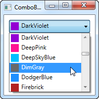
For each of the ComboBoxItem's we now add a StackPanel, in which we add an Image and a TextBlock. This gives us full control of the content as well as the text rendering, as you can see from the screenshot, where both text color and image indicates a color value.
Data binding the ComboBox
As you can see from the first examples, manually defining the items of a ComboBox control is easy using XAML, but you will likely soon run into a situation where you need the items to come from some kind of data source, like a database or just an in-memory list. Using WPF data binding and a custom template, we can easily render a list of colors, including a preview of the color:
<Window x:Class="WpfTutorialSamples.ComboBox_control.ComboBoxDataBindingSample"
        xmlns="http://schemas.microsoft.com/winfx/2006/xaml/presentation"
        xmlns:x="http://schemas.microsoft.com/winfx/2006/xaml"
        Title="ComboBoxDataBindingSample" Height="200" Width="200">
    <StackPanel Margin="10">
        <ComboBox Name="cmbColors">
            <ComboBox.ItemTemplate>
                <DataTemplate>
                    <StackPanel Orientation="Horizontal">
                        <Rectangle Fill="{Binding Name}" Width="16" Height="16" Margin="0,2,5,2" />
                        <TextBlock Text="{Binding Name}" />
                    </StackPanel>
                </DataTemplate>
            </ComboBox.ItemTemplate>
        </ComboBox>
    </StackPanel>
</Window>
using System;
using System.Collections.Generic;
using System.Windows;
using System.Windows.Media;

namespace WpfTutorialSamples.ComboBox_control
{
        public partial class ComboBoxDataBindingSample : Window
        {
                public ComboBoxDataBindingSample()
                {
                        InitializeComponent();
                        cmbColors.ItemsSource = typeof(Colors).GetProperties();
                }
        }
}
It's actually quite simple: In the Code-behind, I obtain a list of all the colors using a Reflection based approach with the Colors class. I assign it to the ItemsSource property of the ComboBox, which then renders each color using the template I have defined in the XAML part.
Each item, as defined by the ItemTemplate, consists of a StackPanel with a Rectangle and a TextBlock, each bound to the color value. This gives us a complete list of colors, with minimal effort - and it looks pretty good too, right?
IsEditable
In the first examples, the user was only able to select from our list of items, but one of the cool things about the ComboBox is that it supports the possibility of letting the user both select from a list of items or enter their own value. This is extremely useful in situations where you want to help the user by giving them a pre-defined set of options, while still giving them the option to manually enter the desired value. This is all controlled by the IsEditable property, which changes the behavior and look of the ComboBox quite a bit:
<Window x:Class="WpfTutorialSamples.ComboBox_control.ComboBoxEditableSample"
        xmlns="http://schemas.microsoft.com/winfx/2006/xaml/presentation"
        xmlns:x="http://schemas.microsoft.com/winfx/2006/xaml"
        Title="ComboBoxEditableSample" Height="150" Width="200">
    <StackPanel Margin="10">
        <ComboBox IsEditable="True">
            <ComboBoxItem>ComboBox Item #1</ComboBoxItem>
            <ComboBoxItem>ComboBox Item #2</ComboBoxItem>
            <ComboBoxItem>ComboBox Item #3</ComboBoxItem>
        </ComboBox>
    </StackPanel>
</Window>
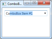
As you can see, I can enter a completely different value or pick one from the list. If picked from the list, it simply overwrites the text of the ComboBox.
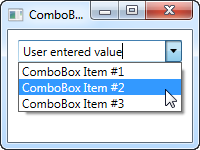
As a lovely little bonus, the ComboBox will automatically try to help the user select an existing value when the user starts typing, as you can see from the next screenshot, where I just started typing "Co":
By default, the matching is not case-sensitive but you can make it so by setting the IsTextSearchCaseSensitive to True. If you don't want this auto complete behavior at all, you can disable it by setting the IsTextSearchEnabled to False.
Working with ComboBox selection
A key part of using the ComboBox control is to be able to read the user selection, and even control it with code. In the next example, I've re-used the data bound ComboBox example, but added some buttons for controlling the selection. I've also used theSelectionChanged event to capture when the selected item is changed, either by code or by the user, and act on it.
Here's the sample:
<Window x:Class="WpfTutorialSamples.ComboBox_control.ComboBoxSelectionSample"
        xmlns="http://schemas.microsoft.com/winfx/2006/xaml/presentation"
        xmlns:x="http://schemas.microsoft.com/winfx/2006/xaml"
        Title="ComboBoxSelectionSample" Height="125" Width="250">
    <StackPanel Margin="10">
        <ComboBox Name="cmbColors" SelectionChanged="cmbColors_SelectionChanged">
            <ComboBox.ItemTemplate>
                <DataTemplate>
                    <StackPanel Orientation="Horizontal">
                        <Rectangle Fill="{Binding Name}" Width="16" Height="16" Margin="0,2,5,2" />
                        <TextBlock Text="{Binding Name}" />
                    </StackPanel>
                </DataTemplate>
            </ComboBox.ItemTemplate>
        </ComboBox>
        <WrapPanel Margin="15" HorizontalAlignment="Center">
            <Button Name="btnPrevious" Click="btnPrevious_Click" Width="55">Previous</Button>
            <Button Name="btnNext" Click="btnNext_Click" Margin="5,0" Width="55">Next</Button>
            <Button Name="btnBlue" Click="btnBlue_Click" Width="55">Blue</Button>
        </WrapPanel>
    </StackPanel>
</Window>
using System;
using System.Collections.Generic;
using System.Reflection;
using System.Windows;
using System.Windows.Media;

namespace WpfTutorialSamples.ComboBox_control
{
        public partial class ComboBoxSelectionSample : Window
        {
                public ComboBoxSelectionSample()
                {
                        InitializeComponent();
                        cmbColors.ItemsSource = typeof(Colors).GetProperties();
                }

                private void btnPrevious_Click(object sender, RoutedEventArgs e)
                {
                        if(cmbColors.SelectedIndex > 0)
                                cmbColors.SelectedIndex = cmbColors.SelectedIndex - 1;
                }

                private void btnNext_Click(object sender, RoutedEventArgs e)
                {
                        if(cmbColors.SelectedIndex < cmbColors.Items.Count-1)
                                cmbColors.SelectedIndex = cmbColors.SelectedIndex + 1;
                }

                private void btnBlue_Click(object sender, RoutedEventArgs e)
                {
                        cmbColors.SelectedItem = typeof(Colors).GetProperty("Blue");
                }

                private void cmbColors_SelectionChanged(object sender, System.Windows.Controls.SelectionChangedEventArgs e)
                {
                        Color selectedColor = (Color)(cmbColors.SelectedItem as PropertyInfo).GetValue(null, null);
                        this.Background = new SolidColorBrush(selectedColor);
                }
        }
}
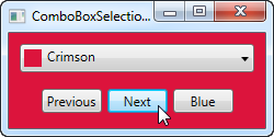
The interesting part of this example is the three event handlers for our three buttons, as well as the SelectionChanged event handler. In the first two, we select the previous or the next item by reading the SelectedIndex property and then subtracting or adding one to it. Pretty simple and easy to work with.
In the third event handler, we use the SelectedItem to select a specific item based on the value. I do a bit of extra work here (using .NET reflection), because the ComboBox is bound to a list of properties, each being a color, instead of a simple list of colors, but basically it's all about giving the value contained by one of the items to the SelectedItem property.
In the fourth and last event handler, I respond to the selected item being changed. When that happens, I read the selected color (once again using Reflection, as described above) and then use the selected color to create a new background brush for the Window. The effect can be seen on the screenshot.
If you're working with an editable ComboBox (IsEditable property set to true), you can read the Text property to know the value the user has entered or selected.
WPF中ComboBox用法的更多相关文章
- WPF中INotifyPropertyChanged用法与数据绑定
在WPF中进行数据绑定的时候常常会用到INotifyPropertyChanged接口来进行实现,下面来看一个INotifyPropertyChanged的案例. 下面定义一个Person类: usi ...
- 解答WPF中ComboBox SelectedItem Binding不上的Bug
正在做一个打印机列表,从中选择一个打印机(System.Printing) <ComboBox Width="150" ItemsSource="{Binding ...
- WPF中ComboBox使用
1.数据绑定 前台代码: <ComboBox Height="23" HorizontalAlignment="Left" Margin="86 ...
- WPF中ComboBox控件的SelectedItem和SelectedValue的MVVM绑定
问题描述:左侧是一个ListView控件,用于显示User类的Name属性,右侧显示其SelectedItem的其他属性,包括Age, Address,和Category.其中Category用Com ...
- WPF中ComboBox绑定数据库自动读取产生数据
前台端 <ComboBox HorizontalAlignment="Name="cmb_SSBM" DisplayMemberPath="NAME&qu ...
- WPF中ComboBox控件绑定键值对操作
WPF中下拉框将键值对作为其数据源的具体操作.本实例以枚举类型以及枚举特性描述字符串生成键值对来进行. namespace ViewC { /// <summary> /// View.x ...
- 【Ext.Net学习笔记】04:Ext.Net中使用数据、Ext.Net Store的用法、Ext.Net ComboBox用法
之前的几篇文章都是介绍Ext.Net较为基础的东西,今天的这一篇将介绍数据的一些用法,包括XTemplate绑定数据.Store(Modal.Proxy).ComboBox的用法等. XTemplat ...
- WPF中log4net的用法
WPF中如何使用log4nethttp://www.cnblogs.com/C-Sharp2/archive/2013/04/12/WPF-LOG4NET.html Apache log4net Ma ...
- WPF中StringFormat 格式化 的用法
原文 WPF中StringFormat 格式化 的用法 网格用法 <my:DataGridTextColumn x:Name="PerformedDate" Header=& ...
随机推荐
- python基础——使用模块
python基础——使用模块 Python本身就内置了很多非常有用的模块,只要安装完毕,这些模块就可以立刻使用. 我们以内建的sys模块为例,编写一个hello的模块: #!/usr/bin/env ...
- 谈谈我的编程之路---WAMP(二)
WAMP的一些配置与使用心得(MYSQL) 刚开始接触数据库的时候,我一直认为数据库操作工具和数据库是同一种东西,它们是一体的,后来我才明白,数据库它是一个独立的仓库,用官方点的话来解释 数据库(Da ...
- sqlserver 用户、账号、安全等问题小汇
一.孤立账号 SQL Server 的用户安全管理分两层,整个SQL Server 服务器一层,每个数据库一层. 在服务器层的帐号,叫登录账户(SQL Server:服务器角色),可以设置它管理整个S ...
- nginx 配一个简单的静态文件服务器 和一个虚似机
下面是个图片服务器: server { listen ; server_name img.xxx.xxx.com; root /data/site/img.xxx.xxx.com; access_lo ...
- MVC基础知识 – 1.抽象工厂模式
1.调用规则 2.简单工厂 问题:在List.aspx里怎么new一个业务层? 2.1.再在 02SBLL 解决方案里建一个类库 BLL_Tow,也有一个 Users.cs 2.2.建立一个工厂 2. ...
- Spring.Net学习之简单的知识点(一)
1.Spring.Net是一个开源的应用程序框架,可以简化开发主要功能(1)实现控制反转(IOC/DI),也就是不要直接new,依赖于接口(2)面向切面编程(AOP),就是向程序中利用委托注册事件简单 ...
- 使用JDBC的addBatch()方法提高效率
在批量更新SQL操作的时候建议使用addBatch,这样效率是高些,数据量越大越能体现出来 Statement接口里有两个方法:void addBatch(String sql)将给定的 SQ ...
- [LeetCode] Pow(x, n)
Implement pow(x, n). 有史以来做过最简单的一题,大概用5分钟ac,我采用fast exponential,这个在sicp的第一章就有描述.思想是:如果n是偶数的话,那么m^n = ...
- <转>ORA-12154: TNS: 无法解析指定的连接标识符
相信作为ORACLE数据库的开发人员没有少碰到“ORA-12154: TNS: 无法解析指定的连接标识符”,今天我也又碰到了类似的情况,将我的解决方法进行小结,希望能对碰到同样问题的友人们提供帮助. ...
- 设置SecureCRT会话的缓冲区大小
转自:http://blog.csdn.net/imxiangzi/article/details/7457703 在使用SecureCRT操作设备时,默认的回滚行数为500行.可以通过打开[选项]- ...