用css画图标
css3的属性 transform(转换) 用途很广泛,功能也很强大,为了熟悉它的各种转换方式(平移 translate,旋转 rotate,扭曲 skew,放缩 scale),我做了一些平常常用的一些简单的图标。
这些图标很多是通过三角形来拼贴起来的,所以我们需要知道怎么样画三角形。
1. 我们要将该 div 的 width 和 height 都设置为 0,三角形是通过设置 border 来实现;
2. 通过我们需要画成的三角形的目标分析,这个三角形的朝向(只针对规则的朝向:上、右、下、左、上左、上右、下右、下左,不规则的朝向可以通过旋转来实现);
3. 如果是上、右、下、左四种中的一种,将朝向的对面的 border-color 设置为我们需要的颜色,该朝向的这一边不设置 border,其它两边的 border-color 设置为 transparent;
4. 如果是上左、上右、下右、下左中的一种,以上右为例,设置相关的两边:上和右的 border-color 设置成我们想要的颜色,其它两边的 border-width 设置成 transparent。
5. border-width 的值就是底边长和高。
看几个例子:
例1:
图形:

该图形中,只有上方位有边,这个边就是三角形的底边了,底边长为 3.6em(左右相加),高为 2em。右、下、左没有边。于是 border-top-color: #000; | border-right-color: transparent; | border-left-color: transparent; | border-top-width: 2em; | border-right-width: 1.8em; | border-left-width: 1.8em;
.bottom {

    width:;

    height:;

    border-top: 2em solid #000;

    border-right: 1.8em solid transparent;

    border-left: 1.8em solid transparent;

}
例2:

该图形中,左和下上方位有边,朝向为下左,底边长为 2em(左右相加),左边长为 4em(上下相加)。
.bottomLeft {

    width:;

    height:;

    border-width: 2em 1em;

    border-style: solid;

    border-color: transparent transparent #000 #000;

}
例3:

该图形中,它的朝向并不是上面提到的那八种,实际上它可以通过例 2 顺时针旋转 60° 得到。
.bottomLeftRotate {

    width:;

    height:;

    border-width: 2em 1em;

    border-style: solid;

    border-color: transparent transparent #000 #000;

    transform: rotate(60deg);

}
好了,进入正题,用 css 画一些常见的图标,目的有五个:1. 熟悉三角形的画法;2. 熟悉 transform 的使用;3. 回顾数学角度计算;4. 回顾定位布局方法;5. 回顾居中显示方法。
所有的 dom 都基于一个 div,比如下面第一个实例“向上”:
<div class="top"></div>
第二个实例“向右”:
<div class="right"></div>
1. 向上

.top {

    box-sizing: border-box;

    position: relative;

    width:;

    height:;

    border-right: .9em solid transparent;

    border-bottom: .9em solid #000;

    border-left: .9em solid transparent;

}

.top:after {

    content: ""; /*针对before,after必须加上*/

    position: absolute;

    left: 50%;

    top: .7em;

    margin-left: -.45em; /*宽度的一半,结合 left: 50%; 使用*/

    width: .9em;

    height: 1.3em;

    background-color: #000;

}
2. 向右

.right {

    box-sizing: border-box;

    position: relative;

    width: 1.3em;

    height: .9em;

    background-color: #000;

}

.right:after {

    content: "";

    position: absolute;

    top: 50%;

    left: 1.1em;

    margin-top: -.9em;

    width:;

    height:;

    border-top: .9em solid transparent;

    border-bottom: .9em solid transparent;

    border-left: .9em solid #000;

}
3. 向下

.bottom {

    box-sizing: border-box;

    position: relative;

    width: .9em;

    height: 1.3em;

    background-color: #000;

}

.bottom:after {

    content: "";

    position: absolute;

    left: 50%;

    top: 1.1em;

    margin-left: -.9em;

    width:;

    height:;

    border-right: .9em solid transparent;

    border-top: .9em solid #000;

    border-left: .9em solid transparent;

}
4. 向左

.left {

    box-sizing: border-box;

    position: relative;

    width:;

    height:;

    border-top: .9em solid transparent;

    border-right: .9em solid #000;

    border-bottom: .9em solid transparent;

}

.left:after {

    content: "";

    position: absolute;

    top:;

    bottom:; /*在绝对定位中,top: 0; bottom: 0; margin: auto; 结合使用能竖直居中*/

    left: .7em;

    margin: auto;

    width: 1.3em;

    height: .9em;

    background-color: #000;

}
以上四个图标由三角形和长方形拼贴而成。
5. 正确

.true {

    position: relative;

    width: 1.2em;

    height: .3em;

    background-color: #000;

    transform: rotate(60deg);

    transform-origin: right center;

    border-radius: .15em;

}

.true:after {

    content: "";

    position: absolute;

    top: .1em;

    left: -.85em;

    width: 2em;

    height: .3em;

    background-color: #000;

    transform: rotate(60deg);

    transform-origin: right center;

    border-radius: .15em;

}
将 transform-origin 设置为 right center; 是为了好计算相对于它做绝对定位的 after 伪元素的位置。其实根据计算 .true:after 的 top: .15em; left: -.8em; 设置成上面的 top: .1em; left: -.85em; 能让两根线的连接处拼贴得更好。
6. 错误

.false {

    position: relative;

    width: 2em;

    height: .3em;

    background-color: #000;

    transform: rotate(45deg);

    border-radius: .15em;

}

.false:after {

    content: "";

    position: absolute;

    width: 2em;

    height: .3em;

    background-color: #000;

    transform: rotate(90deg);

    border-radius: .15em;

}
transform-origin 的值默认为 center center 0; 因此只需旋转 90deg 即可。旋转也是相对于相对定位的元素,所以这里只需要在原基础上旋转 90deg。
7. 菜单

.menu {

    box-sizing: border-box;

    position: relative;

    width: 2em;

    height: 2em;

    background-color: #000;

    border-radius: .3em;

}

.menu:before {

    box-sizing: border-box;

    content: "";

    position: absolute;

    top:;

    right:;

    bottom:;

    left:;

    margin: auto;

    width: 1.2em;

    height: .15em;

    background-color: #fff;

}

.menu:after {

    box-sizing: border-box;

    content: "";

    position: absolute;

    top:;

    right:;

    bottom:;

    left:;

    margin: auto;

    width: 1.2em;

    height: .9em;

    border-width: .15em;

    border-style: solid none;

    border-color: #fff;

}
8. 菜单2

.menu2 {

    box-sizing: border-box;

    position: relative;

    width: .5em;

    height: .5em;

    background-color: #000;

    border-radius: 50%;

    cursor: pointer;

}

.menu2:before {

    box-sizing: border-box;

    content: "";

    position: absolute;

    top:;

    left: -.75em;

    width: .5em;

    height: .5em;

    background-color: #000;

    border-radius: 50%;

}

.menu2:after {

    box-sizing: border-box;

    content: "";

    position: absolute;

    top:;

    left: .75em;

    width: .5em;

    height: .5em;

    background-color: #000;

    border-radius: 50%;

}
9. 下载

.download {

    box-sizing: border-box;

    position: relative;

    width: 2em;

    height: .8em;

    border-width: .3em;

    border-style: none solid solid;

    border-color: #000;

}

.download:before {

    content: "";

    position: absolute;

    right:;

    bottom: .7em;

    left:;

    margin: auto;

    width: .3em;

    height: 1em;

    background-color: #000;

}

.download:after {

    content: "";

    position: absolute;

    right:;

    bottom: .2em;

    left:;

    margin: auto;

    width:;

    height:;

    border-right: .6em solid transparent;

    border-top: .6em solid #000;

    border-left: .6em solid transparent;

}
箭头下面的“框”,设置 border-top-style:none; 而不是设置 border-top-color: transparent; 这样做就能实现,应该与上边框连接处的线那里不会出现线条变细的情况,如下:

这里只是将 border-style 和 border-color 的值换成了 solid 和 transparent #000 #000.
10. 上传

.upload {

    box-sizing: border-box;

    position: relative;

    width: 2em;

    height: .8em;

    border-width: .3em;

    border-style: none solid solid;

    border-color: #000;

}

.upload:before {

    content: "";

    position: absolute;

    right:;

    bottom: .2em;

    left:;

    margin: auto;

    width: .3em;

    height: 1em;

    background-color: #000;

}

.upload:after {

    content: "";

    position: absolute;

    right:;

    bottom: 1.1em;

    left:;

    margin: auto;

    width:;

    height:;

    border-right: .6em solid transparent;

    border-bottom: .6em solid #000;

    border-left: .6em solid transparent;

}
11. 视频

.video {

    box-sizing: border-box;

    position: relative;

    width: 1.5em;

    height: 1.2em;

    background-color: #000;

    border-radius: .3em;

}

.video:after {

    content: "";

    position: absolute;

    top: 50%;

    left: 1.4em;

    margin-top: -.7em;

    width:;

    height:;

    border-top: .7em solid transparent;

    border-right: .6em solid #000;

    border-bottom: .7em solid transparent;

}
12. 语音

.voice {

    box-sizing: border-box;

    position: relative;

    width: 1.4em;

    height: 1em;

    border-width: .2em;

    border-style: none none solid;

    border-color: #000;

    border-radius: 50%;

}

 .voice:before {

    content: "";

    position: absolute;

    right:;

    left:;

    bottom: .05em;

    margin: auto;

    width: .8em;

    height: 1.3em;

    background-color: #000;

    border-radius: .4em;

}

.voice:after {

    content: "";

    position: absolute;

    right:;

    bottom: -.6em;

    left:;

    margin: auto;

    width:;

    height:;

    border-right: .6em solid transparent;

    border-bottom: .4em solid #000;

    border-left: .6em solid transparent;

}
13. 播放

.play {

    box-sizing: border-box;

    position: relative;

    width: 2em;

    height: 2em;

    border: .2em solid #000;

    border-radius: 50%;

}

.play:after {

    content: "";

    position: absolute;

    top:;

    bottom:;

    left: 50%;

    margin-top: auto;

    margin-bottom: auto;

    margin-left: -.3em; /*没有让其左右居中,因为看起来右边更空一些*/

    width:;

    height:;

    border-top: .6em solid transparent;

    border-bottom: .6em solid transparent;

    border-left: .9em solid #000;

}
14. 暂停

.pause {

    box-sizing: border-box;

    position: relative;

    width: 2em;

    height: 2em;

    border: .2em solid #000;

    border-radius: 50%;

}

.pause:before {

    box-sizing: border-box;

    content: "";

    position: absolute;

    top:;

    bottom:;

    left: 50%;

    margin-top: auto;

    margin-bottom: auto;

    margin-left: -.35em;

    width: .2em;

    height: .9em;

    background-color: #000;

}

.pause:after {

    box-sizing: border-box;

    content: "";

    position: absolute;

    top:;

    bottom:;

    left: 50%;

    margin-top: auto;

    margin-bottom: auto;

    margin-left: .15em;

    width: .2em;

    height: .9em;

    background-color: #000;

}
15. 上一首(集)

.previous {

    box-sizing: border-box;

    position: relative;

    width: 2em;

    height: 2em;

    border: .2em solid #000;

    border-radius: 50%;

}

.previous:before {

    box-sizing: border-box;

    content: "";

    position: absolute;

    top:;

    bottom:;

    left: 50%;

    margin-top: auto;

    margin-bottom: auto;

    margin-left: -.65em;

    width:;

    height:;

    border-top: .45em solid transparent;

    border-bottom: .45em solid transparent;

    border-right: .6em solid #000;

}

.previous:after {

    box-sizing: border-box;

    content: "";

    position: absolute;

    top:;

    bottom:;

    left: 50%;

    margin-top: auto;

    margin-bottom: auto;

    margin-left: -.2em;

    width:;

    height:;

    border-top: .45em solid transparent;

    border-bottom: .45em solid transparent;

    border-right: .6em solid #000;

}
16. 下一首(集)

.next {

    box-sizing: border-box;

    position: relative;

    width: 2em;

    height: 2em;

    border: .2em solid #000;

    border-radius: 50%;

}

.next:before {

    box-sizing: border-box;

    content: "";

    position: absolute;

    top:;

    bottom:;

    left: 50%;

    margin-top: auto;

    margin-bottom: auto;

    margin-left: -.4em;

    width:;

    height:;

    border-top: .45em solid transparent;

    border-bottom: .45em solid transparent;

    border-left: .6em solid #000;

}

.next:after {

    box-sizing: border-box;

    content: "";

    position: absolute;

    top:;

    bottom:;

    left: 50%;

    margin-top: auto;

    margin-bottom: auto;

    margin-left: .05em;

    width:;

    height:;

    border-top: .45em solid transparent;

    border-bottom: .45em solid transparent;

    border-left: .6em solid #000;

}
17. 停止

.stop {

    box-sizing: border-box;

    position: relative;

    width: 2em;

    height: 2em;

    border: .2em solid #000;

    border-radius: 50%;

}

.stop:after {

    box-sizing: border-box;

    content: "";

    position: absolute;

    top:;

    right:;

    bottom:;

    left:;

    margin: auto;

    width: .9em;

    height: .9em;

    background-color: #000;

}
18. 当前位置

.position {

    position: relative;

    width: .6em;

    height: .6em;

    border: .4em solid #000;

    border-radius: 50%;

}

.position:after {

    content: "";

    position: absolute;

    top: .55em;

    left: -.4em;

    width:;

    height:;

    border-top: 1em solid #000;

    border-right: .7em solid transparent;

    border-left: .7em solid transparent;

    border-top-left-radius: 50%;

    border-top-right-radius: 50%;

}
勉强看起来像,中间的圆,不圆了。
19. pc

.pc {

    box-sizing: border-box;

    position: relative;

    width: 2em;

    height: 1.4em;

    border-width: .2em .2em .3em;

    border-style: solid;

    border-color: #000;

    border-radius: .2em;

    background-color: #efefef;

}

.pc:before {

    content: "";

    position: absolute;

    top: 1.2em;

    right:;

    left:;

    margin: auto;

    width: .6em;

    height: .4em;

    background-color: #000;

}

.pc:after {

    content: "";

    position: absolute;

    top: 1.6em;

    right:;

    left:;

    margin: auto;

    width: 1.6em;

    height: .2em;

    background-color: #000;

}
20. phone

.phone {

    box-sizing: border-box;

    position: relative;

    width: 1.4em;

    height: 2em;

    background-color: #efefef;

    border-width: .3em .2em .5em;

    border-style: solid;

    border-color: #000;

    border-radius: .15em;

}

.phone:after {

    content: "";

    position: absolute;

    right:;

    bottom: -.4em;

    left:;

    margin: auto;

    width: .5em;

    height: .3em;

    background-color: #fff;

    border-radius: .3em;

}
21. 搜索

.search {

    box-sizing: border-box;

    position: relative;

    width: 1em;

    height: .3em;

    background-color: #000;

    border-top-right-radius: .15em;

    border-bottom-right-radius: .15em;

    transform: rotate(40deg);

    transform-origin: right center;

}

 .search:before {

    content: "";

    position: absolute;

    left: -1.3em;

    bottom: -.6em;

    width: 1em;

    height: 1em;

    border: .3em solid #000;

    border-radius: 50%;

}
22. 五角星

.star {

    box-sizing: border-box;

    position: relative;

    width:;

    height:;

    border-top: .7em solid #000;

    border-right: 1em solid transparent;

    border-left: 1em solid transparent;

}

.star:before {

    content: "";

    position: absolute;

    top: -.7em;

    left: -1em;

    width:;

    height:;

    border-top: .7em solid #000;

    border-right: 1em solid transparent;

    border-left: 1em solid transparent;

    transform: rotate(72deg);

}

.star:after {

    content: "";

    position: absolute;

    top: -.7em;

    left: -1em;

    width:;

    height:;

    border-top: .7em solid #000;

    border-right: 1em solid transparent;

    border-left: 1em solid transparent;

    transform: rotate(-72deg);

}
根据多边形的内角和公式可知 360*(5-2) / 5 = 72°。剩下的调整一下位置就好了。这个五角星由三个三角形拼贴而成。
23. 电子邮件

.email {

    box-sizing: border-box;

    position: relative;

    width:;

    height:;

    border-width: .7em 1em;

    border-style: solid;

    border-color: transparent transparent #000 #000;

}

.email:before {

     content: "";

     position: absolute;

     top: -.7em;

     left: 1em;

     transform: rotateY(180deg);

     transform-origin: left center;

    width:;

    height:;

    border-width: .7em 1em;

    border-style: solid;

    border-color: transparent transparent #000 #000;

}

.email:after {

    content: "";

    position: absolute;

    top: -.7em;

    left: 50%;

    margin-left: -.9em;

    width:;

    height:;

    border-top: .6em solid #000;

    border-right: .9em solid transparent;

    border-left: .9em solid transparent;

}
24. 眼睛

.eye {

    box-sizing: border-box;

    position: relative;

    width: 2em;

    height: 1.2em;

    background-color: #000;

    border-radius: 50%;

}

.eye:before {

    content: "";

    position: absolute;

    top:;

    right:;

    bottom:;

    left:;

    margin: auto;

    width: .8em;

    height: .8em;

    background-color: #fff;

    border-radius: 50%;

}

.eye:after {

    content: "";

    position: absolute;

    top:;

    right:;

    bottom:;

    left:;

    margin: auto;

    width: .4em;

    height: .4em;

    background-color: #000;

    border-radius: 50%;

}
25. 未锁

.unlock {

    box-sizing: border-box;

    position: relative;

    width: 1.6em;

    height: 1.4em;

    background-color: #000;

    border-radius: .2em;

}

.unlock:before {

    box-sizing: border-box;

    content: "";

    position: absolute;

    top: -.4em;

    right: -.4em;

    width: 1em;

    height: .6em;

    border-width: .2em;

    border-style: solid solid none;

    border-color: #000;

    border-radius: .5em;

}

.unlock:after {

    box-sizing: border-box;

    content: "";

    position: absolute;

    bottom: .2em;

    left: 50%;

    margin-left: -.15em;

    width: .3em;

    height: .5em;

    border-top-left-radius: .25em;

    border-top-right-radius: .25em;

    background-color: #fff;

}
这里 .unlock:before 设置了 border-radius: .5em; 所以导致 被打开的锁下边框位置的部分看起来很细。
26. 杯子

.cup {

    box-sizing: border-box;

    position: relative;

    width: 1.3em;

    height: 2em;

    border-width: .2em .2em 1.2em;

    border-style: solid;

    border-color: #000;

    background-color: #efefef;

    border-bottom-left-radius: .3em;

    border-bottom-right-radius: .3em;

}

.cup:before {

    box-sizing: border-box;

    content: "";

    position: absolute;

    top: .1em;

    left: -.7em;

    width: .7em;

    height: 1.4em;

    border-width: .2em;

    border-style: solid;

    border-color: #000;

    border-top-left-radius: .3em;

    border-bottom-left-radius: .3em;

}
27. 心

.heart {

    position: relative;

    width: 1.4em;

    height: 2em;

    background-color: #000;

    border-top-left-radius: 1em;

    border-top-right-radius: 1em;

    transform: rotate(-45deg);

    transform-origin: center bottom;

}

.heart:after {

    content: "";

    position: absolute;

    top: -.7em;

    left: -.7em;

    width: 1.4em;

    height: 2em;

    background-color: #000;

    border-top-left-radius: 1em;

    border-top-right-radius: 1em;

    transform: rotate(90deg);

    transform-origin: center bottom;

}
该爱心由两个柱子一样的东西拼贴而成,很粗鲁,所以它是是黑色。
28. 主页

.home {

    box-sizing: border-box;

    position: relative;

    width: 1.4em;

    height: 1em;

    background-color: #000;

}

 .home:before {

    content: "";

    position: absolute;

    top: -.7em;

    left: 50%;

    margin-left: -1em;

    border-left: 1em solid transparent;

    border-right: 1em solid transparent;

    border-bottom: .8em solid #000;

}

.home:after {

    z-index:;

    content: "";

    position: absolute;

    right:;

    bottom:;

    left:;

    margin: auto;

    width: .3em;

    height: .5em;

    background-color: #fff;

}
29. 密码

.password {

    box-sizing: border-box;

    position: relative;

    width: 1.8em;

    height: 1.4em;

    background-color: #000;

    border-radius: .2em;

}

.password:before {

    box-sizing: border-box;

    content: "";

    position: absolute;

    top: -.6em;

    left: 50%;

    margin-left: -.5em;

    width: 1em;

    height: 1em;

    border: .2em solid #000;

    border-radius: 50%;

}

.password:after {

    box-sizing: border-box;

    content: "";

    position: absolute;

    bottom: .2em;

    left: 50%;

    margin-left: -.15em;

    width: .3em;

    height: .5em;

    border-top-left-radius: .25em;

    border-top-right-radius: .25em;

    background-color: #fff;

}
30. 用户(账号)

.user {

    box-sizing: border-box;

    position: relative;

    width: .9em;

    height: .9em;

    background-color: #000;

    border-radius: 50%;

}

.user:after {

    content: "";

    position: absolute;

    top: 1em;

    left: 50%;

    margin-left: -.9em;

    width: 1.8em;

    height: 1em;

    background-color: #000;

    border-top-left-radius: .9em;

    border-top-right-radius: .9em;

}
更新:(2017-06-27)
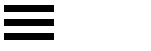
对于菜单的图标,可以不使用生成内容 content 属性及伪元素 before 和 after 。如下面的图标:

可以通过一段很简短的 css 实现:
#menu {

    color: #000;
    display: block;

    width: 50px;

    height: 50px;

    box-sizing: border-box;

    border-top: 10px solid; /*没有设置颜色值,将同文本颜色一样*/

    border-bottom: 10px solid;

    padding-top: 10px;

    padding-bottom: 10px;

    background-color: currentColor; /*颜色关键字,将同文本颜色一致*/

    background-clip: content-box; /*背景将绘制在内容方框内*/

}
上面的代码可以更简短一些,比如不设置 box-sizing 和 height 属性,结果是一样的,三条短横线的高度和它们之间的间距一样均为 10px ,要是在 less 预处理器中可这样写:
#menu {

  @size: 10px;

  color: #000;
  displsy: block;

  width: @size * 5;
  height: @size * 5;

  border-top: @size solid;

  border-bottom: @size solid;

  padding-top: @size;

  padding-bottom: @size;

  background-color: currentColor;

  background-clip: content-box;

}
如果需要整体调整图标的大小,改变 @size 变量的值就行了。如果宽度需要稍微宽点,将乘号 “*” 后面的数值变大就行了。
更新:(2019-08-27)
在绘制边框的时候,有一个 border-style 的值为 double 的边框属性,可以据此制作出形如轨道的效果
受这个效果的启发,同样可以仅通过边框就制作出一个菜单图标
<div class="double"></div>

.double {

    width: 50px;

    height: 7px;

    border-top: 21px double #000;

    border-bottom: 7px solid #000;

}
用css画图标的更多相关文章
- 用css控制一个DIV画图标。
在实际开发中,我们会用到一些小图形,图标.大多数情况下都是用图片来实现的,同时对图片进行处理使图片大小尽可能的缩小.但是图片在怎么处理也是按KB来算的.但是要是用CSS画,只要用很少的空间就能完成同样 ...
- Effective前端3:用CSS画一个三角形
p { text-indent: 2em } .triangle-container p { text-indent: 0 } img { margin: 15px 0 } 三角形的场景很常见,打开一 ...
- Effective前端(3)用CSS画一个三角形
来源:https://zhuanlan.zhihu.com/p/26160325 三角形的场景很常见,打开一个页面可以看到各种各样的三角形: 由于div一般是四边形,要画个三角形并不是那么直观.你可以 ...
- 一步一步教你用CSS画爱心
今天小颖给大家分享一个用CSS画的爱心,底下有代码和制作过程,希望对大家有所帮助. 第一步: 先画一个正方形.如图: <!DOCTYPE html> <html> <he ...
- 参考bootstrap中的popover.js的css画消息弹框
前段时间小颖的大学同学给小颖发了一张截图,图片类似下面这张图: 小颖当时大概的给她说了下,其实小颖也不知道上面那个三角形怎么画嘻嘻,给她说了DOM结构,具体的css让她自己百度,今天小颖自己参考boo ...
- 用css画出三角形
看到有面试题里会有问到如何用css画出三角形 众所周知好多图形都可以拆分成三角形,所以说会了画三角形就可以画出很多有意思的形状 画出三角形的原理是调整border(边框)的四个方向的宽度,线条样式以及 ...
- 用纯css画个三角形
用纯css画个三角形以下是源代码: <!DOCTYPE html PUBLIC "-//W3C//DTD XHTML 1.0 Transitional//EN" " ...
- 如何用css画出三角形
看到有面试题里会有问到如何用css画出三角形 众所周知好多图形都可以拆分成三角形,所以说会了画三角形就可以画出很多有意思的形状 画出三角形的原理是调整border(边框)的四个方向的宽度,线条样式以及 ...
- 用css画出三角形【转】
看到有面试题里会有问到如何用css画出三角形 众所周知好多图形都可以拆分成三角形,所以说会了画三角形就可以画出很多有意思的形状 画出三角形的原理是调整border(边框)的四个方向的宽度,线条样式以及 ...
随机推荐
- CSS3颜色特征温故
网页是色彩的表现原理:显示器是由一个个像素构成,利用电子束来表现色彩.像素把光的三原色:红色(R).绿色(G).蓝色(B)组合成的色彩按照科学原理表现出来.一个像素包含8位元色彩的信息量,又从0 ~ ...
- 闭包和this
一.闭包 最开始理解闭包是在一个函数内部定义一个函数,可以在外面的环境里进行调用.现在对于闭包的理解是利用函数来保存作用域内的对象. 理解闭包首先要理解执行上下文,变量对象,活动对象,作用域链.因为执 ...
- spring web MVC
详情:http://blog.csdn.net/mic_hero/article/details/50237627
- BPM配置故事之案例8-根据表单数据调整审批线路
Boss突然来到:小明啊,咱们的物资申请金额现在既然可以确定了,以后金额在1万以下的申请单,就不用我审批了.直接通过就行了. 小明:好的 然后小明把流程线路改成了这样. 线路条件1 线路条件2
- Web自动化测试 Selenium 2/3
TesNG和Selenium集成使用 TestNG 是一个设计用来简化广泛的测试需求的测试框架,从单元测试(隔 离测试一个类)到集成测试(测试由有多个类多个包甚至多个外部框架组成的整 个系统,例如运用 ...
- Day Tips:分布式缓存的删除和重建
遇到cacheHostInfo is null 错误时,必须将这台服务器上的实例删除重新创建 $instanceName ="SPDistributedCacheService Name=A ...
- Sharepoint学习笔记—习题系列--70-576习题解析 -(Q72-Q74)
Question 72 You are designing a SharePoint 2010 application and a Web application. You need to desi ...
- Android 视频播放器,在线播放
1. Bilibili https://github.com/Bilibili/ijkplayer 1.测试的时候总是崩溃,不知道是我不会用还是怎么回事. 2016-04-15 2.AndroidVi ...
- iOS数据缓存及YYCache的实现分析
1. 什么是cache cache就是缓存的意思. 计算机上的cache就是高速缓存,计算机组成课程里的定义是,存在于主存和CPU之间,主要用于解决CPU处理数据的速度远远大于读取主存数据的速度. 手 ...
- Android的生命周期学习
掌握Android的生命周期对于如何一个刚刚接触Android初学者来说是至关重要的,在然后的开发中会给我留有更多的时刻余地,当自己正在认识Android中整个声明周期后,会编写出更加的流畅的程序 应 ...