
HTML & CSS – Practice Projects
前言
学完了 w3school 就要练练手了. 这篇是记入我学习的过程, 和知识点.
update: 2022-02-27
用文章来表达太难了, 用视频比较合理. 所以我就没有继续写了.
这里记入几篇教程:
One Page Full Website Project For Practice | HTML & CSS Responsive Website | Web Cifar 2021 (CSS)
Youtube – Sass Tutorial for Beginners - CSS With Superpowers (Sass)
Youtube – Build a Modern Landing Page With Tailwind CSS (Tailwind CSS)
参考:
One Page Full Website Project For Practice | HTML & CSS Responsive Website | Web Cifar 2021
这篇的内容会依据上面这个 step by step video 走.
Section 的运用
大部分网站首页的设计都会用多个 section 来表示. 是一个 summary 快速预览的概念, 用户对某个 section 感兴趣才导航到细节页面.
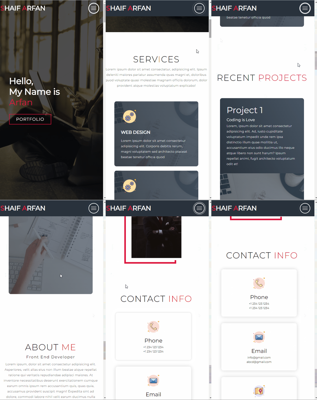
大部分人会把第一屏称它为 Hero Section
Hero Section HTML
第一屏长这样
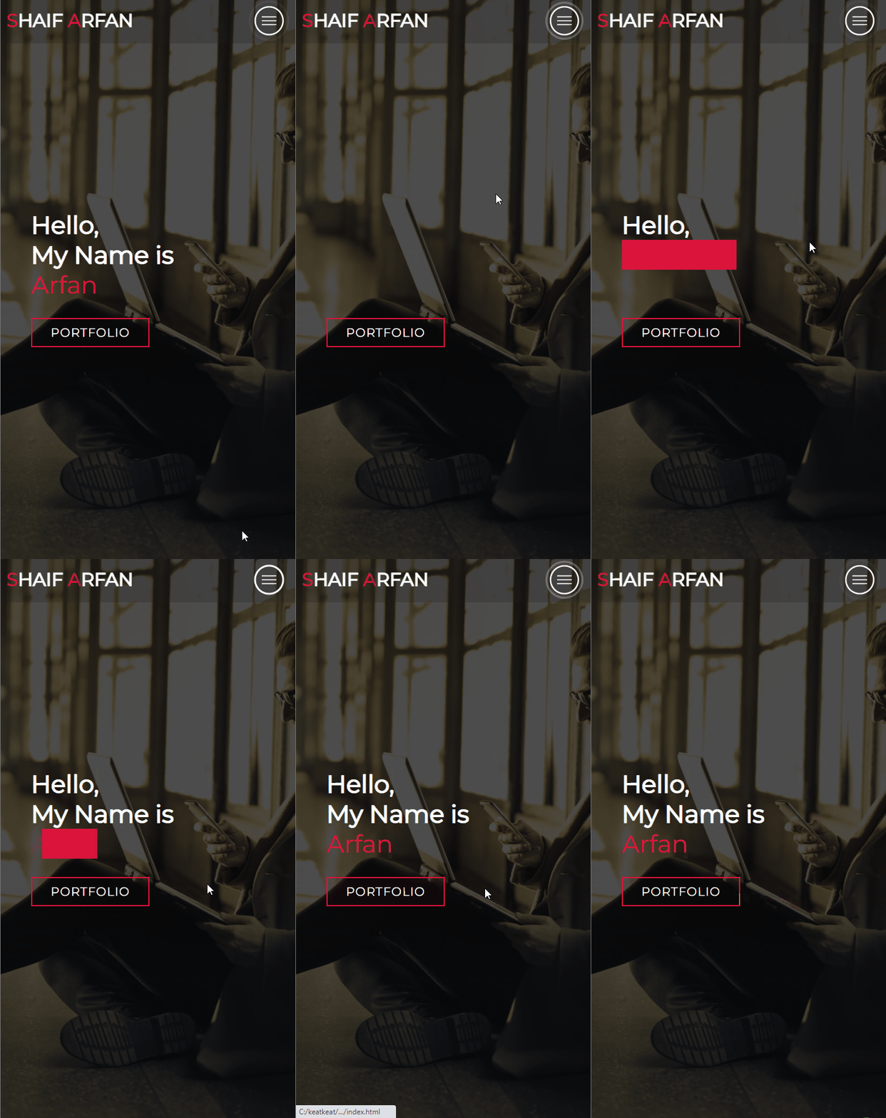
先不管最上方的 logo 和 hamburger menu.
中间是一个 title 和一个 call to action (CTA), 然后有 animation, CTA hover 也有个变色过渡.
  <body>

    <!-- Hero Section  -->

    <section id="hero-section">

      <div class="container">

        <div>

          <h1>Hello, My Name is Arfan!</h1>

          <a href="#" class="cta">Portfolio</a>

        </div>

      </div>

    </section>

    <!-- End Hero Section -->

  </body>
1. 通过注释来划分 section, 这个是一个 best practice 来的, 看注释理解结构会很舒服.
2. CSS 排版通常使用 flex, 所以元素都会被 container 抱起来, 类似 Figma 的 Frame.
3. title 一般上用 h1 来表示, CTA 一般用 anchor / button, 这里用的是 anchor 因为它是 link.
4. title 和 CTA 需要被 div wrap 起来是因为它们是一起的, container 负责居中它们.
Anchor type
视频里面, 作者用了 type 这个属性来表示 <a> anchor 是一个 button, 这个应该是错误的.

Type 属性是用来表达 MIME type 的.

Reset CSS
最简单的 Reset CSS, 为了统一 browser 行为.
* {

  padding: 0;

  margin: 0;

  box-sizing: border-box;

}
Font-family
它用的是 Google Fonts
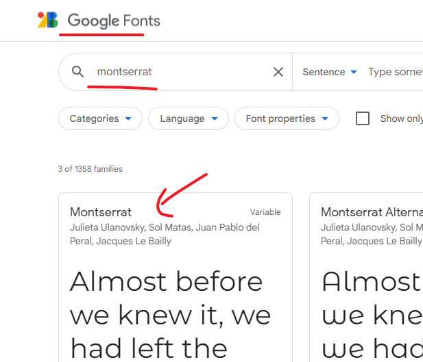
到 fonts.google.com search "montserrat", 点击搜索结果
选择需要的 weight (Light 300, Regular 400, Bold 700)
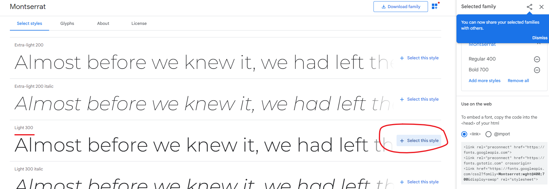
然后使用 import 的方式放入 style.css
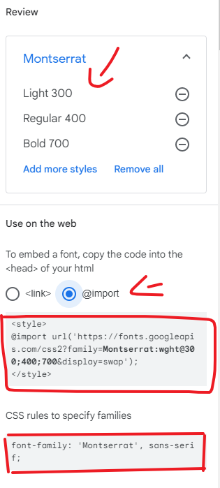
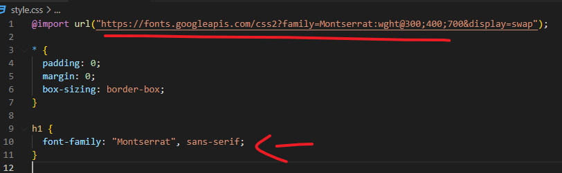
sans-serif 是 fallback 字体.
定义全局字体
html {

  font-size: 10px;

  font-family: 'Montserrat', sans-serif;

}
它在 HTML 设定了 font-size: 10px, 往后子孙用 rem 来管理, 这个是正确的方式, 但一般上 rem 跟 browser 用户 setting 跑会更好, 而且默认是 16px 而不是 10px. 当然设计师可以有自己的设计偏好.
Remove Anchor Underline
auchor 默认都有下划线, 很破坏 design 的, 拿掉.
a {

  text-decoration: none;

}
居中
Title 和 CTA 要居中, 用 flex.
.container {

  min-height: 100vh;

  display: flex;

  justify-content: center;

  align-items: center;

}
高度 100vh 是占满 1 屏.
背景图 + 黑影
#hero-section {

  background-image: url(img/hero-bg.png);

  background-size: cover;

  background-position: top center;

}
直接在 hero section 添加背景图就可以了. straightforward, 然后是黑影.
黑影其实是一个黑色的 div, 有点透明, 然后它覆盖在整个图片上面 (或者说整个 hero section 上面).
先搞一个 黑色 div 出来, 一般上会用 CSS 伪元素来完成, 而不是在 HTML 写一个 div.
#hero-section::after {

  content: "";

  height: 100%;

  width: 100%;

  background-color: black;

  opacity: 0.7;

}
伪元素会被插入到 hero section 里面的最后一个.
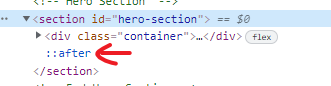
width, height 100% 表示跟 parent (hero section) 一样大.
有了黑影. 下一步是让它覆盖整个 section. 要让东西重叠就需要定位.
#hero-section {

  position: relative;

}

#hero-section::after {

  position: absolute;

  top: 0;

  left: 0;

}
这样黑影就覆盖 hero section 了. 但有一个小问题, 那就是 hero section 里的 title 和 CTA 也被黑影覆盖了. 点击不了.
解决方法就是设置 z-index. 具体原理可以看这篇
最后 CSS 长这样
/* Hero Section */

#hero-section {

  background-image: url(img/hero-bg.png);

  background-size: cover;

  background-position: top center;

  position: relative;

  z-index: 0;

}

#hero-section::after {

  content: "";

  height: 100%;

  width: 100%;

  background-color: black;

  opacity: 0.7;

  position: absolute;

  top: 0;

  left: 0;

  z-index: -1;

}

/* End Hero Section */
CTA Hover Transition
参考: CSS – Transition & Animation
#hero-section .cta:hover {

  background-color: crimson;

}
Text Reveal CSS Animation Effect
到目前为止长这样
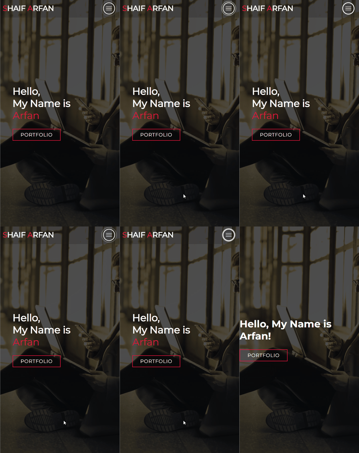
中间的部分还需要加上 animation
参考:
Text Reveal CSS Animation Effect | Elementor | Web Cifar 2020
这里我的做法和视频不同, 视频是用 h1>span 来做 overlay 而我用 ::after
视频通过 h1 color: transparent 让字体消失, 我用 opacity, 主要是管理方式的不同.
先把 h1 拆分成 3 个

h1-wrapper 内就会有 content: '' 作为 overlay
#hero-section .h1-wrapper {

  position: relative;

  width: fit-content;

}
position: relative 让 overlay 定位, fix-content 是 hug content h1, 不然它的 width 会很长
#hero-section .h1-wrapper::after {

  content: '';

  background-color: crimson;

  position: absolute;

  width: 0;

  height: 100%;

  top: 0;

  left: 0;

}
接下来做动画给它
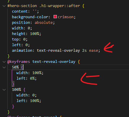
一开始 overlay width 0 什么都看不到
50% 的时候 width: 100% 覆盖完 h1
100% 的时候又回到 0%
left 是用来控制左到右, 右到左效果的.


第一张是 left: 20%; width 80%
第二张是 left 40%; width 60%
最后是 h1 字体一开始看不见, 等 overlay 过了才出现
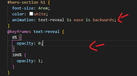
时间配合 delay 的时间要配合到 overlay animation 的 duration 哦

最后让 3 个 h1 分别不同的 delay. 1 个 1 给出现, 还有把最后一个颜色变成赤红色.
CSS 和 HTML


@import url('https://fonts.googleapis.com/css2?family=Montserrat:wght@300;400;700&display=swap');

* {

  padding: 0;

  margin: 0;

  box-sizing: border-box;

}

html {

  font-size: 10px;

  font-family: 'Montserrat', sans-serif;

}

a {

  text-decoration: none;

}

.container {

  min-height: 100vh;

  display: flex;

  justify-content: center;

  align-items: center;

}

/* Hero Section */

#hero-section {

  background-image: url(img/hero-bg.png);

  background-size: cover;

  background-position: top center;

  position: relative;

  z-index: 0;

  --duration: 2s;

}

#hero-section::after {

  content: '';

  height: 100%;

  width: 100%;

  background-color: black;

  opacity: 0.7;

  position: absolute;

  top: 0;

  left: 0;

  z-index: -1;

}

#hero-section h1 {

  font-size: 4rem;

  color: white;

  animation-name: text-reveal;

  animation-duration: 1s;

  animation-timing-function: ease;

  animation-fill-mode: backwards;

}

#hero-section .h1-wrapper:nth-of-type(1) h1 {

  animation-delay: calc(1s + (var(--duration) / 2));

}

#hero-section .h1-wrapper:nth-of-type(2) h1 {

  animation-delay: calc((1s + var(--duration)) + (var(--duration) / 2));

}

#hero-section .h1-wrapper:nth-of-type(3) h1 {

  animation-delay: calc((1s + (var(--duration) * 2)) + (var(--duration) / 2));

  color: crimson;

}

@keyframes text-reveal {

  0% {

    opacity: 0;

  }

  100% {

    opacity: 1;

  }

}

#hero-section .h1-wrapper {

  position: relative;

  width: fit-content;

}

#hero-section .h1-wrapper::after {

  content: '';

  background-color: crimson;

  position: absolute;

  width: 0;

  height: 100%;

  top: 0;

  left: 0;

  animation-name: text-reveal-overlay;

  animation-duration: var(--duration);

  animation-timing-function: ease;

}

#hero-section .h1-wrapper:nth-of-type(1)::after {

  animation-delay: 1s;

}

#hero-section .h1-wrapper:nth-of-type(2)::after {

  animation-delay: calc(1s + var(--duration));

}

#hero-section .h1-wrapper:nth-of-type(3)::after {

  animation-delay: calc(1s + (var(--duration) * 2));

}

@keyframes text-reveal-overlay {

  50% {

    width: 100%;

    left: 0%;

  }

  100% {

    width: 0;

    left: 100%;

  }

}

#hero-section .cta {

  font-size: 2rem;

  text-transform: uppercase;

  letter-spacing: 0.1rem;

  color: white;

  border: 2px solid crimson;

  padding: 10px 30px;

  display: inline-block;

  margin-top: 30px;

  transition: background-color 0.3s ease;

}

#hero-section .cta:hover {

  background-color: crimson;

}

/* End Hero Section */
<!DOCTYPE html>

<html lang="en">

  <head>

    <meta charset="UTF-8" />

    <meta http-equiv="X-UA-Compatible" content="IE=edge" />

    <meta name="viewport" content="width=device-width, initial-scale=1.0" />

    <link rel="stylesheet" href="style.css" />

    <script src="script.js" defer></script>

    <title>My First Website</title>

  </head>

  <body>

    <!-- Hero Section  -->

    <section id="hero-section">

      <div class="container">

        <div>

          <div class="h1-wrapper"><h1>Hello,</h1></div>

          <div class="h1-wrapper"><h1>My Name is</h1></div>

          <div class="h1-wrapper"><h1>Arfan</h1></div>

          <a href="#" class="cta">Portfolio</a>

        </div>

      </div>

    </section>

    <!-- End Hero Section -->

  </body>

</html>
写不下去了... 感觉用视频讲会方便很多. CSS 有许多小样的东西要注意. 一个一个写又很扎乱.
所以接下来只写各个小招数招数, 还有单独的 CSS 只是就好了.
HTML & CSS – Practice Projects的更多相关文章
- 2015年最佳的12个 CSS 开发工具推荐
CSS所能做的就是改变网页的布局.排版和调整字间距等,但编写 CSS 并不是一项容易的任务,当你接触新的 CSS3 属性及其各自的浏览器前缀的时候,你会发现很伤脑经.值得庆幸的是一些优秀的开发人员提供 ...
- Github上的1000多本免费电子书重磅来袭!
Github上的1000多本免费电子书重磅来袭! 以前 StackOverFlow 也给出了一个免费电子书列表,现在在Github上可以看到时刻保持更新的列表了. 瞥一眼下面的书籍分类目录,你就能 ...
- Github 的一个免费编程书籍列表
Index Ada Agda Alef Android APL Arduino ASP.NET MVC Assembly Language Non-X86 AutoHotkey Autotools A ...
- Matplotlib数据可视化(3):文本与轴
在一幅图表中,文本.坐标轴和图像的是信息传递的核心,对着三者的设置是作图这最为关心的内容,在上一篇博客中虽然列举了一些设置方法,但没有进行深入介绍,本文以围绕如何对文本和坐标轴进行设置展开(对图像 ...
- css best practice for big team and project
推荐查看以下文章: https://segmentfault.com/a/1190000000704006 关于BEM,SMACSS,OOCSS的通俗易懂的介绍 http://philipwalton ...
- css grid layout in practice
css grid layout in practice https://caniuse.com/#search=grid subgrid https://caniuse.com/#search=cal ...
- A Complete List of .NET Open Source Developer Projects
http://scottge.net/2015/07/08/a-complete-list-of-net-open-source-developer-projects/?utm_source=tuic ...
- HTML和xhtml,CSS
索引: 初学者入门书籍 高级进阶书籍 W3C官方手册 网站架构 移动平台网站开发 视频资源 开发工具 初学者入门书籍: 中文电子书 深入浅出html pdf中文版 魅丽的网页设计 JAVA WE ...
- ConCurrent in Practice小记 (3)
ConCurrent in Practice小记 (3) 高级同步技巧 Semaphore Semaphore信号量,据说是Dijkstra大神发明的.内部维护一个许可集(Permits Set),用 ...
- ConCurrent in Practice小记 (2)
Java-ConCurrent2.html :first-child{margin-top:0!important}img.plugin{box-shadow:0 1px 3px rgba(0,0,0 ...
随机推荐
- 在该serializer中使用source参数指定序列化时使用的字段的choices选项
在序列化中获取time_unit字段的中文名称,你可以使用choices选项中定义的第二个值,即元组中的第二个元素.你可以通过定义一个serializer,然后在该serializer中使用sourc ...
- 学习笔记--Java中final关键字
Java中final关键字 关于Java语言中的final关键字: final是一个关键字,表示:最终的,不可改变 final修饰的类无法被继承 final修饰的方法无法被覆盖 final修饰的变量一 ...
- 数组的创建-数组-C
数组内存是连续的 数组是一个整体,它的内存是连续的:也就是说,数组元素之间是相互挨着的,彼此之间没有一点点缝隙.下图演示了int a[4];在内存中的存储情形: 「数组内存是连续的」这一点很重要,所以 ...
- odoo 开发入门教程系列-基本视图
在上一章中已经看到,odoo能够为给定模型生成默认视图.实际上,默认视图对于业务应用程序来说是不可接受的.相反,我们至少应该以逻辑的方式组织各个字段. 视图是在带有操作和菜单的XML文件中定义的.它们 ...
- odoo 给form表单视图内联列表添加按钮
实践环境 Odoo 14.0-20221212 (Community Edition) 代码实现 模块文件组织结构 说明:为了更好的表达本文主题,一些和主题无关的文件.代码已略去 odoo14\cus ...
- docker 容器迁移到其他机器
docker 容器迁移到其他机器思路为:容器转为镜像,再保存为镜像文件,迁移到其他机器后导入为镜像 1.commit:将容器转镜像 # docker commit {container_id} {镜像 ...
- Microsoft Dynamics CRM 365/2016 配置POP3/STMP邮箱(附例)
前期准备: 必须支持pop3/stmp的邮箱 以下用网易163邮箱做的测试,注意开通了独立安全码,非邮箱登录密码 1.打开设置>>电子邮件配置 2.新建电子邮件配置 pop3/smtp 3 ...
- 【Java】SPI机制
SPI全称: 服务供应商接口 Service Provider Interface 服务发现机制 入门概念视频来自于: https://www.bilibili.com/video/BV1E44y1N ...
- 【转载】 NLP如此钟情英语研究真的好吗?
转载自: https://mbd.baidu.com/newspage/data/landingsuper?context=%7B%22nid%22%3A%22news_965090611243366 ...
- docker容器下安装nccl失败,报错:Failed to init nccl communicator for group,init nccl communicator for group nccl_world_group
相关内容参考: https://www.cnblogs.com/devilmaycry812839668/p/15022320.html =============================== ...