BootStrap栅格系统原理 笔记
1.内容居中:效果
关键代码:
<div class="container"> .........之前上面添加在body标签下的代码 </div>
添加class=“container”之后,div里内容如图居中。
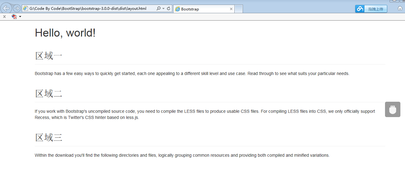
2.类似Table的栅格系统:效果

关键代码:
首先为三个区域添加一个容器,可以使用div,并且为div添加一个类 <div class="row">.
然后我们为每个小的区域也添加一个容器div,并且为div添加一个类<div class="col-xs-4">
简单代码实现如下:
 <div class="container"> <h1>Hello, world!</h1> <div class="row">

<div class="col-xs-4"> <h2 class="page-header">区域一</h2> <p>Bootstrap has a few easy ways to quickly get started, each one appealing to a different skill level and use case. Read through to see what suits your particular needs.</p> </div>

<div class="col-xs-4"> <h2 class="page-header">区域二</h2> <p>If you work with Bootstrap's uncompiled source code, you need to compile the LESS files to produce usable CSS files. For compiling LESS files into CSS, we only officially support Recess, which is Twitter's CSS hinter based on less.js.</p> </div>

<div class="col-xs-4"> <h2 class="page-header">区域三</h2> <p>Within the download you'll find the following directories and files, logically grouping common resources and providing both compiled and minified variations.</p> </div>

</div> </div>
默认一共12列, 这边设置“col-xs-4”,然后就是被 平均分成 3列了,每列包含4小列(也就是占据的 栅格列数目),这边“4“的范围是 1~12,
如果要平均分成2列,则 用 “col-xs-6”
BootStrap栅格系统原理 笔记的更多相关文章
- Bootstrap栅格系统(布局)
栅格系统(布局) Bootstrap内置了一套响应式.移动设备优先的流式栅格系统,随着屏幕设备或视口(viewport)尺寸的增加,系统会自动分为最多12列. 我在这里是把Bootstrap中的栅格系 ...
- 巧用 BootStrap --- 栅格系统(布局)轻松搞定网页响应式布局!
摘要:Bootstrap 为我们提供了一套响应式.移动设备优先的流式栅格系统,合理的使用栅格系统将会使得网站页面布局变得更加简单,在设置了媒体查询之后,响应式网站也无需再单独写了.接下来我以Boots ...
- Bootstrap 栅格系统初识
以下理论内容copy自bootstrap中文网(一个不错的bootstrap学习网站). 栅格系统 Bootstrap 提供了一套响应式.移动设备优先的流式栅格系统,随着屏幕或视口(viewport) ...
- 第二百三十五节,Bootstrap栅格系统
Bootstrap栅格系统 学习要点: 1.移动设备优先 2.布局容器 3.栅格系统 本节课我们主要学习一下 Bootstrap 的栅格系统,提供了一套响应式.移动设备优先的流 式栅格系统. 一.移动 ...
- Bootstrap栅格系统详解,响应式布局
Bootstrap栅格系统详解 栅格系统介绍 Bootstrap 提供了一套响应式.移动设备优先的流式栅格系统,随着屏幕或视口(viewport)尺寸的增加,系统会自动分为最多12列. 栅格系统用于通 ...
- Bootstrap 栅格系统(转载)
源地址:http://www.cnblogs.com/linjiqin/p/3559800.html Bootstrap 栅格系统 目录1.简介2.栅格选项3.列偏移4.嵌套列5.列排序 1.简介Bo ...
- 初学bootstrap ---栅格系统
<!DOCTYPE html> <html lang="en"> <head> <meta charset="UTF-8&quo ...
- 入门——Bootstrap栅格系统
作为刚接触到Bootstrap框架的新手一枚,刚开始对Bootstrap中的栅格系统一脸懵逼,后来经过反复的上网查找资料以及自己一直在练习,总算对栅格系统了解个差不多,所以我将我所了解的当成是日记写下 ...
- Bootstrap栅格系统基本使用
1.什么是栅格系统: 在Bootstrap中,它提供了一套响应式.移动设备优先的流式栅格系统,随着屏幕或视口(viewport)尺寸的增加,系统会自动分为最多12列.栅格系统用于通过一系列的行(row ...
随机推荐
- gem install 出现Errno::ECONNRESET: Connection reset by peer - SSL_connect (https://api.rubygems.org
在安装了rvm来管理多版本的ruby之后,想在不同环境下安装一些gems,结果gem install puma 之后,发现一次又一次失败. gem install 出现Errno::ECONNRESE ...
- [转载] A set of top Computer Science blogs
This started out as a list of top Computer Science blogs, but it more closely resembles a set: the o ...
- Android学习笔记----Activity的生命周期图示
转载,一目了然.
- JS - IE中没有console定义
由于IE中没有Console相关定义,所以不能使用它输出打印信息,且会出现脚本中断. 所以在IE中务必去掉(注释掉)console相关脚本代码.
- idea使用maven启动tomcat
1.设置tomcat,如图: 2.添加war包 3.修改pom.xml 删除可能的选项,如果有下面的代码,删除掉 4.选择使用的resources目录 5.启动即可
- Domain Space
Bluehost Register Page http://www.bluehost.com/track/weipengp
- Python测试基础教程
Python简明教程1-为什么 Pythonhttp://www.automationqa.com/forum.php?mod=viewthread&tid=3674&fromuid= ...
- linux的文件种类与扩展名
一.文件种类: 1.普通文件(regular file)第一个字符为[ - ] 包括:①纯文本档(ASCII):这是Linux系统中最多的一种文件类型,称为纯文本档.是因为内容为我们人类可以直接读到的 ...
- pdf嵌入字体
论文提交时,要求所有的字体都是嵌入的,为这个问题折腾了很久,发现了一个很好的答案,记一下: http://stackoverflow.com/questions/4231656/how-do-i-em ...
- JDK的下载、安装及环境变量的配置
官网下载JDK: www.oracle.com 或者 www.java.sun.com 安装JDK: 双击运行下载的 jdk-8u25-windows-i586.exe即可. 假设安装目录为:D: ...