常见手机的设备分辨率、viewport和devicePixelRatio
常见手机的设备分辨率和viewport分辨率,及其1rem的大小(以vmin为单位)
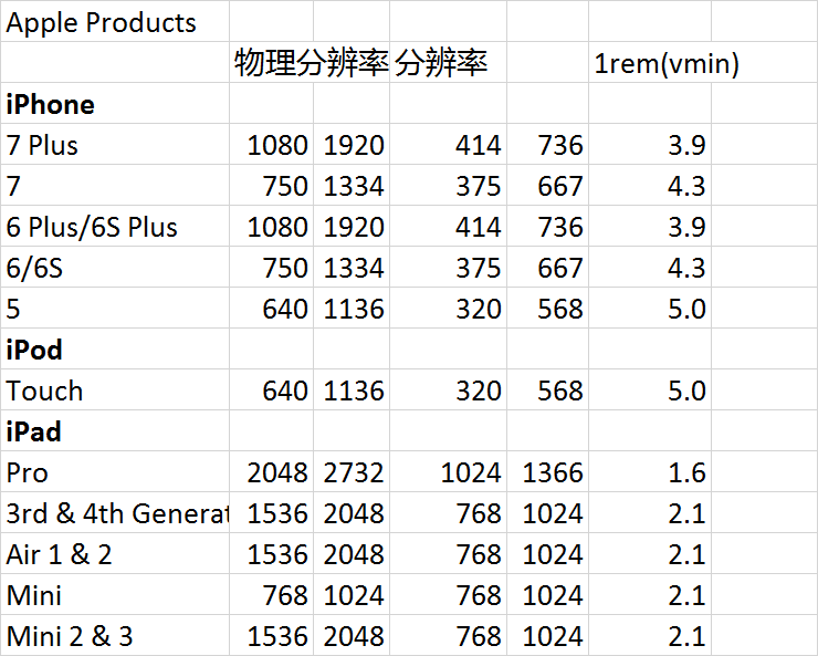
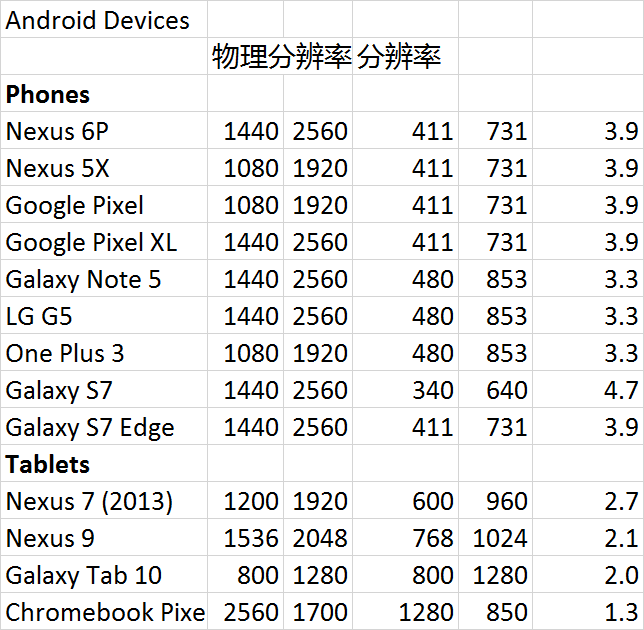

常见的devicePixelRatio是1, 1.325, 1.5, 2, 2.4, 3. (具体见下面的表格,从Chrome Emulator中导出的)。
| Brand | Device | Resolution | Pixel Ratio |
|---|---|---|---|
| Amazon | Kindle Fire | 1024x600 | 1 |
| Amazon | Kindle Fire HD 7" | 1280x800 | 1.5 |
| Amazon | Kindle Fire HD 8.9" | 1920x1200 | 1.5 |
| Apple | iPad 1 | 1024x768 | 1 |
| Apple | iPad 2 | 1024x768 | 1 |
| Apple | iPad 3 | 2048x1536 | 2 |
| Apple | iPad 4 | 2048x1536 | 2 |
| Apple | iPad Mini | 1024x768 | 1 |
| Apple | iPhone 3GS | 320x480 | 1 |
| Apple | iPhone 4 | 640x960 | 2 |
| Apple | iPhone 5 | 640x1136 | 2 |
| BlackBerry | PlayBook | 1024x600 | 1 |
| BlackBerry | Z10 | 768x1280 | 2 |
| BlackBerry | Z30 | 720x1280 | 2 |
| Nexus 10 | 2560x1600 | 2 | |
| Nexus 4 | 768x1280 | 2 | |
| Nexus 5 | 1080x1920 | 3 | |
| Nexus 7 | 1280x800 | 1.325 | |
| Nexus 7 (2013) | 1920x1200 | 2 | |
| Nexus S | 480x800 | 1.5 | |
| HTC | Desire | 480x800 | 1.5 |
| HTC | Desire HD | 480x800 | 1.5 |
| HTC | Evo | 480x800 | 1.5 |
| HTC | Evo 3D | 540x960 | 1.5 |
| HTC | EVO LTE | 720x1280 | 2 |
| HTC | One X | 720x1280 | 2 |
| HTC | Sensation | 540x960 | 1.5 |
| HTC | Touch HD | 480x800 | 1.5 |
| LG | Optimus 2X | 480x800 | 1.5 |
| LG | Optimus 3D | 480x800 | 1.5 |
| LG | Optimus 4X HD | 720x1280 | 1.7 |
| LG | Optimus Black | 480x800 | 1.5 |
| LG | Optimus G | 768x1280 | 2 |
| LG | Optimus LTE | 720x1280 | 1.7 |
| LG | Optimus One | 320x480 | 1.5 |
| Motorola | Atrix 2 | 540x960 | 1 |
| Motorola | Atrix 4G | 540x960 | 1 |
| Motorola | Defy | 480x854 | 1.5 |
| Motorola | Droid | 480x854 | 1.5 |
| Motorola | Droid 3 | 540x960 | 1 |
| Motorola | Droid 4 | 540x960 | 1 |
| Motorola | Droid Razr | 540x960 | 1 |
| Motorola | Droid Razr HD | 720x1280 | 1 |
| Motorola | Droid X | 480x854 | 1.5 |
| Motorola | Milestone | 480x854 | 1.5 |
| Motorola | Xoom | 1280x800 | 1 |
| Motorola | Xyboard | 1280x800 | 1 |
| Nokia | C5 | 360x640 | 1 |
| Nokia | C6 | 360x640 | 1 |
| Nokia | C7 | 360x640 | 1 |
| Nokia | Lumia 7X0 | 480x800 | 1.5 |
| Nokia | Lumia 8XX | 480x800 | 1.5 |
| Nokia | Lumia 900 | 480x800 | 1.5 |
| Nokia | Lumia 920 | 768x1280 | 2.4 |
| Nokia | Lumia 925 | 768x1280 | 2.4 |
| Nokia | Lumia 928 | 768x1280 | 2.4 |
| Nokia | Lumia 1020 | 768x1280 | 2.4 |
| Nokia | N8 | 360x640 | 1 |
| Nokia | N800 | 480x800 | 1.5 |
| Nokia | N810 | 480x800 | 1.5 |
| Nokia | N900 | 480x800 | 1.5 |
| Nokia | N97 | 360x640 | 1 |
| Nokia | X7 | 360x640 | 1 |
| Samsung | Galaxy Nexus | 720x1280 | 2 |
| Samsung | Galaxy Note | 800x1280 | 2 |
| Samsung | Galaxy Note 2 | 720x1280 | 2 |
| Samsung | Galaxy Note 3 | 1080x1920 | 2 |
| Samsung | Galaxy S | 480x800 | 1.5 |
| Samsung | Galaxy S 2 | 480x800 | 1.5 |
| Samsung | Galaxy S 3 | 720x1280 | 2 |
| Samsung | Galaxy S 4 | 1080x1920 | 3 |
| Samsung | Galaxy Tab | 1024x600 | 1 |
| Samsung | Galaxy Tab 10.1 | 1280x800 | 1 |
| Samsung | Galaxy Tab 7.7 | 1280x800 | 1 |
| Samsung | Galaxy Tab 8.9 | 1280x800 | 1 |
| Samsung | Galaxy W | 480x800 | 1.5 |
| Sony | Xperia Ion | 720x1280 | 2 |
| Sony | Xperia S | 720x1280 | 2 |
| Sony | Xperia Sola | 480x854 | 1 |
| Sony | Xperia U | 480x854 | 1 |
| Sony | Xperia Z | 1080x1920 | 3 |
| Sony | Xperia Z1 | 1080x1920 | 3 |
Common display resolutions[edit]
|
Standard |
Aspect ratio |
Width (px) |
Height (px) |
% of Steam users (Aug 2017) |
% of web users (May 2017) |
|
SVGA |
4:3 |
800 |
600 |
n/a |
0.35 |
|
WSVGA |
~17:10 |
1024 |
600 |
n/a |
0.44 |
|
XGA |
4:3 |
1024 |
768 |
1.06 |
5.34 |
|
XGA+ |
4:3 |
1152 |
864 |
n/a |
0.37 |
|
WXGA |
16:9 |
1280 |
720 |
0.52 |
2.69 |
|
WXGA |
5:3 |
1280 |
768 |
0.24 |
0.54 |
|
WXGA |
16:10 |
1280 |
800 |
1.13 |
5.52 |
|
SXGA |
5:4 |
1280 |
1024 |
2.90 |
5.14 |
|
HD |
~16:9 |
1360 |
768 |
2.36 |
2.25 |
|
HD |
~16:9 |
1366 |
768 |
17.85 |
29.94 |
|
WXGA+ |
16:10 |
1440 |
900 |
4.15 |
6.7 |
|
other |
16:9 |
1536 |
864 |
0.66 |
3.5 |
|
HD+ |
16:9 |
1600 |
900 |
4.76 |
5.89 |
|
WSXGA+ |
16:10 |
1680 |
1050 |
3.11 |
2.71 |
|
FHD |
16:9 |
1920 |
1080 |
54.28 |
16.02 |
|
WUXGA |
16:10 |
1920 |
1200 |
1.02 |
1.23 |
|
other |
21:9 |
2560 |
1080 |
0.69 |
n/a |
|
WQHD |
16:9 |
2560 |
1440 |
2.66 |
1.67 |
|
other |
21:9 |
3440 |
1440 |
0.28 |
n/a |
|
4K UHD |
16:9 |
3840 |
2160 |
0.90 |
n/a |
|
Other |
1.44 |
8.1 |
* https://www.netmarketshare.com/report.aspx?qprid=17 (市场份额统计资料)
https://material.io/devices/
https://hwstats.unity3d.com/mobile/display-winrt.html
http://mediag.com/news/popular-screen-resolutions-designing-for-all/
https://bobmckay.com/web/tablet-smartphone-resolutions-screen-sizes/
http://www.cnblogs.com/GameEngine/p/6528721.html
iPhone viewport设置:
https://developer.apple.com/library/content/documentation/AppleApplications/Reference/SafariWebContent/UsingtheViewport/UsingtheViewport.html
https://en.wikipedia.org/wiki/Display_resolution
常见手机的设备分辨率、viewport和devicePixelRatio的更多相关文章
- iOS系统下 的手机屏幕尺寸 分辨率 及系统版本 总结
今天 我对iOS系统下 的手机屏幕尺寸 分辨率 及系统版本做了一次系统总结 供大家参考. 首先 是系统: 随着iOS 系统不断升级,现在已经到iOS7.0了, 并且TA有了很多新变化,最震撼的 ...
- 9个最新的手机/移动设备jQuery插件
随着互联网的流行,移动网站开始急速增加,在2014年手机网站将会出现很多,所以手机网站是必须要学会制作的.手机网站不像桌面平台一样制作,否则会影响显示效果,目前大部分手机网站使用响应式设计技术,而且也 ...
- 最新的手机/移动设备jQuery插件
随着互联网的流行,移动网站开始急速增加,在2014年手机网站将会出现很多,所以手机网站是必须要学会制作的.手机网站不像桌面平台一样制作,否则会影响显示效果,目前大部分手机网站使用响应式设计技术,而且也 ...
- iOS设备分辨率
CHENYILONG Blog iOS设备分辨率 © chenyilong. Powered by Postach.io Blog
- unity获取设备分辨率
设备分辨率 using UnityEngine; using System.Collections; public class ExampleClass : MonoBehaviour { void ...
- is_mobile()判断手机移动设备
is_mobile()判断手机移动设备.md is_mobile()判断手机移动设备 制作响应式主题时会根据不同的设备推送不同的内容,是基于移动设备网络带宽压力,避免全局接收pc端内容. functi ...
- Js获取移动设备分辨率
在<head>中引入 <meta name="viewport" content="width=device-width, initial-scale ...
- Web移动端设计——移动设备分辨率一览表
作为在移动端开发的web程序员来说,如果不懂设备的一些性能,在开发上面是非常耗时间的一件事,同时带来负面影响的是项目的进度被拖腿了. 下面是个人收集的一些移动端设备的分辨率参数: 1. 平板设备: ...
- 移动设备优先viewport
Bootstrap 3 的设计目标是移动设备优先,然后才是桌面设备.这实际上是一个非常及时的转变,因为现在越来越多的用户使用移动设备. 为了让 Bootstrap 开发的网站对移动设备友好,确保适当的 ...
随机推荐
- 【oracle】ORA-12541:TNS:no listener
查看监听文件 locate listener.ora 切换到数据库用户 su - ora11g 查看监听状态 状态显示,监听没有打开 开启监听,start后面加上你需要启动的监听名字(因为listen ...
- docker-compose部署mongodb+redis遇到的问题
Demo环境下需要用到Redis+mongodb两种DB配合使用,所以暂时直接使用docker的redids和mongodb镜像,用docker-compose进行联合部署 使用的版本如下: dock ...
- Spring Security框架下Restful Token的验证方案
项目使用Restful的规范,权限内容的访问,考虑使用Token验证的权限解决方案. 验证方案(简要概括): 首先,用户需要登陆,成功登陆后返回一个Token串: 然后用户访问有权限的内容时需要上传T ...
- 2018.9.12 B树总结
1. B-Tree B-树是一种平衡的多路查找树,它在文件系统中很有用. 1.1 B-Tree 特性 关键字集合分布在整颗树中: 任何一个关键字出现且只出现在一个结点中: 搜索有可能在非叶子结点结束: ...
- 前端自动化构建工具 gulp 学习笔记 一、
一.我对gulp的初期理解 是一种前端辅助开发工具 可以帮你把js,css,img等文件 合并.压缩,图片好像是合并为精灵图,合并为精灵图之后,还会生成一个css样式表. 官方解说是:基于流的自动化构 ...
- [工作积累] D3D10+ 中 Pixel Shader 的input semantic和参数顺序
由于semantic的使用,我们有理由相信 vertex shader的output 和 pixel shader的input是按照semantic来匹配的,而跟传入顺序无关.印象dx9时代是这样. ...
- 请用java解析下xml
Java XML简介 XML(EXtensible Markup Language) 可扩展标记语言 可以说是一个文本文件 作用数交互 配置应用程序 Xml解析技术 三种方式 Dom 文档数据 ...
- jumpserver堡垒机部署
初稿(后面我有时间再整理一下,看能不能弄成自动化脚本安装): systemctl stop firewalld #关闭防火墙setenforce 0 #关闭selinuxyum install htt ...
- day-07数据类型转换与字符编码
类型转换 1.字符串转换为数字 res = int('10')print(res)res = int('-3')print(res)res = float('.15')print(res)res = ...
- java_oop_接口
接口 难的是在系统设计里怎么样使用接口,主要在语法,不在系统架构与设计 概念 声明 语法 只有抽象方法的抽象类?可以用接口来表示,用接口来代替这样的抽象类,是因为 ...