
css3动画水波纹、波浪
<!DOCTYPE html>

<html lang="en">

<head>

    <meta charset="UTF-8">

    <title>Document</title>

    <style type="text/css">

    html{

        font-size: 20px;

    }

      body{

          background:#444;

      }

    @-webkit-keyframes opac{

        from {

            opacity: 1;

            width:0;

            height:0;

            top:50%;

            left:50%;

        }

        to {

            opacity : 0;

            width:100%;

            height:100%;

            top:0;

            left:0;

        }

    }

    .animate .w2{

        /*延迟1s*/

        -webkit-animation-delay:1s;

    }

    .animate .w3{

        -webkit-animation-delay:2s;

    }

    .animate .w4{

        -webkit-animation-delay:3s;

    }

    .wave{

        width: 22.7rem;

        height: 22.7rem;

        position: absolute;

        top: 0;

        left: 0;

        right: 0;

        margin: 0 auto;

    }

    .wave *{

        border:1px solid #fff;

        position:absolute;

        border-radius:50%;

        -webkit-animation:opac 4s infinite;

    }

    </style>

</head>

<body>

    <div class="animate wave">

        <div class="w1"></div>

        <div class="w2"></div>

        <div class="w3"></div>

        <div class="w4"></div>

    </div>

</body>

</html>
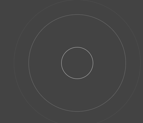
效果图:
2.波浪
<!DOCTYPE html>

<html lang="en">

<head>

    <meta charset="UTF-8">

    <title>Document</title>

    <style>

    *{margin:0;padding:0;}

    body{ background-color: #522350 }

    .water {

        position: relative;

        width: 200px;

        height: 200px;

        background-color: rgb(118, 218, 255);

        border-radius: 50%;

        margin:200px auto 0;

        overflow: hidden;

    }

    .water:before,.water:after{

           content: "";

           position: absolute;

           width: 400px;

           height: 400px;

           top: 0;

           left: 50%;

           background-color: rgba(255, 255, 255, .4);

           border-radius: 45%;

           transform: translate(-50%, -70%) rotate(0);

           animation: rotate 6s linear infinite;

           z-index: 10;

    }

    .water:after {

           border-radius: 47%;

           background-color: rgba(255, 255, 255, .9);

           transform: translate(-50%, -70%) rotate(0);

           animation: rotate 10s linear -5s infinite;

           z-index: 20;

    }

    @keyframes rotate {

        50% {

            transform: translate(-50%, -70%) rotate(180deg);

        } 100% {

            transform: translate(-50%, -70%) rotate(360deg);

        }

    }

    </style>

</head>

<body>

    <div class="water"></div>

</body>

</html>
效果:

3.波浪
<!DOCTYPE html>
<html lang="en"> <head>
<meta charset="UTF-8">
<title>Document</title>
<style type="text/css">
* {
padding: 0px;
margin: 0px;
font-family: "微软雅黑";
font-size: 100%;
font-style: normal
} dd,
dl,
dt,
em,
i,
p,
textarea,
a,
div {
padding: 0px;
margin: 0px;
} a {
text-decoration: none;
} img {
border: 0px;
} ul,
li {
padding: 0px;
margin: 0px;
list-style: none;
} .fl {
float: left
} .fr {
float: right
} body {
margin: 0px;
padding: 0px;
color: #000;
background: #fff;
} a {
-webkit-tap-highlight-color: rgba(0, 0, 0, 0);
-webkit-tap-highlight-color: transparent;
} .none {
display: none
} .fensug {
width: 168px;
height: 168px;
background: #fff;
border: 9px #5576ac solid;
margin: 100px auto;
padding: 5px;
-webkit-border-radius: 25em;
-moz-border-radius: 25em;
border-radius: 25em;
overflow: hidden;
position: relative
} .fensug .wavenum {
width: 168px;
height: 168px;
overflow: hidden;
-webkit-border-radius: 50%;
border-radius: 50%;
text-align: center;
display: table-cell;
vertical-align: middle;
position: absolute;
left: 5px;
top: 5px;
z-index: 5;
display: flex;
align-items: center;
justify-content: center;
flex-direction: column;
} .fensug .wavenum b {
color: #fff;
font-size: 43px;
text-align: center;
display: block;
position: relative;
z-index: 2;
line-height: 45px;
} .fensug .wavenum tt {
color: #fff;
font-size: 20px;
text-align: center;
display: block;
position: relative;
z-index: 2;
font-weight: bold;
width: 140px;
border-top: 2px #fff solid;
margin: 3px auto;
line-height: 35px;
} .waven {
width: 168px;
height: 168px;
webkit-border-radius: 25em;
-moz-border-radius: 25em;
border-radius: 25em;
background: #5576ac;
overflow: hidden;
position: relative
} .wave {
width: 408px;
height: 80%;
position: absolute;
left: 0px;
bottom: 0;
background: url(http://www.17sucai.com/preview/5730/2018-09-20/images/images/wave.png) no-repeat;
animation: move_wave 1s linear infinite;
-webkit-animation: move_wave 1s linear infinite;
} @-webkit-keyframes move_wave {
0% {
-webkit-transform: translateX(0)
} 50% {
-webkit-transform: translateX(-25%)
} 100% {
-webkit-transform: translateX(-50%)
}
} @keyframes move_wave {
0% {
transform: translateX(0)
} 50% {
transform: translateX(-25%)
} 100% {
transform: translateX(-50%)
}
}
</style>
</head> <body>
<div class="fensug">
<div class="wavenum "><b id="denfenjs">61%</b><tt>2018 Q1</tt></div>
<div class="waven">
<div class="wave" style="height: 60%;"> </div>
</div>
</div>
<script src="http://apps.bdimg.com/libs/jquery/1.9.1/jquery.min.js" type="text/javascript"></script>
<script type="text/javascript">
var waveHeight = 0;
var waveNum = 61; function waves() {
if (waveHeight < waveNum) {
$(".wave").css("height", waveHeight + "%");
waveHeight++;
}
setTimeout(function() { waves() }, 15);
} $(function() {
$("#denfenjs").html(waveNum + "%");
waves();
})
</script>
</body> </html>
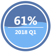
效果图:
css3动画水波纹、波浪的更多相关文章
- html5 +css3 点击后水波纹扩散效果 兼容移动端
<!DOCTYPE html> <html> <head> <meta http-equiv="Content-Type" content ...
- css3动画图片波纹效果
这里的图片很有特点,下面有演示图片样式 <!DOCTYPE html PUBLIC "-//W3C//DTD XHTML 1.0 Transitional//EN" &quo ...
- css 实现水波纹,波浪动画效果
<div class="wave"> 水波纹效果 <div class="wave1"></div> <div cla ...
- Android -- 贝塞尔实现水波纹动画(划重点!!)
1,昨天看到了一个挺好的ui效果,是使用贝塞尔曲线实现的,就和大家来分享分享,还有,在写博客的时候我经常会把自己在做某种效果时的一些问题给写出来,而不是像很多文章直接就给出了解决方法,这里给大家解释一 ...
- CSS3 水波纹
css3 动画设置水波纹,效果如下图: 源码: <!DOCTYPE html> <html lang="en"> <head> <meta ...
- HTML5 Canvas水波纹动画特效
HTML5的Canvas特性非常实用,我们不仅可以在Canvas画布上绘制各种图形,也可以制作绚丽的动画,比如这次介绍的水波纹动画特效.以前我们也分享过一款基于HTML5 WebGL的水波荡漾动画,让 ...
- 用path动画绘制水波纹
用path动画绘制水波纹 效果 源码 // // ViewController.m // PathAnimation // // Created by YouXianMing on 15/7/3. / ...
- css3+jQuery实现按钮水波纹效果
<!DOCTYPE html> <html> <head> <meta charset="UTF-8"> <meta name ...
- 8个超震撼的HTML5和纯CSS3动画源码
HTML5和CSS3之所以强大,不仅因为现在大量的浏览器的支持,更是因为它们已经越来越能满足现代开发的需要.Flash在几年之后肯定会消亡,那么HTML5和CSS3将会替代Flash.今天我们要给大家 ...
随机推荐
- Spring Boot实践——Spring Boot 2.0 新特性和发展方向
出自:https://mp.weixin.qq.com/s/EWmuzsgHueHcSB0WH-3AQw 以Java 8 为基准 Spring Boot 2.0 要求Java 版本必须8以上, Jav ...
- js获取当前项目根路径URL (转自CSDN 红领巾-sunlight)
/** * //获取当前项目根路径 * @return {TypeName} */ function getRootPath(){ //获取当前网址,如: http://localhost:8083/ ...
- docker swarm test
consul: 192.168.111.111: docker run -d -p 8500:8500 --name=consul progrium/consul -server -bootstrap ...
- git的基础操作-入门
本文是根据廖雪峰的git教程写的笔记:https://www.liaoxuefeng.com/wiki/0013739516305929606dd18361248578c67b8067c8c017b0 ...
- CompletionPort
[CompletionPort] 1.CreateIoCompletionPort.此方法用于创建与绑定.此方法调用后,socket即退出,只能通过CompletionKey来辨认是哪个socket的 ...
- 03-SSH综合案例:商城表关系分析
1.2 设计页面: 静态页面: 1.3 数据库分析与设计: 一般是一个Java类就对应一个表,有哪些类?那看你有哪些实体啊?一般一个模块对应一个实体 有用户模块就会有用户的一个实体,就会有用 ...
- jQuery的过滤器总结
1.内容过滤器 $(function () { // $("a:contains('标签')").css("color","green") ...
- 深入剖析java的try…catch…finally语句
一.前言 前些天参加面试的时候有一道题: public class test { public static void main(String[] args){ try { return; } fin ...
- Linux Terminal Games
linux Terminal Games install note:sudo apt install, or sudo apt-get install 2048 // download c src # ...
- jquery判断页面元素是否存在的方法