CSS过渡约束的计算
CSS过度约束性质
什么是CSS过度约束
简单的来说就是,父子元素的情况下,子元素的位置是依据一定条件进行计算的,以下则对这些条件进行详细的说明
当没有开启绝对定位或固定定位时
水平布局必须要满足以下等式
子元素在父元素中的水平布局必须要满足以下等式
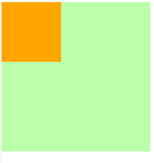
margin-left + border-left + padding-left + width + paddind-right + border-right + margin-right = 包含块的内容区的width
探寻能够设置成auto的CSS属性
这里七个值在中能设置auto的属性有
width: auto;

margin-left: auto;

margin-right: auto;
等式不成立(过度约束)时的几种情况
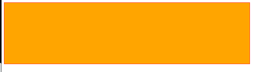
当margin与width都没有设置为auto
浏览器自动计算margin-right
<style>

    .box1{

        width: 800px;

        height: 200px;

        border: 1px red solid;

    }

    .box2{

        width: 200px;

        height: 200px;

        background-color: orange;

        /* margin-right无论设置多少都没用,因为浏览器会自动计算此值 */

        margin-right: 2000px;

        /* 此时margin-right = 600px

        margin-left + border-left + padding-left + width + paddind-right + border-right + margin-right = 包含块的内容区的width

        0 + 0 + 0 + 200 + 0 + 0 + margin-right = 800

        */

    }

</style>

<body>

    <div class="box1">

        <div class="box2"></div>

    </div>

</body>
当margin或width中有一个被设置为auto
会自动调整那个被设置为auto的属性
<style>

    .box1{

        width: 800px;

        height: 200px;

        border: 1px red solid;

    }

    .box2{

        width: 200px;

        height: 200px;

        background-color: orange;

        margin-left: auto;

        /* 此时margin-right = 0px

        margin-left + border-left + padding-left + width + paddind-right + border-right + margin-right = 包含块的内容区的width

        auto + 0 + 0 + 200 + 0 + 0 + margin-right = 800

        会自动调整那个被设置为auto的属性

        600px + 0 + 0 + 200 + 0 + 0 + margin-right = 800

        */

    }

</style>

<body>

    <div class="box1">

        <div class="box2"></div>

    </div>

</body>

当margin与width都被设置为auto
宽度会被调整到最大,外边距为0
<style>

    .box1{

        width: 800px;

        height: 200px;

        border: 1px red solid;

    }

    .box2{

        width: auto;

        height: 200px;

        background-color: orange;

        margin-left: auto;

        margin-right: auto;

        /* 此时width会是800px

        margin-left + border-left + padding-left + width + paddind-right + border-right + margin-right = 包含块的内容区的width

        auto + 0 + 0 + auto + 0 + 0 + auto = 800

        宽度会被调整到最大,外边距为0

        0 + 0 + 0 + width=auto=>800px + 0 + 0 + 0 = 800

        */

    }

</style>

<body>

    <div class="box1">

        <div class="box2"></div>

    </div>

</body>
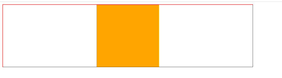
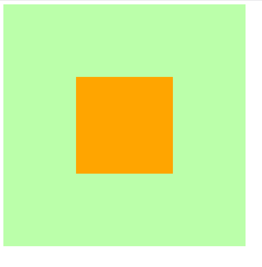
当margin都被设置为auto,width是固定值时
会自动平均分配给两个为auto的margin
这也是元素水平居中的原理
<style>

    .box1{

        width: 800px;

        height: 200px;

        border: 1px red solid;

    }

    .box2{

        width: 200px;

        height: 200px;

        background-color: orange;

        margin-left: auto;

        margin-right: auto;

        /* margin-left = margin-right = 300px

        margin-left + border-left + padding-left + width + paddind-right + border-right + margin-right = 包含块的内容区的width

        auto + 0 + 0 + 200 + 0 + 0 + auto = 800

        */

    }

</style>

<body>

    <div class="box1">

        <div class="box2"></div>

    </div>

</body>
当开启绝对定位或固定定位时
水平布局必须要满足以下等式
子元素在父元素中的水平布局必须要满足以下等式

left + margin-left + border-left + padding-left + width + paddind-right + border-right + margin-right + right = 包含块的内容区的width
垂直布局必须要满足以下等式(没开定位时垂直布局不受约束)
子元素在父元素中的垂直布局必须要满足以下等式

top + margin-top + border-top + padding-top + height + paddind-bottom + border-bottom + margin-bottom + bottom = 包含块的内容区的height
垂直布局的情况与水平布局一致
探寻可以设置为auto的CSS属性
left: auto;

right: auto;

margin-left: auto;

margin-right: auto;

width: auto;
当都没有设置auto时
会自动调整right值以使等式满足,注意: 没开启定位时,是自动调整margin-right
<style>

    .box1{

        width: 500px;

        height: 500px;

        background-color: #bfa;

        position: relative;

    }

    .box2{

        width: 200px;

        height: 200px;

        background-color: orange;

        position: absolute;

        /* 水平布局必须要满足以下等式

            left + margin-left + border-left + padding-left + width + paddind-right + border-right + margin-right + right = 包含块的内容区的width

        */

        left: 0;

        right: 0;   /* right将不会生效,因为需要满足过度约束*/

        /* 0 + 0 + 0 + 0 + 200px + 0 + 0 + 0 + right = 500px

            right => 300px

         */

    }

</style>

<body>

    <div class="box1">

        <div class="box2"></div>

    </div>

</body>
当其中有一个属性被设置auto时
自动调整auto的值使等式成立
<style>

    .box1{

        width: 500px;

        height: 500px;

        background-color: #bfa;

        position: relative;

    }

    .box2{

        width: auto;

        height: 200px;

        background-color: orange;

        position: absolute;

        /* 水平布局必须要满足以下等式

            left + margin-left + border-left + padding-left + width + paddind-right + border-right + margin-right + right = 包含块的内容区的width

        */

        left: 0;

        right: 0;

        /* 0 + 0 + 0 + 0 + auto + 0 + 0 + 0 + 0 = 500px

            auto => 500px

         */

    }

</style>

<body>

    <div class="box1">

        <div class="box2"></div>

    </div>

</body>
当width和margin被设置auto时(与其他水平布局一样当同时存在总是优先调整width)
会调整width,并将margin设置为0
<style>

    .box1{

        width: 500px;

        height: 500px;

        background-color: #bfa;

        position: relative;

    }

    .box2{

        width: auto;

        height: 200px;

        background-color: orange;

        position: absolute;

        margin-left: auto;

        margin-right: auto;

        /* 水平布局必须要满足以下等式

            left + margin-left + border-left + padding-left + width + paddind-right + border-right + margin-right + right = 包含块的内容区的width

        */

        left: 0;

        right: 0;

        /* 0 + auto + 0 + 0 + width + 0 + 0 + auto + 0 = 500px

            auto => 0px

            width => 500px

            当width和margin被设置auto时只会调整width

         */

    }

</style>

<body>

    <div class="box1">

        <div class="box2"></div>

    </div>

</body>

当margin left right被设置auto时
因为left,right两个属性的默认值是auto,所以会优先调整left和right
<style>

    .box1{

        width: 500px;

        height: 500px;

        background-color: #bfa;

        position: relative;

    }

    .box2{

        width: 200px;

        height: 200px;

        background-color: orange;

        position: absolute;

        margin-left: auto;

        margin-right: auto;

        /* 水平布局必须要满足以下等式

            left + margin-left + border-left + padding-left + width + paddind-right + border-right + margin-right + right = 包含块的内容区的width

        */

        /* 不指定时left与right默认值就是auto*/

        /* left: auto;

        right: auto; */

        /* auto + auto + 0 + 0 + 200px + 0 + 0 + auto + auto = 500px

            优先调整left或right(相当于回到第一种情况==>优先调整right)

            0 + 0 + 0 + 0 + 200px + 0 + 0 + 0 + 300px = 500px

        */

    }

</style>

<body>

    <div class="box1">

        <div class="box2"></div>

    </div>

</body>
所以实现水平居中时需要显式的指定left和right的值
<style>

    .box1{

        width: 500px;

        height: 500px;

        background-color: #bfa;

        position: relative;

    }

    .box2{

        width: 200px;

        height: 200px;

        background-color: orange;

        position: absolute;

        margin-left: auto;

        margin-right: auto;

        /* 水平布局必须要满足以下等式

            left + margin-left + border-left + padding-left + width + paddind-right + border-right + margin-right + right = 包含块的内容区的width

        */

        /* 水平居中时需要显式的指定left和right的值*/

        left: 0;

        right: 0;

        /* 0 + auto + 0 + 0 + 200px + 0 + 0 + auto + 0 = 500px

            调整margin-left和margin-right

            0 + 150px + 0 + 0 + 200px + 0 + 0 + 0 + 150px = 500px

        */

    }

</style>

<body>

    <div class="box1">

        <div class="box2"></div>

    </div>

</body>

集合开启定位后水平与垂直方向的过度约束的知识实现在父元素中垂直水平居中
<style>

    .father{

        width: 500px;

        height: 500px;

        background-color: #bfa;

    }

    .son{

        width: 200px;

        height: 200px;

        background-color: orange;

    }

    /* 实现在父元素中垂直水平居中 */

    /* ====================水平居中样式开始================= */

    .father{

        position: relative; /* 确定father为包含块,不然定位就会以html为原点 */

    }

    .son{

        position: absolute;

        left: 0;

        right: 0;

        margin-left: auto;

        margin-right: auto;

    }

    /*

        此时条件约束等式为

        left + margin-left + border-left + padding-left + width + paddind-right + border-right + margin-right + right = 包含块的内容区的width

        0 + auto + 0 + 0 + 200px + 0 + 0 + auto + 0 = 500px

        auto => 150px

    */

    /* ====================水平居中样式结束================= */

    /* ====================垂直居中样式开始================= */

    .father{

        position: relative;

    }

    .son{

        position: absolute;     /* 只有开启定位才受过度约束 */

        top: 0;

        bottom: 0;

        margin-top: auto;

        margin-bottom: auto;

    }

    /*

        此时条件约束等式为

        top + margin-top + border-top + padding-top + height + paddind-bottom + border-bottom + margin-bottom + bottom = 包含块的内容区的height

        0 + auto + 0 + 0 + 200px + 0 + 0 + auto + 0 = 500px

        auto => 150px

    */

    /* ====================垂直居中样式结束================= */

    /* 实现在父元素中垂直水平居中 */

</style>

<body>

    <div class="father">

        <div class="son"></div>

    </div>

</body>
CSS过渡约束的计算的更多相关文章
- 深入理解CSS过渡transition
× 目录 [1]定义 [2]过渡属性 [3]持续时间[4]延迟时间[5]时间函数[6]多值[7]阶段[8]触发[9]API 前面的话 通过过渡transition,可以让web前端开发人员不需要jav ...
- Vue过渡效果之CSS过渡
前面的话 Vue 在插入.更新或者移除 DOM 时,提供多种不同方式的应用过渡效果.本文将从CSS过渡transition.CSS动画animation及配合使用第三方CSS动画库(如animate. ...
- 047——VUE中css过渡动作实例
<!DOCTYPE html> <html lang="en"> <head> <meta charset="UTF-8&quo ...
- css过渡和2d详解及案例
css过渡和2d详解及案例(案例在下方,不要着急) 本文重点: 1.在2D变化使用过程中,有些需求需要两种或两种以上的变化同时使用, 值得注意的是尽量把位移变化放在最前面,把其他变化放在最后面,属性值 ...
- Vue css过渡 和 js 钩子过渡
css过渡 <transition name="slide"> <div v-show="!showChatInput" class=&quo ...
- 看完就懂--CSS选择器优先级的计算
CSS选择器优先级的计算 什么是选择器的优先级 优先级的计算与比较(一) - 优先级具有可加性 - 选择器优先级不会超过自身最大数量级 - 同等优先级情况下,后写的覆盖前写的 - 并集选择器之间的优先 ...
- CSS过渡、CSS动画
<!DOCTYPE html> <html> <head> <meta charset="utf-8"/> <script s ...
- CSS特异性(CSS Specificity)的细节之CSS样式权重的计算与理解(CSS样式覆盖规则)
本篇讲解CSS特异性(CSS Specificity)的细节,也就是CSS样式选择器的权重计算 通过计算选择器的权重(weight)最终决定哪个选择器将获得优先权去覆盖其他选择器的样式设定,即“优先原 ...
- 深入理解CSS选择器优先级的计算
选择器的优先级关系到元素应用哪个样式.在CSS2.1的规范(http://www.w3.org/TR/2009/CR-CSS2-20090908/cascade.html#specificity)中是 ...
随机推荐
- [CF套题] CF-1163
CF-1163 传送门 # Penalty A B1 B2 C1 C2 D E F 3 (483) 464 +0 0:06 +1 01:13 +3 01:12 + 01:57 + 01:56 A 第一 ...
- 【uva 10600】ACM Contest and Blackout(图论--次小生成树 模版题)
题意:有T组数据,N个点,M条边,每条边有一定的花费.问最小生成树和次小生成树的权值. 解法:具体请见 关于生成树的拓展 {附[转]最小瓶颈路与次小生成树}(图论--生成树) 1 #include&l ...
- 【noi 2.6_1481】Maximum sum(DP)
题意:求不重叠的2段连续和的最大值. 状态定义f[i]为必选a[i]的最大连续和,mxu[i],mxv[i]分别为前缀和后缀的最大连续和. 注意:初始化f[]为0,而max值为-INF.要看好数据范围 ...
- zoj3593One Person Game (扩展欧几里德)
There is an interesting and simple one person game. Suppose there is a number axis under your feet. ...
- c#小灶——9.算术运算符
算数运算符用来在程序中进行运算. 首先,了解最简单的加(+)减(-)乘(*)除(/)运算符: 举例 int a = 1; int b = 2; int c = a + b; Console.Write ...
- Go语言中时间轮的实现
最近在工作中有一个需求,简单来说就是在短时间内会创建上百万个定时任务,创建的时候会将对应的金额相加,防止超售,需要过半个小时再去核对数据,如果数据对不上就需要将加上的金额再减回去. 这个需求如果用Go ...
- dp的小理解
这段时间刷dp,总结出了一个不算套路的套路. 1.根据题意确定是否有重叠子问题,也就是前面的状态对后面的有影响,基本满足这个条件的就可以考虑用dp了. 2.确定是dp后,就是最难的部分--如何根据题意 ...
- Socket 编程简介
Socket又称"套接字",应用程序通常通过"套接字"向网络发出请求或者应答网络请求,使主机间或者一台计算机上的进程间可以通讯. 本章节我们为大家接收 Perl ...
- Linux内核实现透视---硬中断
Linux的中断处理是驱动中比较重要的一部分内容,要清楚具体的实现才能更好的理解而不是靠记住别人理解后总结的规律,所以今天就打算从从源码来学习一下Linux内核对于中断处理过程,设计中断子系统的初始化 ...
- Javascript实现"点按钮出随机背景色的"三个DIV
<!DOCTYPE html> <html> <head> <title>Random_Color-Transformation</title&g ...