css中的左右垂直居中的问题,可兼容各种版本浏览器的写法
目前主流的css布局包含:居中布局、多列布局、全屏布局。
主要样式参考:
<style type="text/css">

        html,body,p,h1,h2,ul,li{

            margin: 0;

            padding: 0;

            list-style: none;

        }

        .main ul{

            display:flex;

            flex-direction: row;

            justify-content: space-between;

            padding:20px;

        }

        .main div{

              width: 200px;

              height: 200px;

              text-align: center;

              margin-bottom: 10px;

              background-color: #faa755;

        }

        .main div p{

            width: 100px;

            height: 50px;

            background-color: #fedcbd;

        }

        /*水平居中*/

        .center-line-inline{

            display:inline-block;

            text-align: center;

        }

        .center-line-inblock{

            margin:0 auto;

            text-align: center;

        }

        .center-line-flex{

            display:flex;

            flex-direction: row;

            justify-content: center;

        }

        /*垂直居中*/

        .center-row{

            display: table-cell;

            vertical-align:middle;

        }

        .center-row-position{

            position:relative;

            margin-top:10px;

        }

        .center-row-position p{

            position: absolute;

            top:50%;

            left:0;

            margin-top: -25px;

        }

        .center-row-flex{

            display:flex;

            align-items: center;

        }

        /*水平垂直居中*/

        .center-all{

            display: table-cell;

            text-align: center;

            vertical-align:middle;

        }

        .center-all p{

            display: inline-block;

        }

        .center-all-position{

            position: relative;

            margin-top:10px;

        }

        .center-all-position p{

            position:absolute;

            left:50%;

            top:50%;

            margin-top:-25px;

            margin-left:-50px;

        }

        .center-all-flex{

            display:flex;

            align-items: center;

            justify-content: center;

        }

        /*圣杯布局*/

        .main .grail-box{

            width: 100%;

            height: 600px;

            position:relative;

        }

        .main .grail-box .center{

             background:#feeeed;

             width: 100%;

             height: 600px;

        }

         .main .grail-box .left{

            background:#f391a9;

            width: 200px;

            height: 600px;

            position:absolute;

            left:0;

            top:0;

         }

        .main .grail-box .right{

           background: #4e72b8;

           width: 200px;

           height: 600px;

           position:absolute;

           right:0;

           top:0;

        }

        .main .grail-box-fl{

            width: 100%;

            height: 600px;

            overflow: hidden;

        }

        .main .grail-box-fl .center{

            background:#feeeed;

            width: calc(100% - 400px);

            height: 600px;

            float:left;

        }

        .main .grail-box-fl .left{

            background:#f391a9;

            width: 200px;

            height: 600px;

            float:left;

         }

         .main .grail-box-fl .right{

           background: #4e72b8;

           width: 200px;

           height: 600px;

           float: left;

        }

    </style>
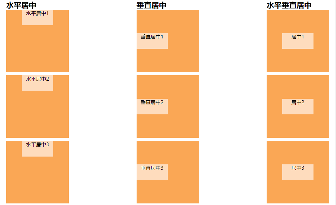
一、居中布局
<ul>

    <li>

      <h2>水平居中</h2>

      <div>

          <p class="center-line-inline">水平居中1</p>  <!-- 块级元素:text-align:center -->

      </div>

      <div>

          <p class="center-line-inblock">水平居中2</p>  <!-- 块级元素:margin:0 auto -->

      </div>

      <div class="center-line-flex">

          <p>水平居中3</p> <!-- 弹性盒模型 justify-content: center;-->

      </div>

    </li>

    <li>

      <h2>垂直居中</h2>

      <div class="center-row">

          <p class="center-row-inline">垂直居中1</p> <!-- vertical-align:该属性定义行内元素的基线相对于该元素所在行的基线的垂直对齐(大白话就是相对于同一行元素来说),所以使用此属性布局垂直居中,需要设置父级元素属性为表格属性 -->

      </div>

      <div class="center-row-position">

          <p>垂直居中2</p>  <!-- 通过定位计算,需要知道子元素的高度 -->

      </div>

      <div class="center-row-flex">

          <p>垂直居中3</p>  <!-- 弹性盒模型 align-items: center; -->

      </div>

    </li>

    <li>

      <h2>水平垂直居中</h2>

      <div class="center-all">

          <p>居中1</p>    <!-- vertical-align结合align-center-->

      </div>

      <div class="center-all-position">

          <p>居中2</p>    <!-- 通过定位计算,需要知道子元素的宽高-->

      </div>

      <div class="center-all-flex">

          <p>居中3</p>    <!-- 通过弹性盒模型-->

      </div>

    </li>

  </ul>
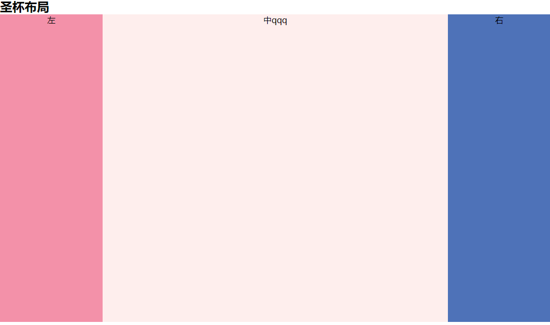
二、多列布局(两列/三列布局、圣杯布局)
<h1>多列布局</h1>

  <h2>圣杯布局</h2> <!--  (左右固定中间自适应)(中间栏要在浏览器中优先渲染) -->

  <div class="grail-box"> <!--  通过绝对定位 -->

      <p class="center">中qqq</p>

      <p class="left">左</p>

      <p class="right">右</p>

  </div>

  <div class="grail-box-fl"> <!--  通过浮动 -->

      <p class="left">左</p>

      <p class="center">中</p>

      <p class="right">右</p>

  </div>
三、全屏布局(等分布局、等高布局、全屏布局)
css中的左右垂直居中的问题,可兼容各种版本浏览器的写法的更多相关文章
- CSS中设置DIV垂直居中的N种方法 兼容IE浏览器
在说到这个问题的时候,也许有人会问CSS中不是有vertical-align属性来设置垂直居中的吗?即使是某些浏览器不支持我只需做少许的CSS Hack技术就可以啊!所以在这里我还要啰嗦两句,CSS中 ...
- CSS中设置div垂直居中
在说到这个问题的时候,也许有人会问CSS中不是有vertical-align属性来设置垂直居中的吗?即使是某些浏览器不支持我只需做少许的CSS Hack技术就可以啊!所以在这里我还要啰嗦两句,CSS中 ...
- css中元素水平垂直居中4种方法介绍
table-cell轻松设置文本图片水平垂直居中 让一个元素垂直居中的思路:把这个元素的容器设置为table-cell,也就是具有表格单元格的特性,再使用vertical-align(这个属性对blo ...
- CSS中图片水平垂直居中方法小结
写页面时难免会遇到水平垂直居中的问题,总结一下最近使用的方法. 一.使用垂直居中和水平居中 <div id="div1"> <img src="img/ ...
- 在CSS中水平居中和垂直居中:完整的指南
这篇文章将会按照如下思路展开: 一.水平居中 1. 行内元素水平居中 2. block元素水平居中 3. 多个块级元素水平居中 二.垂直居中 1. 行内元素水平居中 2. block元素水平居中 3. ...
- CSS中元素水平居中和垂直居中的方法
#CSS中水平居中和垂直居中的方法 一. 水平居中 1.行内元素(文本,图片等) 如果被设置元素为文本.图片等行内元素时,可以通过给父元素设置` text-align:center;` 来实现 2.定 ...
- css中的1px并不总等于设备的1px(高分辨率不等 低分辨等)
在css中我们一般使用px作为单位,在桌面浏览器中css的1个像素往往都是对应着电脑屏幕的1个物理像素,这可能会造成我们的一个错觉,那就是css中的像素就是设备的物理像素.但实际情况却并非如此,css ...
- CSS中强大的EM
(转)作者:dearjohn ,发布于2012-7-31 http://www.uml.org.cn/html/201207311.asp 使用CSS也好久了,但一直都是在使用“px”来设置Web元素 ...
- css中的em 简单教程 -- 转
先附上原作的地址: https://www.w3cplus.com/css/px-to-em 习惯性的复制一遍~~~~ -------------------------------我是分界线---- ...
随机推荐
- css实现图标移上图标弹跳效果
html部分: <div class="bounce" style="width:20px;height:20px;border:1px solid red;&qu ...
- Opencv3 Robert算子 Sobel算子 拉普拉斯算子 自定义卷积核——实现渐进模糊
#include <iostream>#include <opencv2/opencv.hpp> using namespace std;using namespace cv; ...
- 30-Transformation(HDU4578)-区间线段树(复杂)
http://acm.hdu.edu.cn/showproblem.php?pid=4578 Transformation Time Limit: 15000/8000 MS (Java/Others ...
- jquery函数$.proxy简单示例
来自于<jquery 权威指南> ------------------------------ <!DOCTYPE html PUBLIC "-//W3C//DTD XHT ...
- Spring.net 容器注入是替换(后处理器appConfigPropertyHolder)
.定义节点 下面两个都定义为键值对 <section name="DaoConfiguration" type="System.Configuration.Name ...
- 文件上传控件asp:FileUpload
前端 使用的控件<asp:FileUpload ID="fileup" runat="server" /><span class=" ...
- https hsts 私密链接
chrome强制转跳https,删除对某个域名的强制转跳即可 hrome的地址栏输入:chrome://net-internals/#hsts 在Delete domain下输入相对应的网址,不带 ...
- 【转】JAVA 并发编程-多个线程之间共享数据
原文地址:http://blog.csdn.net/hejingyuan6/article/details/47053409# 多线程共享数据的方式: 1,如果每个线程执行的代码相同,可以使用同一个R ...
- Redis与Java的链接Jedis(二)
就像jdbc跟java链接数据库一样 redis跟java链接最好的工具就是Jedis 相关资源下载:https://github.com/xetorthio/jedis 正常建立java项目, 导入 ...
- up7-文件保存位置
asp.net 默认位置:项目/upload/年/月/日/guid/ 代码截图: 位置截图: jsp 默认位置:tomcat/webapps/Uploader7Oracle/upload/年/月/ ...